In this article, I will show you how to use the ggplot2 plotting library in R. It was written by Hadley Wickham. If you don’t have already have it, install it and load it up:
install.packages('ggplot2')
library(ggplot2)
qplot
qplot is the quickest way to get off the ground running. For this demonstration, we will use the mtcars dataset from the datasets package.
library(datasets)
qplot(mpg, disp, data = mtcars)
will give the following plot:
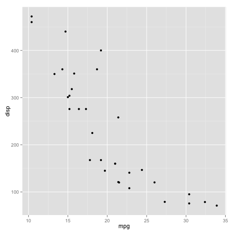
We can also color the datapoints based on the number of cylinders that each car has as follows:
mtcars$cyl <- as.factor(mtcars$cyl)
qplot(mpg, disp, data = mtcars, color = cyl)
which will give the following plot:
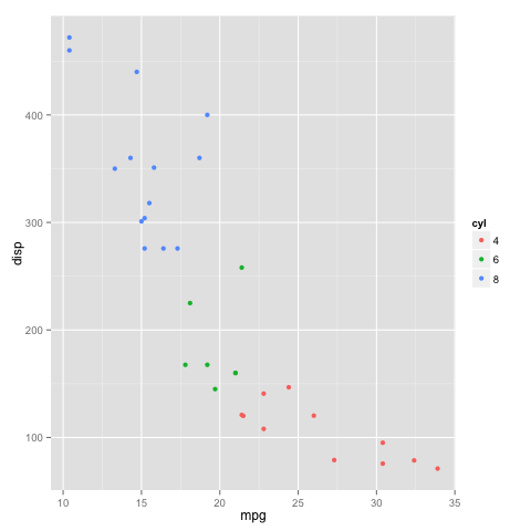
You can also plot a histogram:
qplot(mtcars$mpg, fill = mtcars$cyl, binwidth = 2)
which will give the following plot:
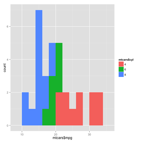
Another thing you may notice is that instead of specifying data = mtcars, I just used mtcars$mpg and mtcars$cyl here. Both are acceptable ways, and you are free to use whichever you prefer.
You can also split the plot using facets.
qplot(mpg, disp, data = mtcars, facets = cyl ~ .)
which gives the following plot:

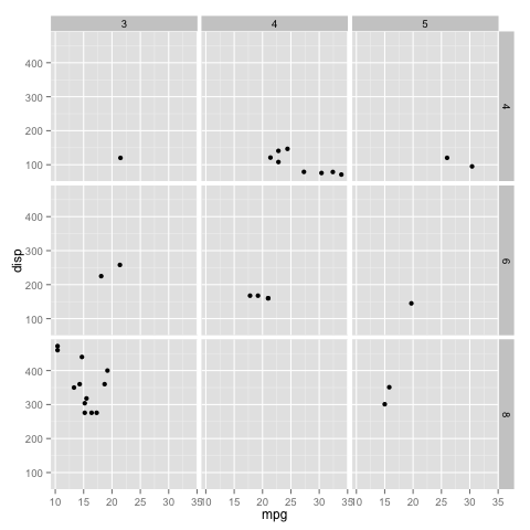
You can also split along both the x axes and y axes as follows:
mtcars$gear <- as.factor(mtcars$gear)
qplot(mpg, disp, data - mtcars, facets = cyl ~ gear)
ggplot
While qplot is a great way to get off the ground running, it does not provide the same level of customization as ggplot. All the above plots can be reproduced using ggplot as follows:
ggplot(mtcars, aes(mpg, disp)) + geom_point()
ggplot(mtcars, aes(mpg, disp)) + geom_point(aes(color = cyl))
ggplot(mtcars, aes(mpg)) + geom_bar(aes(fill = cyl), binwidth = 2)
ggplot(mtcars, aes(mpg, disp)) + geom_point() + facet_grid(cyl ~ .)
ggplot(mtcars, aes(mpg, disp)) + geom_point() + facet_grid(cyl ~ gear)
Customization
There are a variety of options available for customization. I will describe a few here.
For example, for the points, we can specify size, color and alpha. Alpha determines how opaque each point is, with 0 being the lowest, and 1 being the highest value it can take.
We can specify the labels for the x axis and y axis using xlab and ylab respectively, and the title using ggtitle.
There are a variety of options for modifying the legend title, text, colors, order, position, etc.
You can also select a theme for the plot. Use ?ggtheme to see all the options that are available.
Here is an example:
ggplot(mtcars, aes(mpg, disp)) +
geom_point(aes(color = carb), size = 2.5, alpha = 0.8) +
facet_grid(cyl ~ gear) +
xlab('Miles per US gallon') +
ylab('Displacement in cubic inches') +
ggtitle('Fuel consumption vs displacement') +
theme(legend.background = element_rect(color = 'orange', fill = 'purple', size = 1.2, linetype = 'dotted'), legend.key = element_rect(fill = 'pink'), legend.position = 'top')
which gives the following plot:
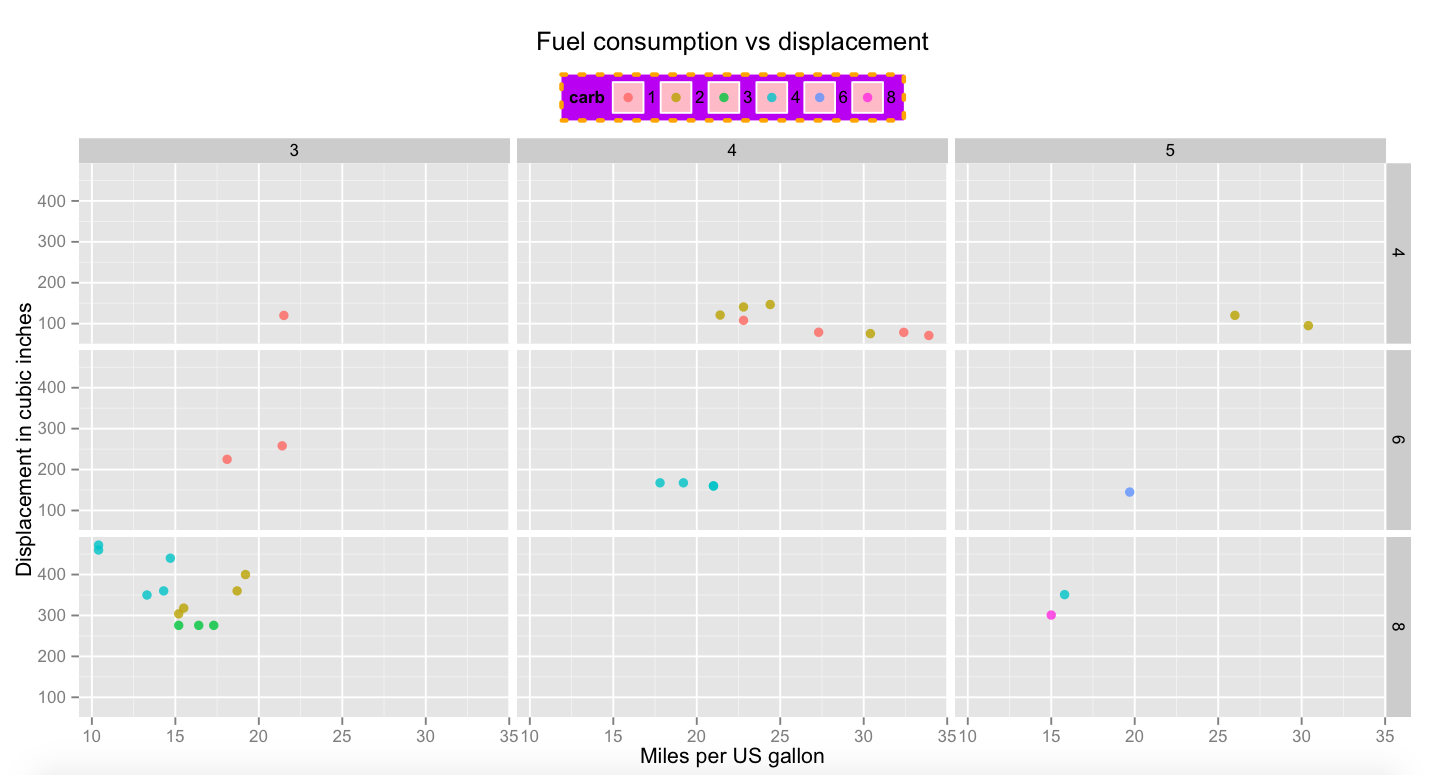
The above plot is only for demonstration purposes, and it shows some of the many customization options available in the ggplot2 library. For more options, please refer to the ggplot2 documentation.
If you have any questions, please feel free to leave a comment or reach out to me on Twitter.


Hello! I am very new in R! Trying to plot my data (which is pedestrian trajectories in a csv file). This is the code I use: ggplot(data = data), aes(x = x_axis , y =y_axis, group = user_id, color = as.factor(user_type)) + geom_path()
but I get error : Error: unexpected ‘,’ in “ggplot(data = data),”
Could you please help me to fix it?
If it were faster for large datasets and able to create 3D plots it would be perfect. It would need to import some ideas from Vispy.
“Please note the spelling of “colour” in the legend settings. “Color” will not work.”
One can use “color” instead of “colour” throughout all of ggplot2 commands; it works in this case, for instance.
What does not work is “Color”, with a capital “C”. Neither does “Colour”, or “Size”… it has nothing to do with the spelling.
Hello Eduardo, when writing the article, I was referring to the ggplot2 wiki, where Hadley Wickham mentioned that only “colour” will work, and not “color”. However, I just did some testing, and it looks like you are correct (and the wiki is possible outdated).
Thank you for pointing it out to me! I have edited the article accordingly.
Just a minor detail that caught my eye. Nice article!
Thank you for your kind words Eduardo. I’m glad you enjoyed it!