
The U.S. Census Bureau publishes the rent that a typical household pays in every county in the country, updated every year, and gives it away through a free API. With the tidycensus package you can pull that data — numbers and the map polygons to draw it — in a single function call, then turn it into a national map in about twenty lines. Here we map median gross rent by county to see where renting is expensive and where it is cheap.
Getting the data
The data comes from the American Community Survey (ACS), the Census Bureau’s rolling survey of about 3.5 million addresses a year. We use the 5-year estimates (here 2019–2023), which pool five years of responses so that even small, rural counties get a reliable number. The variable we want is B25064_001: median gross rent in dollars — contract rent plus utilities — for renter-occupied housing.
tidycensus talks to the ACS API, and the API needs a free key. Request one at api.census.gov/data/key_signup.html; it arrives by email in a minute. Activate it, then install it into R once — after that tidycensus finds it automatically in every session, so you never put it in a script you share:
library(tidycensus)
census_api_key("YOUR_KEY_HERE", install = TRUE)  # run once; writes to ~/.Renviron
With the key set, load the packages we need:
library(tidycensus)
library(tigris)     # shift_geometry(): repositions Alaska & Hawaii
library(dplyr)
library(sf)
library(ggplot2)
library(scales)     # dollar labels
library(patchwork)  # combine the small-multiple maps

options(tigris_use_cache = TRUE)  # cache boundary files after first download
Now one call does everything. We ask for the rent variable at geography = "county", and — this is what makes tidycensus special — set geometry = TRUE so it also downloads the county boundaries and returns them joined to the data as an sf object. Leaving state unset gives us every county in the country; shift_geometry() then tucks Alaska and Hawaii under the lower 48 so the whole nation fits one frame.
us <- get_acs(
  geography  = "county",
  variables  = "B25064_001",   # median gross rent (dollars)
  year       = 2023,
  survey     = "acs5",
  geometry   = TRUE,
  resolution = "20m"           # generalized boundaries: smaller, faster, fine for a national map
)

us <- shift_geometry(us)
The result is a tidy sf data frame — one row per county, the value in estimate, its 90% margin of error in moe, and a geometry column. Always look before drawing:
us                       # an sf object: data + polygons together
## Simple feature collection with 3222 features and 5 fields
## Geometry type: GEOMETRY
## Dimension:     XY
## Bounding box:  xmin: -3112200 ymin: -1697728 xmax: 2258154 ymax: 1558935
## Projected CRS: USA_Contiguous_Albers_Equal_Area_Conic
## First 10 features:
##    GEOID                         NAME   variable estimate moe
## 1  13027       Brooks County, Georgia B25064_001      752  79
## 2  31095   Jefferson County, Nebraska B25064_001      659  50
## 3  51683      Manassas city, Virginia B25064_001     1835  62
## 4  56021      Laramie County, Wyoming B25064_001     1080  29
## 5  13135     Gwinnett County, Georgia B25064_001     1713  16
## 6  20001         Allen County, Kansas B25064_001      685  60
## 7  27065    Kanabec County, Minnesota B25064_001     1003  83
## 8  28107   Panola County, Mississippi B25064_001      859  44
## 9  31185        York County, Nebraska B25064_001      885  49
## 10 42063 Indiana County, Pennsylvania B25064_001      786  28
##                          geometry
## 1  MULTIPOLYGON (((1163909 -64...
## 2  MULTIPOLYGON (((-115252.6 3...
## 3  MULTIPOLYGON (((1580860 292...
## 4  MULTIPOLYGON (((-765818.2 5...
## 5  MULTIPOLYGON (((1073286 -32...
## 6  MULTIPOLYGON (((41912.94 35...
## 7  MULTIPOLYGON (((192562.6 95...
## 8  MULTIPOLYGON (((527838.1 -3...
## 9  MULTIPOLYGON (((-152283 398...
## 10 MULTIPOLYGON (((1383131 460...
summary(us$estimate)     # the spread of county rents
##    Min. 1st Qu.  Median    Mean 3rd Qu.    Max.     NAs
##   253.0   742.0   848.5   928.4  1021.0  2893.0      10
sum(is.na(us$estimate))  # counties with no published estimate
## [1] 10
Two things to note. A handful of counties come back NA — mostly tiny populations the Bureau suppresses for privacy; we’ll let them render in grey. And that moe column is a reminder these are survey estimates, not a census: a county’s rent is “$1,200 ± $80,” not exactly $1,200. For a national map the uncertainty is small relative to the range, but it’s there.
Map it
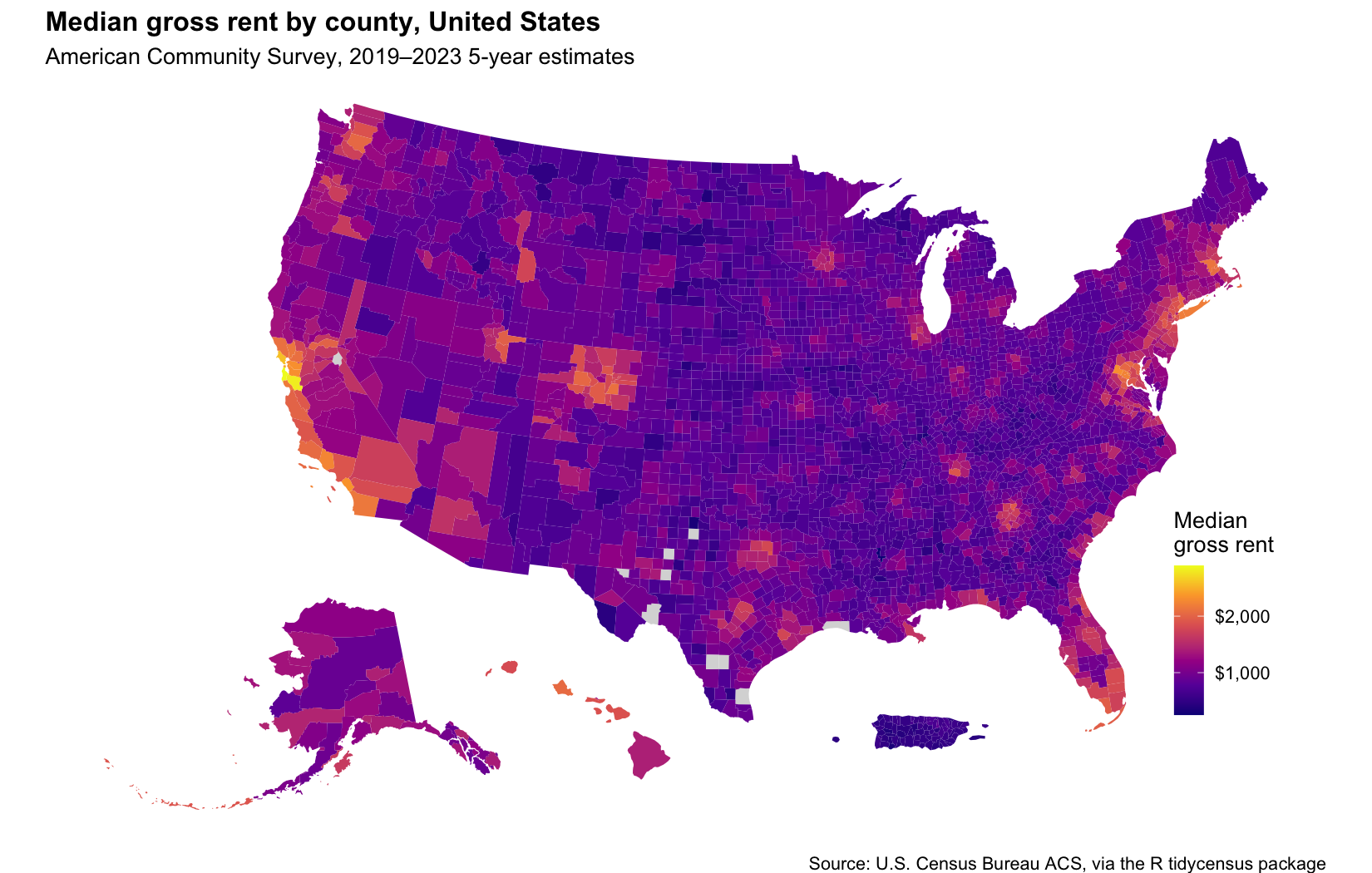
Rent is a sequential quantity — low to high — so we fill with a sequential palette (viridis’s plasma), which is colorblind-safe and reads clearly in print. geom_sf() draws the polygons; everything else is labels and a clean, map-friendly theme.
ggplot(us) +
  geom_sf(aes(fill = estimate), color = NA) +
  scale_fill_viridis_c(
    option   = "plasma",
    labels   = label_dollar(),
    na.value = "grey85",
    name     = "Medianngross rent"
  ) +
  labs(
    title    = "Median gross rent by county, United States",
    subtitle = "American Community Survey, 2019–2023 5-year estimates",
    caption  = "Source: U.S. Census Bureau ACS, via the R tidycensus package"
  ) +
  theme_void(base_size = 13) +
  theme(plot.title = element_text(face = "bold"),
        legend.position = c(0.92, 0.3))
Reading the map
The typical county’s median rent is about $848 — but the map is a story of a few bright clusters against a wide, darker interior. Rent runs from $253 in Issaquena County up to $2,893 in San Mateo County, an elevenfold spread. Only about 6% of counties top $1,500, and they are not scattered randomly: they concentrate in coastal California and the Bay Area, the Washington–Boston corridor, and pockets around Seattle, Denver, and the mountain-resort West. Because every number in this paragraph is computed from the same object we mapped, the text always matches the picture — re-knit it next year and both update together.
The priciest counties make the coastal concentration concrete:
d |>
  arrange(desc(estimate)) |>
  transmute(County = NAME, `Median rent` = scales::dollar(estimate)) |>
  head(8) |>
  knitr::kable()
| County | Median rent |
|---|---|
| San Mateo County, California | $2,893 |
| Santa Clara County, California | $2,814 |
| Marin County, California | $2,584 |
| San Francisco County, California | $2,419 |
| Orange County, California | $2,352 |
| Contra Costa County, California | $2,322 |
| Alameda County, California | $2,318 |
| Loudoun County, Virginia | $2,317 |
Zooming into the states
A national map flattens what happens inside each state. The state = argument fixes that — it accepts a vector, so one call pulls several states at once. Here we grab the four most populous, then draw each on its own colour scale to bring out where rent concentrates within each one.
states <- c("California", "Texas", "Florida", "New York")

sc <- get_acs(geography = "county", variables = "B25064_001", state = states,
              year = 2023, survey = "acs5", geometry = TRUE, resolution = "20m")
sc$state <- sub(".*, ", "", sc$NAME)   # pull the state name out of "County, State"

one_state <- function(st) {
  ggplot(filter(sc, state == st)) +
    geom_sf(aes(fill = estimate), color = "grey92", linewidth = 0.05) +
    scale_fill_viridis_c(option = "plasma", labels = label_dollar(),
                         na.value = "grey85", name = NULL) +
    labs(title = st) +
    theme_void(base_size = 12) +
    theme(plot.title = element_text(face = "bold", hjust = 0.5),
          legend.key.width = unit(0.35, "cm"), legend.text = element_text(size = 8))
}

(one_state("California") | one_state("Texas")) /
(one_state("Florida")   | one_state("New York")) +
  plot_annotation(
    title   = "Median gross rent by county — each state on its own colour scale",
    caption = "Source: U.S. Census Bureau ACS, via the R tidycensus package",
    theme   = theme(plot.title = element_text(face = "bold", size = 15)))
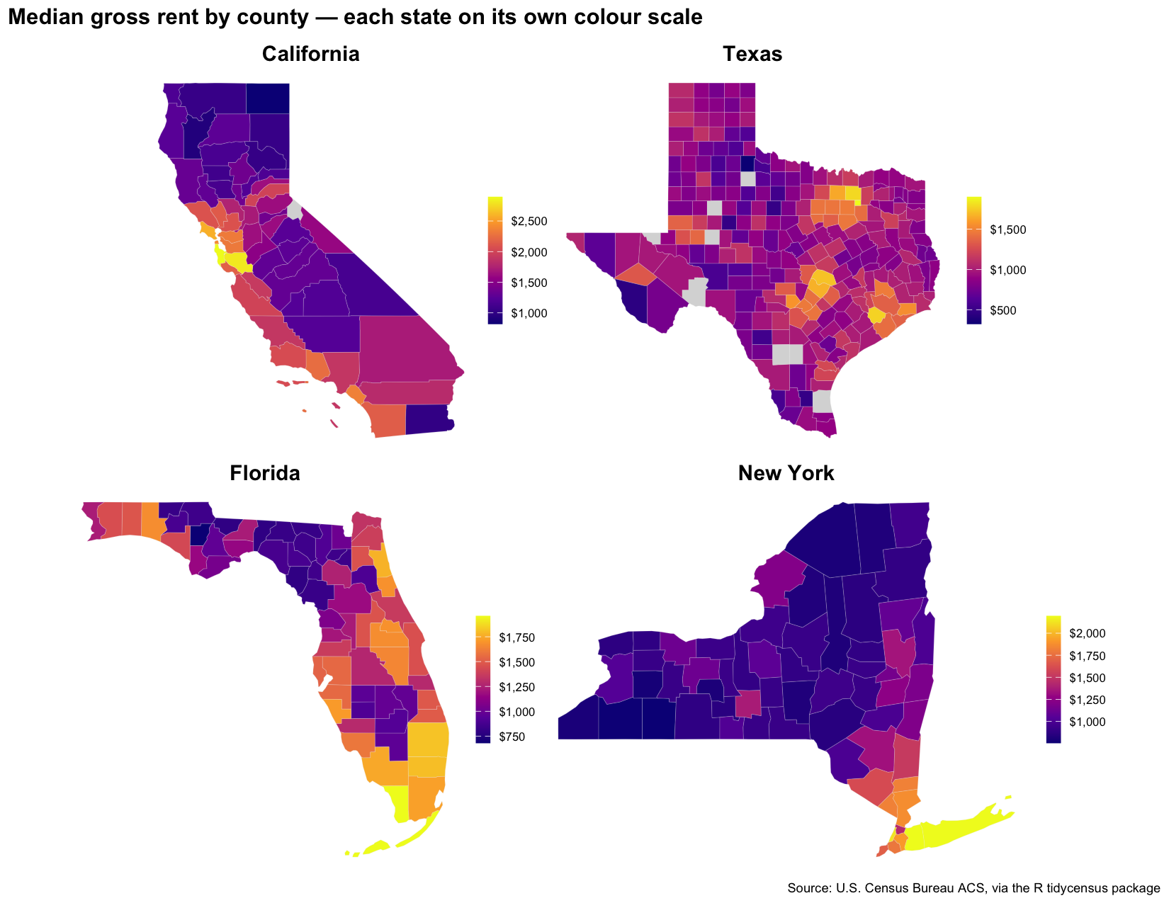
The pattern repeats with variations. California is expensive along almost its entire coast, with the Bay Area at the top of its range. New York is the sharpest split — downstate (New York City, Long Island, Westchester) against a uniformly inexpensive upstate. Florida’s money is on the water: the southeast around Miami, the southwest around Naples, the interior far cheaper. Texas is mostly its metros — Austin and Houston — but note the bright cluster out west, the Permian Basin oil counties, where a housing crunch has nothing to do with a big city.
One caution about reading these together: because each panel has its own scale, the same colour means different rents in different states — a “bright” Texas county (around $1,500) rents for far less than a bright California one (near (2,800). Per-state scales reveal internal *pattern*; for cross-state *levels*, use one shared scale (`limits = range(sc)estimate, na.rm = TRUE)`) instead.
Make it your own
Nothing above is specific to rent. Change one variable code and you map something else entirely; change geography and you change the resolution:
B19013_001— median household incomeB25077_001— median home valueDP02_0154PE— households with a broadband subscription (percent)geography = "tract"with astateandcounty— a neighborhood-level map of a single metro
To find a variable, browse the full ACS table with load_variables(2023, "acs5") and search it — there are tens of thousands. The pattern stays the same: get_acs() with geometry = TRUE, then geom_sf().
That’s all. You now have a script that pulls an authoritative national dataset, joins it to its own geography, and maps it — and re-points at any variable or place with a one-line change.
