To build a Forest Plot often the forestplot package is used in R. However, I find the ggplot2 to have more advantages in making Forest Plots, such as enable inclusion of several variables with many categories in a lattice form. You can also use any scale of your choice such as log scale etc. In this post, I will introduce how to plot Risk Ratios and their Confidence Intervals of several conditions.
Lets start by loading the package ggplot2 in our R.
library(ggplot2)
Data
For demostration purposes, I will load a data which contains few columns named Condition, RiskRatio, LowerLimit, UpperLimit, and Group. The current data is in long format; if your data is not in this format, check out the melt function, in the reshape package, it provides a really easy way to reshape data into long format. The reference group RR=1. My data is in xlsx format, therefore, I load data using read_excel in readxl package as demonstrated below.
RR_data <- data.frame(read_excel("C:/Users/fatakora/Dropbox/MY write R write ups/Risk_Ratio_data.xlsx"))
         Condition    RiskRatio LowerLimit UpperLimit  Group
1	Condition1	1.0512	 1.0174	   1.0863       GroupB
2	Condition2	1.0169	 0.9638	   1.0731	GroupB
3	Condition3	1.0391	 1.0185	   1.0601	GroupB
10	Condition1	1.1057	 1.0667	   1.1463	GroupC
11	Condition2	1.4204	 1.3471	   1.4978	GroupC
12	Condition3	1.0344	 1.0105	   1.0589	GroupC
19	Condition1	1.0000	 1.0000	   1.0000	GroupA
20	Condition2	1.0000	 1.0000	   1.0000	GroupA
21	Condition3	1.0000	 1.0000	   1.0000	GroupA
For the sake of easy demonstrations and simplicity, we truncate the upper limits to 2 as maximum and lower limits to 0.5 as minimum.
RR_data$UpperLimit[RR_data$UpperLimit > 2] = 2
RR_data$LowerLimit[RR_data$LowerLimit < 0.5] = 0.5
ggplot2
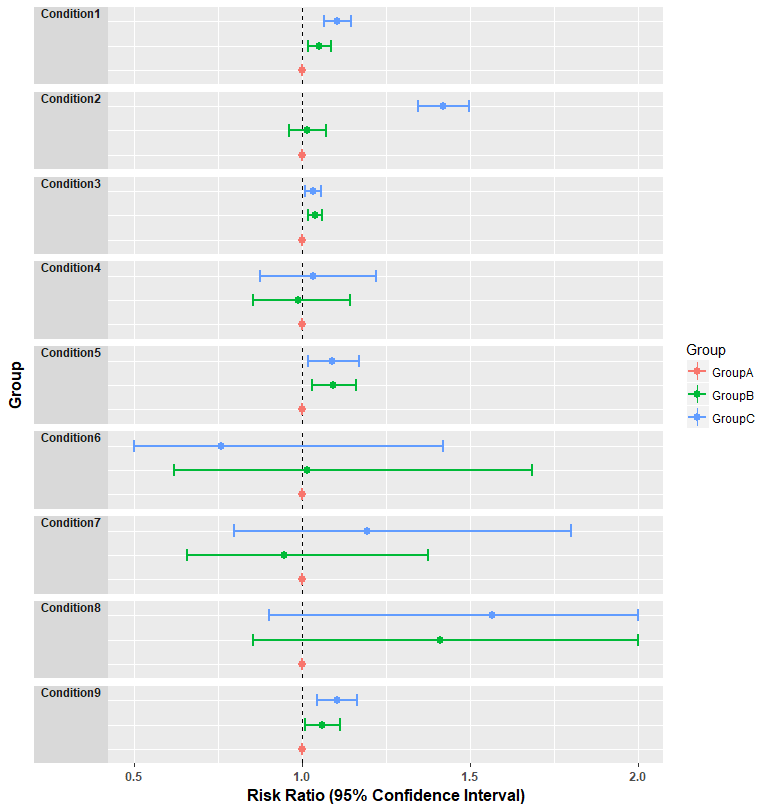
The following codes will plot the graph below
p = ggplot(data=RR_data,
    aes(x = Group,y = RiskRatio, ymin = LowerLimit, ymax = UpperLimit ))+
    geom_pointrange(aes(col=Group))+
    geom_hline(aes(fill=Group),yintercept =1, linetype=2)+
    xlab('Group')+ ylab("Risk Ratio (95% Confidence Interval)")+
    geom_errorbar(aes(ymin=LowerLimit, ymax=UpperLimit,col=Group),width=0.5,cex=1)+
    facet_wrap(~Condition,strip.position="left",nrow=9,scales = "free_y") +
    theme(plot.title=element_text(size=16,face="bold"),
        axis.text.y=element_blank(),
        axis.ticks.y=element_blank(),
        axis.text.x=element_text(face="bold"),
        axis.title=element_text(size=12,face="bold"),
        strip.text.y = element_text(hjust=0,vjust = 1,angle=180,face="bold"))+
    coord_flip()
 p
Gives this plot:
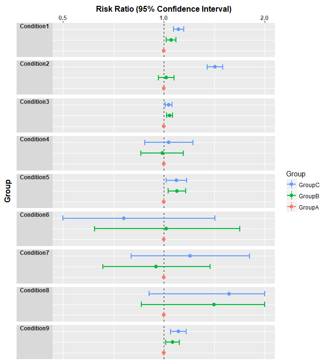
To add your logscale use scale_y_log10". For example, after log scale “half risk” (RR = 0.5) is equidistant from 1 as “double risk” (2.0). Note that, position can be used to change where you want the axis to appear (in this case I chose top but default is bottom).
p +
 scale_y_log10(breaks=c(0.5,1,2),position="top",limits=c(0.5,2)) +
 guides(col = guide_legend(reverse = TRUE))
Gives this plot:
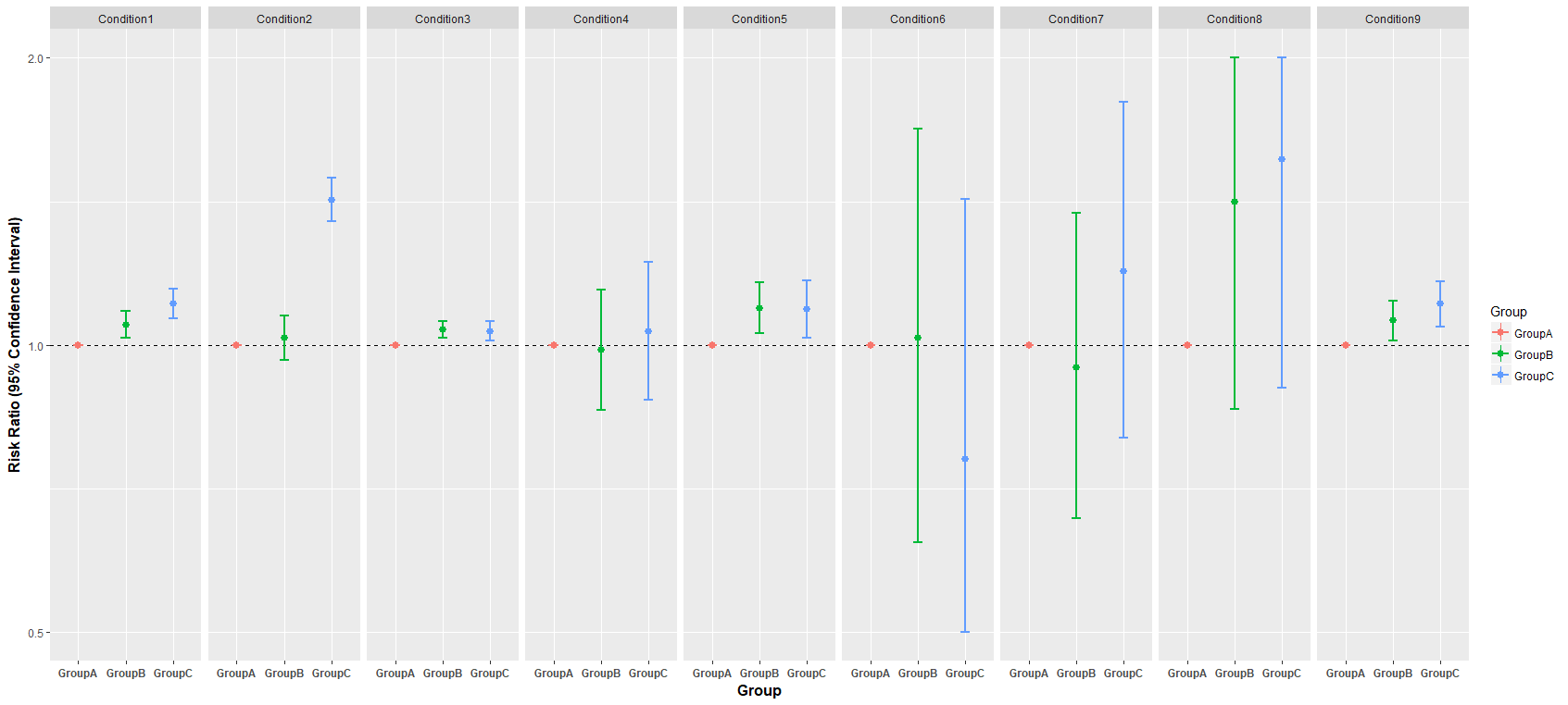
To make the lines vertical, just take out coord_flip() out of p, in this strip.text.y will not be needed since we don’t have to rotate or adjust the labels of the panels of (conditions) in this case. The strip_position in the facet_wrap is also changed to “top”, the y-axes ticks and texts is no more set to blank as shown in the following codes
p = ggplot(data=RR_data,
    aes(x = Group,y = RiskRatio, ymin = LowerLimit, ymax = UpperLimit ))+
    geom_pointrange(aes(col=Group))+
    geom_hline(aes(fill=Group),yintercept =1, linetype=2)+
    xlab('Group')+ ylab("Risk Ratio (95% Confidence Interval)")+
    geom_errorbar(aes(ymin=LowerLimit, ymax=UpperLimit,col=Group),width=0.2,cex=1)+
    facet_wrap(~Condition,strip.position="top",nrow=1,scales = "free_x") +
    theme(plot.title=element_text(size=16,face="bold"),
          axis.text.x=element_text(face="bold"),
          axis.title=element_text(size=12,face="bold"))+
          scale_y_log10(breaks=c(0.5,1,2))
p
Gives this plot:
Conclusion
I have explored how to make lattice-like forest plots in R using gplot2. This can be extended to different estimates/measures and their confidence intervals. Note that you can tweak the graphs by playing with the arguments in the functions.
https://uploads.disquscdn.com/images/889e858ae0c5fc006c855e644cea9be0f971b1531281faa3e2a72e0a6099cc42.png
Hello, i need some help.
please am trying to plot exactly this image using ggplo2 but is have not been able to do get it done. please i need some help on the code
Is it possible to customize the order of conditions? Thanks
Yes I have the same question! Mine are appearing in reverse order.