How long is your drive to work, and how does it compare to the rest of the country? The US Census Bureau asks that exact question of millions of households every year, and it hands you the answer for free through the American Community Survey (ACS). In this tutorial I use the tidycensus package to pull mean travel-time-to-work down to the county and census-tract level, draw a national commute map, and then break the number apart three ways: by metro, by how people travel, and by where they live inside a single city. Along the way one result stands out that I did not expect.
I use a handful of packages, all on CRAN. tidycensus fetches ACS estimates (and, handily, their map geometry in one call); the rest are for wrangling and plotting.
library(tidycensus)
library(dplyr)
library(stringr)
library(forcats)
library(ggplot2)
library(sf)
library(ggrepel)
library(patchwork)
tidycensus needs a free Census API key. Request one at api.census.gov/data/key_signup.html, then run census_api_key("YOUR_KEY", install = TRUE) once and restart R.
Finding the right variable
The ACS reports commute times across dozens of tables. There is no single "mean commute" variable, but there is an easy way to build one. Table B08013 gives the aggregate travel time to work (every commuter’s minutes added together) for an area, and B08012 gives the number of workers who commute. Divide one by the other and you get the mean. Every ACS table has an _001 row for the total, which is all I need here.
I pull both for every county in the country at once. Leaving out the state argument returns all ~3,200 counties. I use the wide output so each variable becomes its own column.
cty <- get_acs(
  geography = "county",
  variables = c(agg = "B08013_001", workers = "B08012_001"),
  year = 2022, survey = "acs5", output = "wide"
) |>
  mutate(mean_commute = aggE / workersE)

nat_mean <- sum(cty$aggE, na.rm = TRUE) / sum(cty$workersE, na.rm = TRUE)
round(nat_mean, 1)
## [1] 26.7
Averaged across every commuter in the country, the mean trip is 26.7 minutes each way. Before mapping anything, it is worth looking at the extremes to check the numbers make sense.
cty |>
  filter(workersE > 50000) |>
  arrange(desc(mean_commute)) |>
  transmute(NAME, mean_commute = round(mean_commute, 1)) |>
  head(6)
## # A tibble: 6 × 2
##   NAME                        mean_commute
##   <chr>                              <dbl>
## 1 Bronx County, New York              44.6
## 2 Charles County, Maryland            44.2
## 3 Richmond County, New York           43.8
## 4 Queens County, New York             43.6
## 5 Kings County, New York              42.7
## 6 Monroe County, Pennsylvania         39.8
The longest commutes among populous counties are the outer boroughs of New York and the exurban counties feeding Washington and New York. That is exactly what you would expect, so the pipeline is working.
The national map
To map this I ask tidycensus for the same data with geometry by adding geometry = TRUE. That returns an sf object I can hand straight to ggplot2. The one extra touch is tigris::shift_geometry(), which relocates Alaska, Hawaii, and Puerto Rico under the lower 48 so the whole country fits one frame.
I reuse a small editorial theme across every figure in this post. It tints the entire canvas a light gray and strips the chart down to the data. For a map I also drop the axes.
dsp_theme <- theme_minimal(base_size = 13) +
  theme(plot.background    = element_rect(fill = "#ECECEF", color = NA),
        panel.background   = element_rect(fill = "#ECECEF", color = NA),
        panel.grid.minor   = element_blank(),
        panel.grid.major.x = element_blank(),
        panel.grid.major.y = element_line(color = "grey78"),
        axis.ticks         = element_blank(),
        plot.title         = element_text(face = "bold"),
        plot.subtitle      = element_text(color = "grey30"))

map_theme <- dsp_theme +
  theme(panel.grid.major = element_blank(),
        axis.text = element_blank(), axis.title = element_blank(),
        legend.position = "bottom")
Now the map itself. The data comes down with geometry, I shift it, and geom_sf() fills each county by its mean commute. County outlines would only clutter 3,200 shapes, so I draw them borderless and overlay a single thin white state layer to give the eye something to orient by. I pull state boundaries from tigris and shift them the same way, so they line up with the counties. I also drop labels on a few large metros so the geography is easy to read, using ggrepel to nudge the text clear of the coastline.
cty_geo <- get_acs(
  geography = "county",
  variables = c(agg = "B08013_001", workers = "B08012_001"),
  year = 2022, survey = "acs5", output = "wide", geometry = TRUE
) |>
  mutate(mean_commute = aggE / workersE) |>
  tigris::shift_geometry()

states <- tigris::states(cb = TRUE, year = 2022) |>
  filter(!STUSPS %in% c("VI", "GU", "MP", "AS")) |>
  tigris::shift_geometry()

# a few metros to anchor the eye; transformed into the shifted map's CRS
cities <- tibble::tribble(
  ~lab,            ~lon,     ~lat,
  "New York",      -74.00,   40.71,
  "San Francisco", -122.42,  37.77,
  "Washington",    -77.04,   38.90,
  "Boston",        -71.06,   42.36,
  "Chicago",       -87.63,   41.88
) |>
  st_as_sf(coords = c("lon", "lat"), crs = 4326) |>
  st_transform(st_crs(cty_geo))

city_labels <- geom_text_repel(
  data = cities, aes(label = lab, geometry = geometry),
  stat = "sf_coordinates", size = 3.2, fontface = "bold",
  color = "grey10", bg.color = "#ECECEF", bg.r = 0.15,
  min.segment.length = 0, segment.color = "grey30",
  segment.size = 0.25, box.padding = 0.5, seed = 1
)

ggplot(cty_geo) +
  geom_sf(aes(fill = mean_commute), color = NA) +
  geom_sf(data = states, fill = NA, color = "white", linewidth = 0.2) +
  city_labels +
  scale_fill_viridis_c(option = "magma", direction = -1,
                       name = "Mean commute (min)  ",
                       breaks = c(15, 25, 35, 45)) +
  labs(title = "How long is the drive to work?",
       subtitle = "Mean travel time to work by county, ACS 2018-2022",
       caption = "Data: US Census Bureau, ACS 5-year") +
  guides(fill = guide_colorbar(barwidth = 12, barheight = 0.5,
                               title.position = "top", title.hjust = 0.5)) +
  map_theme
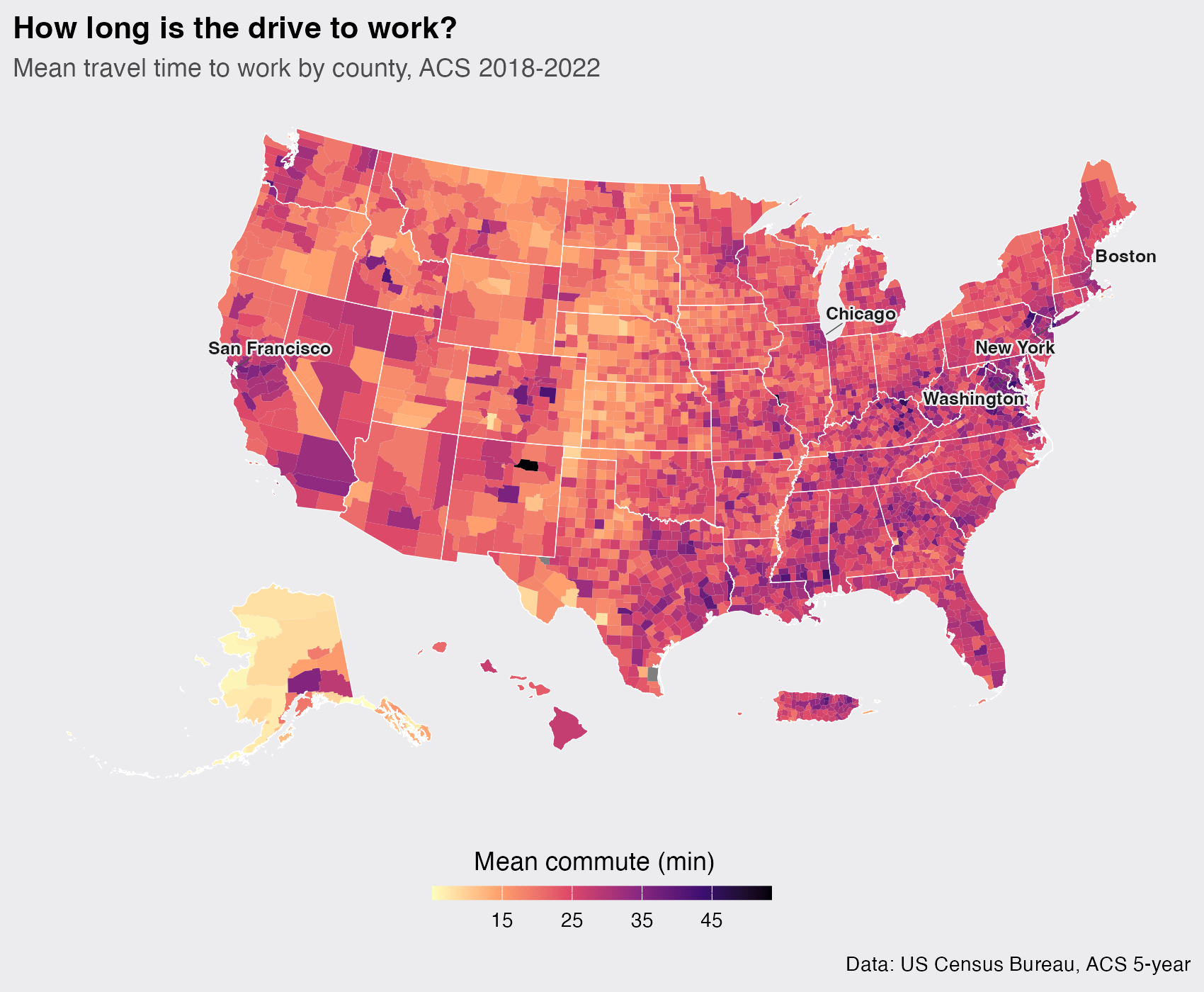
The geography tells a clear story. Commutes are longest in the dark bands of the East, the Appalachians and the Deep South, and around every major metro. They are shortest across the light expanse of the Great Plains and rural Alaska, where towns are small and the drive across one is a matter of minutes. Long commutes are a feature of density and distance-to-a-big-city, not of open country.
Which metros have it worst
The county map hints at metros but does not rank them. For that I switch the geography to "cbsa", the Census term for metropolitan and micropolitan areas, and pull population too so I can keep only the large metros where the number is stable.
metro <- get_acs(
  geography = "cbsa",
  variables = c(agg = "B08013_001", workers = "B08012_001", pop = "B01003_001"),
  year = 2022, survey = "acs5", output = "wide"
) |>
  filter(str_detect(NAME, "Metro Area"), popE > 500000) |>
  mutate(mean_commute = aggE / workersE,
         label = paste0(str_extract(NAME, "^[^-,]+"), ", ",
                        str_remove(str_extract(NAME, ", [A-Z]{2}"), ", ")))
A horizontal bar chart is the natural way to compare the top of the list. I sort with fct_reorder() so the bars line up longest-first and add the value at the end of each.
metro |>
  slice_max(mean_commute, n = 15) |>
  ggplot(aes(mean_commute, fct_reorder(label, mean_commute))) +
  geom_col(fill = "#0066CC", width = 0.72) +
  geom_text(aes(label = sprintf("%.1f", mean_commute)), hjust = -0.15, size = 3.6) +
  scale_x_continuous(expand = expansion(mult = c(0, 0.10))) +
  labs(title = "The metros with the longest commutes",
       subtitle = "Mean travel time to work, metros over 500k people, ACS 2018-2022",
       x = NULL, y = NULL, caption = "Data: US Census Bureau, ACS 5-year") +
  dsp_theme +
  theme(axis.text.x = element_blank(), panel.grid.major.x = element_blank())
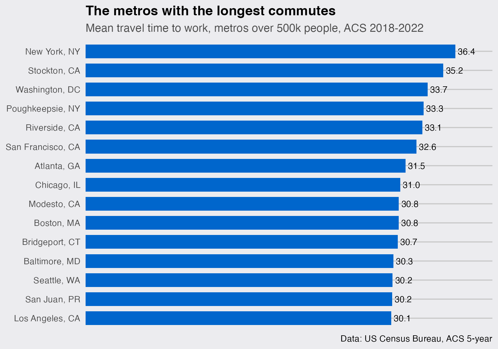
New York tops the list, no surprise. What is more interesting is the company it keeps: Stockton, Riverside, and Modesto are not big job centers themselves, they are the affordable edges of the Bay Area and Los Angeles, where people move for cheaper housing and pay for it in driving time. The longest commutes are half about big cities and half about the sprawl around them.
The result I did not expect: by mode
Here is where the data surprised me. I assumed transit riders, gliding past traffic, would have the shortest commutes. The opposite is true. Table B08136 breaks aggregate travel time down by how people get to work, and B08301 gives the matching worker counts, so the same divide-and-average trick gives a mean commute per mode. The mode categories are split across several rows, so I pull the whole tables and pick the pieces I need.
agg <- get_acs("us", table = "B08136", year = 2022, survey = "acs5")
cnt <- get_acs("us", table = "B08301", year = 2022, survey = "acs5")

A <- function(code) agg$estimate[agg$variable == code]
N <- function(...) sum(sapply(c(...), function(x) cnt$estimate[cnt$variable == x]))

modes <- data.frame(
  mode = c("Drove alone", "Carpooled", "Bus", "Subway / rail",
           "Commuter rail / ferry", "Walked"),
  minutes = c(A("B08136_003") / N("B08301_003"),
              A("B08136_004") / N("B08301_004"),
              A("B08136_008") / N("B08301_011"),
              A("B08136_009") / N("B08301_012", "B08301_014"),
              A("B08136_010") / N("B08301_013", "B08301_015"),
              A("B08136_011") / N("B08301_019"))
)
ggplot(modes, aes(minutes, fct_reorder(mode, minutes))) +
  geom_col(fill = "#0066CC", width = 0.68) +
  geom_text(aes(label = sprintf("%.0f min", minutes)), hjust = -0.15, size = 4) +
  scale_x_continuous(expand = expansion(mult = c(0, 0.13))) +
  labs(title = "Transit takes far longer than driving",
       subtitle = "Mean travel time to work by commute mode, US, ACS 2018-2022",
       x = NULL, y = NULL, caption = "Data: US Census Bureau, ACS 5-year") +
  dsp_theme +
  theme(axis.text.x = element_blank(), panel.grid.major.x = element_blank())
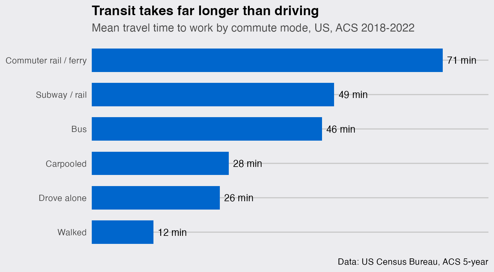
Someone who drives alone averages about 26 minutes. Someone on commuter rail or a ferry averages 71, nearly three times as long. This is not because trains are slow. It is a selection effect: transit is worth taking mostly for long trips into dense downtowns, so the people who use it are the ones with the longest journeys to begin with, and their door-to-door time includes walking, waiting, and transfers. The mode does not cause the long commute; the long commute is why they chose the mode. It is a good reminder that a difference in a group average is rarely a clean cause-and-effect.
A map makes the selection effect obvious. If I map the share of workers who commute by public transportation, table B08301 again, I can see where those long transit trips actually happen. Transit share is tiny in almost every county, so I put the color scale on a square-root transform to keep the busy metros from washing everything else out.
ts <- get_acs(
  geography = "county",
  variables = c(transit = "B08301_010", total = "B08301_001"),
  year = 2022, survey = "acs5", output = "wide", geometry = TRUE
) |>
  mutate(transit_share = 100 * transitE / totalE) |>
  tigris::shift_geometry()

ggplot(ts) +
  geom_sf(aes(fill = transit_share), color = NA) +
  geom_sf(data = states, fill = NA, color = "grey35", linewidth = 0.15) +
  city_labels +
  scale_fill_viridis_c(option = "mako", direction = -1, transform = "sqrt",
                       breaks = c(1, 5, 15, 30),
                       name = "% commuting by transit  ") +
  labs(title = "Transit is a big-metro phenomenon",
       subtitle = "Share of workers commuting by public transportation, ACS 2018-2022",
       caption = "Data: US Census Bureau, ACS 5-year") +
  guides(fill = guide_colorbar(barwidth = 12, barheight = 0.5,
                               title.position = "top", title.hjust = 0.5)) +
  map_theme
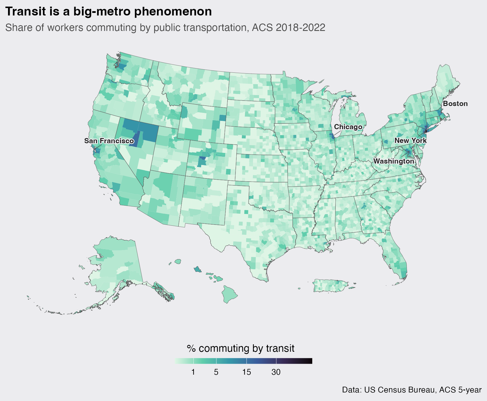
The country is almost empty. Transit collapses to a handful of dark islands: New York above all, then the Bay Area, Washington, Boston, and Chicago. These are the same metros that topped the commute-time chart, and that is the whole point. The long transit average is not a national fact about trains; it is a few very large, very dense metros where a long ride beats an even longer drive, showing up in the one national number.
Inside a single metro
A metro-wide average hides as much as it shows. To see the texture I drop to the census-tract level, the finest geography the ACS maps well, for two metros with very different shapes. tidycensus takes a vector of counties, and I keep only tracts with enough commuters to be reliable.
get_metro <- function(state, counties, name) {
  get_acs("tract", state = state, county = counties,
          variables = c(agg = "B08013_001", workers = "B08012_001"),
          year = 2022, survey = "acs5", output = "wide", geometry = TRUE) |>
    mutate(mean_commute = aggE / workersE, metro = name) |>
    filter(workersE > 200)
}

nyc <- get_metro("NY", c("New York", "Kings", "Queens", "Bronx", "Richmond"),
                 "New York City")
atl <- get_metro("GA", c("Fulton", "DeKalb", "Cobb", "Gwinnett", "Clayton"),
                 "Atlanta")
I draw both on a shared color scale with patchwork so the two panels are directly comparable, then collect the single legend.
rng <- range(c(nyc$mean_commute, atl$mean_commute), na.rm = TRUE)

one_map <- function(d, ttl) {
  ggplot(d) +
    geom_sf(aes(fill = mean_commute), color = NA) +
    scale_fill_viridis_c(option = "magma", direction = -1, limits = rng, name = "min") +
    labs(title = ttl) +
    theme_void(base_size = 12) +
    theme(plot.background = element_rect(fill = "#ECECEF", color = NA),
          plot.title = element_text(face = "bold", hjust = 0.02))
}

(one_map(nyc, "New York City") | one_map(atl, "Atlanta")) +
  plot_layout(guides = "collect") +
  plot_annotation(
    title = "Same average, two different shapes",
    subtitle = "Mean travel time to work by census tract, ACS 2018-2022",
    caption = "Data: US Census Bureau, ACS 5-year",
    theme = theme(plot.background = element_rect(fill = "#ECECEF", color = NA),
                  plot.title = element_text(face = "bold", size = 16),
                  plot.subtitle = element_text(color = "grey30")))
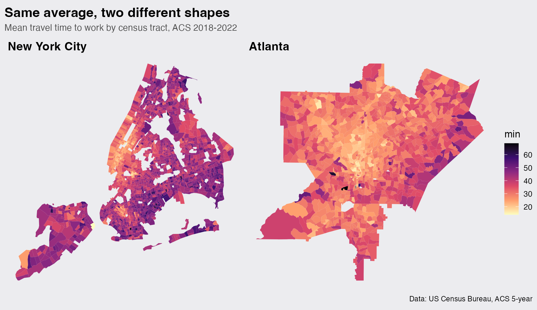
The two cities could not be more different. New York is dark almost everywhere, a median tract commute of 42.7 minutes, and the longest trips are in the outer boroughs, not the core: people commute into Manhattan, not out of it. Atlanta shows the classic ring: a bright, short-commute core in Midtown and Buckhead fading to dark exurban edges, with a tract median of just 30 minutes. Same country, same survey, two completely different geographies of getting to work.
One more number worth knowing
The averages are one thing, but the tail is where the human cost sits. Table B08303 bins commuters by how long they travel, so I can count the "super-commuters" who spend 60 minutes or more each way.
b <- get_acs("us", table = "B08303", year = 2022, survey = "acs5")
total <- b$estimate[b$variable == "B08303_001"]
over60 <- sum(b$estimate[b$variable %in% c("B08303_012", "B08303_013")])
round(100 * over60 / total, 1)
## [1] 8.9
About 8.9 percent of American commuters, roughly 12.3 million people, spend at least an hour getting to work, one way. That is two-plus hours of every working day spent in transit.
Make it your own
Everything here comes from three or four ACS variables and the divide-an-aggregate-by-a-count trick. Swap the table codes and you can map median rent, income, insurance coverage, or the share of people who work from home, at any geography from the whole nation down to a single tract. Change the state and county arguments and the tract maps redraw for your own city. The ACS has thousands of variables; load_variables(2022, "acs5") lets you search them all.
That’s it. I hope you find this tutorial useful, and if you have questions, leave a comment below.


