
I wanted to map where fresh food is hard to reach, and the question that ended up mattering was not where the stores are. It was what counts as a store. A food access map quietly encodes an answer before any distance gets measured: if a gas station shelf of chips and canned goods counts as food access, almost nowhere looks deserted, and if only a real grocery store counts, the same map can turn dark. I wanted to see how big that gap actually is, in one state, with the definition dialed from generous to strict and everything else held fixed.
The state is Mississippi, where food access in the Delta has been studied for decades, and the data is the USDA’s SNAP retailer list: every store authorized to accept SNAP benefits, which in practice means essentially every place that sells food, from supermarkets down to corner stores. It is open, keyless, queryable as an API, and, best of all, already geocoded and typed. Each store carries coordinates and a Store_Type label, so there is no geocoding step at all and the definition of a food store becomes a single filter() call.
The machinery is the same nearest-feature toolkit I used to map a hospital desert: sf for distances, tigris for census geography, one measurement per tract. This time the measurement stays still and the definition moves.
library(httr2)
library(dplyr)
library(tidyr)
library(purrr)
library(stringr)
library(sf)
library(tigris)
library(ggplot2)
Every store that takes SNAP
The retailer list sits behind an ArcGIS feature service that returns at most 1,000 rows per request, so I ask for the total first and then page through it. One detail matters before any distance gets computed: distance does not respect state lines. A tract on the Mississippi River may be served by a store on the other bank, so I fetch Mississippi and all four neighboring states, and later measure Mississippi tracts against the whole pool.
api <- paste0(
  "https://services1.arcgis.com/RLQu0rK7h4kbsBq5/arcgis/rest/services/",
  "snap_retailer_location_data/FeatureServer/0/query"
)

snap_query <- function(...) {
  request(api) |>
    req_url_query(where = "State IN ('MS','LA','AR','TN','AL')", f = "json", ...) |>
    req_perform() |>
    resp_body_json()
}

n_stores <- snap_query(returnCountOnly = "true")$count

stores <- seq(0, n_stores - 1, by = 1000) |>
  map(\(offset) {
    snap_query(
      outFields = "Store_Name,Store_Type,State,Longitude,Latitude",
      returnGeometry = "false",
      resultOffset = offset,
      resultRecordCount = 1000
    )$features |>
      map(\(f) as_tibble(f$attributes)) |>
      list_rbind()
  }) |>
  list_rbind()

nrow(stores)
## [1] 20685
What does Mississippi’s slice of that look like by store type?
ms_stores <- stores |> filter(State == "MS")

ms_stores |> count(Store_Type, sort = TRUE)
## # A tibble: 7 × 2
##   Store_Type              n
##   <chr>               <int>
## 1 Convenience Store    1237
## 2 Other                1108
## 3 Super Store           198
## 4 Supermarket           158
## 5 Grocery Store         120
## 6 Specialty Store        51
## 7 Farmers and Markets    47
This table is the whole post in miniature. Of 2,919 SNAP-authorized stores in Mississippi, only 476 are supermarkets, super stores, or grocery stores, about 16%. The rest is mostly convenience stores plus a large "Other" bucket, and matching store names shows 97% of that bucket is dollar and drugstore chains. In fact 679 of the state’s stores are a single chain, Dollar General, which by itself outnumbers every supermarket, super store, and grocery store in Mississippi combined.
None of this says people buy nothing edible at those stores. It says that if a map counts them as food access, it is asserting that a dollar store and a supermarket answer the same need, and that assertion deserves to be tested rather than inherited.
Three definitions of a food store
So I make the definition explicit, three times, from generous to strict. The generous tier counts every SNAP retailer. The middle tier keeps stores whose primary business is groceries: supermarkets, super stores, and grocery stores, which is close in spirit to the store set the USDA’s Food Access Research Atlas uses for its low-access measure. The strict tier drops the smaller grocery stores and keeps supermarkets and super stores alone. Farmers markets and specialty stores stay out of all three, not as a judgment but because seasonal hours and partial ranges make them a different kind of access.
stores_sf <- stores |>
  st_as_sf(coords = c("Longitude", "Latitude"), crs = 4326) |>
  st_transform(5070)

tiers <- list(
  "Any SNAP retailer" = stores_sf,
  "Any grocer"        = stores_sf |> filter(Store_Type %in% grocer_types),
  "Supermarkets only" = stores_sf |> filter(Store_Type %in% c("Supermarket", "Super Store"))
)

map_int(tiers, nrow)
## Any SNAP retailer        Any grocer Supermarkets only
##             20685              4033              2901
Those counts cover the five-state pool. The coordinates go straight into sf and then into EPSG:5070, an equal-area projection in meters, so distances and the maps behave.
The distance from every tract
Mississippi’s census tracts come from tigris, and each tract is represented by its centroid. Then the measurement is the same two sf calls for each tier: st_nearest_feature() finds the closest qualifying store, st_distance(..., by_element = TRUE) returns that one distance, and 1,609.34 turns meters into miles.
tr <- tracts("Mississippi", cb = TRUE, year = 2022, progress_bar = FALSE) |>
  st_transform(5070)
ctr <- st_centroid(st_geometry(tr))

nearest_mi <- function(pts) {
  i <- st_nearest_feature(ctr, pts)
  as.numeric(st_distance(ctr, pts[i, ], by_element = TRUE)) / 1609.34
}

tr <- tr |>
  mutate(
    mi_any    = nearest_mi(tiers[["Any SNAP retailer"]]),
    mi_grocer = nearest_mi(tiers[["Any grocer"]]),
    mi_super  = nearest_mi(tiers[["Supermarkets only"]])
  )
nearest_type <- stores_sf$Store_Type[st_nearest_feature(ctr, stores_sf)]
pct_not_grocer <- mean(!nearest_type %in% grocer_types) * 100
Before any map, one number sets the scene: for 87% of Mississippi tracts, the nearest SNAP-authorized store is not a grocer of any kind. The typical tract sits 1.2 miles from some store that takes SNAP but 2.5 miles from the nearest grocer, and no tract in the state is more than 11 miles from some SNAP store. Whether anything fresh is sold there is exactly what that generous number cannot say.
One state, three deserts
Now the three maps, on one shared color scale so a shade means the same distance everywhere. A square-root transform keeps the few remotest tracts from flattening everything else, and the dots are the stores that count under each definition.
tier_levels <- names(tiers)

long <- tr |>
  select(GEOID, mi_any, mi_grocer, mi_super) |>
  pivot_longer(starts_with("mi_"), names_to = "def", values_to = "mi") |>
  mutate(def = factor(def, c("mi_any", "mi_grocer", "mi_super"), tier_levels))

ms_state <- states(cb = TRUE, year = 2022, progress_bar = FALSE) |>
  filter(STUSPS == "MS") |>
  st_transform(5070)

dots <- imap(tiers, \(pts, nm) st_filter(pts, ms_state) |> mutate(def = nm)) |>
  bind_rows() |>
  mutate(def = factor(def, tier_levels))

map_theme <- theme_void(base_size = 12) +
  theme(
    plot.background = element_rect(fill = "#ECECEF", color = NA),
    legend.position = "bottom",
    strip.text = element_text(face = "bold", size = 11),
    plot.title = element_text(face = "bold", size = 16),
    plot.subtitle = element_text(color = "grey30")
  )

ggplot(long) +
  geom_sf(aes(fill = mi), color = NA) +
  geom_sf(data = dots, shape = 16, size = 0.25, alpha = 0.55, color = "#111111") +
  facet_wrap(~def) +
  scale_fill_viridis_c(
    option = "magma",
    direction = -1,
    transform = "sqrt",
    breaks = c(1, 5, 10, 15),
    name = "Miles to nearest qualifying store  "
  ) +
  guides(fill = guide_colorbar(
    barwidth = 12,
    barheight = 0.5,
    title.position = "top",
    title.hjust = 0.5
  )) +
  labs(
    title = "One state under three definitions of a food store",
    subtitle = "Distance from each Mississippi census tract to the nearest store that counts",
    caption = "Data: USDA SNAP Retailer Locator"
  ) +
  map_theme
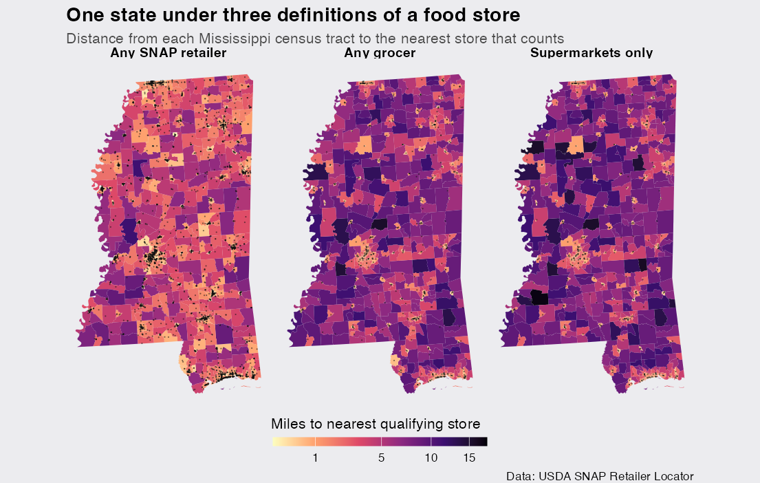
The left panel is what a generous definition produces: dots everywhere, a state mostly within a mile or two of something, nothing that invites the word desert. Move right and the dots thin out from 2,919 to 356, and the shading deepens across the Delta in the northwest and the timber counties in the south. Same state, same measurement, same scale. The only thing that changed is the answer to "what is a food store."
An official yardstick
Shading needs a threshold before it becomes a claim, and the USDA’s Food Access Research Atlas provides the standard one: low access means the nearest store is more than 1 mile away in urban areas or more than 10 miles away in rural ones. I apply those thresholds to my tract distances, classifying a tract as urban when its centroid falls inside a Census urban area. The urban areas file is a one-time national download of about 70 MB, which tigris caches.
ua <- urban_areas(year = 2023, progress_bar = FALSE) |>
  st_transform(5070)

tr <- tr |> mutate(urban = lengths(st_intersects(ctr, ua)) > 0)

low_access <- function(mi) if_else(tr$urban, mi > 1, mi > 10)

tr <- tr |>
  mutate(
    la_any    = low_access(mi_any),
    la_grocer = low_access(mi_grocer),
    la_super  = low_access(mi_super)
  )

tibble(
  definition = tier_levels,
  low_access_tracts = c(sum(tr$la_any), sum(tr$la_grocer), sum(tr$la_super)),
  share = paste0(round(100 * low_access_tracts / nrow(tr)), "%")
)
## # A tibble: 3 × 3
##   definition        low_access_tracts share
##   <chr>                         <int> <chr>
## 1 Any SNAP retailer                52 6%
## 2 Any grocer                      207 24%
## 3 Supermarkets only               250 29%
This is the headline of the whole exercise. Count every store that takes SNAP and Mississippi barely has a food desert: 6% of tracts fail the distance test. Require an actual grocer and it is 24%, roughly a quarter of the state, a 4-fold jump from moving one filter. A reader of the first map and a reader of the second would walk away with different beliefs about the same state, and neither map would look wrong.
Two honest notes on the yardstick. My version uses tract centroids where the Atlas uses fine population grids, so the numbers will not match theirs exactly; the point here is how the estimate moves under the definition, which the centroid version measures cleanly since the geography is identical across tiers. And tracts stand in for people, which is reasonable because tracts are drawn to hold roughly equal population, around 4,000 people each.
The masked desert
Because each stricter tier is a subset of the one before, a tract’s distance can only grow as the definition tightens. That means the 52 tracts that fail under the generous definition also fail under the stricter ones, and the interesting set is the difference: tracts that pass the distance test only because convenience and dollar stores count. I map exactly those.
status_levels <- c(
  "Low access under any definition",
  "Low access once a grocer is required",
  "Within reach of a grocer"
)

tr <- tr |>
  mutate(status = factor(case_when(
    la_any    ~ status_levels[1],
    la_grocer ~ status_levels[2],
    .default  = status_levels[3]
  ), levels = status_levels))

ggplot(tr) +
  geom_sf(aes(fill = status), color = "#ECECEF", linewidth = 0.08) +
  geom_sf(
    data = st_filter(tiers[["Any grocer"]], ms_state),
    shape = 21, size = 0.8, stroke = 0.2, fill = "#111111", color = "white"
  ) +
  scale_fill_manual(
    values = c("#8C3B00", "#E8862D", "#D8D8DE") |> setNames(status_levels),
    name = NULL
  ) +
  labs(
    title = "The masked food desert",
    subtitle = "Orange tracts pass the 1-mile / 10-mile test only if convenience\nand dollar stores count as food access. Dots are grocers.",
    caption = "Data: USDA SNAP Retailer Locator, US Census urban areas"
  ) +
  map_theme +
  guides(fill = guide_legend(ncol = 1))
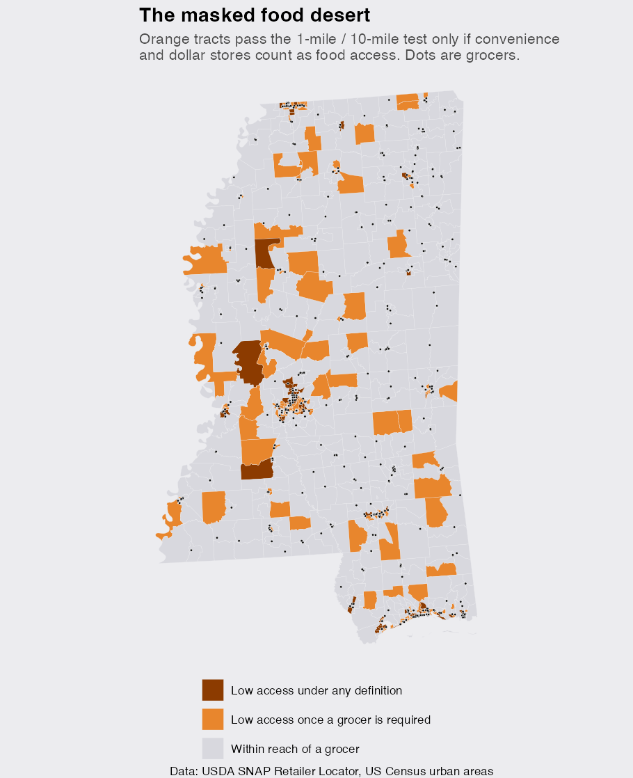
The orange is the masked desert: 155 tracts, 18% of the state, that a generous map quietly absorbs. It is not one contiguous region but a scatter across the Delta’s edges, the south, and the fringes of metro areas, which is itself telling. These are places with stores, often several, just not grocery stores. The dark tracts are beyond reach under any definition. And the single farthest tract from any grocer, 15 miles, is not in some remote corner of the Delta but in Madison County, inside the Jackson metropolitan area, because suburban counties keep rural backsides that access maps rarely look for.
The access curves
A pair of thresholds is two vertical cuts through what is really a curve, so the last figure draws the whole thing: for each definition, the share of tracts within a given distance of the nearest qualifying store. The plot theme here is a small snippet I reuse; copy it into your own charts if you like the look.
dsp_colors <- c("#0066CC", "#E8862D", "#159A6C", "#7D5BD6",
                "#D64580", "#2AA9B8", "#C9A227")
dsp_theme <- theme_minimal(base_size = 13) +
  theme(plot.background    = element_rect(fill = "#ECECEF", color = NA),
        panel.background   = element_rect(fill = "#ECECEF", color = NA),
        panel.grid.minor   = element_blank(),
        panel.grid.major.x = element_blank(),
        panel.grid.major.y = element_line(color = "grey78"),
        axis.ticks         = element_blank(),
        plot.title         = element_text(face = "bold"),
        strip.text         = element_text(face = "bold"))

curve <- long |>
  st_drop_geometry() |>
  group_by(def) |>
  reframe(
    m = seq(0, 18, 0.25),
    pct = sapply(m, \(x) mean(mi <= x) * 100)
  )

ggplot(curve, aes(m, pct, color = def)) +
  geom_vline(xintercept = c(1, 10), color = "grey55", linetype = "dashed") +
  geom_line(linewidth = 1.1) +
  scale_color_manual(values = dsp_colors[1:3]) +
  annotate("text", x = 1.3, y = 6, label = "1 mi (urban standard)",
           hjust = 0, size = 3.4, color = "grey40") +
  annotate("text", x = 10.3, y = 6, label = "10 mi (rural standard)",
           hjust = 0, size = 3.4, color = "grey40") +
  labs(
    title = "Access curves under the three definitions",
    subtitle = "Share of Mississippi tracts within a given distance of the nearest qualifying store",
    x = "Miles to nearest qualifying store",
    y = "% of tracts within",
    color = NULL
  ) +
  dsp_theme +
  theme(legend.position = "bottom")

The gap between the blue curve and the other two is the definition gap, and it is widest right where the urban standard sits: 44% of tracts are within a mile of some SNAP store but only 24% are within a mile of a grocer. The other thing the curves show is what they do not separate: the orange and green lines nearly coincide, so statewide the smaller grocery stores barely move the totals. But statewide is not local. Dropping them pushes the nearest store more than 2 miles farther away for 49 tracts, which is the difference between walkable and not in the small towns that own exactly one independent grocery.
What I would carry forward
The usual caveats apply, and each one is worth stating precisely. SNAP authorization is a proxy for existence: essentially every supermarket and grocery store participates, so the strict tiers are close to complete, while the generous tier misses food sellers that never sought authorization, meaning the generous map is if anything too pessimistic and the measured gap a floor. Tract centroids compress a tract to a point, which is roughest in large rural tracts. And distance is only one axle of access; a car, a bus route, prices, and store hours are all invisible here.
What I take from this is not a fact about Mississippi so much as a habit for mapping access to anything. The pipeline is general: change one string and the same code runs for any state, or swap the store list for pharmacies or clinics or broadband. But whatever you point it at, the definition of the thing being reached is a parameter of the analysis, not a given, and the honest move is to show the map under more than one setting of it. Here, one filter() call moved a food desert from 6% of a state to 24%. Any conclusion that fragile under a definition deserves to be shown fragile, and any conclusion that survives it is worth far more.

