
A "hospital desert" map measures, for each neighborhood, the distance to the nearest hospital. You have probably seen one: they are a staple of health-access reporting, and Nevada is the usual poster child. The shading always looks the same: a huge dark interior with two small pale dots on it.
I kept wondering how much of that dark interior anyone actually lives in, so I built the map myself, for Nevada, and then measured the thing the shading hides. Nevada really does look like one of the worst hospital deserts in the country, even though almost everyone in it lives in Las Vegas or Reno, a few minutes from an emergency room. The fix is to weight the same result by population instead of by area, and the difference turns out to be the whole story. And because a gap measured in one state could be waved off as just how the measurement behaves, I run the identical pipeline on Massachusetts, a state with the opposite geography, and let the two results face each other.
Along the way you get a reusable toolkit: pulling a facility list from an API, geocoding each facility from its street address, measuring distance to the nearest one with sf, and weighting a spatial result by population instead of by area. Everything is open data and every package is on CRAN, and the whole pipeline needs no API key at all.
library(httr2)
library(dplyr)
library(tidyr)
library(zipcodeR)
library(tidygeocoder)
library(sf)
library(tigris)
library(ggplot2)
Nevada hospitals data
The Centers for Medicare & Medicaid Services publishes a Hospital General Information file listing every hospital in the country. It is queryable as JSON, and its datastore API takes a conditions filter, so I ask for Nevada only and get the whole state’s list in one page, no paging loop.
url <- "https://data.cms.gov/provider-data/api/1/datastore/query/xubh-q36u/0"

hosp_raw <- request(url) |>
  req_url_query(
    limit = 500,
    `conditions[0][property]` = "state",
    `conditions[0][operator]` = "=",
    `conditions[0][value]` = "NV"
  ) |>
  req_perform() |>
  resp_body_json() |>
  (\(x) bind_rows(lapply(x$results, as_tibble)))()

nrow(hosp_raw)
## [1] 46
That is every hospital in Nevada. But "hospital" is a broad label, and I want emergency care. The file carries an emergency_services flag and a hospital_type, so I keep the emergency-capable set: general acute-care, critical-access, and rural-emergency hospitals that report an ER.
er_types <- c(
  "Acute Care Hospitals",
  "Critical Access Hospitals",
  "Rural Emergency Hospital"
)

er_hosp <- hosp_raw |>
  filter(hospital_type %in% er_types, emergency_services == "Yes") |>
  mutate(zip5 = substr(zip_code, 1, 5))

nrow(er_hosp)
## [1] 34
Geocoding hospital addresses
The file gives street addresses but no coordinates, so I have to geocode them. The US Census runs a free, keyless batch geocoder, and tidygeocoder talks to it straight from R. With only a few dozen Nevada hospitals this is a single quick call, no batching.
geo <- er_hosp |>
  geocode(
    street = address,
    city = citytown,
    state = state,
    postalcode = zip5,
    method = "census",
    quiet = TRUE
  )
The Census matcher resolves most of the addresses; the few it misses usually have a PO-box or otherwise unmatchable street line. For those I fall back to the ZIP centroid, which is fine as a minority backstop, with a coalesce().
zip_ll <- zip_code_db |> transmute(zip5 = zipcode, zlat = lat, zlng = lng)

er_geo <- geo |>
  left_join(zip_ll, by = "zip5") |>
  mutate(
    long = coalesce(long, zlng), # Census miss -> ZIP centroid
    lat = coalesce(lat, zlat)
  ) |>
  filter(!is.na(lat))

nrow(er_geo)
## [1] 34
Now I turn the coordinates into a spatial object and project it. Modern sf, through its s2 backend, measures true distances on the sphere even from raw longitude and latitude, so the old rule that you must never compute distance on lon/lat no longer bites. I still project to EPSG:5070, an equal-area continental projection in meters, because the area and centroid calculations later behave in a flat equal-area space and the map draws in the right shape.
er <- er_geo |>
  st_as_sf(coords = c("long", "lat"), crs = 4326) |>
  st_transform(5070)
The desert map
I pull Nevada’s census tracts with tigris (geometry only, no survey data). The tract geometry carries ALAND, its land area, which I will need later.
tr <- tracts("Nevada", cb = TRUE, year = 2022, progress_bar = FALSE) |>
  st_transform(5070)
The measurement is two sf calls. For each tract centroid, st_nearest_feature() finds the closest emergency-capable hospital, and st_distance(..., by_element = TRUE) returns that one distance. I divide by 1609.34 for miles.
ctr <- st_centroid(tr)
i <- st_nearest_feature(ctr, er)
tr$er_mi <- as.numeric(st_distance(ctr, er[i, ], by_element = TRUE)) / 1609.34
Now the desert map. I shade each tract by its distance on a square-root color scale, so a few very remote tracts do not stretch it and flatten everything else, and I drop a dot on every emergency-capable hospital so you can see where the care actually sits. I use one editorial theme, tinted light gray with the axes stripped away; copy it into your own maps.
rng <- range(tr$er_mi, na.rm = TRUE)

ggplot(tr) +
  geom_sf(aes(fill = er_mi), color = NA) +
  # a dot on every ER hospital: they cluster in the pale near-ER areas
  # (Las Vegas, Reno) and vanish from the dark empty center
  geom_sf(
    data = er,
    inherit.aes = FALSE,
    shape = 21,
    size = 1.1,
    stroke = 0.25,
    fill = "#111111",
    color = "white"
  ) +
  scale_fill_viridis_c(
    option = "magma",
    direction = -1,
    transform = "sqrt",
    limits = rng,
    breaks = c(5, 10, 20, 40),
    name = "Miles to nearest ER  "
  ) +
  guides(
    fill = guide_colorbar(
      barwidth = 14,
      barheight = 0.5,
      title.position = "top",
      title.hjust = 0.5
    )
  ) +
  labs(
    title = "Nevada: how far is the nearest ER?",
    subtitle = "Distance from each census tract to the nearest hospital with a general ER",
    caption = "Data: CMS Hospital General Information"
  ) +
  theme_void(base_size = 12) +
  theme(
    plot.background = element_rect(fill = "#ECECEF", color = NA),
    legend.position = "bottom",
    plot.title = element_text(face = "bold", size = 17),
    plot.subtitle = element_text(color = "grey30")
  )
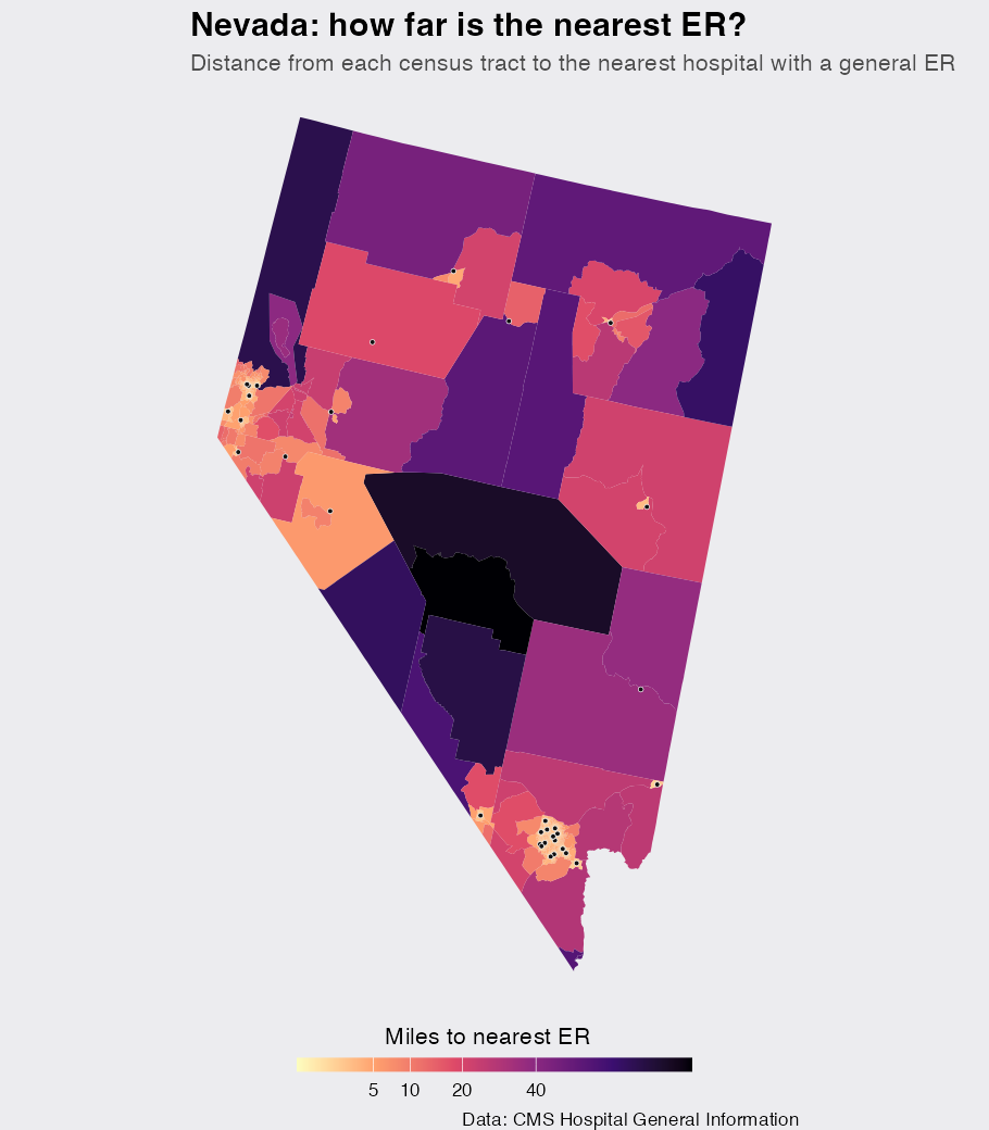
The pattern looks damning: a vast dark center hundreds of miles from an ER, with the hospital dots huddled into a couple of small clusters. Read as "where hospitals are out of reach," the map is misleading. The next section shows why.
The problem: the map colors land, not people
Look at the dark tracts. They are real, they genuinely are far from an ER, but they are enormous and nearly empty. The people live in the small pale specks: Las Vegas and Reno. A choropleth gives every tract visual weight in proportion to its area, so a thousand square miles of empty desert dominates the image while a dense city takes up a few pixels. The map answers "how much land is far from an ER," when the question we care about is "how many people are."
I can answer both with the data already in hand. Census tracts are drawn to hold roughly equal population, so counting tracts is a good stand-in for counting people, and ALAND gives me area. I compute the share of Nevada within 20 miles of an ER weighted two ways: by people (each tract equal) and by land (each tract weighted by area).
tr_tab <- st_drop_geometry(tr)

by_people <- mean(tr_tab$er_mi <= 20) * 100
by_land <- sum(tr_tab$ALAND[tr_tab$er_mi <= 20]) / sum(tr_tab$ALAND) * 100

c(by_people = round(by_people), by_land = round(by_land))
## by_people   by_land
##        94        17
There is the whole story in two numbers. 94% of Nevadans live within 20 miles of an ER, but only 17% of the state’s land does, a gap of 78 points. The desert is real as geography and almost empty as a matter of people.
A control state with the opposite geography
Two numbers from one state are suggestive, not conclusive. Maybe a gap like that is just what this measurement produces everywhere, and every state’s map overstates its desert by about the same amount. The way to rule that out is a control with the opposite geography, so I picked Massachusetts: small, dense, and with emergency care spread across the whole state. Every step above is the same handful of calls with a different state code, so I fold the pipeline into one function and run it once more.
desert_tracts <- function(abbr, name) {
  er <- request(url) |>
    req_url_query(
      limit = 500,
      `conditions[0][property]` = "state",
      `conditions[0][operator]` = "=",
      `conditions[0][value]` = abbr
    ) |>
    req_perform() |>
    resp_body_json() |>
    (\(x) bind_rows(lapply(x$results, as_tibble)))() |>
    filter(hospital_type %in% er_types, emergency_services == "Yes") |>
    mutate(zip5 = substr(zip_code, 1, 5)) |>
    geocode(
      street = address,
      city = citytown,
      state = state,
      postalcode = zip5,
      method = "census",
      quiet = TRUE
    ) |>
    left_join(zip_ll, by = "zip5") |>
    mutate(long = coalesce(long, zlng), lat = coalesce(lat, zlat)) |>
    filter(!is.na(lat)) |>
    st_as_sf(coords = c("long", "lat"), crs = 4326) |>
    st_transform(5070)

  tr <- tracts(name, cb = TRUE, year = 2022, progress_bar = FALSE) |>
    st_transform(5070)
  ctr <- st_centroid(tr)
  i <- st_nearest_feature(ctr, er)
  tr$er_mi <- as.numeric(st_distance(ctr, er[i, ], by_element = TRUE)) / 1609.34
  tr$state <- name

  list(er = er, tracts = tr)
}

ma <- desert_tracts("MA", "Massachusetts")
First, the same desert map for Massachusetts, drawn on the same square-root color scale with Nevada’s limits, so a shade of color means the same distance in both maps.
ggplot(ma$tracts) +
  geom_sf(aes(fill = er_mi), color = NA) +
  geom_sf(
    data = ma$er,
    inherit.aes = FALSE,
    shape = 21,
    size = 1.1,
    stroke = 0.25,
    fill = "#111111",
    color = "white"
  ) +
  scale_fill_viridis_c(
    option = "magma",
    direction = -1,
    transform = "sqrt",
    limits = rng,
    breaks = c(5, 10, 20, 40),
    name = "Miles to nearest ER  "
  ) +
  guides(
    fill = guide_colorbar(
      barwidth = 14,
      barheight = 0.5,
      title.position = "top",
      title.hjust = 0.5
    )
  ) +
  labs(
    title = "Massachusetts: how far is the nearest ER?",
    subtitle = "Same measurement and color scale as the Nevada map",
    caption = "Data: CMS Hospital General Information"
  ) +
  theme_void(base_size = 12) +
  theme(
    plot.background = element_rect(fill = "#ECECEF", color = NA),
    legend.position = "bottom",
    plot.title = element_text(face = "bold", size = 17),
    plot.subtitle = element_text(color = "grey30")
  )
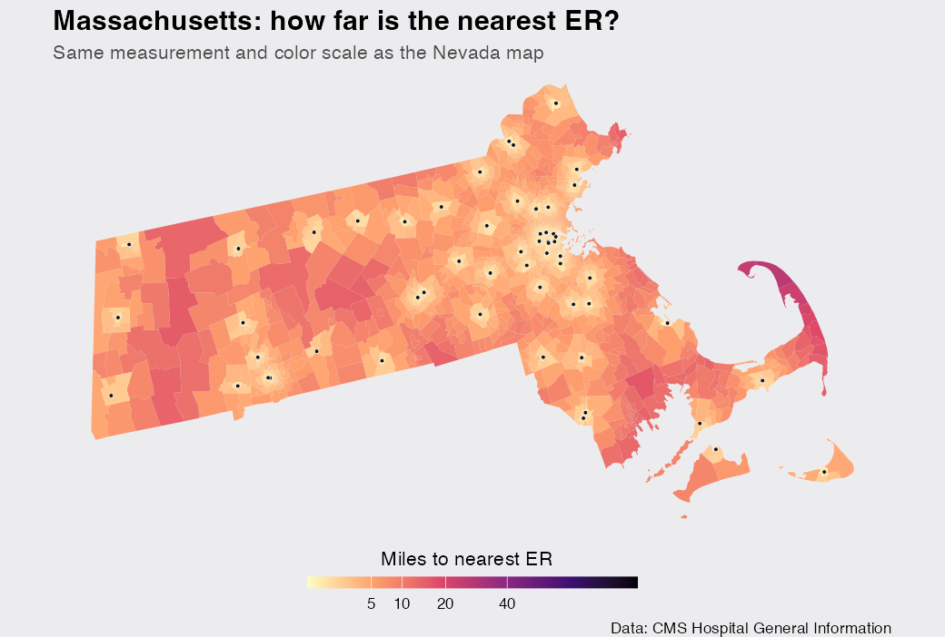
On Nevada’s scale Massachusetts never gets near the dark end: its deepest shade is the outer tip of Cape Cod, about 27 miles from an ER, while Nevada’s remotest tract sits 3.9 times farther out. The 57 emergency-capable hospitals dot the state end to end instead of huddling in two corners. Nothing here tempts a "desert" headline, which is what a control should look like.
Now the same 20-mile shares, for both states side by side.
both <- bind_rows(
  tibble(state = "Nevada", er_mi = tr_tab$er_mi, ALAND = tr_tab$ALAND),
  ma$tracts |> st_drop_geometry() |> select(state, er_mi, ALAND)
)

shares <- both |>
  group_by(state) |>
  summarise(
    by_people = mean(er_mi <= 20) * 100,
    by_land = sum(ALAND[er_mi <= 20]) / sum(ALAND) * 100
  ) |>
  mutate(gap = by_people - by_land)

shares
## # A tibble: 2 × 4
##   state         by_people by_land    gap
##   <chr>             <dbl>   <dbl>  <dbl>
## 1 Massachusetts      99.8    99.3  0.486
## 2 Nevada             94.4    16.5 77.8
Massachusetts barely registers a gap: 99.8% of its people and 99.3% of its land sit within 20 miles of an ER, 0.5 points apart, against Nevada’s 78. So the gap is not something the measurement manufactures on its own. It is a property of Nevada’s geography, and it took the control to earn that sentence.
The cumulative curves put the contrast in one picture. For each state I plot the share within a given distance weighted by people next to the same share weighted by land.
curve <- both |>
  group_by(state) |>
  reframe(
    mi = seq(0, 60, 1),
    People = sapply(mi, \(m) mean(er_mi <= m) * 100),
    Land = sapply(mi, \(m) sum(ALAND[er_mi <= m]) / sum(ALAND) * 100)
  ) |>
  pivot_longer(c(People, Land), names_to = "weight", values_to = "pct")

ggplot(curve, aes(mi, pct, color = weight)) +
  geom_line(linewidth = 1.1) +
  facet_wrap(~ factor(state, c("Nevada", "Massachusetts"))) +
  scale_color_manual(values = c(People = "#0066CC", Land = "#E8862D")) +
  labs(
    title = "Same measurement, two states, counted two ways",
    subtitle = "Share of each state within a distance of an ER, weighted by population vs by land area",
    x = "Miles to nearest ER",
    y = "% within",
    color = NULL,
    caption = "Data: CMS Hospital General Information; tract land area from US Census TIGER"
  ) +
  theme_minimal(base_size = 12) +
  theme(
    plot.background = element_rect(fill = "#ECECEF", color = NA),
    panel.background = element_rect(fill = "#ECECEF", color = NA),
    panel.grid.minor = element_blank(),
    panel.grid.major.x = element_blank(),
    panel.grid.major.y = element_line(color = "grey78"),
    axis.ticks = element_blank(),
    strip.text = element_text(face = "bold"),
    plot.title = element_text(face = "bold"),
    plot.subtitle = element_text(color = "grey30"),
    legend.position = "bottom"
  )
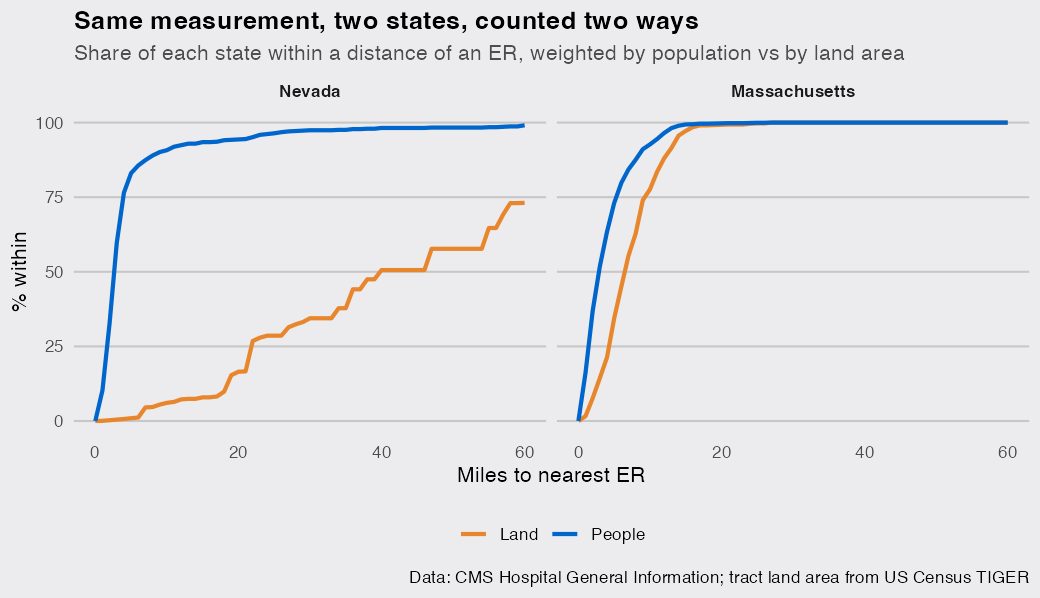
In the Nevada panel the blue people line snaps up to near 100% within a few miles while the orange land line crawls: the signature of a place that looks empty on a map but lives in a couple of cities. In Massachusetts the two lines climb together and are finished by about 20 miles, because when people and hospitals spread over the land together there is nothing for the two weightings to disagree about. The divergence, not the dark shading, is what a desert of land rather than a desert of people looks like, and it is exactly what the choropleth hides.
(Two caveats worth naming. First, equal-population tracts are an approximation, and rural tracts run a little smaller, so if anything they understate how concentrated the population really is: weighting by an actual population count only widens the gap. Second, each state sees only its own hospitals, so a few border towns that actually rely on an out-of-state ER, Mesquite near St. George, Utah, or Laughlin near Bullhead City, Arizona, read as farther from care than they are. That, too, only overstates the desert.)
Make it your own
The pipeline is general: desert_tracts() already takes any state, or point the same steps at any table of facilities, pharmacies, clinics, grocery stores, and st_nearest_feature() measures access to whatever you give it. The last figure is the piece worth carrying past this dataset. Any time you shade a map by a rate or a distance over regions that vary wildly in population, from rural tracts to whole countries, the map is weighting by area, and your eye reads it as importance. Before you call something a desert, weight it by the people who actually live there, and check a place where you expect no desert at all, so you know what agreement looks like. Sometimes the desert stays. In Nevada, I found, almost nobody lives in it.

