I wanted to know which US counties have the deadliest roads, measured as deaths per resident. The ranking takes a few lines of R: count deaths per county, divide by population, sort. The result looks authoritative, but both ends of it are made of counties too small to rank. Once I corrected for that, the top of the list barely changed and the bottom was replaced entirely.
Road deaths and population by county
Deaths come from NHTSA’s Fatality Analysis Reporting System (FARS), one CSV per year, which records the county where each fatal crash happened. Population comes from the Census Bureau’s 2020-2023 county estimates. I pool four years to give the small counties more to work with. Both sources are keyless downloads; the FARS files are about 33 MB each.
library(tidyverse)
read_fars <- function(year) {
  zip <- tempfile(fileext = ".zip")
  download.file(paste0("https://static.nhtsa.gov/nhtsa/downloads/FARS/", year,
                       "/National/FARS", year, "NationalCSV.zip"), zip, mode = "wb")
  read_csv(unz(zip, paste0("FARS", year, "NationalCSV/accident.csv")),
           col_select = c(STATE, COUNTY, FATALS), show_col_types = FALSE)
}
crashes <- map(2020:2023, read_fars) |> list_rbind()

pop <- read_csv("https://www2.census.gov/programs-surveys/popest/datasets/2020-2023/counties/totals/co-est2023-alldata.csv",
                locale = locale(encoding = "latin1"), show_col_types = FALSE) |>
  filter(SUMLEV == "050") |>
  transmute(STATE = as.numeric(STATE), COUNTY = as.numeric(COUNTY),
            name = paste0(CTYNAME, ", ", STNAME), pop = POPESTIMATE2023,
            person_years = POPESTIMATE2020 + POPESTIMATE2021 +
                           POPESTIMATE2022 + POPESTIMATE2023)
The two files do not share every county code. FARS still files Oglala Lakota County, South Dakota under its pre-2015 code, and Connecticut and Alaska redrew their county-level units after 2019, so an anti_join() finds deaths with no matching population. I recode the one county and drop the two states. Counties with no deaths get an explicit zero, because a county missing from the death counts is a real zero, not missing data.
counties <- crashes |>
  mutate(COUNTY = if_else(STATE == 46 & COUNTY == 113, 102, COUNTY)) |>
  count(STATE, COUNTY, wt = FATALS, name = "deaths") |>
  right_join(pop, by = c("STATE", "COUNTY")) |>
  filter(!STATE %in% c(2, 9)) |>
  mutate(deaths = replace_na(deaths, 0),
         rate = deaths / person_years * 1e5)
That is 3,105 counties and 164,423 road deaths, a national rate of 12.5 per 100,000 residents per year. Sorted by rate, every one of the top 10 has fewer than 2,196 residents, and first place goes to Loving County, Texas, where 18 deaths against 43 residents give 8,738 per 100,000. At the bottom, 33 counties recorded no deaths in four years, and none has more than 25,600 people. A county of 2,000 people is expected to see about one road death a year, so one crash more or less moves its rate by 50 per 100,000. Its position in the ranking says more about chance than about its roads.
How do I rank rates in R without small counties dominating?
Shrink each county’s rate toward what a county of its size would be expected to have, in proportion to how little data it has. This is empirical Bayes with a Poisson-gamma model: a negative binomial regression supplies the expected rate and how much counties really vary around it. The shrunk rate is (deaths + theta) / (person_years + theta / expected_rate). A big county keeps its own rate, and a county with two expected deaths is pulled most of the way toward the expected rate. This block runs on its own, with MASS 7.3 (a recommended package that ships with R 4.6), on the Insurance data that comes with it:
library(MASS)

eb_rate <- function(count, exposure, size) {
  fit <- glm.nb(count ~ log(size) + offset(log(exposure)))
  expected <- fitted(fit) / exposure
  (count + fit$theta) / (exposure + fit$theta / expected)
}

# car insurance claims per policy holder, 64 cells of very different sizes
ins <- transform(Insurance,
                 raw = Claims / Holders,
                 shrunk = eb_rate(Claims, Holders, Holders))
head(ins[order(ins$raw), c("Holders", "Claims", "raw", "shrunk")], 3)
##    Holders Claims        raw    shrunk
## 61       3      0 0.00000000 0.3157277
## 46      29      2 0.06896552 0.2053231
## 3      246     20 0.08130081 0.1231629
The cell with 3 policy holders and no claims has the lowest raw claim rate in the table; shrunk, it has the highest, because it is a cell of young drivers with big engines, where the larger cells claim often, and 3 holders are too few to say otherwise. The next block does the same thing to the counties.
Including log(pop) in the regression matters here. Rural roads really are deadlier: the smallest tenth of counties (under 4,928 people) run at 45.4 deaths per 100,000, against 9.9 in the largest tenth. Shrinking every county toward the national 12.5 would erase that real difference along with the noise.
fit <- glm.nb(deaths ~ log(pop) + offset(log(person_years)), data = counties)
counties <- counties |>
  mutate(expected = fitted(fit) / person_years,
         eb = (deaths + fit$theta) / (person_years + fit$theta / expected) * 1e5,
         raw_rank = min_rank(desc(rate)), eb_rank = min_rank(desc(eb)))
What survives the correction
The two ends react very differently. The top holds: 8 of the raw top 10 stay in the shrunk top 10, and 11 of the shrunk top 15 are rural Texas counties, most of them on the highways of the Permian Basin oil fields and the empty stretches of West Texas. Those counties had so many deaths that chance cannot explain them. The bottom does not hold. Of the 33 zero-death counties, the best placed is now the 13th safest of 3,105. Among the ten safest counties after shrinkage, 9 have more than 200,000 residents: Manhattan at 2.3 and Brooklyn at 2.6 deaths per 100,000, plus Staten Island, Queens, Arlington and Loudoun in Virginia, Suffolk and Middlesex in Massachusetts, and Hudson in New Jersey. Their low rates rest on dozens to hundreds of deaths. The exception is Bristol County, Rhode Island, with 1 death among 50,255 people in four years, a record strong enough to hold up even after shrinkage.
dsp_colors <- c("#0066CC", "#E8862D", "#159A6C", "#7D5BD6",
                "#D64580", "#2AA9B8", "#C9A227")
dsp_theme <- theme_minimal(base_size = 13) +
  theme(plot.background    = element_rect(fill = "#ECECEF", color = NA),
        panel.background   = element_rect(fill = "#ECECEF", color = NA),
        panel.grid.minor   = element_blank(),
        panel.grid.major.x = element_blank(),
        panel.grid.major.y = element_line(color = "grey78"),
        axis.ticks         = element_blank(),
        plot.title         = element_text(face = "bold"),
        strip.text         = element_text(face = "bold"))

counties |>
  pivot_longer(c(rate, eb), names_to = "measure", values_to = "value") |>
  mutate(measure = factor(measure, levels = c("rate", "eb"),
                          labels = c("Raw rate", "Shrunk (empirical Bayes)"))) |>
  ggplot(aes(pop, value)) +
  geom_point(aes(color = deaths == 0), alpha = 0.45, size = 1.1) +
  geom_line(aes(y = expected * 1e5), linewidth = 0.8) +
  facet_wrap(~ measure) +
  scale_x_log10(labels = scales::label_comma()) +
  scale_color_manual(values = dsp_colors[c(1, 2)],
                     labels = c("At least one death", "No deaths")) +
  coord_cartesian(ylim = c(0, 200)) +
  labs(x = "County population (log scale)", y = "Road deaths per 100,000 per year",
       color = NULL, title = "Small counties spread out, big ones do not") +
  dsp_theme + theme(legend.position = "top")
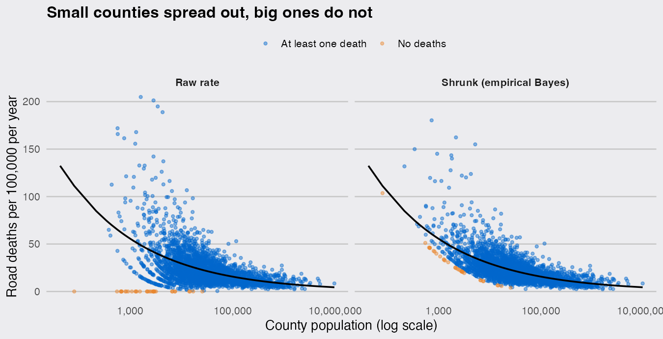
The black line is the expected rate for a county of each size. In the left panel the small counties fan out from zero to beyond the top of the chart (Loving County is off the scale), and the curved bands are counties with exactly one, two or three deaths; in the right panel they fall back toward the line, and the orange zero-death counties rise off the floor.
One caveat the shrinkage cannot fix. FARS records where the crash happened, not where the victim lived, so a "per resident" rate for a county with through-traffic describes its roads rather than its people. A county of 43 people did not lose 18 of them; the deaths happened on its roads, which carry oil-field traffic from far beyond the county. With four years of data, the shrunk rate still puts Loving first at 587 per 100,000, because the deaths are real. The denominator is the wrong one for a county that people mostly drive through.
The general lesson for any rate map or league table in R, whether of deaths, crimes or disease cases: sort the raw rates and the extremes you get will be the smallest units. Shrink toward a size-aware expectation before you rank.


