Similar to histograms, density plots are used to show the distribution of data. Additionally, density plots are especially useful for comparing distributions. For example, I often compare the levels of different risk factors (i.e., cholesterol levels, glucose, body mass index) between individuals with and without cardiovascular disease. Also, with density plots, we can illustrate how the distribution of a particular variable changes over time.
The function we use for making the density plot is sm.density.compare() from the sm package. To install and load the package, use the code below:
install.packages("sm")
library(sm)
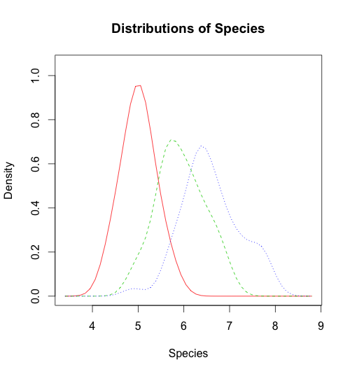
In this example, I am using the iris dataset and comparing the distribution of sepal length across the different species. After you load the dataset, run the code below to build the density plot:
sm.density.compare(iris$Sepal.Length, iris$Species, xlab="Species")
title(main="Distributions of Species")
Here is the plot, with one density curve for each species:
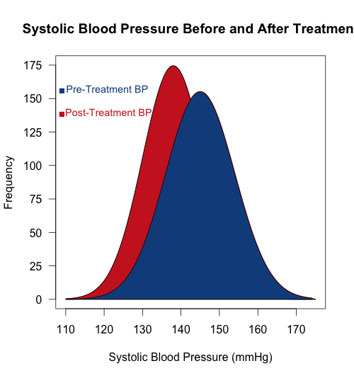
To make a fancier density plot, Chris shared an R script with us. It draws two overlapping normal density curves with base R graphics, fills them with color, and adds a small legend:
x <- seq(from = 110, to = 174, by = 0.5)
y1 <- dnorm(x, mean = 145, sd = 9)
y2 <- dnorm(x, mean = 138, sd = 8)
plot(x, y1, type="l", lwd=2, col="red",
     main="Systolic Blood Pressure Before and After Treatment",
     xlab = "Systolic Blood Pressure (mmHg)",
     ylab = "Frequency", yaxt="n",
     xlim = c(110, 175), ylim = c(0, 0.05))
lines(x, y2)
polygon(c(110,x,175),c(0,y2,0), col="firebrick3",
     border = "black")
polygon(c(117,x,175),c(0,y1,0), col="dodgerblue4",
     border = "black")
ylab=c(seq(from=0, to=175, by=25))
y=c(seq(from=0, to=0.05, length.out = 8))
axis(2,at=y,labels=ylab, las=1)
text(x = 120, y = 0.045, "- Pre-Treatment BP", col = "dodgerblue4", cex = 0.9)
text(x = 120, y = 0.04, " - Post-Treatment BP", col = "firebrick3", cex = 0.9)
points(109, 0.0445, pch = 15, col = "dodgerblue4")
points(109, 0.0395, pch = 15, col = "firebrick3")
Here is the plot:
I hope you understand the script above; if not, please leave a comment and we will be happy to assist.


Hello, I´am trying to compare vocabulary results by gender, but it appears the following error: sm.density.compare can handle only 1-d data What thus that means?
is the variable continous?
yes
Hello, I´am trying to compare vocabulary results by gender, but it appears the following error: sm.density.compare can handle only 1-d data What thus that means?
Error when executing the sm.density.compare command: Error in is.vector(x): trying to get slot “Sepal.Length” from an object (class “data.frame”) that is not an S4 object. Ideas?
Hi Adrian,
I just tested the script and it works fine with R version 3.2.2.