In this post, I will show how to collect data from a webpage and analyze or visualize it in R. For this task, I will use the rvest package to get the data from Wikipedia. I got the idea to write this post from Fisseha Berhane.
I will retrieve the prevalence of obesity in the US from this Wikipedia page and then plot it on a map. Let’s begin by loading the required packages.
## LOAD THE PACKAGES ####
library(rvest)
library(ggplot2)
library(dplyr)
library(scales)
Next, we download the data from Wikipedia.
## LOAD THE DATA ####
obesity = read_html("https://en.wikipedia.org/wiki/Obesity_in_the_United_States")

obesity = obesity %>%
     html_nodes("table") %>%
     .[[1]]%>%
     html_table(fill=T)
The first line of code reads the page from Wikipedia, and the lines that follow extract the table we are interested in and transform it into a data frame in R.
Let’s look at the head of our data.
head(obesity)
State and District of Columbia Obese adults Overweight (incl. obese) adults
1                        Alabama        30.1%                           65.4%
2                         Alaska        27.3%                           64.5%
3                        Arizona        23.3%                           59.5%
4                       Arkansas        28.1%                           64.7%
5                     California        23.1%                           59.4%
6                       Colorado        21.0%                           55.0%
  Obese children and adolescents Obesity rank
1                          16.7%            3
2                          11.1%           14
3                          12.2%           40
4                          16.4%            9
5                          13.2%           41
6                           9.9%           51
The data frame looks good, but now we need to clean it to make it ready for plotting. We remove the percent signs and convert the values to numeric.
## CLEAN THE DATA ####
str(obesity)
# remove the % and make the data numeric
for(i in 2:4){
     obesity[,i] = gsub("%", "", obesity[,i])
     obesity[,i] = as.numeric(obesity[,i])
}
# check data again
str(obesity)
'data.frame':	51 obs. of  5 variables:
 $ State and District of Columbia : chr  "Alabama" "Alaska" "Arizona" "Arkansas" ...
 $ Obese adults                   : chr  "30.1%" "27.3%" "23.3%" "28.1%" ...
 $ Overweight (incl. obese) adults: chr  "65.4%" "64.5%" "59.5%" "64.7%" ...
 $ Obese children and adolescents : chr  "16.7%" "11.1%" "12.2%" "16.4%" ...
 $ Obesity rank                   : int  3 14 40 9 41 51 49 43 22 39 ...

'data.frame':	51 obs. of  5 variables:
 $ State and District of Columbia : chr  "Alabama" "Alaska" "Arizona" "Arkansas" ...
 $ Obese adults                   : num  30.1 27.3 23.3 28.1 23.1 21 20.8 22.1 25.9 23.3 ...
 $ Overweight (incl. obese) adults: num  65.4 64.5 59.5 64.7 59.4 55 58.7 55 63.9 60.8 ...
 $ Obese children and adolescents : num  16.7 11.1 12.2 16.4 13.2 9.9 12.3 14.8 22.8 14.4 ...
 $ Obesity rank                   : int  3 14 40 9 41 51 49 43 22 39 ...
Next, we fix the variable names by removing the spaces.
names(obesity)
names(obesity) = make.names(names(obesity))
names(obesity)
[1] "State and District of Columbia"  "Obese adults"
[3] "Overweight (incl. obese) adults" "Obese children and adolescents"
[5] "Obesity rank"
[1] "State.and.District.of.Columbia"  "Obese.adults"
[3] "Overweight..incl..obese..adults" "Obese.children.and.adolescents"
[5] "Obesity.rank"
Now it’s time to load the map data.
# load the map data
states = map_data("state")
str(states)
'data.frame':	15537 obs. of  6 variables:
 $ long     : num  -87.5 -87.5 -87.5 -87.5 -87.6 ...
 $ lat      : num  30.4 30.4 30.4 30.3 30.3 ...
 $ group    : num  1 1 1 1 1 1 1 1 1 1 ...
 $ order    : int  1 2 3 4 5 6 7 8 9 10 ...
 $ region   : chr  "alabama" "alabama" "alabama" "alabama" ...
 $ subregion: chr  NA NA NA NA ...
We will merge the two datasets (obesity and states) by region, so first we need to create a new variable called region in the obesity dataset.
# create a new variable name for state
obesity$region = tolower(obesity$State.and.District.of.Columbia)
Now we can merge the datasets.
states = merge(states, obesity, by="region", all.x=T)
str(states)
'data.frame':	15537 obs. of  11 variables:
 $ region                         : chr  "alabama" "alabama" "alabama" "alabama" ...
 $ long                           : num  -87.5 -87.5 -87.5 -87.5 -87.6 ...
 $ lat                            : num  30.4 30.4 30.4 30.3 30.3 ...
 $ group                          : num  1 1 1 1 1 1 1 1 1 1 ...
 $ order                          : int  1 2 3 4 5 6 7 8 9 10 ...
 $ subregion                      : chr  NA NA NA NA ...
 $ State.and.District.of.Columbia : chr  "Alabama" "Alabama" "Alabama" "Alabama" ...
 $ Obese.adults                   : num  30.1 30.1 30.1 30.1 30.1 30.1 30.1 30.1 30.1 30.1 ...
 $ Overweight..incl..obese..adults: num  65.4 65.4 65.4 65.4 65.4 65.4 65.4 65.4 65.4 65.4 ...
 $ Obese.children.and.adolescents : num  16.7 16.7 16.7 16.7 16.7 16.7 16.7 16.7 16.7 16.7 ...
 $ Obesity.rank                   : int  3 3 3 3 3 3 3 3 3 3 ...
Plot the data
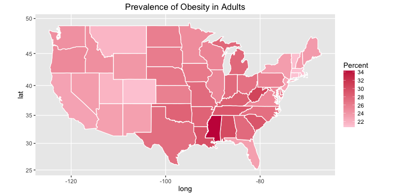
Finally, we will plot the prevalence of obesity in adults.
## MAKE THE PLOT ####

# adults
ggplot(states, aes(x = long, y = lat, group = group, fill = Obese.adults)) +
     geom_polygon(color = "white") +
     scale_fill_gradient(name = "Percent", low = "#feceda", high = "#c81f49", guide = "colorbar", na.value="black", breaks = pretty_breaks(n = 5)) +
     labs(title="Prevalence of Obesity in Adults") +
     coord_map()
Here is the plot for adults:
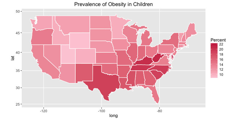
Similarly, we can plot the prevalence of obesity in children.
# children
ggplot(states, aes(x = long, y = lat, group = group, fill = Obese.children.and.adolescents)) +
     geom_polygon(color = "white") +
     scale_fill_gradient(name = "Percent", low = "#feceda", high = "#c81f49", guide = "colorbar", na.value="black", breaks = pretty_breaks(n = 5)) +
     labs(title="Prevalence of Obesity in Children") +
     coord_map()
Here is the plot for children:
If you would like to show the state names on the map, use the code below to create a new dataset with the coordinates of the state centers.
statenames = states %>%
     group_by(region) %>%
     summarise(
          long = mean(range(long)),
          lat = mean(range(lat)),
          group = mean(group),
          Obese.adults = mean(Obese.adults),
          Obese.children.and.adolescents = mean(Obese.children.and.adolescents)
 )
Then add this line to the ggplot code above:
geom_text(data=statenames, aes(x = long, y = lat, label = region), size=3)
That’s all. I hope you learned something useful today. Leave a comment below if you have any questions.


you should include “library(maps) and library(mapproj)” along with the other library statements
When I tried to read in the data with read_html(). I got the following error message. by the way, all the required library were successfully loaded. Please help me!
> obesity = read_html(“https://en.wikipedia.org/wiki/Obesity_in_the_United_States”)
Error in open.connection(x, “rb”) :
Peer certificate cannot be authenticated with given CA certificates
Accept
Thanks for sharing. This is good example. It would even be better if you’ve added the pop-up effect as you hover over the states?
True, hover effect is really nice. I think should use another package for this?
great post, to add hovering feature you can simply run ggplotply() on your code. I have recently discovered this function and it’s actually a pain reliever. It comes from plotly package.
All you need to do is to install and load plotly, then define an R object representing your plot, for instance ‘map_plot’, and finally running ggplotly passing your plot as an argument: ggplotly(map_plot). this will produce a plot identical to the original one, enhanced with hovering and zooming features.
you can find out more on dedicated plotly documentation page: https://plot.ly/ggplot2/
Thanks Andrea!
You’re R code above the child map appears to be the same block of code that created the adult map. In other words, the plot is correct, but the block of code is wrong.
Regardless, thank you for the nice example.
Thanks for the note Jeff. The code is updated.