
Missing data is a problem that challenges data analysis both methodologically and computationally in medical research. Patients in clinical trials and cohort studies may drop out of the study and therefore generate missing data. The missing data can be at random when the participants who drop out of the study are not different from those who remain in the study. For example, in a study of body mass index and cholesterol levels, the data are missing at random if the participants who don’t measure their blood cholesterol have a body mass index comparable to that of the participants who do measure it.
To handle missing data, researchers often choose to conduct the analysis only among participants without missing data (i.e., complete case analysis), but sometimes they prefer to impute the data. In previous tutorials (Tutorial 1, Tutorial 2) published on DataScience+, we have shown how to impute missing data by using the MICE package. In this tutorial, I will show how to graphically present the missing data, with only one purpose: to find out whether the data are missing at random. To do this, we will build plots using the function marginplot from the VIM package. This is a short “how to” tutorial and does not intend to explain the types of missing data. You can learn more about the types of missing data, such as missing completely at random, missing at random, and not missing at random, from the book Statistical Analysis with Missing Data.
Data Preparation
I simulated a database with 250 observations for illustration purposes; it has no clinical relevance. There are seven variables: Age, Gender, Cholesterol, SystolicBP, BMI, Smoking, and Education.
Load the libraries and get the data by running the script below:
library(VIM)
library(mice)
library(dplyr)
library(tibble)
dat <- read.csv(url("https://goo.gl/4DYzru"), header=TRUE, sep=",")
head(dat)
##    Age Gender Cholesterol SystolicBP  BMI Smoking Education
## 1 67.9 Female       236.4      129.8 26.4     Yes      High
## 2 54.8 Female       256.3      133.4 28.4      No    Medium
## 3 68.4   Male       198.7      158.5 24.1     Yes      High
## 4 67.9   Male       205.0      136.0 19.9      No       Low
## 5 60.9   Male       207.7      145.4 26.7      No    Medium
## 6 44.9 Female       222.5      130.6 30.6      No       Low
In this database, there are no missing values. I will introduce missingness not at random for the cholesterol variable. As shown in the code below, the missing values for cholesterol will occur only among participants with body mass index levels of 30 or greater (i.e., participants with obesity).
set.seed(10)
missing = rbinom(250, 1, 0.3)
dat$Cholesterol = with(dat, ifelse(BMI>=30&missing==1, NA, Cholesterol))
sum(is.na(dat$Cholesterol))
[1] 16
We now have 16 participants with missing values in the cholesterol variable. I am going to impute the missing values by using the MICE package and the PMM (predictive mean matching) method.
init = mice(dat, maxit=0)
meth = init$method
predM = init$predictorMatrix
meth[c("Cholesterol")]="pmm"
set.seed(101)
imputed = mice(dat, method=meth, predictorMatrix=predM, m=1)
imp = complete(imputed)
Next, I will create a database with the imputed data and an indicator variable that shows which observations were imputed. This is necessary for plotting with the marginplot function.
dt1 = dat %>%
  select(Cholesterol, BMI) %>%
  rename(Cholesterol_imp = Cholesterol) %>%
  mutate(
    Cholesterol_imp = as.logical(ifelse(is.na(Cholesterol_imp), "TRUE", "FALSE"))
  ) %>%
  rownames_to_column()

dt2 = imp %>%
  select(Cholesterol, BMI) %>%
  rownames_to_column()

dt = left_join(dt1, dt2)
head(dt)
rowname Cholesterol_imp  BMI Cholesterol
1       1           FALSE 26.4       236.4
2       2           FALSE 28.4       256.3
3       3           FALSE 24.1       198.7
4       4           FALSE 19.9       205.0
5       5           FALSE 26.7       207.7
6       6           FALSE 30.6       222.5
Graphical presentation of missing data
Now that we have a database with the imputed variable and the corresponding indicator of whether each observation was imputed, we will plot it by using the function marginplot from the VIM package.
vars <- c("BMI","Cholesterol","Cholesterol_imp")
marginplot(dt[,vars], delimiter="_imp", alpha=0.6, pch=c(19))
This is the output of the code above:
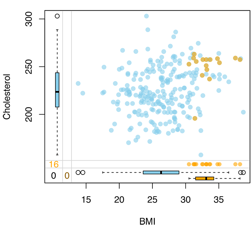
The blue color in the scatterplot above indicates the non-missing values of cholesterol, and the orange shows the missing data that were imputed. As we can see, the participants with missing cholesterol data have a higher body mass index than the participants without missing data, which indicates that the data are not missing at random. The scatterplot also includes boxplots that illustrate the distribution of the data. For example, the median body mass index for participants with missing data is around 33, whereas for those without missing data it is around 26.
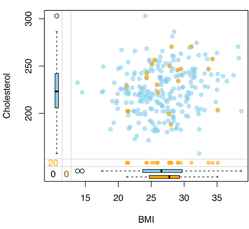
Data that are missing at random would look like the plot below:
Conclusion
In this post, we showed how to use the marginplot function of the VIM package to identify whether your data are missing at random. To learn more about the VIM package, I suggest reading the paper by Bernd Prantner.
I hope you find this post useful. Leave a comment below if you have questions.
