Histogram are frequently used in data analyses for visualizing the data. Through histogram, we can identify the distribution and frequency of the data. Histogram divide the continues variable into groups (x-axis) and gives the frequency (y-axis) in each group. The function that histogram use is hist(). Below I will show a set of examples by using a iris dataset which comes with R.
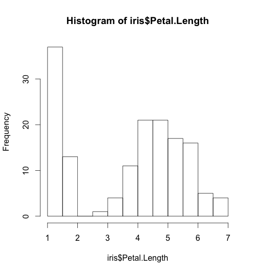
Basic histogram:
hist(iris$Petal.Length)
Here is the basic histogram:
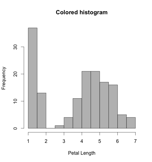
Adding color and labels in histograms:
hist(iris$Petal.Length, col="blue", xlab="Petal Length", main="Colored histogram")
Histogram with labels:
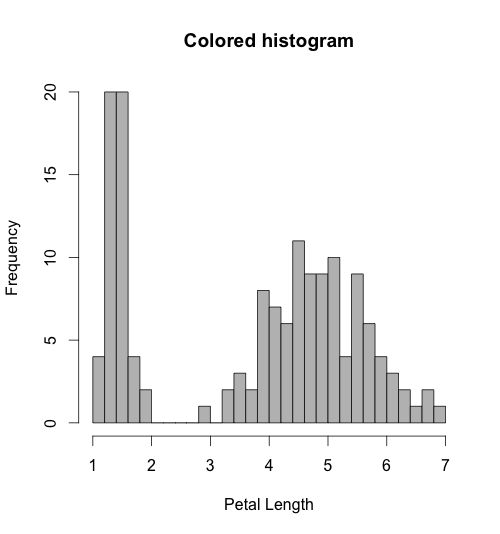
Adding breaks in histograms to give more information about the distribution:
hist(iris$Petal.Length, breaks=30, col="gray", xlab="Petal Length", main="Colored histogram")
Histogram with more bars:
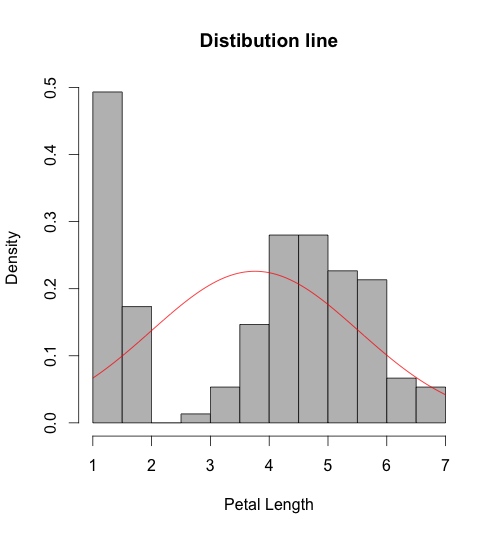
In statistics, the histogram is used to evaluate the distribution of the data. In order to show the distribution of the data we first will show density (or probably) instead of frequency, by using function freq=FALSE. Secondly, we will use the function curve() to show normal distribution line.
Here the example:
# add a normal distribution line in histogram
hist(iris$Petal.Length, freq=FALSE, col="gray", xlab="Petal Length", main="Colored histogram")
curve(dnorm(x, mean=mean(iris$Petal.Length), sd=sd(iris$Petal.Length)), add=TRUE, col="red") #line
Histogram with normal distribution line:
That’s all about histogram in this post if you have any question leave a comment below.