Seaborn is a Python visualization library based on matplotlib. It provides a high-level interface for drawing attractive statistical graphics. It is built on top of matplotlib, including support for numpy and pandas data structures and statistical routines from scipy and statsmodels.
What is categorical data?
A categorical variable (sometimes called a nominal variable) is one that has two or more categories, but there is no intrinsic ordering to the categories. For example, gender is a categorical variable having two categories (male and female) and there is no intrinsic ordering to the categories. Hair color is also a categorical variable having a number of categories (blonde, brown, brunette, red, etc.) and again, there is no agreed way to order these from highest to lowest. A purely categorical variable is one that simply allows you to assign categories but you cannot clearly order the variables. If the variable has a clear ordering, then that variable would be an ordinal variable.
Now let’s discuss using seaborn to plot categorical data! There are a few main plot types for this:
- barplot
- countplot
- boxplot
- violinplot
- striplot
- swarmplot
Let’s go through examples of each!
First, we will import the library Seaborn.
import seaborn as sns
%matplotlib inline
#to plot the graphs inline on jupyter notebook
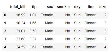
To demonstrate the various categorical plots used in Seaborn, we will use the in-built dataset present in the seaborn library which is the ‘tips’ dataset.
t=sns.load_dataset('tips')
#to check some rows to get a idea of the data present
t.head()
The ‘tips’ dataset is a sample dataset in Seaborn which looks like this.
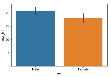
Bar plot
A barplot can be created by the following command below,
sns.barplot(x='sex',y='total_bill',data=t)
Here parameters x, y refers to the name of the variables in the dataset provided in parameter ‘data’.
This gives the output as:
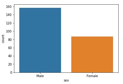
Count plot
This is essentially the same as barplot except the estimator is explicitly counting the number of occurrences. Which is why we only pass the x value. Command for creating countplot is:
sns.countplot(x='sex',data=t)
This gives the countplot as follows:
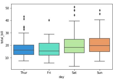
Box plot
A box plot (or box-and-whisker plot) shows the distribution of quantitative data in a way that facilitates comparisons between variables or across levels of a categorical variable. The box shows the quartiles of the dataset while the whiskers extend to show the rest of the distribution, except for points that are determined to be “outliers” using a method that is a function of the inter-quartile range.
sns.boxplot(x='day',y='total_bill',data=t,palette='rainbow')
This gives the output as:
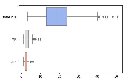
We can also make boxplot for the whole dataframe as:
#Can do entire dataframe with orient='h'
sns.boxplot(data=t,palette='coolwarm',orient='h')
This gives output as:
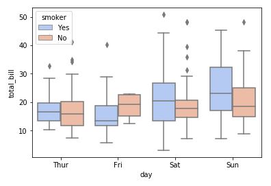
It’s also possible to add a nested categorical variable with the hue parameter.
sns.boxplot(x="day",y="total_bill",hue="smoker",data=t, palette="coolwarm")Output:
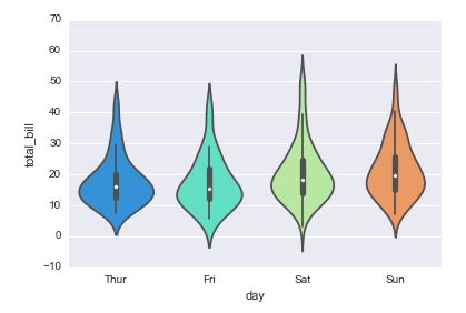
Violin plot
A violin plot plays a similar role as a box and whisker plot. It shows the distribution of quantitative data across several levels of one (or more) categorical variables such that those distributions can be compared. Unlike a box plot, in which all of the plot components correspond to actual datapoints, the violin plot features a kernel density estimation of the underlying distribution.sns.violinplot(x="day", y="total_bill", data=t,palette='rainbow')
Output:
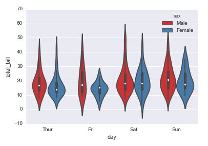
hue can also be applied to violin plot.
sns.violinplot(x="day",y="total_bill",data=t,hue='sex',palette='Set1')
Output gives:
Strip plot AND swarn plot
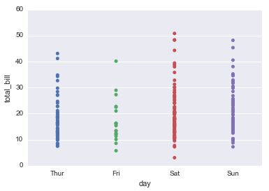
The stripplot will draw a scatterplot where one variable is categorical. A strip plot can be drawn on its own, but it is also a good complement to a box or violin plot in cases where you want to show all observations along with some representation of the underlying distribution.
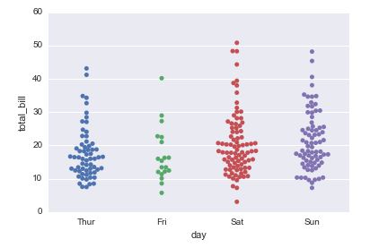
The swarmplot is similar to stripplot(), but the points are adjusted (only along the categorical axis) so that they don’t overlap. This gives a better representation of the distribution of values, although it does not scale as well to large numbers of observations (both in terms of the ability to show all the points and in terms of the computation needed to arrange them).
Command for strip plot:
sns.stripplot(x="day", y="total_bill", data=t)
Output:
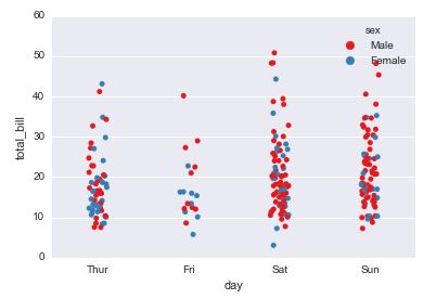
sns.stripplot(x="day",y="total_bill",data=t,jitter=True,hue='sex',palette='Set1')
Output:
Command for swarm plot
sns.swarmplot(x="day", y="total_bill", data=t)
Output:
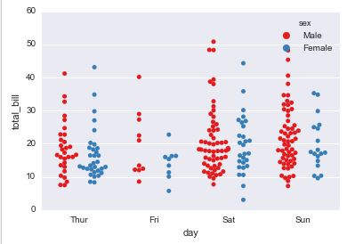
sns.swarmplot(x="day",y="total_bill",hue='sex',data=t,palette="Set1", split=True)
Output:
Hope you like this post.