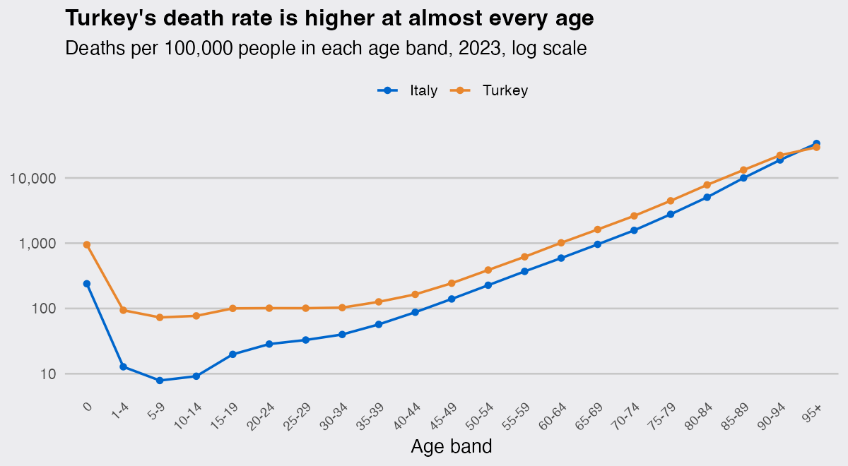
I wanted to answer a plain question with open data: which European country has the highest death rate? Dividing deaths by population is one line of R, and it says Bulgaria, with Turkey safely at the bottom of the list. That answer is mostly about age. Turkey’s death rate is higher than Italy’s in 20 of the 21 age bands I looked at, yet its crude death rate is 46% lower, because 24.0% of people in Italy are 65 or older against 9.9% in Turkey.
Age standardisation is the fix, and in R it is a weighted mean. Computed for 35 countries from two keyless Eurostat downloads, it moves Turkey from last place to 10th and Italy from 11th to 31st, and it drops the correlation between a country’s death rate and its share of over-65s from 0.69 to 0.03.
library(dplyr)
library(readr)
library(stringr)
library(tidyr)
library(ggplot2)
Deaths and population by age from Eurostat
Eurostat’s dissemination API serves any table as CSV, with no key and no registration. 2023 is the latest year with both complete death counts and Eurostat’s own published standardised rates, checked in September 2026. Two tables are needed: demo_magec (deaths by single year of age) and demo_pjan (population on 1 January by single year of age), about 900 KB each for one year.
base <- "https://ec.europa.eu/eurostat/api/dissemination/sdmx/2.1/data/"
query <- "?format=SDMX-CSV&startPeriod=2023&endPeriod=2023"

deaths_raw <- read_csv(paste0(base, "demo_magec", query), show_col_types = FALSE)
pop_raw    <- read_csv(paste0(base, "demo_pjan",  query), show_col_types = FALSE)

unique(deaths_raw$age) |> head(4)
## [1] "TOTAL" "UNK"   "Y1"    "Y10"
Age arrives as a code, not a number: Y_LT1 for under 1, Y1 to Y99, Y_OPEN for 100 and over, UNK, and TOTAL. The totals sit in the same column as the single years, so the first thing to get wrong is summing the value column as it comes.
bg <- deaths_raw |> filter(geo == "BG", sex == "T") |>
  summarise(every_row    = sum(OBS_VALUE),
            single_years = sum(OBS_VALUE[age != "TOTAL"]))
bg
## # A tibble: 1 × 2
##   every_row single_years
##       <dbl>        <dbl>
## 1    202012       101006
Bulgaria registered 101,006 deaths in 2023, and summing the column as it comes reports 202,012, because the TOTAL rows repeat the single years exactly. Nothing warns you and no join fails: the number is simply double.
How do I compute an age-standardised rate in R?
An age-standardised rate is a weighted mean of the age-specific death rates, with a standard population as the weights, so weighted.mean(deaths / pop, w) is the entire calculation. The standard here is the 2013 European Standard Population (ESP2013), the one Eurostat uses: 21 age bands with a fixed number of people per 100,000 in each. Everything below runs on base R plus dplyr 1.2.1, readr 2.2.0 and ggplot2 4.0.3, on R 4.6.1.
esp <- tibble(
  band = c("0", "1-4", "5-9", "10-14", "15-19", "20-24", "25-29", "30-34", "35-39",
           "40-44", "45-49", "50-54", "55-59", "60-64", "65-69", "70-74", "75-79",
           "80-84", "85-89", "90-94", "95+"),
  w    = c(1000, 4000, 5500, 5500, 5500, 6000, 6000, 6500, 7000, 7000, 7000,
           7000, 6500, 6000, 5500, 5000, 4000, 2500, 1500, 800, 200))

by_band <- function(x, value) {
  x |>
    filter(sex == "T", age != "TOTAL",
           !geo %in% c("EU27_2020", "EA20", "EA21", "EFTA", "DE_TOT")) |>
    mutate(age_y = case_when(age == "Y_LT1" ~ 0,
                             age == "Y_OPEN" ~ 100,
                             TRUE ~ suppressWarnings(as.numeric(str_remove(age, "^Y")))),
           band  = as.character(cut(age_y, c(0, 1, seq(5, 95, 5), Inf),
                                    right = FALSE, labels = esp$band))) |>
    filter(!is.na(age_y)) |>
    group_by(geo, band) |>
    summarise("{value}" := sum(OBS_VALUE), .groups = "drop")
}

deaths <- by_band(deaths_raw, "deaths")
pop    <- by_band(pop_raw,    "pop")

complete_geo <- intersect(count(deaths, geo) |> filter(n == 21) |> pull(geo),
                          count(pop,    geo) |> filter(n == 21) |> pull(geo))

rates <- inner_join(deaths, pop, by = c("geo", "band")) |>
  filter(geo %in% complete_geo) |>
  left_join(esp, by = "band") |>
  mutate(rate = 1e5 * deaths / pop)

country_rates <- rates |>
  group_by(geo) |>
  summarise(crude = 1e5 * sum(deaths) / sum(pop),
            asdr  = weighted.mean(rate, w))
Three details matter there. cut(..., right = FALSE) makes the intervals left-closed, so a 65-year-old lands in "65-69" and not in "60-64". weighted.mean() divides by the sum of the weights, so the weights only have to be proportional, and since the age-specific rates are already per 100,000 the standardised rate is too. And geo mixes countries with aggregates such as EU27_2020, which have to go before any ranking. Those chunks are the whole method, and they run from a clean session with nothing but the tidyverse installed.
Check the standardised rate against a published one
Eurostat publishes its own standardised death rates in hlth_cd_asdr2, on the same standard population, which makes a free check on the arithmetic.
published <- read_csv(
  paste0(base, "hlth_cd_asdr2/A.RT.T.TOTAL.TOTAL.", query),
  show_col_types = FALSE) |>
  filter(nchar(geo) == 2) |>
  transmute(geo, published = OBS_VALUE)

check <- inner_join(country_rates, published, by = "geo") |>
  mutate(gap = 100 * (asdr / published - 1))

check |> arrange(desc(abs(gap))) |> head(3)
## # A tibble: 3 × 5
##   geo   crude  asdr published    gap
##   <chr> <dbl> <dbl>     <dbl>  <dbl>
## 1 GE    1143. 5717.     1416. 304.
## 2 LU     671.  848.      801.   5.82
## 3 LI     680.  750.      722.   3.81
33 of the 34 countries land within 5.8% of the published figure, and the median gap is 1.8%. The published rates come from Eurostat’s cause-of-death collection rather than the demographic death register I used, so a small offset is expected.
One country is not close. My rate for Georgia is 5,717 against a published 1,416, four times too high, and the age-specific rates say why immediately.
rates |> filter(geo == "GE", band %in% c("85-89", "90-94", "95+")) |>
  select(band, deaths, pop, rate)
## # A tibble: 3 × 4
##   band  deaths   pop     rate
##   <chr>  <dbl> <dbl>    <dbl>
## 1 85-89   6560 36549   17949.
## 2 90-94   2978  7369   40413.
## 3 95+      824    40 2060000
The population file reports 40 people aged 95 and over in Georgia against 824 deaths in that band, which is 2.06 million deaths per 100,000. Direct standardisation hands that band a fixed weight of 200 per 100,000 however few people are really in it, so one broken denominator carries the whole rate. An age-standardised rate is only as trustworthy as its smallest denominators: print the age-specific rates before you trust the summary. I drop Georgia and continue with 35 countries.
final <- country_rates |>
  filter(geo != "GE") |>
  mutate(rank_crude = rank(-crude), rank_asdr = rank(-asdr))
What standardising changes
names_eu <- c(AT = "Austria", BE = "Belgium", BG = "Bulgaria", CH = "Switzerland",
  CY = "Cyprus", CZ = "Czechia", DE = "Germany", DK = "Denmark", EE = "Estonia",
  EL = "Greece", ES = "Spain", FI = "Finland", FR = "France", HR = "Croatia",
  HU = "Hungary", IE = "Ireland", IS = "Iceland", IT = "Italy",
  LI = "Liechtenstein", LT = "Lithuania", LU = "Luxembourg", LV = "Latvia",
  ME = "Montenegro", MK = "North Macedonia", MT = "Malta", NL = "Netherlands",
  NO = "Norway", PL = "Poland", PT = "Portugal", RO = "Romania", RS = "Serbia",
  SE = "Sweden", SI = "Slovenia", SK = "Slovakia", TR = "Turkey")

dsp_colors <- c("#0066CC", "#E8862D", "#159A6C", "#7D5BD6",
                "#D64580", "#2AA9B8", "#C9A227")
dsp_theme <- theme_minimal(base_size = 13) +
  theme(plot.background    = element_rect(fill = "#ECECEF", color = NA),
        panel.background   = element_rect(fill = "#ECECEF", color = NA),
        panel.grid.minor   = element_blank(),
        panel.grid.major.y = element_blank(),
        panel.grid.major.x = element_line(color = "grey78"),
        axis.ticks         = element_blank(),
        plot.title         = element_text(face = "bold"),
        legend.position    = "top")

plot_df <- final |> mutate(country = reorder(names_eu[geo], asdr))
points  <- plot_df |>
  select(country, Crude = crude, Standardised = asdr) |>
  pivot_longer(-country, names_to = "measure", values_to = "rate")

ggplot(plot_df, aes(y = country)) +
  geom_segment(aes(x = crude, xend = asdr, yend = country),
               color = "grey60", linewidth = 0.5) +
  geom_point(data = points, aes(x = rate, color = measure), size = 2.4) +
  scale_color_manual(values = c(Crude = dsp_colors[2], Standardised = dsp_colors[1])) +
  labs(title = "Standardising for age reorders Europe",
       subtitle = "Deaths per 100,000, 2023, crude and standardised to ESP2013",
       x = NULL, y = NULL, color = NULL) +
  dsp_theme
final |>
  mutate(move = rank_crude - rank_asdr, country = names_eu[geo]) |>
  slice_max(abs(move), n = 6) |>
  select(country, crude, asdr, rank_crude, rank_asdr, move) |>
  arrange(desc(move))
## # A tibble: 6 × 6
##   country         crude  asdr rank_crude rank_asdr  move
##   <chr>           <dbl> <dbl>      <dbl>     <dbl> <dbl>
## 1 Turkey           617. 1242.         35        10    25
## 2 Iceland          663.  895.         34        23    11
## 3 North Macedonia 1103. 1487.         14         3    11
## 4 Greece          1223.  958.          9        21   -12
## 5 Portugal        1125.  894.         12        24   -12
## 6 Italy           1137.  843.         11        31   -20
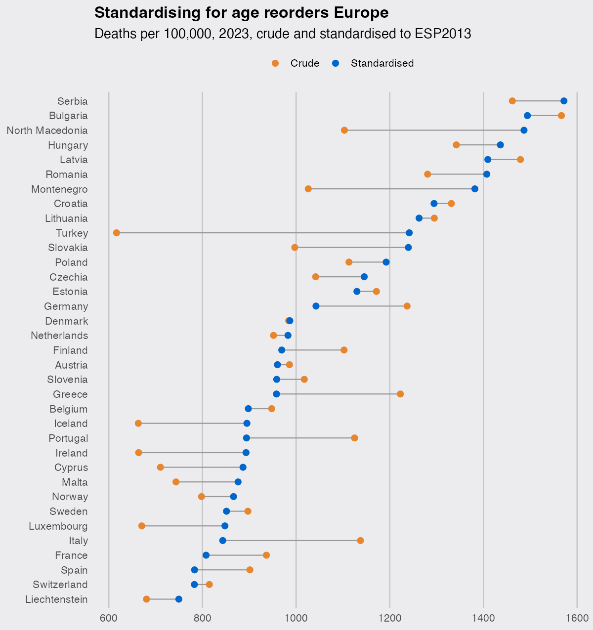
The crude ranking is led by Bulgaria at 1,567 deaths per 100,000 and closed by Turkey at 617, a spread of 2.5 to 1. Standardised, Serbia is top at 1,572, the spread narrows to 2.1 to 1, and the lowest rate among countries of more than a million people belongs to Switzerland and Spain at 783. Between the two rankings the Spearman correlation is only 0.69.
The countries that move are the ones with unusual age structures. Turkey goes from 35th to 10th, Italy from 11th to 31st, Greece from 9th to 21st, and Portugal from 12th to 24th. The clean way to see what standardisation removed is to correlate each rate with the share of the population aged 65 and over.
share65 <- rates |>
  filter(geo != "GE") |>
  group_by(geo) |>
  summarise(share65 = sum(pop[!band %in% esp$band[1:14]]) / sum(pop))

age_cor <- final |> left_join(share65, by = "geo") |>
  summarise(crude = cor(crude, share65), standardised = cor(asdr, share65))
age_cor
## # A tibble: 1 × 2
##   crude standardised
##   <dbl>        <dbl>
## 1 0.692       0.0347
An older population explains 48% of the variance in crude rates across these 35 countries and 0.1% of the variance in standardised ones. That is the whole point of the exercise, in two numbers.
Why Turkey and Italy trade places
pair <- rates |>
  filter(geo %in% c("TR", "IT")) |>
  mutate(band = factor(band, esp$band),
         country = recode(geo, TR = "Turkey", IT = "Italy"))

ggplot(pair, aes(band, rate, color = country, group = country)) +
  geom_line(linewidth = 0.8) +
  geom_point(size = 1.6) +
  scale_y_log10(labels = scales::comma) +
  scale_color_manual(values = c(Turkey = dsp_colors[2], Italy = dsp_colors[1])) +
  labs(title = "Turkey's death rate is higher at almost every age",
       subtitle = "Deaths per 100,000 people in each age band, 2023, log scale",
       x = "Age band", y = NULL, color = NULL) +
  dsp_theme +
  theme(panel.grid.major.x = element_blank(),
        panel.grid.major.y = element_line(color = "grey78"),
        axis.text.x = element_text(angle = 45, hjust = 1, size = 9))
pair |>
  select(band, country, rate) |>
  pivot_wider(names_from = country, values_from = rate) |>
  mutate(ratio = Turkey / Italy) |>
  filter(band %in% c("40-44", "60-64", "75-79", "90-94", "95+"))
## # A tibble: 5 × 4
##   band    Italy Turkey ratio
##   <fct>   <dbl>  <dbl> <dbl>
## 1 40-44    87.5   164. 1.88
## 2 60-64   591.   1014. 1.71
## 3 75-79  2773.   4466. 1.61
## 4 90-94 18848.  22243. 1.18
## 5 95+   33725.  29490. 0.874
Turkey’s death rate is between 1.2 and 1.9 times Italy’s in every band from 40-44 to 90-94, and only in the 95+ band does Italy overtake it. Those bands decide the standardised rate: ages 60 and over contribute 88% of Turkey’s and 92% of Italy’s, since the weights there multiply rates a hundred times larger than the young ones. What flips the crude comparison is that Italy has 24.0% of its population aged 65 and over against Turkey’s 9.9%. The flat stretch in the Turkish line from 5 to 34 is odd enough that I would not lean on it, and it carries almost none of the standardised rate anyway.
Where this applies
Comparing crude rates between populations with different age structures is partly comparing the age structures, and the effect here was large enough to reverse the ranking rather than just shift it. The same correction applies to regions of one country, to hospitals with different case mixes, and to one country against its own past as it ages. The recipe does not change: age-specific rates, a standard population, weighted.mean(), and a look at the smallest denominators before you believe the answer.


