In this post, I will illustrate the use of prediction intervals for the comparison of measurement methods. In the example, a new spectral method for measuring whole blood hemoglobin is compared with a reference method. But first, let's start with discussing the large difference between a confidence interval and a prediction interval.
Prediction interval versus Confidence interval
Very often a confidence interval is misinterpreted as a prediction interval, leading to unrealistic “precise” predictions. As you will see, prediction intervals (PI) resemble confidence intervals (CI), but the width of the PI is by definition larger than the width of the CI.
Let’s assume that we measure the whole blood hemoglobin concentration in a random sample of 100 persons. We obtain the estimated mean (Est_mean), limits of the confidence interval (CI_Lower and CI_Upper) and limits of the prediction interval (PI_Lower and PI_Upper): (The R-code to do this is in the next paragraph)
| Est_mean | CI_Lower | CI_Upper | PI_Lower | PI_Upper |
|---|---|---|---|---|
| 140 | 138 | 143 | 113 | 167 |
The graphical presentation:
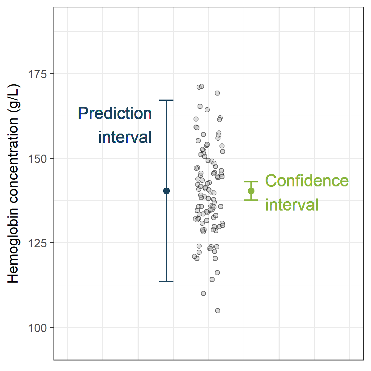
A Confidence interval (CI) is an interval of good estimates of the unknown true population parameter. About a 95% confidence interval for the mean, we can state that if we would repeat our sampling process infinitely, 95% of the constructed confidence intervals would contain the true population mean. In other words, there is a 95% chance of selecting a sample such that the 95% confidence interval calculated from that sample contains the true population mean.
Interpretation of the 95% confidence interval in our example:
- The values contained in the interval [138g/L to 143g/L] are good estimates of the unknown mean whole blood hemoglobin concentration in the population. In general, if we would repeat our sampling process infinitely, 95% of such constructed confidence intervals would contain the true mean hemoglobin concentration.
A Prediction interval (PI) is an estimate of an interval in which a future observation will fall, with a certain confidence level, given the observations that were already observed. About a 95% prediction interval we can state that if we would repeat our sampling process infinitely, 95% of the constructed prediction intervals would contain the new observation.
Interpretation of the 95% prediction interval in the above example:
- Given the observed whole blood hemoglobin concentrations, the whole blood hemoglobin concentration of a new sample will be between 113g/L and 167g/L with a confidence of 95%. In general, if we would repeat our sampling process infinitely, 95% of the such constructed prediction intervals would contain the new hemoglobin concentration measurement.
Remark: Very often we will read the interpretation “The whole blood hemogblobin concentration of a new sample will be between 113g/L and 167g/L with a probability of 95%.” (for example on wikipedia). This interpretation is correct in the theoretical situation where the parameters (true mean and standard deviation) are known.
Estimating a prediction interval in R
First, let's simulate some data. The sample size in the plot above was (n=100). Now, to see the effect of the sample size on the width of the confidence interval and the prediction interval, let's take a “sample” of 400 hemoglobin measurements using the same parameters:
set.seed(123)
hemoglobin<-rnorm(400, mean = 139, sd = 14.75)
df<-data.frame(hemoglobin)
Although we don't need a linear regression yet, I'd like to use the lm() function, which makes it very easy to construct a confidence interval (CI) and a prediction interval (PI). We can estimate the mean by fitting a “regression model” with an intercept only (no slope). The default confidence level is 95%.
Confidence interval:
CI<-predict(lm(df$hemoglobin~ 1), interval="confidence")
CI[1,]
##      fit      lwr      upr
## 139.2474 137.8425 140.6524
The CI object has a length of 400. But since there is no slope in our “model”, each row is exactly the same.
Prediction interval:
PI<-predict(lm(df$hemoglobin~ 1), interval="predict")
## Warning in predict.lm(lm(df$hemoglobin ~ 1), interval = "predict"): predictions on current data refer to _future_ responses
PI[1,]
##      fit      lwr      upr
## 139.2474 111.1134 167.3815
We get a “warning” that “predictions on current data refer to future responses”. That's exactly what we want, so no worries there. As you see, the column names of the objects CI and PI are the same. Now, let's visualize the confidence and the prediction interval.
The code below is not very elegant but I like the result (tips are welcome :-))
library(ggplot2)
limits_CI <- aes(x=1.3  , ymin=CI[1,2], ymax =CI[1,3])
limits_PI <- aes(x=0.7 , ymin=PI[1,2], ymax =PI[1,3])
PI_CI<-ggplot(df, aes(x=1, y=hemoglobin)) +
        geom_jitter(width=0.1, pch=21, fill="grey", alpha=0.5) +
        geom_errorbar (limits_PI, width=0.1, col="#1A425C") +
        geom_point (aes(x=0.7, y=PI[1,1]), col="#1A425C", size=2) +
        geom_errorbar (limits_CI, width=0.1, col="#8AB63F") +
        geom_point (aes(x=1.3, y=CI[1,1]), col="#8AB63F", size=2) +

        scale_x_continuous(limits=c(0,2))+
        scale_y_continuous(limits=c(95,190))+
        theme_bw()+ylab("Hemoglobin concentration (g/L)") +
        xlab(NULL)+
        geom_text(aes(x=0.6, y=160, label="Prediction\ninterval",
                      hjust="right", cex=2), col="#1A425C")+
        geom_text(aes(x=1.4, y=140, label="Confidence\ninterval",
                      hjust="left", cex=2), col="#8AB63F")+
        theme(legend.position="none",
              axis.text.x = element_blank(),
              axis.ticks.x = element_blank())
PI_CI
Gives this plot:
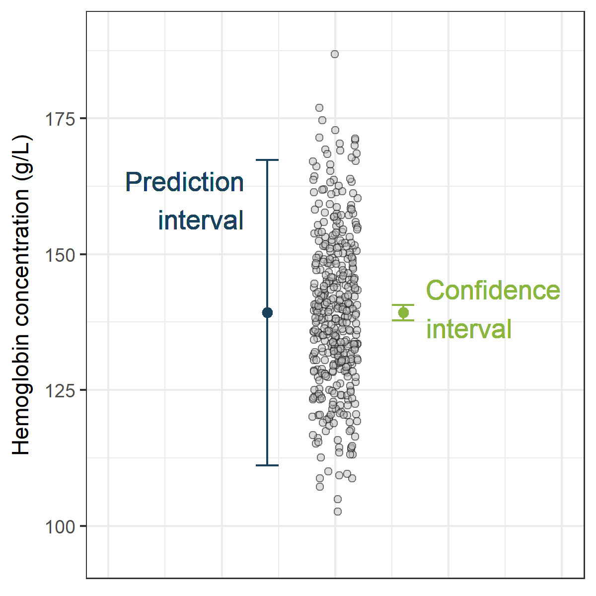
The width of the confidence interval is very small, now that we have this large sample size (n=400). This is not surprising, as the estimated mean is the only source of uncertainty. In contrast, the width of the prediction interval is still substantial. The prediction interval has two sources of uncertainty: the estimated mean (just like the confidence interval) and the random variance of new observations.
Example: comparing a new with a reference measurement method.
A prediction interval can be useful in the case where a new method should replace a standard (or reference) method.
If we can predict well enough what the measurement by the reference method would be, (given the new method) than the two methods give similar information and the new method can be used.
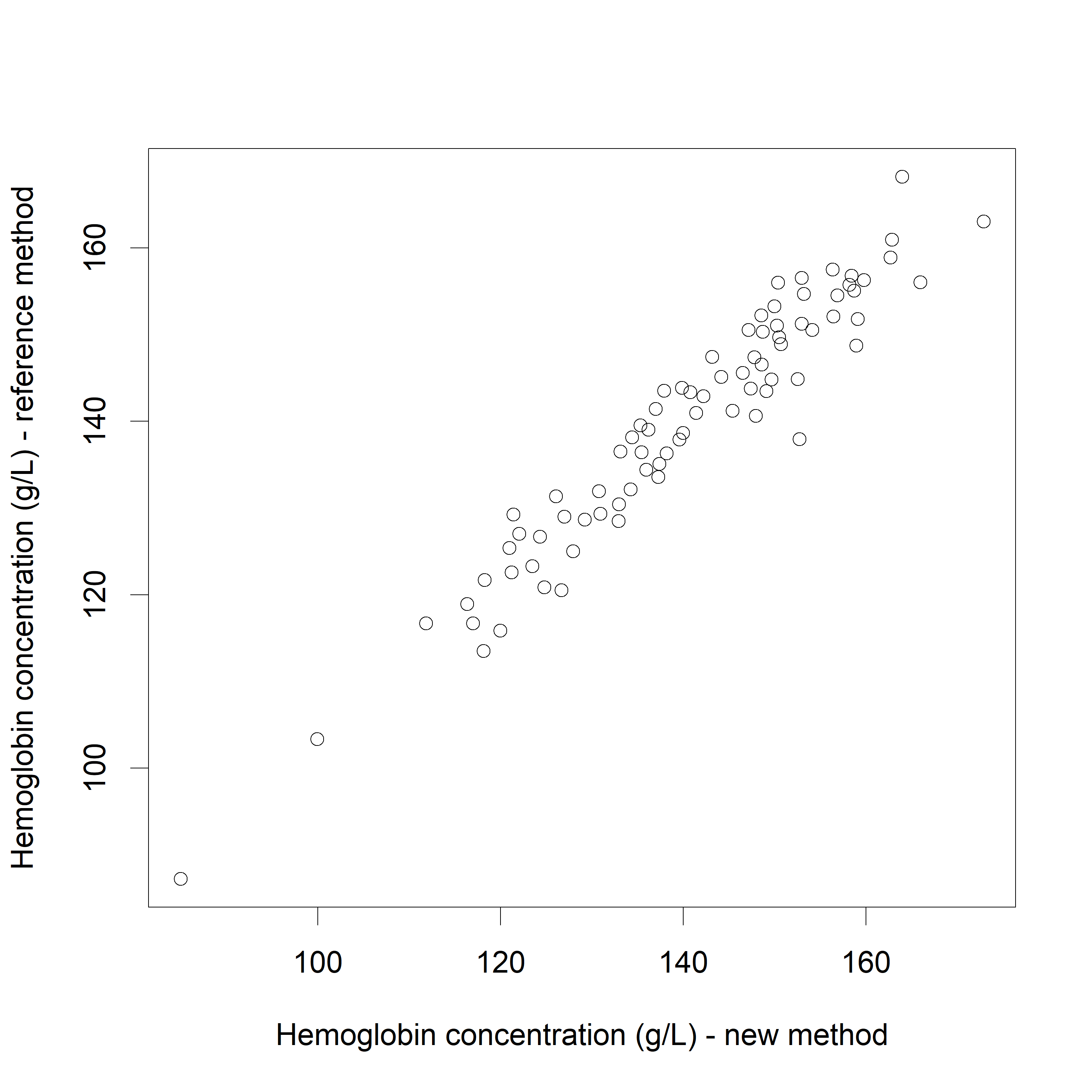
For example in (Tian, 2017) a new spectral method (Near-Infra-Red) to measure hemoglobin is compared with a Golden Standard. In contrast with the Golden Standard method, the new spectral method does not require reagents. Moreover, the new method is faster. We will investigate whether we can predict well enough, based on the measured concentration of the new method, what the measurement by the Golden Standard would be. (note: the measured concentrations presented below are fictive)
Hb<- read.table("http://rforbiostatistics.colmanstatistics.be/wp-content/uploads/2018/06/Hb.txt",
                 header = TRUE)
kable(head(Hb))
| New | Reference |
|---|---|
| 84.96576 | 87.24013 |
| 99.91483 | 103.38143 |
| 111.79984 | 116.71593 |
| 116.95961 | 116.72065 |
| 118.11140 | 113.51541 |
| 118.21411 | 121.70586 |
plot(Hb$New, Hb$Reference,
     xlab="Hemoglobin concentration (g/L) - new method",
     ylab="Hemoglobin concentration (g/L) - reference method")
Gives this plot:
Prediction Interval based on linear regression
Now, let's fit a linear regression model predicting the hemoglobin concentrations measured by the reference method, based on the concentrations measured with the new method.
fit.lm <- lm(Hb$Reference ~ Hb$New)
plot(Hb$New, Hb$Reference,
     xlab="Hemoglobin concentration (g/L) - new method",
     ylab="Hemoglobin concentration (g/L) - reference method")
cat ("Adding the regression line:")
Adding the regression line:
abline (a=fit.lm$coefficients[1], b=fit.lm$coefficients[2] )
cat ("Adding the identity line:")
Adding the identity line:
abline (a=0, b=1, lty=2)
Th plot:
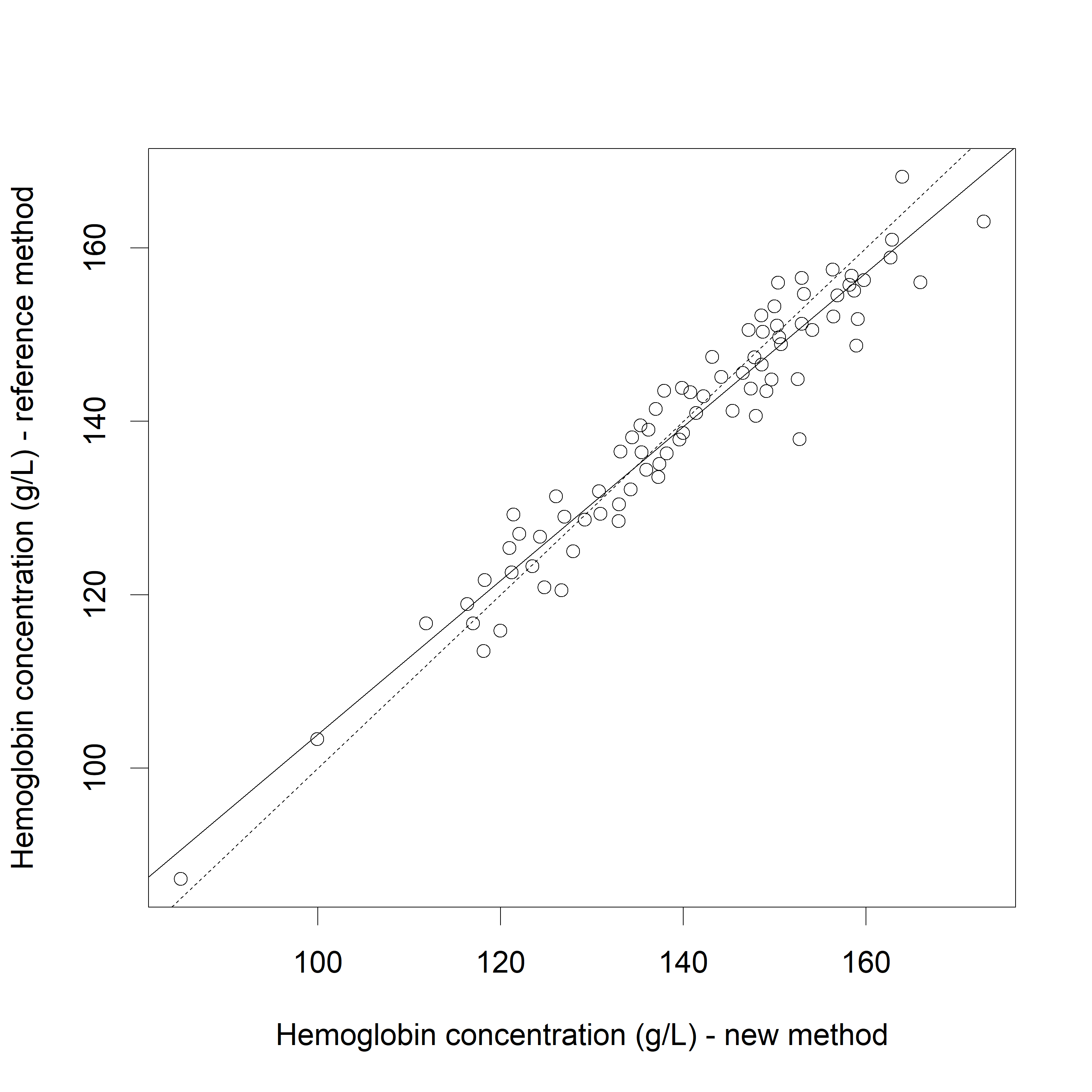
If both measurement methods would exactly correspond, the intercept would be zero and the slope would be one (=“identity line”, dotted line). Now, let's calculated the confidence interval for this linear regression.
CI_ex <- predict(fit.lm, interval="confidence")
colnames(CI_ex)<- c("fit_CI", "lwr_CI", "upr_CI")
And the prediction interval:
PI_ex <- predict(fit.lm, interval="prediction")
## Warning in predict.lm(fit.lm, interval = "prediction"): predictions on current data refer to _future_ responses
colnames(PI_ex)<- c("fit_PI", "lwr_PI", "upr_PI")
We can combine those results in one data frame and plot both the confidence interval and the prediction interval.
Hb_results<-cbind(Hb, CI_ex, PI_ex)
kable(head(round(Hb_results),1))
| New | Reference | fit_CI | lwr_CI | upr_CI | fit_PI | lwr_PI | upr_PI |
|---|---|---|---|---|---|---|---|
| 85 | 87 | 91 | 87 | 94 | 91 | 82 | 99 |
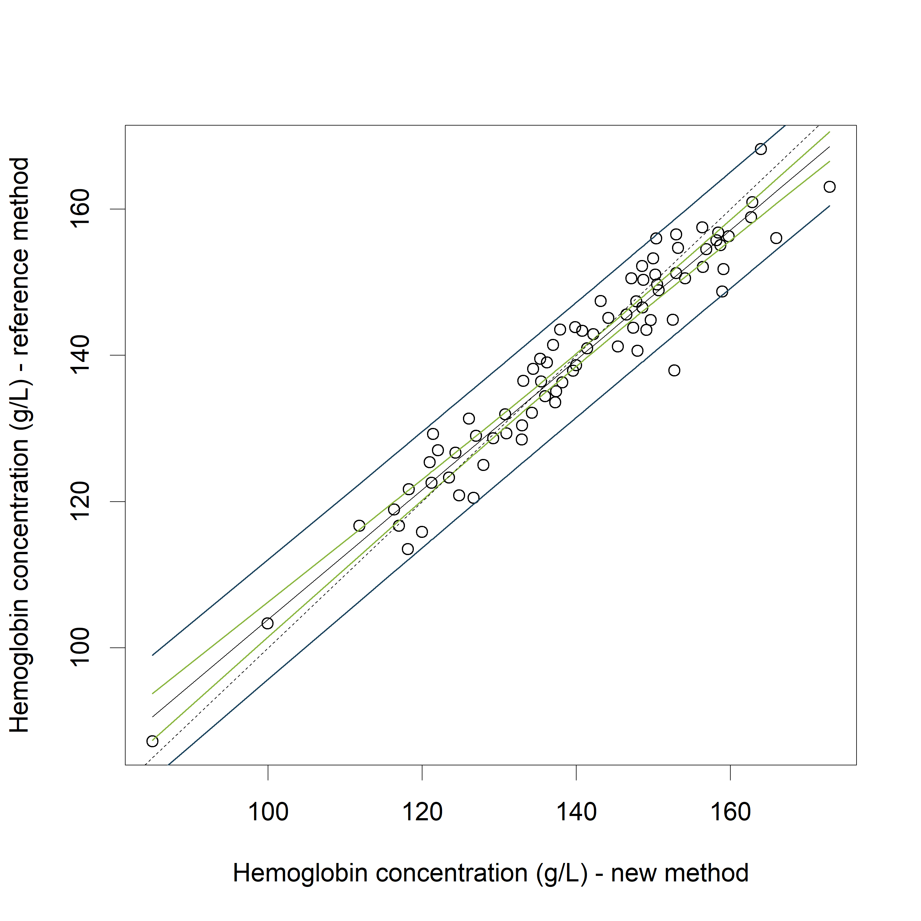
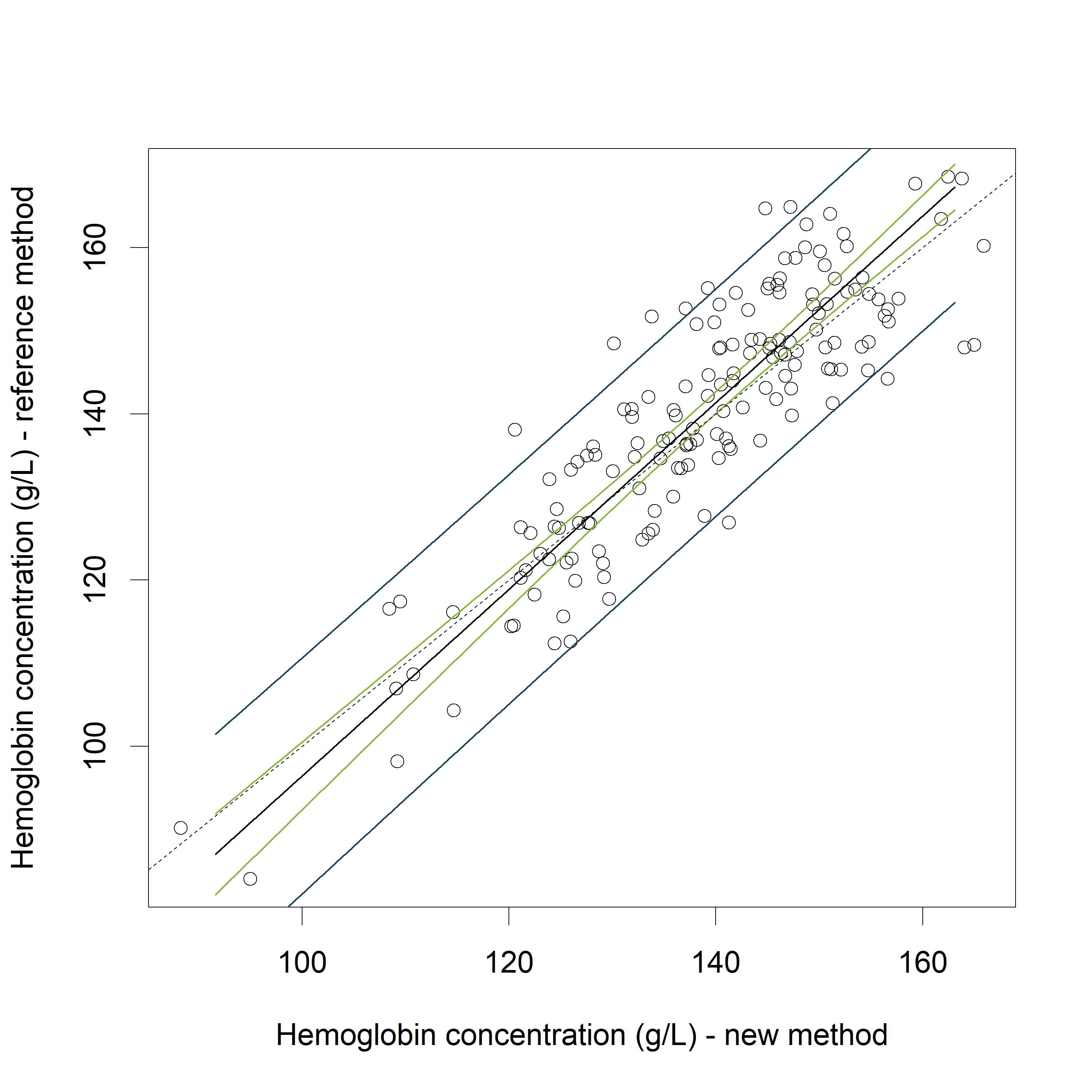
Visualizing the CI (in green) and the PI (in blue):
plot(Hb$New, Hb$Reference,
     xlab="Hemoglobin concentration (g/L) - new method",
     ylab="Hemoglobin concentration (g/L) - reference method")
Hb_results_s <- Hb_results[order(Hb_results$New),]
lines (x=Hb_results_s$New, y=Hb_results_s$fit_CI)
lines (x=Hb_results_s$New, y=Hb_results_s$lwr_CI,
       col="#8AB63F", lwd=1.2)
lines (x=Hb_results_s$New, y=Hb_results_s$upr_CI,
       col="#8AB63F", lwd=1.2)
lines (x=Hb_results_s$New, y=Hb_results_s$lwr_PI,
       col="#1A425C", lwd=1.2)
lines (x=Hb_results_s$New, y=Hb_results_s$upr_PI,
       col="#1A425C", lwd=1.2)
abline (a=0, b=1, lty=2)
Gives this plot:
In (Bland, Altman 2003) it is proposed to calculate the average width of this prediction interval, and see whether this is acceptable. Another approach is to compare the calculated PI with an “acceptance interval”. If the PI is inside the acceptance interval for the measurement range of interest (see Francq, 2016).
In the above example, both methods do have the same measurement scale (g/L), but the linear regression with prediction interval is particularly useful when the two methods of measurement have different units.
However, the method has some disadvantages:
- Predictions intervals are very sensitive to deviations from the normal distribution.
- In “standard” linear regression (or Ordinary Least Squares (OLS) regression),the presence of measurement error is allowed for the Y-variable (here, the reference method) but not for the X-variable (the new method). The absence of errors on the x-axis is one of the assumptions. Since we can expect some measurement error for the new method, this assumption is violated here.
Taking into account errors on both axes
In contrast to Ordinary Least Square (OLS) regression, Bivariate Least Square (BLS) regression takes into account the measurement errors of both methods (the New method and the Reference method). Interestingly, prediction intervals calculated with BLS are not affected when the axes are switched (del Rio, 2001).
In 2017, a new R-package BivRegBLS was released. It offers several methods to assess the agreement in method comparison studies, including Bivariate Least Square (BLS) regression.
If the data are unreplicated but the variance of the measurement error of the methods is known, The BLS() and XY.plot() functions can be used to fit a bivariate Least Square regression line and corresponding confidence and prediction intervals.
library (BivRegBLS)
Hb.BLS = BLS (data = Hb, xcol = c("New"),
ycol = c("Reference"), var.y=10, var.x=8, conf.level=0.95)
XY.plot (Hb.BLS,
         yname = "Hemoglobin concentration (g/L) - reference method",
         xname = "Hemoglobin concentration (g/L) - new method",
         graph.int = c("CI","PI"))
Gives this plot:
Now we would like to decide whether the new method can replace the reference method. We allow the methods to differ up to a given threshold, which is not clinically relevant. Based on this threshold an “acceptance interval” is created. Suppose that differences up to 10 g/L (=threshold) are not clinically relevant, then the acceptance interval can be defined as Y=X±??, with ?? equal to 10. If the PI is inside the acceptance interval for the measurement range of interest then the two measurement methods can be considered to be interchangeable (see Francq, 2016).
The accept.int argument of the XY.plot() function allows for a visualization of this acceptance interval
XY.plot (Hb.BLS,
         yname = "Hemoglobin concentration (g/L) - reference method",
         xname = "Hemoglobin concentration (g/L) - new method",
         graph.int = c("CI","PI"),
         accept.int=10)
Givbes this plot:
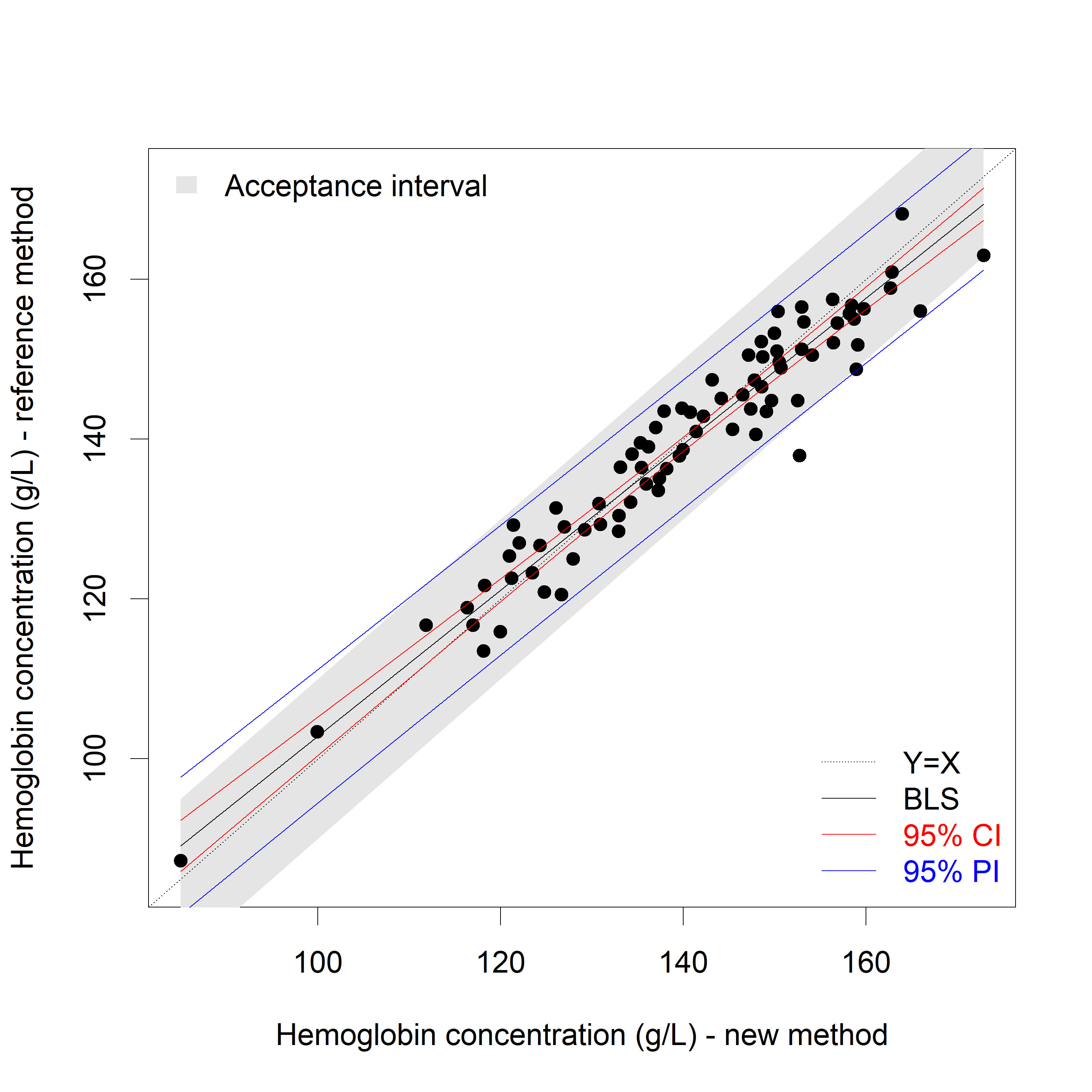
For the measurement region 120g/L to 150 g/L, we can conclude that the difference between both methods is acceptable. If the measurement regions below 120g/l and above 150g/L are important, the new method cannot replace the reference method.
Regression on replicated data
In method comparison studies, it is advised to create replicates (2 or more measurements of the same sample with the same method). An example of such a dataset:
Hb_rep <- read.table("http://rforbiostatistics.colmanstatistics.be/wp-content/uploads/2018/06/Hb_rep.txt",
                 header = TRUE)
kable(head(round(Hb_rep),1))
| New_rep1 | New_rep2 | Ref_rep1 | Ref_rep2 |
|---|---|---|---|
| 88 | 95 | 90 | 84 |
When replicates are available, the variance of the measurement errors are calculated for both the new and the reference method and used to estimate the prediction interval. Again, the BLS() function and the XY.plot() function are used to estimate and plot the BLS regression line, the corresponding CI and PI.
Hb_rep.BLS = BLS (data = Hb_rep,
                  xcol = c("New_rep1", "New_rep2"),
                  ycol = c("Ref_rep1", "Ref_rep2"),
                  qx = 1, qy = 1,
                  conf.level=0.95, pred.level=0.95)

XY.plot (Hb_rep.BLS,
         yname = "Hemoglobin concentration (g/L) - reference method",
         xname = "Hemoglobin concentration (g/L) - new method",
         graph.int = c("CI","PI"),
         accept.int=10)
Giuves this plot:
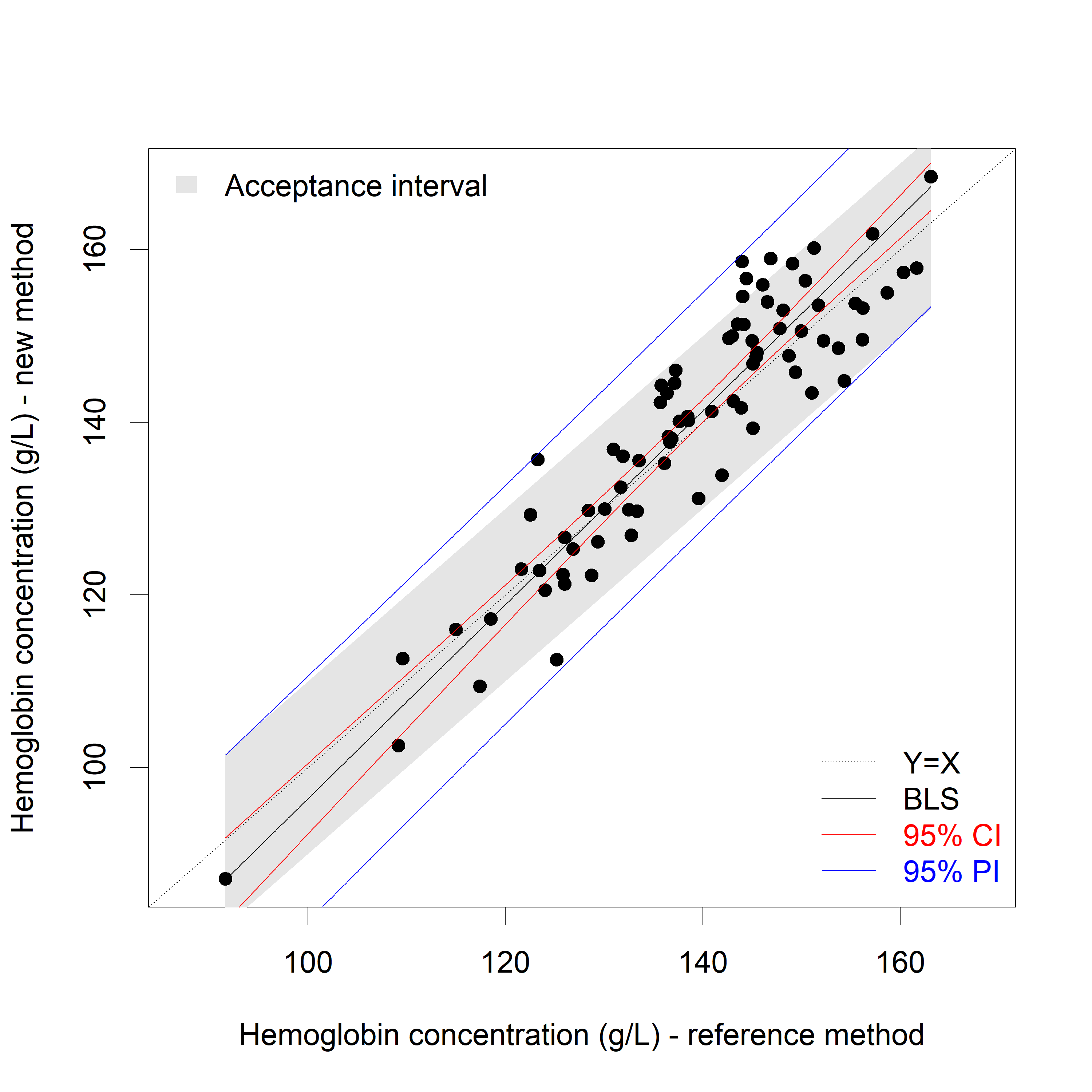
It is clear that the prediction interval is not inside the acceptance interval here. The new method cannot replace the reference method. A possible solution is to average the repeats. The BivRegBLS package can create prediction intervals for the mean of (2 or more) future values, too! More information in this presentation (presented at useR!2017).
In the plot above, averages of the two replicates are calculated and plotted. I'd like to see the individual measurements:
plot(x=c(Hb_rep$New_rep1, Hb_rep$New_rep2),
     y=c(Hb_rep$Ref_rep1, Hb_rep$Ref_rep2),
     xlab="Hemoglobin concentration (g/L) - new method",
     ylab="Hemoglobin concentration (g/L) - reference method")
lines (x=as.numeric(Hb_rep.BLS$Pred.BLS[,1]),
       y=as.numeric(Hb_rep.BLS$Pred.BLS[,2]),
       lwd=2)
lines (x=as.numeric(Hb_rep.BLS$Pred.BLS[,1]),
       y=as.numeric(Hb_rep.BLS$Pred.BLS[,3]),
       col="#8AB63F", lwd=2)
lines (x=as.numeric(Hb_rep.BLS$Pred.BLS[,1]),
       y=as.numeric(Hb_rep.BLS$Pred.BLS[,4]),
       col="#8AB63F", lwd=2)
lines (x=as.numeric(Hb_rep.BLS$Pred.BLS[,1]),
       y=as.numeric(Hb_rep.BLS$Pred.BLS[,5]),
       col="#1A425C", lwd=2)
lines (x=as.numeric(Hb_rep.BLS$Pred.BLS[,1]),
       y=as.numeric(Hb_rep.BLS$Pred.BLS[,6]),
       col="#1A425C", lwd=2)
abline (a=0, b=1, lty=2)
Gives this plot:
Remarks
- Although not appropriate in the context of method comparison studies, Pearson correlation is still frequently used. See Bland & Altman (2003) for an explanation on why correlations are not adviced.
- Methods presented in this blogpost are not applicable to time-series
References
- Confidence interval and prediction interval: Applied Linear Statistical Models, 2005, Michael Kutner, Christopher Nachtsheim, John Neter, William Li. Section 2.5
- Prediction interval for method comparison:
Bland, J. M. and Altman, D. G. (2003), Applying the right statistics: analyses of measurement studies. Ultrasound Obstet Gynecol, 22: 85-93. doi:10.1002/uog.12
section: “Appropriate use of regression”. - Francq, B. G., and Govaerts, B. (2016) How to regress and predict in a Bland-Altman plot? Review and contribution based on tolerance intervals and correlated-errors-in-variables models. Statist. Med., 35: 2328-2358. doi: 10.1002/sim.6872.
- del Río, F. J., Riu, J. and Rius, F. X. (2001), Prediction intervals in linear regression taking into account errors on both axes. J. Chemometrics, 15: 773-788. doi:10.1002/cem.663
- Example of a method comparison study: H. Tian, M. Li, Y. Wang, D. Sheng, J. Liu, and L. Zhang, “Optical wavelength selection for portable hemoglobin determination by near-infrared spectroscopy method,” Infrared Phys. Techn 86, 98-102 (2017). doi.org/10.1016/j.infrared.2017.09.004.
- the
predict()andlm()functions of R: Chambers, J. M. and Hastie, T. J. (1992) Statistical Models in S. Wadsworth & Brooks/Cole.
1) How did you decide var.y and var.x value i.e. 10 and 8 respectively? what criteria did you follow, then I will act accordingly as per my data
“Hb.BLS = BLS (data = Hb, xcol = c(“New”),
ycol = c(“Reference”), var.y=10, var.x=8, conf.level=0.95)”
2) How to find 95% PI value to see that it falls under acceptable range or not?
3) how to find the value of 95%CI?
I wonder if you are aware of methods to obtain PI for more obscure models, e.g., random forests.
You write:
> The whole blood hemogblobin concentration of a new sample will be between 113g/L and 167g/L with a probability of 95%.”
Isn’t that the confidence interval fallacy all over again? You can only say that the concentration in a large number of replications would be so the true value of the individual is contained on average 95% of the times? (you write this correctly above) However, the exact value of the new sample will either be inside or outside the interval, so the above quoted statement is IMHO not correct even if you know the mean and sd of the underlying Gaussian (and the covariates being identical).
I don’t think it’s a fallacy.
Indeed, a confidence interval makes a statement about a fixed true parameter which is either in it or not. In contrast, a prediction interval makes a statement about a future value. At the moment of the interval construction, the future observation is not realized yet and does have a probability distribution. If we assume a normal probability distribution with known sd and mean, we can talk about probabilities.
This part of my blogpost was based on Kutner (2005), which is considered as a reference for statistical modeling. In the paragraph: “prediction interval when parameters are known” (section 2.5) they talk about “probability” when interpreting the prediction interval.
Applied Linear Statistical
Models, 2005, Michael Kutner, Christopher Nachtsheim, John Neter, William Li.
Maybe I need to think about this a bit longer. Thanks for the reference!
Great article! In your Remarks, you write that “Methods presented in this blogpost are not applicable to time-series”. Can you tell me a method and R function that CAN be used with time-series data? Thanks in advance.
Maybe I’m missing something. You’re creating a CI for a single value (the mean) and a PI for many possible new values. Why wouldn’t the PI be much wider?
Both the CI and the PI are intervals for single values. The CI makes a statement about the mean, the PI allows for a statement about a future observation.
It is indeed logic that the PI is wider than the CI. For a CI, the estimated mean is the only source of uncertainty. The PI has two sources of uncertainty: the estimated mean
(just like the confidence interval) and the random variance of new
observations.
I hope this answers your question?