The AUC* or concordance statistic c is the most commonly used measure for diagnostic accuracy of quantitative tests. It is a discrimination measure which tells us how well we can classify patients in two groups: those with and those without the outcome of interest. Since the measure is based on ranks, it is not sensitive to systematic errors in the calibration of the quantitative tests.
It is very well known that a test with no better accuracy than chance has an AUC of 0.5, and a test with perfect accuracy has an AUC of 1. But what is the exact interpretation of an AUC of for example 0.88? Did you know that the AUC is completely equivalent with the Mann-Whitney U test statistic?
*AUC: the Area Under the Curve (AUC) of the Receiver Operating Characteristic (ROC) curve.
Example
Around 27% of the patients with liver cirrhosis will develop Hepatocellular Carcinoma (HCC) within 5 years of follow-up. With our biomarker “peakA” we would like to predict which patients will develop HCC, and which won't. We will assess the diagnostic accuracy of biomarker “peakA” using the AUC.
To keep things visually clear, we suppose we have a dataset of only 12 patients. Four patients did develop HCC (the “cases”) and 8 didn't (the “controls”). (fictive data)
| HCC | Biomarker_value |
|---|---|
| 0 | 1.063 |
| 1 | 1.132 |
| 1 | 1.122 |
| 1 | 1.058 |
| 0 | 0.988 |
| 0 | 1.182 |
| 0 | 1.037 |
| 0 | 1.052 |
| 0 | 0.925 |
| 1 | 1.232 |
| 0 | 0.911 |
| 0 | 0.967 |
The AUC can be defined as “The probability that a randomly selected case will have a higher test result than a randomly selected control”. Let's use this definition to calculate and visualize the estimated AUC.
In the figure below, the cases are presented on the left and the controls on the right.
Since we have only 12 patients, we can easily visualize all 32 possible combinations of one case and one control. (Rcode below)
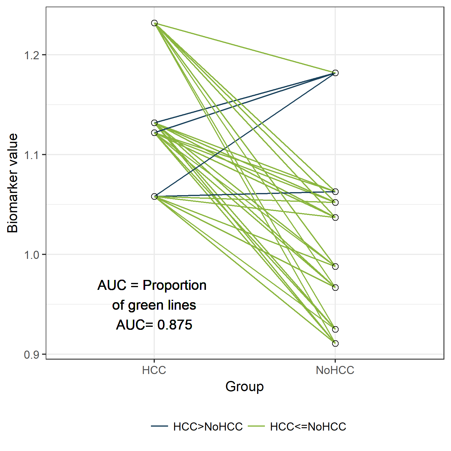
Those 32 different pairs of cases and controls are represented by lines on the plot above. 28 of them are indicated in green. For those pairs, the value for “PeakA” is higher for the case compared to the control. The remaining 4 pairs are indicated in blue. The AUC can be estimated as the proportion of pairs for which the case has a higher value compared to the control. Thus, the estimated AUC is the proportion of green lines or 28/32 = 0.875. This visualization might help to understand the concept of an AUC. Besides this educational purpose, this type of plot is not very useful. Hopefully, the sample size of your study is much larger than 12 patients. And in that situation, this type of plot will become very crowded.
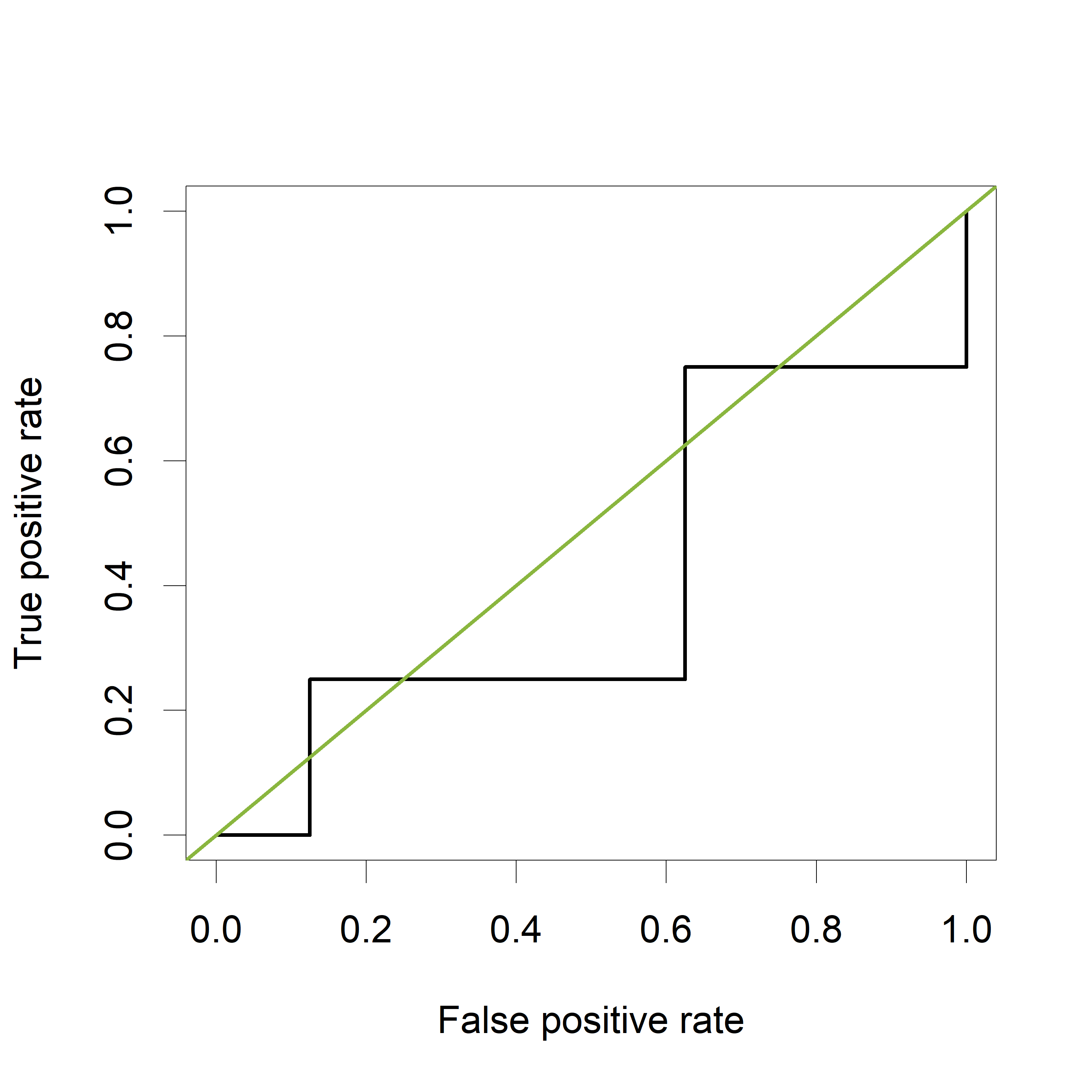
The ROC curve
Now let's verify that the AUC is indeed equal to 0.875 in a classical way, by plotting a ROC curve and calculating the estimated AUC using the ROCR package.
The ROC curve plots the False Positive Rate (FPR) on the X-axis and the True Postive Rate (TPR) on the Y-axis for all possible thresholds (or cutoff values).
- True Positive Rate (TPR) or sensitivity: the proportion of actual positives that are correctly identified as such.
- True Negative Rate (TNR) or specificiy: the proportion of actual negatives that are correctly identified as such.
- False Positive Rate (FPR) or 1-specificity: the proportion of actual negatives that are wrongly identified as positives.
library(ROCR)
pred <- prediction(df$Biomarker_value, df$HCC )
perf <- performance(pred,"tpr","fpr")
plot(perf,col="black")
abline(a=0, b=1, col="#8AB63F")
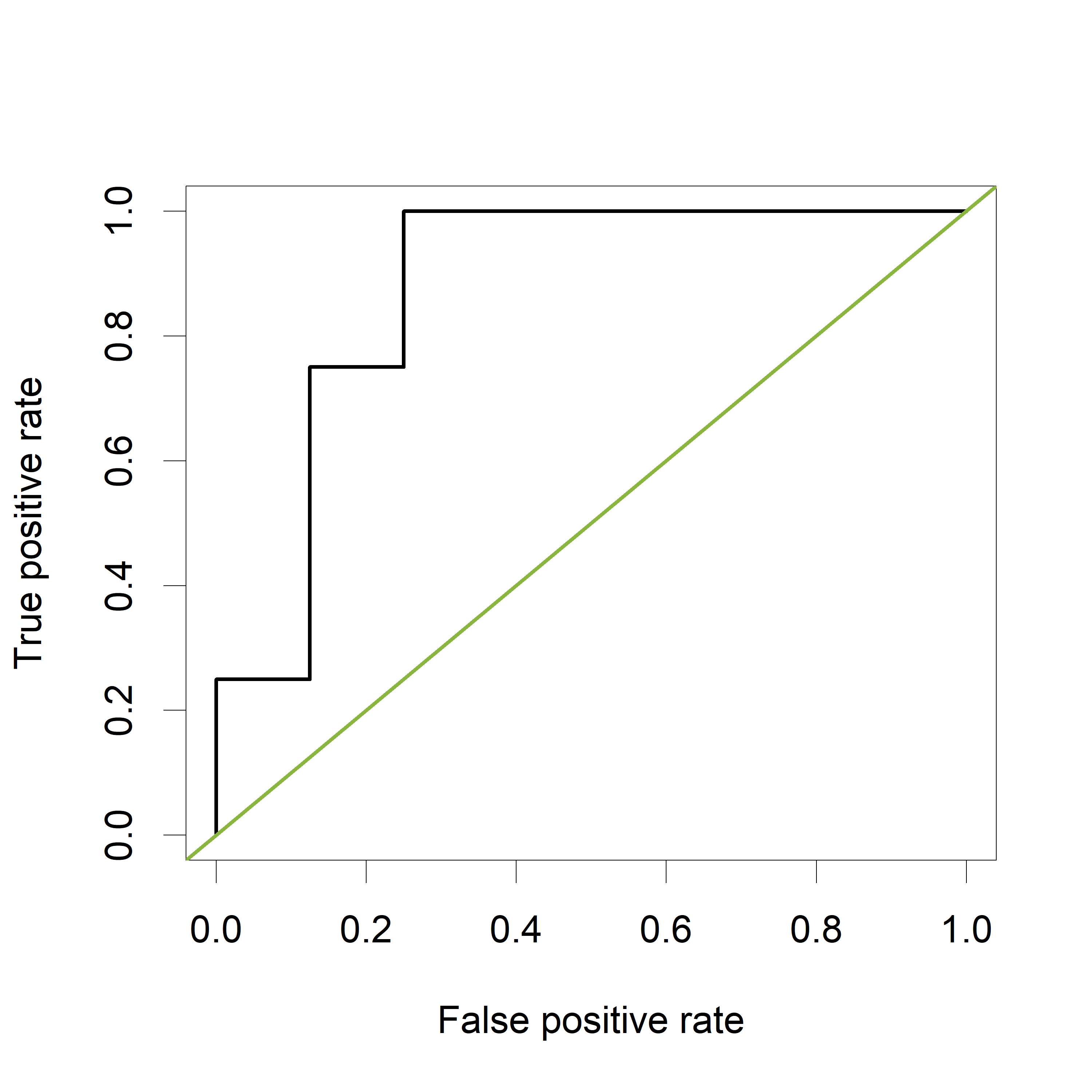
The green line represents a completely uninformative test, which corresponds to an AUC of 0.5. A curve pulled close to the upper left corner indicates (an AUC close to 1 and thus) a better performing test. The ROC curve does not show the cutoff values
The ROCR package also allows to calculate the estimated AUC:
auc<- performance( pred,  c("auc"))
unlist(slot(auc , "y.values"))
[1] 0.875
The estimated AUC based on this ROC curve is indeed equal to 0.875, the proportion of pairs for which the value of “PeakA” is larger for HCC compared to NoHCC.
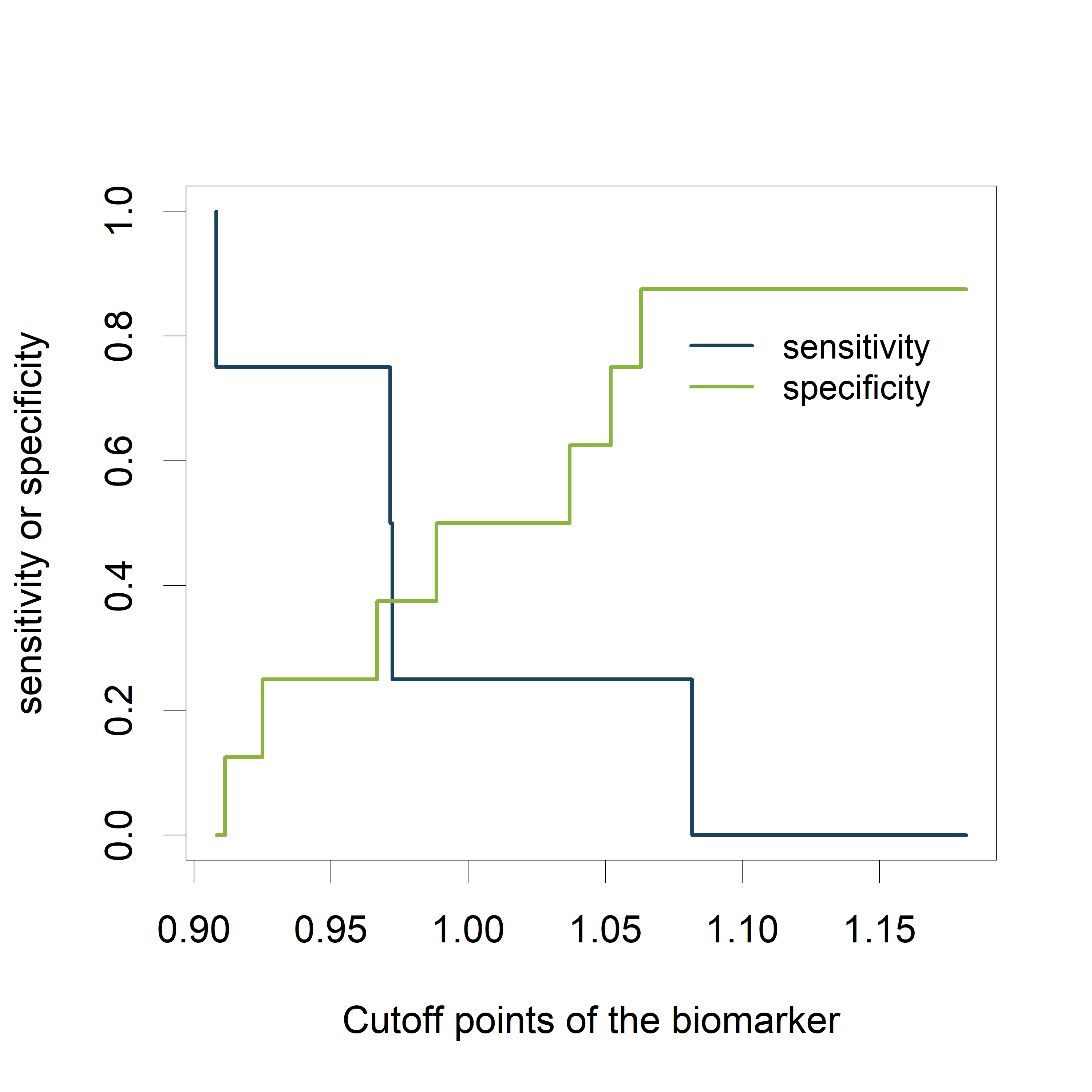
Relation to cutoff points of the biomarker
Visualizing the sensitivity and specificity as a function of the cutoff points of the biomarker results in a plot that is at least as informative as a ROC curve and (in my opinion) easier to interpret. The plot can be created using the ROCR package.
library(ROCR)
testy <- performance(pred,"tpr","fpr")
Using the str() function, we see that the following slots are part of the testy object:
- alpha.values: Cutoff
- x.values: Specificity or True Negative Rate
- y.values: Sensitivity or True Positive Rate
plot([email protected][[1]], [email protected][[1]], type='n',
     xlab='Cutoff points of the biomarker',
     ylab='sensitivity or specificity')
lines([email protected][[1]], [email protected][[1]],
      type='s', col="#1A425C", lwd=2)
lines([email protected][[1]], [email protected][[1]],
      type='s', col="#8AB63F", lwd=2)
legend(1.11,.85, c('sensitivity', 'specificity'),
       lty=c(1,1), col=c("#1A425C", "#8AB63F"), cex=.9, bty='n')
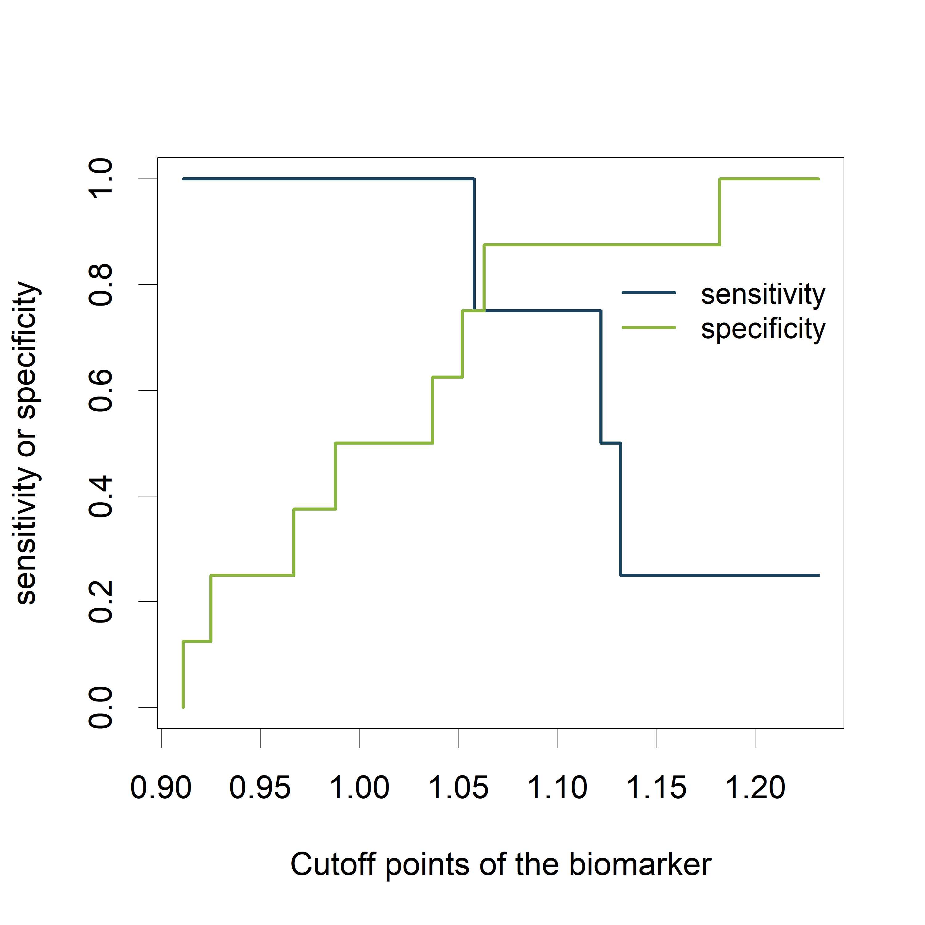
The plot shows how the sensitivity increases as the specificity decreases and vice versa, in relation to the possible cutoff points of the biomarker.
Mann-Whitney U test statistic
The Mann-Whitney U test statistic (or Wilcoxon or Kruskall-Wallis test statistic) is equivalent to the AUC (Mason, 2002).
The AUC can be calculated from the output of the wilcox.test() function:
wt <-wilcox.test(data=df, df$Biomarker_value ~ df$HCC)
1 - wt$statistic/(sum(df$HCC==1)*sum(df$HCC==0))
    W
0.875
The p-value of the Mann-Whitney U test can thus safely be used to test whether the AUC differs significantly from 0.5 (AUC of an uninformative test).
wt <-wilcox.test(data=df, df$Biomarker_value ~ df$HCC)
wt$p.value
[1] 0.04848485
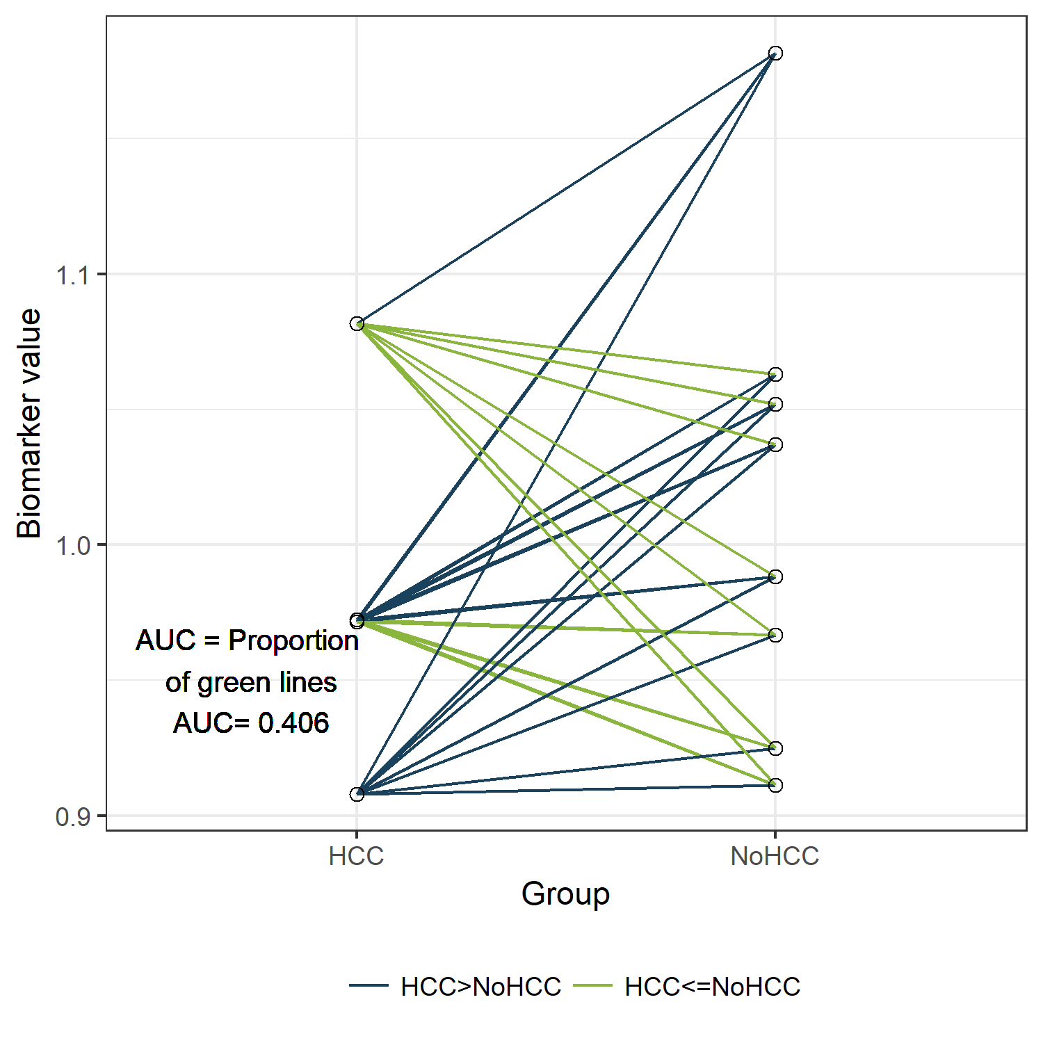
Simulation: the completely uninformative test.
Now, let's have a look how our plots look like if our biomarker is not informative at all.
Data creation:
#simulation of the data
set.seed(12345)
HCC <- rbinom (n=12, size=1, prob=0.27)
Biomarker_value <- rnorm (12,mean=1,sd=0.1) + HCC*0
# replacing the zero by a value would make the test informative
df<-data.frame (HCC, Biomarker_value)
library(knitr)
kable(head(df))
| HCC | Biomarker_value |
|---|---|
| 0 | 1.0630099 |
| 1 | 0.9723816 |
| 1 | 0.9715840 |
| 1 | 0.9080678 |
| 0 | 0.9883752 |
| 0 | 1.1817312 |
The function expand.grid() is used to create all possible combinations of one case and one control:
newdf<- expand.grid (Biomarker_value [df$HCC==0],Biomarker_value [df$HCC==1])
colnames(newdf)<- c("NoHCC", "HCC")
newdf$Pair <- seq(1,dim(newdf)[1])
For each pair the values of the biomarker are compared between case and control:
newdf$Comparison  <- 1*(newdf$HCC>newdf$NoHCC)
mean(newdf$Comparison)
[1] 0.40625
newdf$Comparison<-factor(newdf$Comparison, labels=c("HCC>NoHCC","HCC<=NoHCC"))
kable (head(newdf,4))
| NoHCC | HCC | Pair | Comparison |
|---|---|---|---|
| 1.0630099 | 0.9723816 | 1 | HCC>NoHCC |
| 0.9883752 | 0.9723816 | 2 | HCC>NoHCC |
| 1.1817312 | 0.9723816 | 3 | HCC>NoHCC |
| 1.0370628 | 0.9723816 | 4 | HCC>NoHCC |
library(data.table)
longdf = melt(newdf, id.vars = c("Pair", "Comparison"),
              variable.name = "Group",
                measure.vars = c("HCC", "NoHCC"))

lab<-paste("AUC = Proportion \n of green lines \nAUC=", round(table(newdf$Comparison)[2]/sum(table(newdf$Comparison)),3))
library(ggplot2)
fav.col=c("#1A425C", "#8AB63F")
ggplot(longdf, aes(x=Group, y=value))+geom_line(aes(group=Pair, col=Comparison)) +
        scale_color_manual(values=fav.col)+theme_bw() +
        ylab("Biomarker value") + geom_text(x=0.75,y=0.95,label=lab) +
        geom_point(shape=21, size=2) +
        theme(legend.title=element_blank(), legend.position="bottom")
library(ROCR)
pred <- prediction(df$Biomarker_value, df$HCC )
perf <- performance(pred,"tpr","fpr")
plot(perf,col="black")
abline(a=0, b=1, col="#8AB63F")
Calculating the AUC:
auc<- performance( pred,  c("auc"))
unlist(slot(auc , "y.values"))
[1] 0.40625
Sensitivity and specificity as a function of the cutoff points of the biomarker:
library(ROCR)
testy <- performance(pred,"tpr","fpr")
plot([email protected][[1]], [email protected][[1]], type='n', xlab='Cutoff points of the biomarker', ylab='sensitivity or specificity')
lines([email protected][[1]], [email protected][[1]], type='s', col="#1A425C")
lines([email protected][[1]], [email protected][[1]], type='s', col="#8AB63F")
legend(1.07,.85, c('sensitivity', 'specificity'), lty=c(1,1), col=c("#1A425C", "#8AB63F"), cex=.9, bty='n')
Equivalence with the Mann-Whitney U test:
wt <-wilcox.test(data=df, df$Biomarker_value ~ df$HCC)
1 - wt$statistic/(sum(df$HCC==1)*sum(df$HCC==0))
      W
0.40625
wt$p.value
[1] 0.6828283
General remarks on the AUC
Often, a combination of new markers is selected from a large set. This can result in overoptimistic expectations of the marker's performance. Any performance measure should be estimated with correction for optimism, for example by applying cross-validation or bootstrap resampling. However, validation in fully independent, external data is the best way to validate a new marker.
When we want to assess the incremental value of an additional marker (e.g. molecular, genetic, imaging) to an existing model, the increase of the AUC can be reported.
References
- Mason, S. J. and Graham, N. E. (2002), Areas beneath the relative operating characteristics (ROC) and relative operating levels (ROL) curves: Statistical significance and interpretation. Q.J.R. Meteorol. Soc., 128: 2145-2166.
- Steyerberg, Ewout W. et al. “Assessing the Performance of Prediction Models: A Framework for Some Traditional and Novel Measures.” Epidemiology (Cambridge, Mass.) 21.1 (2010): 128-138.
- Tutorial: Lecture 19 (lab 9)
- Xavier Verhelst, Dieter Vanderschaeghe, Laurent Castéra, Tom Raes, Anja Geerts, Claire Francoz, Roos Colman, François Durand, Nico Callewaert, and Hans Van Vlierberghe (2017). A Glycomics-Based Test Predicts the Development of Hepatocellular Carcinoma in Cirrhosis. Clin Cancer Res (23) (11) 2750-2758
Very good description! The ROCR package, the connection to the Mann-Whitney U test -> very nice write-up!