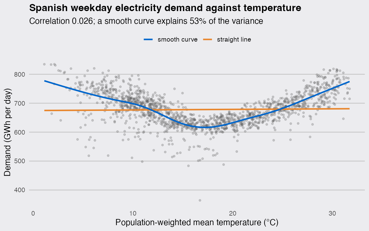
I wanted to know how much of a country’s daily electricity demand is just the weather, so I pulled five and a half years of Spanish grid data, lined it up against temperature, and ran cor(). It came back 0.026, with a p-value of 0.33. Read literally, that says temperature has nothing to do with how much electricity Spain uses, which cannot be right. The same two columns support a smooth curve that explains 53% of the variance in daily demand. Here is what the correlation was hiding, and the R that gets it back.
The data
Both sources are keyless. Daily demand for the Spanish mainland grid comes from Red Eléctrica’s apidatos service, one call per year, and daily mean temperature from the Open-Meteo archive API, which takes several locations in one request. One city is a poor stand-in for a national grid, so I average the five largest mainland cities weighted by population.
library(jsonlite)
library(dplyr)
library(purrr)
library(lubridate)

get_demand <- function(y) {
  url <- sprintf(paste0("https://apidatos.ree.es/en/datos/demanda/evolucion",
                        "?start_date=%d-01-01T00:00&end_date=%d-12-31T23:59&time_trunc=day",
                        "&geo_trunc=electric_system&geo_limit=peninsular&geo_ids=8741"), y, y)
  values <- fromJSON(url)$included$attributes$values[[1]]
  tibble(date = as.Date(substr(values$datetime, 1, 10)), gwh = values$value / 1000)
}

cities <- tibble(lat = c(40.4168, 41.3874, 39.4699, 37.3891, 41.6488),
                 lon = c(-3.7038,  2.1686, -0.3763, -5.9845, -0.8891),
                 pop = c(3.28,     1.62,    0.79,    0.68,    0.67))

weather <- fromJSON(sprintf(paste0("https://archive-api.open-meteo.com/v1/archive?latitude=%s&longitude=%s",
                                   "&start_date=2021-01-01&end_date=2026-08-31",
                                   "&daily=temperature_2m_mean&timezone=Europe%%2FMadrid"),
                            paste(cities$lat, collapse = ","),
                            paste(cities$lon, collapse = ",")), simplifyVector = FALSE)

temp <- map2_dfr(weather, cities$pop, \(x, pop) {
  tibble(pop = pop, date = as.Date(unlist(x$daily$time)),
         t = as.numeric(unlist(x$daily$temperature_2m_mean)))
}) |>
  group_by(date) |>
  summarise(temp = weighted.mean(t, pop), .groups = "drop")

dat <- map_dfr(2021:2026, get_demand) |>
  filter(date <= as.Date("2026-08-31")) |>
  inner_join(temp, by = "date") |>
  filter(wday(date, week_start = 1) <= 5)

nrow(dat)
## [1] 1477
That leaves 1,477 weekdays from January 2021 to August 2026. I drop weekends because the working week is a bigger lever than the weather: weekdays average 678 GWh against 587 GWh at weekends, a 91 GWh gap that would smear the temperature signal across the plot. wday(date, week_start = 1) <= 5 is the locale-safe way to do it, because weekdays(date) %in% c("Saturday", "Sunday") matches nothing on a machine whose locale is not English.
Why is the correlation near zero when temperature obviously matters?
Because cor() measures straight-line association, and this relationship is a V. Cold days push demand up through heating, hot days push it up through cooling, and averaged over a year the two halves cancel almost exactly.
cor(dat$temp, dat$gwh)
## [1] 0.02559973
cor(dat$temp, dat$gwh, method = "spearman")
## [1] -0.04521095
summary(lm(gwh ~ temp, data = dat))$r.squared
## [1] 0.0006553461
The Pearson correlation is 0.026 (p = 0.33, not significant at any conventional level) and the linear fit explains 0.07% of the variance, with a slope of 0.2 GWh per degree. Switching to a rank correlation does not rescue it: Spearman is -0.045, no better and now negative, because rank correlation still only looks for a monotone trend. The demonstration fits on one line, no data needed: x <- seq(-1, 1, 0.01); cor(x, x^2) returns 1e-16, a correlation of zero for a perfect parabola.
library(ggplot2)
library(mgcv)

dsp_colors <- c("#0066CC", "#E8862D", "#159A6C", "#7D5BD6",
                "#D64580", "#2AA9B8", "#C9A227")
dsp_theme <- theme_minimal(base_size = 13) +
  theme(plot.background    = element_rect(fill = "#ECECEF", color = NA),
        panel.background   = element_rect(fill = "#ECECEF", color = NA),
        panel.grid.minor   = element_blank(),
        panel.grid.major.x = element_blank(),
        panel.grid.major.y = element_line(color = "grey78"),
        axis.ticks         = element_blank(),
        plot.title         = element_text(face = "bold"),
        strip.text         = element_text(face = "bold"))

ggplot(dat, aes(temp, gwh)) +
  geom_point(alpha = 0.25, size = 1.1, color = "grey35") +
  geom_smooth(aes(color = "straight line"), method = "lm",
              formula = y ~ x, se = FALSE, linewidth = 1.1) +
  geom_smooth(aes(color = "smooth curve"), method = "gam",
              formula = y ~ s(x, bs = "cs"), se = FALSE, linewidth = 1.1) +
  scale_color_manual(values = dsp_colors, name = NULL) +
  labs(title = "Spanish weekday electricity demand against temperature",
       subtitle = "Correlation 0.026; a smooth curve explains 53% of the variance",
       x = "Population-weighted mean temperature (°C)", y = "Demand (GWh per day)") +
  dsp_theme + theme(legend.position = "top")
How do I fit a curve instead of a straight line in R?
Use a generalised additive model: gam(y ~ s(x)) from mgcv, which chooses the amount of wiggle for you (by REML here) instead of making you guess a polynomial degree.
fit <- gam(gwh ~ s(temp, bs = "cs"), data = dat, method = "REML")
summary(fit)$dev.expl
## [1] 0.5317544
summary(fit)$edf
## [1] 7.363416
The same two columns now give 53.2% deviance explained on 7.4 effective degrees of freedom, against 0.07% for the line. The curve bottoms out at 17.2 °C and 616 GWh, and rises in both directions: 11.3 GWh for every degree below 17 °C, 11.0 GWh for every degree above it. In demand terms the extremes are interchangeable. Weekdays at or above 29 °C average 753 GWh and weekdays at or below 5 °C average 757 GWh, within 3 GWh of each other and about 22% above the 619 GWh of a mild 15 to 19 °C day.
The bs = "cs" basis is a shrinkage cubic spline: it can flatten a term to zero, so a genuinely absent relationship is not conjured into a wiggle. If you want a fit you can write out as a formula, lm(gwh ~ poly(temp, 2)) recovers 48% of the variance, most of the story for two coefficients. The low outliers on the plot are holidays: about ten Spanish national days a year sit inside the weekday set and behave like Sundays. Dropping the nine fixed-date ones lifts the explained deviance to 61% and leaves the floor where it was, so they scatter around the curve rather than cause it.
Does geom_smooth() fit a loess or a gam?
It depends on how many rows you hand it. With no method argument (the default is method = NULL, and "auto" is still accepted), ggplot2 4.0.3 fits loess below 1,000 observations and mgcv::gam with formula = y ~ s(x, bs = "cs") and method = "REML" at 1,000 or more.
p <- ggplot(dat, aes(temp, gwh)) + geom_point(alpha = 0.2) + geom_smooth()
p
## `geom_smooth()` using method = 'gam' and formula = 'y ~ s(x, bs = "cs")'
There are 1,477 rows in one group, so that is a gam. The help page says "observations", but the code counts the rows in the largest group rather than in the plot, and that is the part that catches people:
p + aes(color = factor(year(date)))
## `geom_smooth()` using method = 'loess' and formula = 'y ~ x'
That is the same 1,477 rows, but the largest group is now 262 days, so every one of the six lines is a loess fit with span = 0.75, and the message changes to say so. Adding a colour or a facet silently swaps the estimator under all your curves. On this data the two methods land close together, 9.5 GWh apart at their widest, about 1% of daily demand, but that is a property of a well-sampled V and not a promise. The message is the only notice you get, so read it, or write method out explicitly.
Putting the relationship back into one number
If you need a single correlation, correlate demand against distance from the floor rather than against temperature itself.
cor(abs(dat$temp - 17), dat$gwh)
## [1] 0.712305
ggplot(dat, aes(abs(temp - 17), gwh)) +
  geom_point(alpha = 0.25, size = 1.1, color = "grey35") +
  geom_smooth(method = "lm", formula = y ~ x, se = FALSE,
              color = dsp_colors[1], linewidth = 1.1) +
  labs(title = "The same data, measured as distance from 17 °C",
       subtitle = sprintf("Correlation %.2f, against %.3f for raw temperature",
                          cor(abs(dat$temp - 17), dat$gwh), r),
       x = "Degrees away from 17 °C", y = "Demand (GWh per day)") +
  dsp_theme
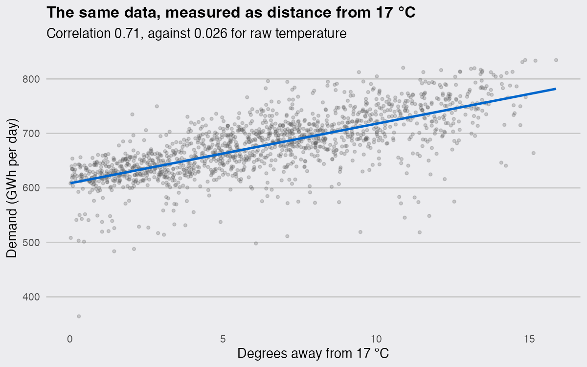
Folding the axis at 17 °C turns 0.026 into 0.71. That transformation is only available once you know where the floor is, which is the argument for plotting and fitting the curve first and reaching for a single number second. A correlation matrix over these two columns reports nothing twice, in Pearson and in Spearman, and it is not lying about the arithmetic. It is answering a question about straight lines that the data never posed.

