In comparison with other statistical software (e.g., SAS, STATA, and SPSS), R is the best for data visualization. Therefore, in all posts I have written for DataScience+ I take advantage of R and make plots using ggplot2 to visualize all the findings. For example, previously I plotted the percentiles of body mass index in the NHANES 2005-2014 and got exactly same results as the paper published in JAMA.
In this post, I will make a map of the prevalence of Alzheimer disease mortality by the state in the USA. The Centers for Disease Control and Prevention is providing the data for download, and they have created a beautiful map. I will try to reproduce the same results using several packages in R.
Libraries and Datasets
Load the library
library(tidyverse)
library(scales)
library(maps)
library(mapproj)
Download the .CSV file from the Centers for Disease Control and Prevention website (link is above)
dt_ad <- read.csv("~/Downloads/ALZHEIMERS2016.csv")
head(dt_ad)
  STATE RATE DEATHS                                              URL
1    AL 45.0  2,507       /nchs/pressroom/states/alabama/alabama.htm
2    AK 25.8    111         /nchs/pressroom/states/alaska/alaska.htm
3    AZ 35.8  3,082       /nchs/pressroom/states/arizona/arizona.htm
4    AR 41.3  1,475     /nchs/pressroom/states/arkansas/arkansas.htm
5    CA 36.1 15,570 /nchs/pressroom/states/california/california.htm
6    CO 34.7  1,835     /nchs/pressroom/states/colorado/colorado.htm
Load the map data of the U.S. states
dt_states = map_data("state") head(dt_states)long lat group order region subregion 1 -87.46201 30.38968 1 1 alabama2 -87.48493 30.37249 1 2 alabama 3 -87.52503 30.37249 1 3 alabama 4 -87.53076 30.33239 1 4 alabama 5 -87.57087 30.32665 1 5 alabama 6 -87.58806 30.32665 1 6 alabama
Now, I have two datasets, one has the rate of mortality from Alzheimer disease and the other have variables with the information to create maps. I need to merge both datasets together but I dont have a similar variable for merge. Therefore, I will create a new region variable form the URL variable in the first dataset and will use to merge with the second dataset. For this purpose, I will use the function separate and gsub. In the end I will merge with states dataset by region.
#get the state name from URL
dt_ad2 = dt_ad %>%
  separate(URL, c("a","b","c","d", "region"), sep="/") %>%
  select(RATE, region)
# removing white space for mergin purposes
dt_states2 = dt_states %>%
  mutate(region = gsub(" ","", region))
# merge
dt_final = left_join(dt_ad2, dt_states2)
Visualization
The dt_final dataset have all the variables I need to make the map.
ggplot(dt_final, aes(x = long, y = lat, group = group, fill = RATE)) +
  geom_polygon(color = "white") +
  scale_fill_gradient(
    name = "Death Rate",
    low = "#fbece3",
    high = "#6f1873",
    guide = "colorbar",
    na.value="#eeeeee",
    breaks = pretty_breaks(n = 5)) +
  labs(title="Mortality of Alzheimer Disease in the U.S.", x="", y="") +
  coord_map()
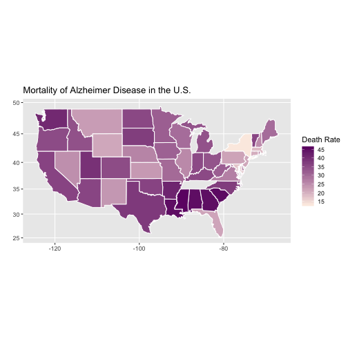
In this short post I showed how simple is to visualize the data in a map. I hope you like it and feel free to post a comment below or send me a message.


Would you make similar map for the Europe as well? I don know if possible though.
Hello. Nice tutorial! I really liked it and got into it. Here’s a few things I changed when working through the tutorial:
1. Used the fiftystater package to include Alaska and Hawaii.
2. Used stringr::str_extract(URL, “[a-z]+(?=\.htm)”) instead of separate() to get the state name out of the URL. That eliminated a warning that I got when using separate().
3. I cut the RATE into categories to make the legend match the legend displayed on the CDC web site. I cut it as follows:
dt_final$RATE2 <- cut(dt_final$RATE, breaks = c(13.0, 23.1, 29.6, 34.8, 37.8, 45.9),
labels = c("13.1 – 22.6",
"23.1 – 27.4",
"29.6 – 34.7",
"34.8 – 37.2",
"37.8 – 45.8"),
right = F)
4. Used scale_fill_brewer("Age-Adjusted Death Rates", type = "seq", palette = "PuRd") to get colors somewhat similar to the CDC legend. (Actually, I prefer these colors better!)
5. Finally I set coord_map("conic", lat0 = 30) to make the map "bend" like it does on the CDC site and added theme(panel.background = element_blank(), axis.text = element_blank(), axis.ticks = element_blank()) to drop the background, axis text, and axis ticks.
Just passing along in case anyone was interested! Thanks again!
Great you shared with us!
Great you shared with us!
TENNESSE AND ARKANSAS???
Arkansas is in the map, with 30-35 mortality rate. Tennessee probably dropped out during merging. You can find it in the map at the CDC website (link above).
Hi,I have a error when I am running this code “dt_states = map_data(“state”)
I made the same stepts like you and I don t understand why I have that error
Error: ggplot2 doesn’t know how to deal with data of class list
Hi, please see if you installed and loaded all necessary packages