Recently, I came across to an article published in JAMA entitled Trends in Obesity Among Adults in the United States 2005 to 2014. Flegal and co-authors investigated the trends of obesity in the US from 2005 to 2014. The authors are using the NHANES data and given that data is freely available, I thought to reproduce the tables and figures by using tidyverse.
Other packages that I will use in this post are ggsci and ggthemes to help me making the figures that have similar style with JAMA. The Hmisc package will be used to calculate the weighted estimates of NHANES. The package tidyverse is developed by Hadley Wickham and Hmisc by Prof. Frank E Harrell.
Libraries and Data
First I will load the necessary libraries
library(tidyverse)
library(RNHANES)
library(ggsci)
library(Hmisc)
library(ggthemes)
Second I will upload NHANES data from 2005 to 2014 and select the variables of interest. As you can see below I am loading different datasets for each cycle of NHANES.
d05 <- nhanes_load_data("BMX_D", "2005-2006") %>%
  transmute(SEQN=SEQN, BMXBMI=BMXBMI, wave=cycle) %>%
  left_join(nhanes_load_data("DEMO_D", "2005-2006"), by="SEQN") %>%
  select(SEQN, BMXBMI, RIDAGEYR, RIAGENDR, wave, RIDEXPRG, WTINT2YR)

d07 <- nhanes_load_data("BMX_E", "2007-2008") %>%
  transmute(SEQN=SEQN, BMXBMI=BMXBMI, wave=cycle) %>%
  left_join(nhanes_load_data("DEMO_E", "2007-2008"), by="SEQN") %>%
  select(SEQN, BMXBMI, RIDAGEYR, RIAGENDR, wave, RIDEXPRG, WTINT2YR)

d09 <- nhanes_load_data("BMX_F", "2009-2010") %>%
  transmute(SEQN=SEQN, BMXBMI=BMXBMI, wave=cycle) %>%
  left_join(nhanes_load_data("DEMO_F", "2009-2010"), by="SEQN") %>%
  select(SEQN, BMXBMI, RIDAGEYR, RIAGENDR, wave, RIDEXPRG, WTINT2YR)

d11 <- nhanes_load_data("BMX_G", "2011-2012") %>%
  transmute(SEQN=SEQN, BMXBMI=BMXBMI, wave=cycle) %>%
  left_join(nhanes_load_data("DEMO_G", "2011-2012"), by="SEQN") %>%
  select(SEQN, BMXBMI, RIDAGEYR, RIAGENDR, wave, RIDEXPRG, WTINT2YR)

d13 <- nhanes_load_data("BMX_H", "2013-2014") %>%
  transmute(SEQN=SEQN, BMXBMI=BMXBMI, wave=cycle) %>%
  left_join(nhanes_load_data("DEMO_H", "2013-2014"), by="SEQN") %>%
  select(SEQN, BMXBMI, RIDAGEYR, RIAGENDR, RIDRETH3, wave, RIDEXPRG, WTINT2YR)
The datasets include following variables:
-
SEQN: id
RIAGENDR: gender
RIDAGEYR: age in years
RIDRETH3: race/origin
BMXBMI: body mass index (BMI)
wave: cycle of survey
RIDEXPRG: pregnancy status
WTINT2YR: 2-year sample weights
I will combine all datasets in one by using the function bind_rows which adds new rows. In comparison to rbind, bind_rows allows to add new rows when columns names do not match. For example, in the d13 I am importing the race variable, whereas in the other dataset this variable is not imported.
dat = bind_rows(d05, d07, d09, d11, d13)
Now that I have all data in a single dataset I will do data wrangling which involves:
-
Exclude participants with no information on BMI
Exclude participants younger than 20 years
Exlude pregnant women
Create age-group variable
Recode gender gender and race variables
Data cleaning
clean_dat = dat %>%
  filter(!is.na(BMXBMI), RIDAGEYR >= 20, (RIDEXPRG != 1 | is.na(RIDEXPRG))) %>%
  mutate(
    age_group = case_when(
      RIDAGEYR >= 20 & RIDAGEYR < 40 ~ "20-39",
      RIDAGEYR >= 40 & RIDAGEYR < 60 ~ "40-59",
      RIDAGEYR >= 60 ~ "60+"
      ),
    age_group = as.factor(age_group),
    race = recode_factor(RIDRETH3,
                         `1` = "Hispanic",
                         `2` = "Hispanic",
                         `3` = "Non-Hispanic, White",
                         `4` = "Non-Hispanic, Black",
                         `6` = "Non-Hispanic, Asian",
                         `7` = "Others"),
    gender = recode_factor(RIAGENDR,
                           `1` = "Men",
                           `2` = "Women")
    )

clean_dat %>%
  slice(1:5)
# A tibble: 5 x 11
    SEQN BMXBMI RIDAGEYR RIAGENDR wave      RIDEXPRG WTINT2YR RIDRETH3 age_group race  gender

1 31131.   30.9      44.       2. 2005-2006       2.   26458.       NA 40-59     NA    Women
2 31132.   24.7      70.       1. 2005-2006      NA    32962.       NA 60+       NA    Men
3 31134.   30.6      73.       1. 2005-2006      NA    43719.       NA 60+       NA    Men
4 31144.   25.0      21.       1. 2005-2006      NA    46374.       NA 20-39     NA    Men
5 31149.   21.6      85.       2. 2005-2006      NA    23813.       NA 60+       NA    Women
Note in the filter code above I am adding a condition keep women who are not pregnant RIDEXPRG != 1 or they have missing data is.na(RIDEXPRG). The latter is important to include all men and women who do not apply this question and therefore is missing.
Results
Now that the data looks good I am ready to reproduce the first table in the paper. The first table is showing the Unweighted Sample Sizes for Adults 20 Years and Older by Sex, Age Group, and Race/Hispanic Origin: NHANES 2013-2014. So the author is interested only in 2013-2014 cycle; I will make sure to include only those participants as our current dataset clean_dat includes all the waves from 2005 to 2014.
clean_dat %>% filter(wave == "2013-2014") %>% group_by(age_group, gender) %>% tally() # A tibble: 6 x 3 # Groups: age_group [?] age_group gender n1 20-39 Men 909 2 20-39 Women 901 3 40-59 Men 897 4 40-59 Women 999 5 60+ Men 832 6 60+ Women 917
I got exactly the same results as it is in Table 1 in the paper.
I may continue to reproduce all other results, but since the code is same, I am just producing one more result from the first table.
clean_dat %>% group_by(age_group, race) %>% tally() # A tibble: 18 x 3 # Groups: age_group [?] age_group race n1 20-39 Hispanic 412 2 20-39 Non-Hispanic, White 734 3 20-39 Non-Hispanic, Black 362 4 20-39 Non-Hispanic, Asian 216 ... ...
If you want to make a table 1 for manuscript read the post Table 1 and the Characteristics of Study Population published at DataScience+
Visulalization
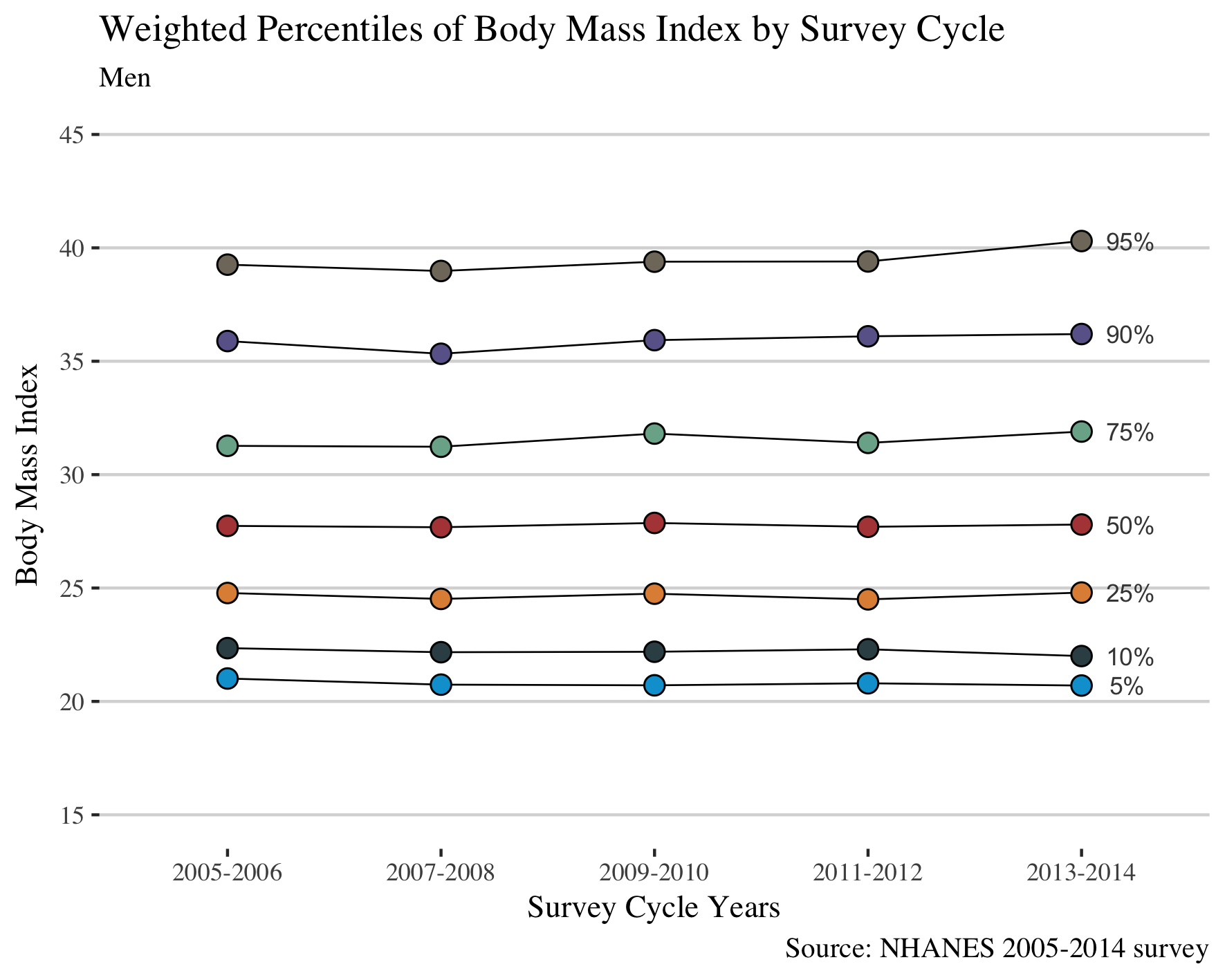
In this section, I will reproduce the figure (Selected Weighted Percentiles of Body Mass Index by Survey Cycle: NHANES 2005-2014) in a manuscript. This is a most critical step in this post as I have to calculate the weighted percentiles in men and women, to find their BMI value for each percentile, and to plot against the NHANES cycle. To make the dataset ready for plotting requires two functions summarise and gather from tidyverse and the function wtd.quantile from Hmisc package. In the plot, I will annotate the corresponding percentile number in the plot. I aim to reproduce exactly the same plot as it is in the paper published in JAMA.
men = clean_dat %>%
  filter(gender == "Men") %>%
  group_by(wave) %>%
  summarise(
    "5%" = wtd.quantile(BMXBMI, WTINT2YR, probs=c(.05)),
    "10%" = wtd.quantile(BMXBMI, WTINT2YR, probs=c(.1)),
    "25%" = wtd.quantile(BMXBMI, WTINT2YR, probs=c(.25)),
    "50%" = wtd.quantile(BMXBMI, WTINT2YR, probs=c(.5)),
    "75%" = wtd.quantile(BMXBMI, WTINT2YR, probs=c(.75)),
    "90%" = wtd.quantile(BMXBMI, WTINT2YR, probs=c(.90)),
    "95%" = wtd.quantile(BMXBMI, WTINT2YR, probs=c(.95))
    ) %>%
  gather("%", bmi, -wave)

men %>%
  slice(1:5)
# A tibble: 5 x 3
  wave      `%`     bmi

1 2005-2006 5%     21.0
2 2007-2008 5%     20.7
3 2009-2010 5%     20.7
4 2011-2012 5%     20.8
5 2013-2014 5%     20.7
Do the same for women.
women = clean_dat %>%
  filter(gender == "Women") %>%
  group_by(wave) %>%
  summarise(
    "5%" = wtd.quantile(BMXBMI, WTINT2YR, probs=c(.05)),
    "10%" = wtd.quantile(BMXBMI, WTINT2YR, probs=c(.1)),
    "25%" = wtd.quantile(BMXBMI, WTINT2YR, probs=c(.25)),
    "50%" = wtd.quantile(BMXBMI, WTBMI2YR, probs=c(.5)),
    "75%" = wtd.quantile(BMXBMI, WTINT2YR, probs=c(.75)),
    "90%" = wtd.quantile(BMXBMI, WTINT2YR, probs=c(.90)),
    "95%" = wtd.quantile(BMXBMI, WTINT2YR, probs=c(.95))
    ) %>%
  gather("%", bmi, -wave)
In the first line of the code below gets the values of BMI for the respective percentile. I will use this information to annotate the percentiles in the plot as authors did in their paper. The other part of the code is ggplot function similar to my other posts. Also, I am using scale_y_continuous to have the same y axis as it is in the paper. You may avoid that line for your own figures.
as.list(men %>% filter(wave == "2013-2014") %>% select(bmi))

ggplot(men, aes(wave, bmi, fill = `%`, group = `%`)) +
  geom_line(color = "black", size = 0.3) +
  geom_point(colour="black", pch=21, size = 3) +
  scale_fill_jama() +
  theme_hc() +
  theme(text = element_text(family = "serif", size = 11), legend.position="none") +
  labs(
    title = "Weighted Percentiles of Body Mass Index by Survey Cycle",
    subtitle = "Men",
    caption = "Source: NHANES 2005-2014 survey",
    x = "Survey Cycle Years",
    y = "Body Mass Index"
    ) +
  scale_y_continuous(limits=c(15,45), breaks=seq(15,45, by = 5)) +
  annotate("text",
           x = "2013-2014",
           y = c(20.7, 22.0, 24.8, 27.8, 31.9, 36.2, 40.3),
           label = c(" 5%", "10%", "25%", "50%", "75%", "90%", "95%"),
           hjust = -0.5, colour = "#444444", size = 3)
This gives the plot:
I do the same for women.
as.list(women %>% filter(wave == "2013-2014") %>% select(bmi))

ggplot(women, aes(wave, bmi, fill = `%`, group = `%`)) +
  geom_line(color = "black", size = 0.3) +
  geom_point(colour="black", pch=21, size = 3) +
  scale_fill_jama() +
  theme_hc() +
  theme(text = element_text(family = "serif", size = 11), legend.position="none") +
  labs(
    title = "Weighted Percentiles of Body Mass Index by Survey Cycle",
    subtitle = "Women",
    caption = "Source: NHANES 2005-2014 survey",
    x = "Survey Cycle Years",
    y = "Body Mass Index"
    ) +
  scale_y_continuous(limits=c(15,45), breaks=seq(15,45, by = 5)) +
  annotate("text",
           x = "2013-2014",
           y = c(19.6, 21.1, 23.7, 28.0, 33.5, 39.8, 43.8),
           label = c(" 5%", "10%", "25%", "50%", "75%", "90%", "95%"),
           hjust = -0.5, colour = "#444444", size = 3)
This gives the plot:
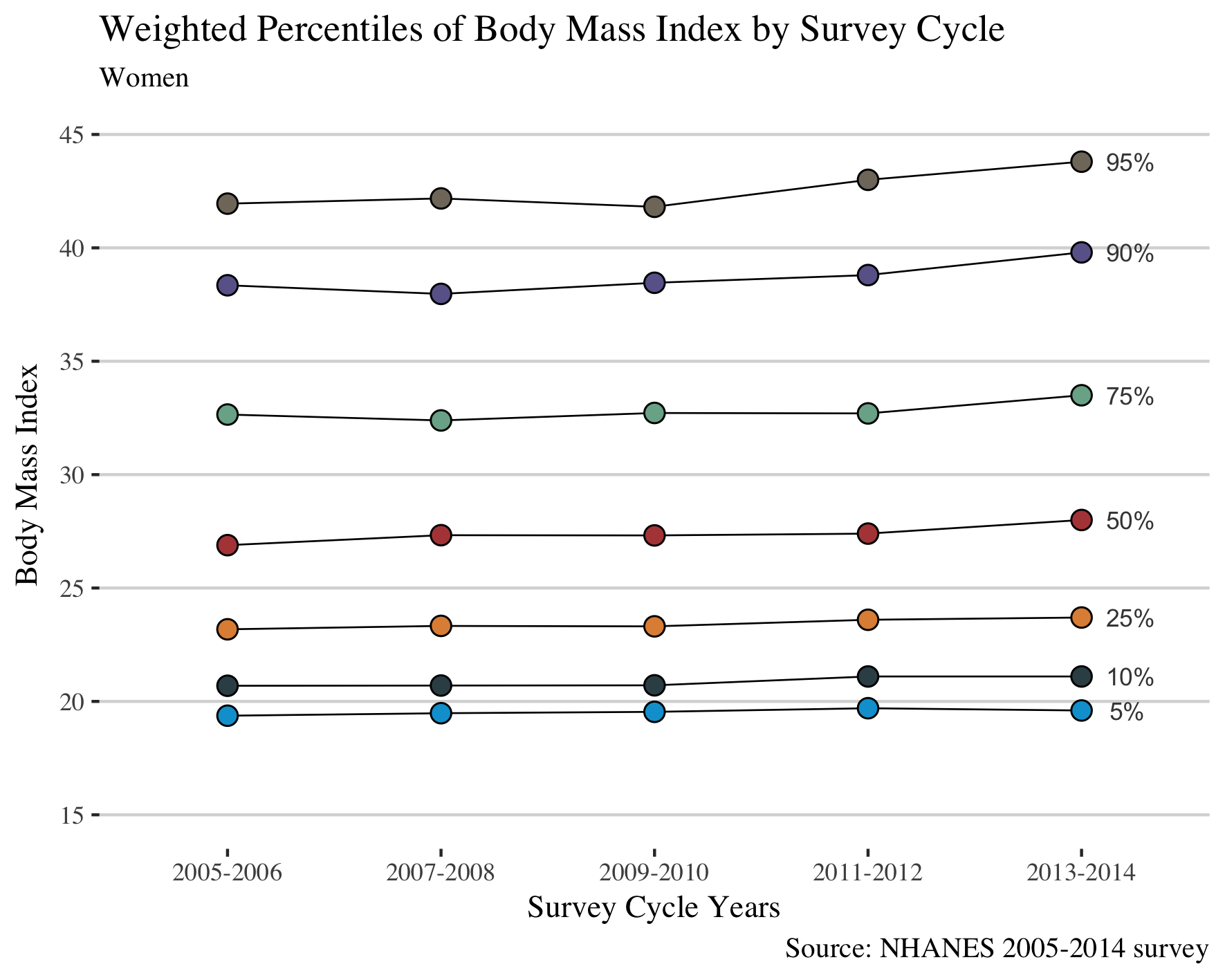
As authors claimed in the paper, from the figure we may conclude that in women the prevalence of overall obesity and of class 2 (BMI > 35) and 3 (BMI>40) obesity increases from the year 2005 to 2014; whereas in men the trends of BMI were stable.
Conclusion
Using tidyverse and Hmisc packages I was able to reproduce the same results as Flegal and co-authors presented in the paper published in JAMA. A critical step which challenged me during this analysis was to make the data ready for plotting. Compared to my previous posts, the new functions I used in this post are wtd.quantile, gather, and annotate.
I hope you enjoy this post, and let me know if you have questions.