In this post, I will show you the advantages of using heatmap to visualize data. The key feature of the heatmap in visualizing the data is the intensity of color across two variables of interest (i.e., X and Y). This is very useful when you want to show a general view of your variables.
The task of this analysis is to visualize the BMI across age and race in Americans using NHANES data.
Load the libraries
library(RNHANES)
library(tidyverse)
Select the dataset from NHANES:
dt1314 = nhanes_load_data("DEMO_H", "2013-2014") %>%
  select(SEQN, cycle, RIDAGEYR, RIDRETH1, INDFMIN2) %>%
  transmute(SEQN=SEQN, wave=cycle, Age=RIDAGEYR, RIDRETH1, INDFMIN2) %>%
  left_join(nhanes_load_data("BMX_H", "2013-2014"), by="SEQN") %>%
  select(SEQN, wave, Age, RIDRETH1, INDFMIN2, BMXBMI)
Recode and modify variables
I manipulate the data by including those older than 18 years old and remove missings in BMI. Also, I do some rename and recoding.
dat = dt1314 %>%
  filter(Age > 18, !is.na(BMXBMI)) %>%
  rename(BMI = BMXBMI) %>%
  mutate(Race = recode_factor(RIDRETH1,
                         `1` = "Mexian American",
                         `2` = "Hispanic",
                         `3` = "Non-Hispanic, White",
                         `4` = "Non-Hispanic, Black",
                         `5` = "Others"))
Visualization
Now, when I visualize the data across two variables, the first thing that comes to my mind is to use a line or point plots.
geom_line
ggplot(dat, aes(x = Age, y = BMI)) +
  geom_line(aes(color = Race))
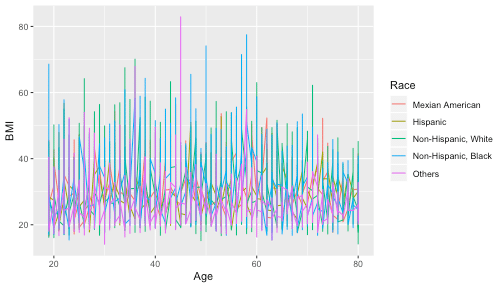
It is difficult to grasp anything in the plot above.
Let try to use the function facet_wrap to distinguish the race from each other.
facet_wrap
ggplot(dat, aes(x = Age, y = BMI)) +
  geom_line(aes(color = Race)) +
  facet_wrap(~Race)
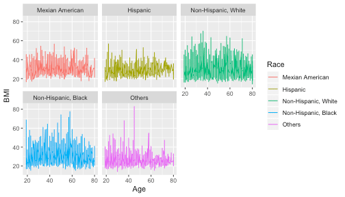
This plot is better, but yet, it would be good to have in one figure.
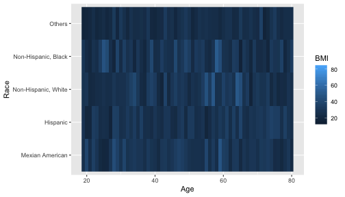
Heatmap
The geom_raster is the function to build a heatmap.
ggplot(dat, aes(Age, Race)) +
  geom_raster(aes(fill = BMI))
To give your own colors use the scale_fill_gradientn function.
ggplot(dat, aes(Age, Race)) +
  geom_raster(aes(fill = BMI)) +
  scale_fill_gradientn(colours=c("white", "red"))
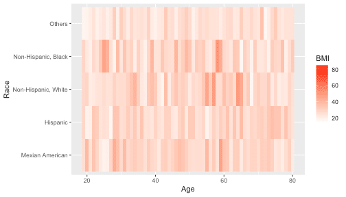
With this plot, first, I can distinguish the highest BMI immediately across age and race. Second, it is easy to compare the values of BMI by race for a given age. Third, all this information is in one plot.
If you have a suggestion on visualizing the data or if I miss any critical function of ggplot2, please comment below.