In this post, I will show you, how to use visualization and transformation for exploring your data in R. I will use several functions that come with Tidyverse package.
In general, there are two types of variables, categorical and continuous. In this section, I will show the best option to examine their distributions using the data from NHANES.
Load the library and data:
library(tidyverse)
library(RNHANES)
d13 = nhanes_load_data("DEMO_H", "2013-2014") %>%
  transmute(SEQN=SEQN, wave=cycle, INDFMIN2, RIDRETH1) %>%
  left_join(nhanes_load_data("BMX_H", "2013-2014"), by="SEQN") %>%
  select(SEQN, wave, INDFMIN2, RIDRETH1, BMXBMI) %>%
   mutate(
    annincome = recode_factor(INDFMIN2,
                         '1' = "lowest",
                         '2' = "lowest",
                         '3' = "lowest",
                         '4' = "low",
                         '5' = "low",
                         '6' = "low",
                         '7' = "medium",
                         '8' = "medium",
                         '9' = "medium",
                         '10' = "high",
                         '12' = "high",
                         '13' = "high",
                         '14' = "highest",
                        '15' = "highest")) %>%
    filter(!is.na(BMXBMI), !is.na(annincome))
With the dataset created I will visualize the distribution using a bar chart.
ggplot(data = d13) +
  geom_bar(aes(annincome))
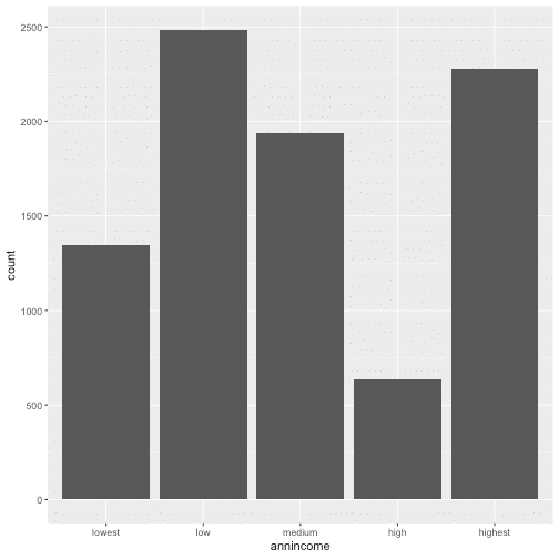
To see the exact number for each category, I can also calculate these values with count()
d13 %>%
  count(annincome)
For a continuous variable it is necessary to use the histogram. I chose to see how BMI is distributed in NHANES population for 2013, with binwidth = 5, so cut the variable by 5 unit increase.
ggplot(data = d13) +
  geom_histogram(aes(BMXBMI), binwidth = 5)
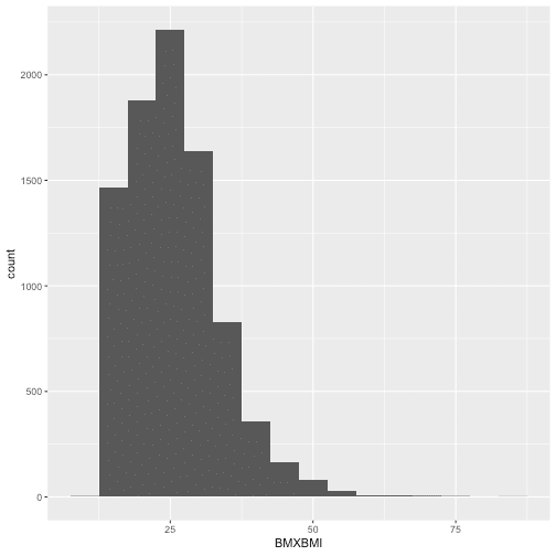
Combining 'ggplot2' and 'dplyr', I can see the relevant values fo Bmi with the function cut_width() by 5 unit increase)
d13 %>%
  count(cut_width(BMXBMI, 5))
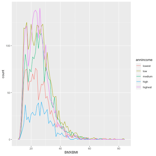
To combine the information I showed previously in the same plot, for information about BMI and annual income I will use geomfreqpoly(), and have the multiple histograms below.
ggplot(data = d13, aes(BMXBMI, color = annincome)) +
  geom_freqpoly(binwidth = 1)
A categorical and a continuous variable
Now I am going to demonstrate a link of a continuous variable based on the other categorical variable using the boxplot.
ggplot(data = d13, aes(annincome, BMXBMI)) +
  geom_boxplot()
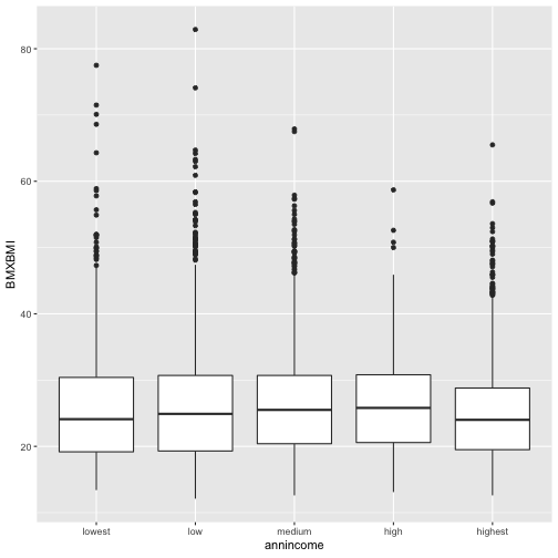
So for each box, the middle line is the median 50th percentile for each category. In my case, if I chose category medium for annual income the median of BMI is ~27. The upper and the lower line of the box shows 75th (BMI=31) percentile, and 25th (BMI=20) percentile and the distance between them is called the Interquartile Range.
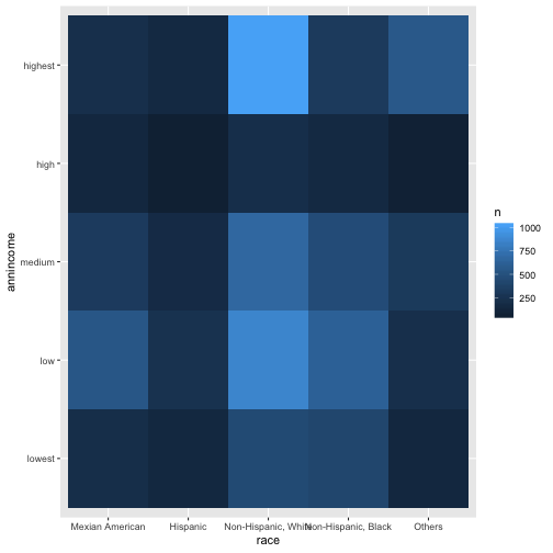
Two categorical variables
For two categorical variable, I need to visualize the relation between them, but I also would like to know the number of observations, so I will use 'geom_tile' and 'fill aesthetic' and have the graph below.
d13 %>%
  mutate(race = recode_factor(RIDRETH1,
                         `1` = "Mexian American",
                         `2` = "Hispanic",
                         `3` = "Non-Hispanic, White",
                         `4` = "Non-Hispanic, Black",
                         `5` = "Others")) %>%
  count(race, annincome) %>%
  ggplot(aes(race, annincome)) +
   geom_tile(aes(fill = n))
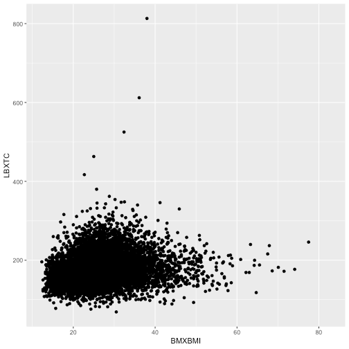
Two continuous variables
Below, I will see how do BMI and cholesterol come along with each other drawn in a scatterplot.
data13 = d13 %>%
  left_join(nhanes_load_data("TCHOL_H", "2013-2014"), by="SEQN") %>%
  select(SEQN, wave, INDFMIN2, RIDRETH1, BMXBMI, LBXTC)

ggplot(data = data13) +
  geom_point(aes(BMXBMI, LBXTC))
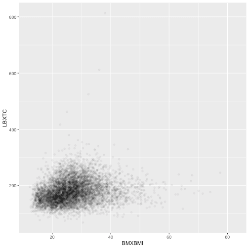
Because the points overplot in the previous scatterplot, I can use 'alpha aesthetic' for a more useful graph.
ggplot(data = data13) +
  geom_point(aes(BMXBMI, LBXTC),
             alpha = 1/20)
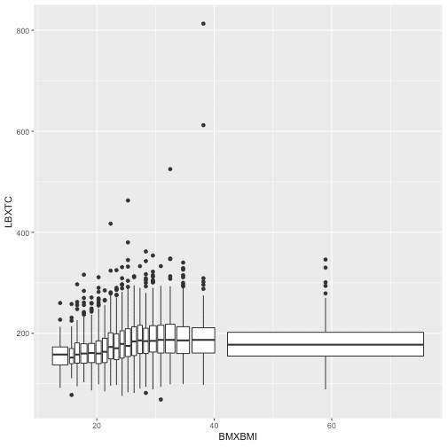
Another way to visualize a relationship of two continuous variables is by using bins and treating one of the variables as a definite. Adding 'cut_number' will make the comparison fairer as there is the same number of points in each bin.
ggplot(data = data13, aes(BMXBMI, LBXTC)) +
  geom_boxplot(aes(group = cut_number(BMXBMI, 20)))
Hope this post will help you chose the right and best way to illustrate distribution and relations within and between variables.
Great
Great post. Thank you for sharing!