This is the first post of a series that will look at how to create graphics in R using the plot function from the base package. There are of course other packages to make cool graphs in R (like ggplot2 or lattice), but so far plot always gave me satisfaction.
In this post we will see how to add information in basic scatterplots, how to draw a legend and finally how to add regression lines.
Data simulation
#simulate some data
dat<-data.frame(X=runif(100,-2,2),T1=gl(n=4,k=25,labels=c("Small","Medium","Large","Big")),Site=rep(c("Site1","Site2"),time=50))
mm<-model.matrix(~Site+X*T1,dat)
betas<-runif(9,-2,2)
dat$Y<-rnorm(100,mm%*%betas,1)
summary(dat)
Adding colors
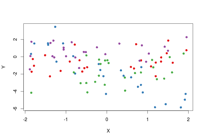
First plot adding colors for the different treatments, one way to do this is to pass a vector of colors to the col argument in the plot function.
#select the colors that will be used
library(RColorBrewer)
#all palette available from RColorBrewer
display.brewer.all()
#we will select the first 4 colors in the Set1 palette
cols<-brewer.pal(n=4,name="Set1")
#cols contain the names of four different colors
#create a color vector corresponding to levels in the T1 variable in dat
cols_t1<-cols[dat$T1]
#plot
plot(Y~X,dat,col=cols_t1,pch=16)
Here is the plot:
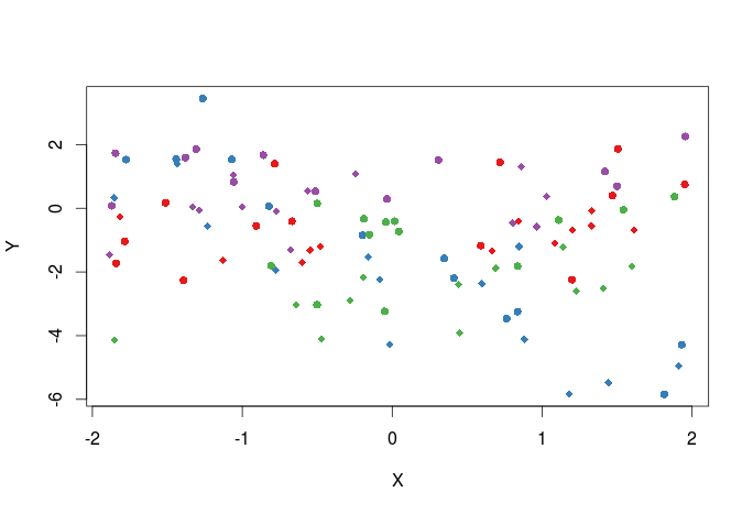
Change plotting symbols
We can also create a vector of plotting symbols to represent data from the two different sites, the different plotting symbols available can be seen here.
pch_site<-c(16,18)[factor(dat$Site)]
#the argument that control the plotting symbols is pch
plot(Y~X,dat,col=cols_t1,pch=pch_site)
Here is the plot:
Add a legend to the graph
Now we should add a legend to the graph:
plot(Y~X,dat,col=cols_t1,pch=pch_site)
legend("topright",legend=paste(rep(c("Small","Medium","Large","Big"),times=2),rep(c("Site 1","Site 2"),each=4),sep=", "),col=rep(cols,times=2),pch=rep(c(16,18),each=4),bty="n",ncol=2,cex=0.7,pt.cex=0.7)
Here is the plot:
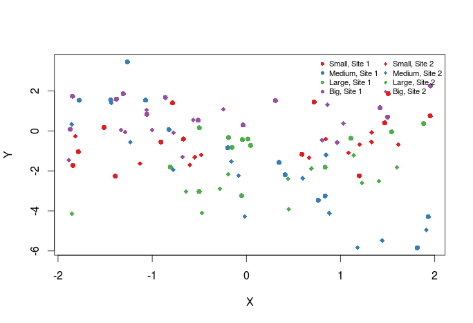
The first argument to legend is basically its position in the graph, then comes the text of the legend. Optionally one may also specify the colors, plotting symbols etc … of the legend symbol. Have a look at ?legend for more options.
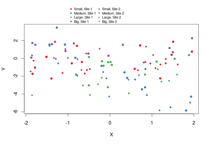
We can also add a legend outside of the graph by setting xpd=TRUE and by specifying the x and y coordinates of the legend.
plot(Y~X,dat,col=cols_t1,pch=pch_site)
legend(x=-1,y=13,legend=paste(rep(c("Small","Medium","Large","Big"),times=2),rep(c("Site 1","Site 2"),each=4),sep=", "),col=rep(cols,times=2),pch=rep(c(16,18),each=4),bty="n",ncol=2,cex=0.7,pt.cex=0.7,xpd=TRUE)
Here is the plot:
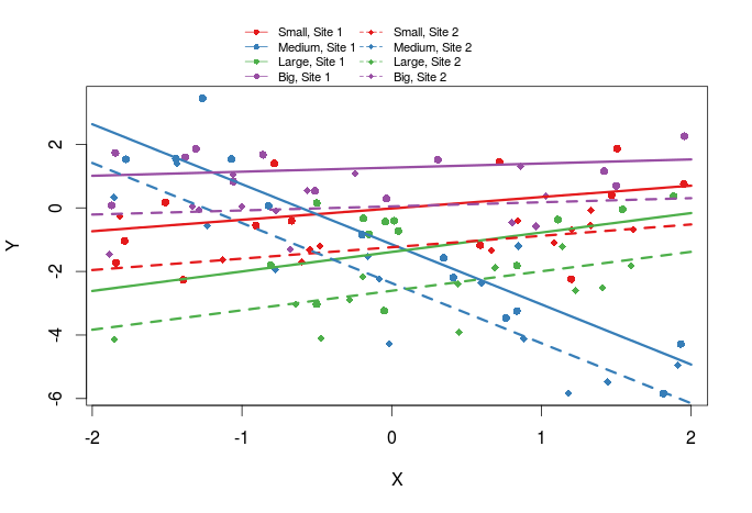
Add regression lines
The last thing we might want to add are regression lines
#generate a new data frame with ordered X values
new_X<-expand.grid(X=seq(-2,2,length=10),T1=c("Small","Medium","Large","Big"),Site=c("Site1","Site2"))
#the model
m<-lm(Y~Site+X*T1,dat)
#get the predicted Y values
pred<-predict(m,new_X)
#plot
xs<-seq(-2,2,length=10)
plot(Y~X,dat,col=cols_t1,pch=pch_site)
lines(xs,pred[1:10],col=cols[1],lty=1,lwd=3)
lines(xs,pred[11:20],col=cols[2],lty=1,lwd=3)
lines(xs,pred[21:30],col=cols[3],lty=1,lwd=3)
lines(xs,pred[31:40],col=cols[4],lty=1,lwd=3)
lines(xs,pred[41:50],col=cols[1],lty=2,lwd=3)
lines(xs,pred[51:60],col=cols[2],lty=2,lwd=3)
lines(xs,pred[61:70],col=cols[3],lty=2,lwd=3)
lines(xs,pred[71:80],col=cols[4],lty=2,lwd=3)
legend(x=-1,y=13,legend=paste(rep(c("Small","Medium","Large","Big"),times=2),rep(c("Site 1","Site 2"),each=4),sep=", "),col=rep(cols,times=2),pch=rep(c(16,18),each=4),lwd=1,lty=rep(c(1,2),each=4),bty="n",ncol=2,cex=0.7,pt.cex=0.7,xpd=TRUE)
Here is the plot:
There is a whole bunch of function to draw elements within the plotting area, a few examples are: points, lines, rect, text. They are handy in many situations and are very similar of use.
That’s it for this basic post, next times we’ll see how to control axis labels and tick marks.