Hello everyone! In this post, I will show you how you can use rbokeh to build interactive graphs and maps in R.
What is bokeh?
Bokeh is a popular python library used for building interactive plots and maps, and now it is also available in R, thanks to Ryan Hafen. It is a very powerful for creating good looking plots for the web easily, and it is fully compatible with shiny.
Generally, plotting in bokeh is done by adding layers to a plot, similar to ggplot2. For creating a simple plot, there are two main steps involved:
figure()– This will initialize the bokeh plot. It has a variety of parameters to set width, height, title, and axes parameters.ly_geom()– This will specify the type of geom you want to use. There are a variety of options, includingly_points,ly_lines,ly_hist,ly_boxplot, etc. Each of these have parameters which allow for specifying size, color, what to show on hover, etc.
Okay, let’s start building some visualizations! Installation instructions are available here.
In one of previous posts, I showed how you can do Hiearchical Clustering in R, and demonstrated it with the iris dataset. Let’s recreate the visualization using rbokeh:
clusters <- hclust(dist(iris[, 3:4]), method = 'average')
clusterCut <- cutree(clusters, 3)
p <- figure(title = 'Hierarchical Clustering of Iris Data') %>%
  ly_points(Petal.Length, Petal.Width, data = iris, color = Species, hover = c(Sepal.Length, Sepal.Width)) %>%
  ly_points(iris$Petal.Length, iris$Petal.Width, glyph = clusterCut, size = 13)
p
which gives us the following plot:
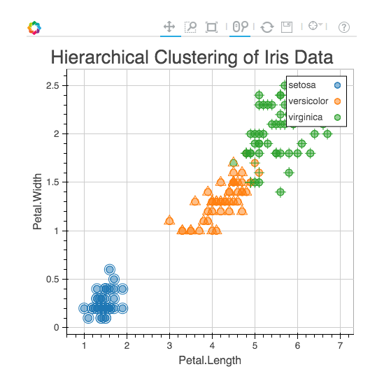
All the points where the two colors don’t match are the ones that were clustered in correctly.
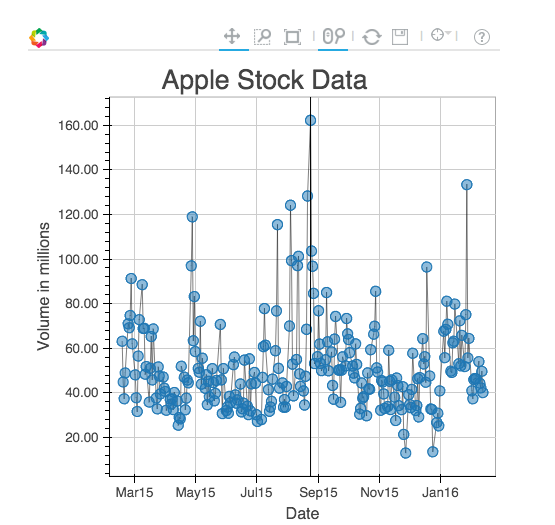
Now, let’s build a chart to show apple stock data for the past year. The data was obtained from Yahoo Finance.
aapl <- read.csv('aapl.csv')
aapl$Date <- as.Date(aapl$Date)
p <- figure(title = 'Apple Stock Data') %>%
  ly_points(Date, Volume / (10 ^ 6), data = aapl, hover = c(Date, High, Open, Close)) %>%
  ly_abline(v = with(aapl, Date[which.max(Volume)])) %>%
  y_axis(label = 'Volume in millions', number_formatter = 'numeral', format = '0.00')
which gives us the following plot (with a vertical line on the date with the highest amount of volume):
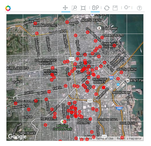
In another previous post, I demonstrated how you can use Leaflet to build Interactive Maps. Let’s recreate this using rbokeh:
SFData <- read.csv('SFPD_Incidents_-_Previous_Year__2015_.csv')
data <- subset(SFData, Category == 'BRIBERY' | Category == 'SUICIDE')
p <- gmap(lat = 37.78, lng = -122.42, zoom = 13) %>%
  ly_points(Y, X, data = data, hover = c(Category, PdDistrict), col = 'red') %>%
  x_axis(visible = FALSE) %>%
  y_axis(visible = FALSE)
which gives us the following plot:
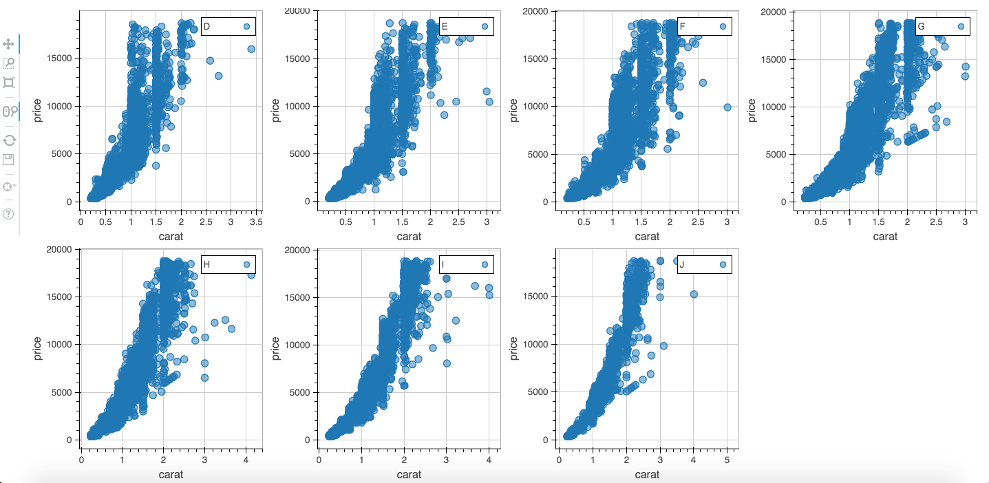
We can also somewhat replicate the facet_grid feature from ggplot2 as follows. We will use the diamonds dataset from ggplot2.
diamonds <- ggplot2:: diamonds
l <- levels(diamonds$color)
plot_list <- vector(mode = 'list', 7)

for (i in 1:length(l)) {
  data <- subset(diamonds, color == l[i])
  plot_list[[i]] <- figure(width = 350, height = 350) %>%
    ly_points(carat, price, data = data, legend = l[i], hover = c(cut, clarity))
}

grid_plot(plot_list, nrow = 2)
which gives us this plot:
Pretty cool, don’t you think? If you want to learn more: The official documentation. The author explains in detail about more customization options, and also shows you how you can build even cooler visualizations, including a visualization of the periodic table, and a visualization of baseball data to show the density of fielding locations of all doubles.
That brings us to the end of the article! As always, if you have questions/feedback, feel free to comment below or reach out to me on Twitter.