Leaflet is an JavaScript library for building interactive maps. RStudio released a package that allows us to build these maps in R! You can do some really cool things in Leaflet, and I will demonstrate a few of those below. Leaflet is compatible with Shiny apps and R Markdown documents.
As mentioned on the RStudio page, the basic steps to create a Leaflet map are:
1. Create a map widget using
leaflet()
2. Add layers to the map usingaddTiles(),addMarkers(), etc.
3. Print the map.
Okay, let’s get started. We will need the leaflet and magrittr packages for this.
Let’s create a basic map centered at San Francisco. First, we create a widget by calling leaflet(). Then, we add tiles to the map using addTiles(). By default, it uses Open Street Map tiles. If you would like to use other tiles, please refer here. We can set the desired longitude and latitude that we want the map to be centered at, and also set the zoom level using the setView() function. The addMarker() function allows us to add a marker at our desired location, with it’s own popup message!
library(leaflet)
library(magrittr)

SFmap <- leaflet() %>%
  addTiles() %>%
  setView(-122.42, 37.78, zoom = 13) %>%
  addMarkers(-122.42, 37.78, popup = 'Bay Area')
SFmap
This gives the following map:
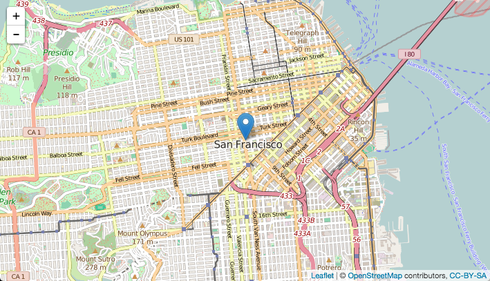
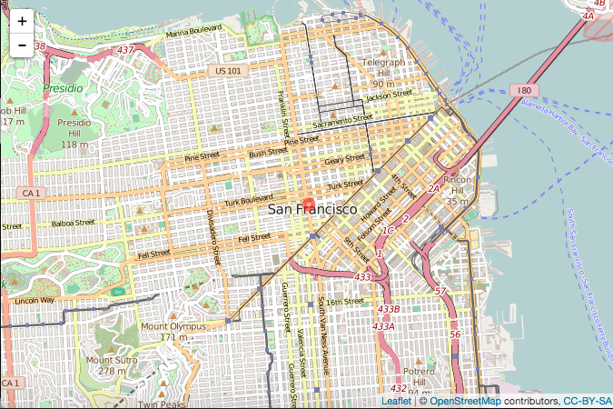
If you click the blue marker, you will see a small popup with the text ‘Bay Area’. There are a variety of options to customize the marker. For example, addCircleMarkers() lets you use circle shaped markers instead of the default ones. You can even add your own icons to use as markers (more info here and here)!
The above map with a circle marker can be built as follows:
SFmap <- leaflet() %>%
  addTiles() %>%
  setView(-122.42, 37.78, zoom = 13) %>%
  addCircleMarkers(-122.42, 37.78, popup = 'Bay Area', radius = 5, color = 'red')
and looks likes this:
Let’s plot an interactive map showing the location of incidents reported to the San Francisco Police Department. The data is available here. Let’s read in the data and see what it looks like.
SFdata <- read.csv('SFPD_Incidents_-_Current_Year__2015_.csv')
head(SFdata)
  IncidntNum               Category                                              Descript DayOfWeek       Date  Time PdDistrict      Resolution                Address         X        Y
1  150927700               BURGLARY           BURGLARY OF APARTMENT HOUSE, UNLAWFUL ENTRY  Thursday 10/22/2015 23:59    CENTRAL            NONE 900 Block of SUTTER ST -122.4160 37.78823
2  150927700 SEX OFFENSES, FORCIBLE                                        SEXUAL BATTERY  Thursday 10/22/2015 23:59    CENTRAL            NONE 900 Block of SUTTER ST -122.4160 37.78823
3  150926570                ASSAULT                                               BATTERY  Thursday 10/22/2015 23:45   RICHMOND            NONE   100 Block of 19TH AV -122.4787 37.78508
4  150925312        STOLEN PROPERTY STOLEN PROPERTY, POSSESSION WITH KNOWLEDGE, RECEIVING  Thursday 10/22/2015 23:40   SOUTHERN JUVENILE BOOKED    0 Block of SPEAR ST -122.3949 37.79311
5  156262768          LARCENY/THEFT                               PETTY THEFT OF PROPERTY  Thursday 10/22/2015 23:40   SOUTHERN            NONE     MARKET ST / 6TH ST -122.4103 37.78223
6  150925312                ROBBERY                ROBBERY, ARMED WITH A DANGEROUS WEAPON  Thursday 10/22/2015 23:40   SOUTHERN JUVENILE BOOKED    0 Block of SPEAR ST -122.3949 37.79311
(There is another location column at the end which I omitted here as it is just a concatenation of the X and Y columns.)
Now let us look at how many incidents of each category were reported.
table(SFdata$Category)
                      ARSON                     ASSAULT                  BAD CHECKS                     BRIBERY                    BURGLARY          DISORDERLY CONDUCT DRIVING UNDER THE INFLUENCE
                        255                       10711                          26                          59                        4749                         396                         360
              DRUG/NARCOTIC                 DRUNKENNESS                EMBEZZLEMENT                   EXTORTION             FAMILY OFFENSES      FORGERY/COUNTERFEITING                       FRAUD
                       3315                         473                         115                          25                          54                         561                        2523
                   GAMBLING                  KIDNAPPING               LARCENY/THEFT                 LIQUOR LAWS                   LOITERING              MISSING PERSON                NON-CRIMINAL
                         22                         286                       34683                         133                          24                        3755                       15360
             OTHER OFFENSES     PORNOGRAPHY/OBSCENE MAT                PROSTITUTION                     ROBBERY                     RUNAWAY             SECONDARY CODES      SEX OFFENSES, FORCIBLE
                      16143                           4                         261                        3054                         124                        1676                         687
 SEX OFFENSES, NON FORCIBLE             STOLEN PROPERTY                     SUICIDE              SUSPICIOUS OCC                        TREA                    TRESPASS                   VANDALISM
                         15                         777                          64                        4367                           1                        1093                        6309
              VEHICLE THEFT                    WARRANTS                 WEAPON LAWS
                       6361                        5378                        1346
To ensure that the map is plotted quickly, I am going to subset the data to only include observations pertaining to bribery or suicide.
data <- subset(SFPDdata, Category == 'BRIBERY' | Category == 'SUICIDE')
Now, let us plot all these incidents on the map!
SFMap %>%
  addTiles() %>%
  setView(-122.42, 37.78, zoom = 13) %>%
  addMarkers(data = data, lng = ~ X, lat = ~ Y, popup = data$Category)
SFMap
The map looks like this:
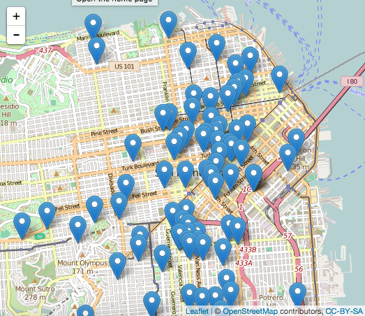
Here, clicking on each marker will give a popup showing whether the incident which occurred at that particular location was bribery or suicide.
A lot of the markers are clumped together rather closely. We can cluster them together by specifying clusterOptions as follows:
SFMap %>%
  addTiles() %>%
  setView(-122.42, 37.78, zoom = 13) %>%
  addCircleMarkers(data = data, lng = ~ X, lat = ~ Y, radius = 5,
                   color = ~ ifelse(Category == 'BRIBERY', 'red', 'blue'),
                   clusterOptions = markerClusterOptions())
which will give the following map:
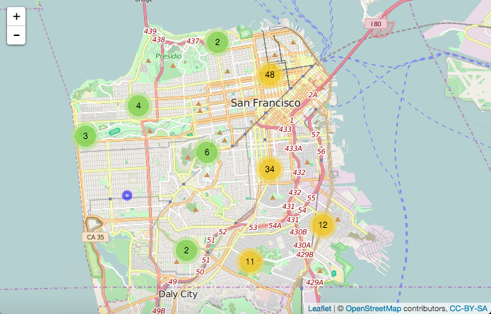
The number inside each circle represents the total number of incidents in that area. Areas with higher incidents are marked by yellow circles and areas with lower incidents are marked by green circles. When you click on a cluster, the map will automatically zoom into that area and split into smaller clusters or show the individual incidents depending on how zoomed in you are. The circle markers are colored red for incidents corresponding to bribery, and blue for incidents corresponding to suicide.
That brings us to the end of the article. I hope you enjoyed it. If you have any questions/feedback, please feel free to leave a comment or reach out to me on Twitter.