There are few things more exciting than seeing your stocks values going up! I started investing last year in stocks and, like visualization and R lover, I couldn’t help but create some nice plots and functions to automate the process of watching it happen.
Important note: this post was written a while ago, using the first (not so stable) version of the code and plots. The results shouldn’t vary (much) and the plots will be much nicer now. Even so, all functions should work as expected.
Some of you might already know the lares package; I’ve included these following ‘stocks family’ functions for some time now but today is the day in which I’ll share with you its nice useful outputs.
Introduction
The overall idea of these functions is to visualize your stocks and portfolio’s performance with a just a few lines of simple code. I’ve created individual functions for each of the calculations and plots, and some other functions that gather all of them into a single list of objects for further use.
On the other hand, the lares package is “my personal library used to automate and speed my everyday work on Analysis and Machine Learning tasks”. I am more than happy to share it with you for your personal use. Feel free to install, use, and comment on any of its code and functionalities and I’ll happy to help you with it. I have previously shared other uses of the library in other posts which might also interest you: Visualizing ML Results (binary), Visualizing ML Results (continuous) and AutoML to understand datasets.
- NOTE 1: The following post was written by a non-economist or professional investor. I am open to your comments and technical corrections if needed. Glad to learn as always!
- NOTE 2: I will be using the less customizable functions in this post so we can focus more on the outputs than in the coding part; but once again, feel free to use the functions and dive into the library to understand or change them!
- NOTE 3: All currency units are USD ($).
Get Historical Values
Let’s start by downloading a dummy Excel file which contains the recommended input format. In there, you will find three tabs which must be filled with your personal data:
- Portfolio: a summary of your investments. Each row represents a Stock and gathers some data from the other 2 tabs. The only inputs you have to fill are Stocks symbols or Tickers, and a given category you wish to group them by (US Stocks, International, Recommended by Bernardo…)
- Funds: here you will log any inputs or outputs of cash to your investment account. The required values are date and amount. There is an additional column for personal use to write notes and concepts if you want to.
- Transactions: this last tab will be your purchase log. You should write which, when, how many, and by how much did you buy each of your stocks.
Now we get to the fun part: R! Even though you might have already installed the lares library before, I strongly recommend to update it with the following command because I’ve created some of the gathering functions recently (yesterday):
install.packages("lares")
NOTE: It may take a while to install the first time because I have some dependencies on other big libraries (like h2o ~123MB). But don’t worry, all of them are quite useful!
After you have filled your data (or you might just want to try the dummy’s), we import it. To quicken the process, we can use the get_stocks function which automatically imports all tabs from your file and returns a list with these three tables.
library(lares)
df <- stocks_file(filename = "dummyPortfolio.xlsx")
Calculations and Plots
To understand where we are now we need to understand where we were before. Let’s download our historical data from the first day we purchased each stock until today included. After that, we automatically process (dplyr mostly) all the data in such a way that we can get the variance for each day, percentages, growth, etc. Finally, some nice plots (ggplot2 mostly) are created; even though they will have some redundant information, they will give us a wider perspective on our whole portfolio.
For further customization, there are other parameters in this function: sometimes, the results need a little adjustment because of dividends not yet published or a little difference in quoting timings. Usually, I wouldn’t use this parameter but might come useful. You can use cash_fix if you want to correct your absolute cumulative. You may also want to custom the tax percentage using the tax parameter, which is set to 30% as default.
dfp <- stocks_obj(df)
That’s it! Now we have everything we need to visualize our stocks’ growth and portfolio’s performance. if you check the dfp object, you’ll notice it is a list with data and 7 plots. Let’s take a look at some of the plots created:
First, I’d like to see an overall daily plot for my portfolio’s ups and downs. It is relevant to see percentages for daily changes and for absolute changes so we don’t panic when a crazy-steep-roller-coaster-day happens.
dfp$plots$roi1
Will show the following plot:
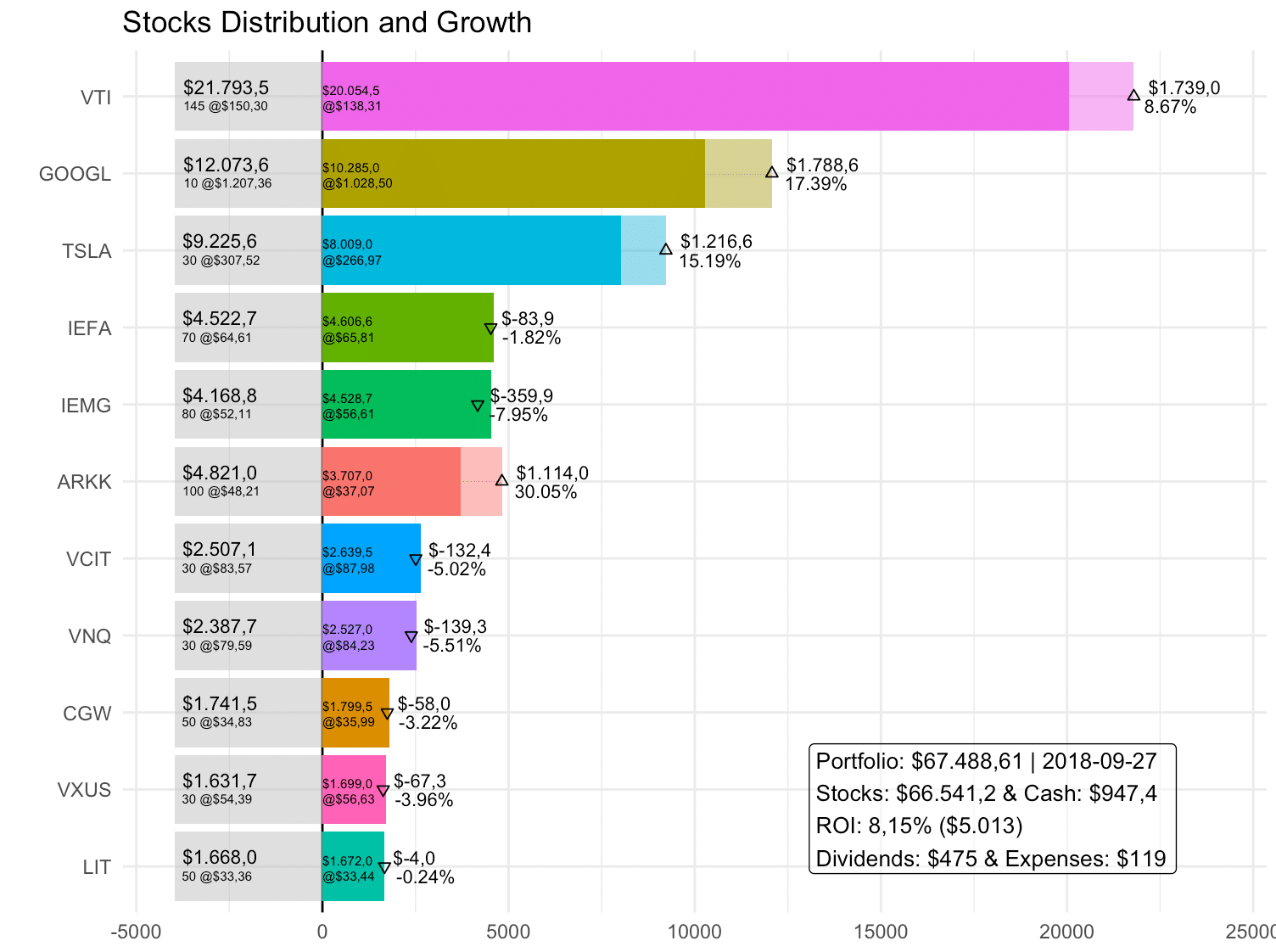
Then, I’d like to see a plot with all my stocks and its numbers, order by relevance (value). We can see all of our stock’s current data (grey boxes at the left), how many we have and their current value. Next to it, at each bar’s foot, the amount invested and their weighted average purchase price. And the head of the bars, we have the earnings metrics: how much have they grown/shrank in absolute currency numbers or percentages. We can also see a symbol, located at today’s total value, that represents if the value has increased or decreased compared to your total stock investment.
dfp$plots$summary
Will plot the following:
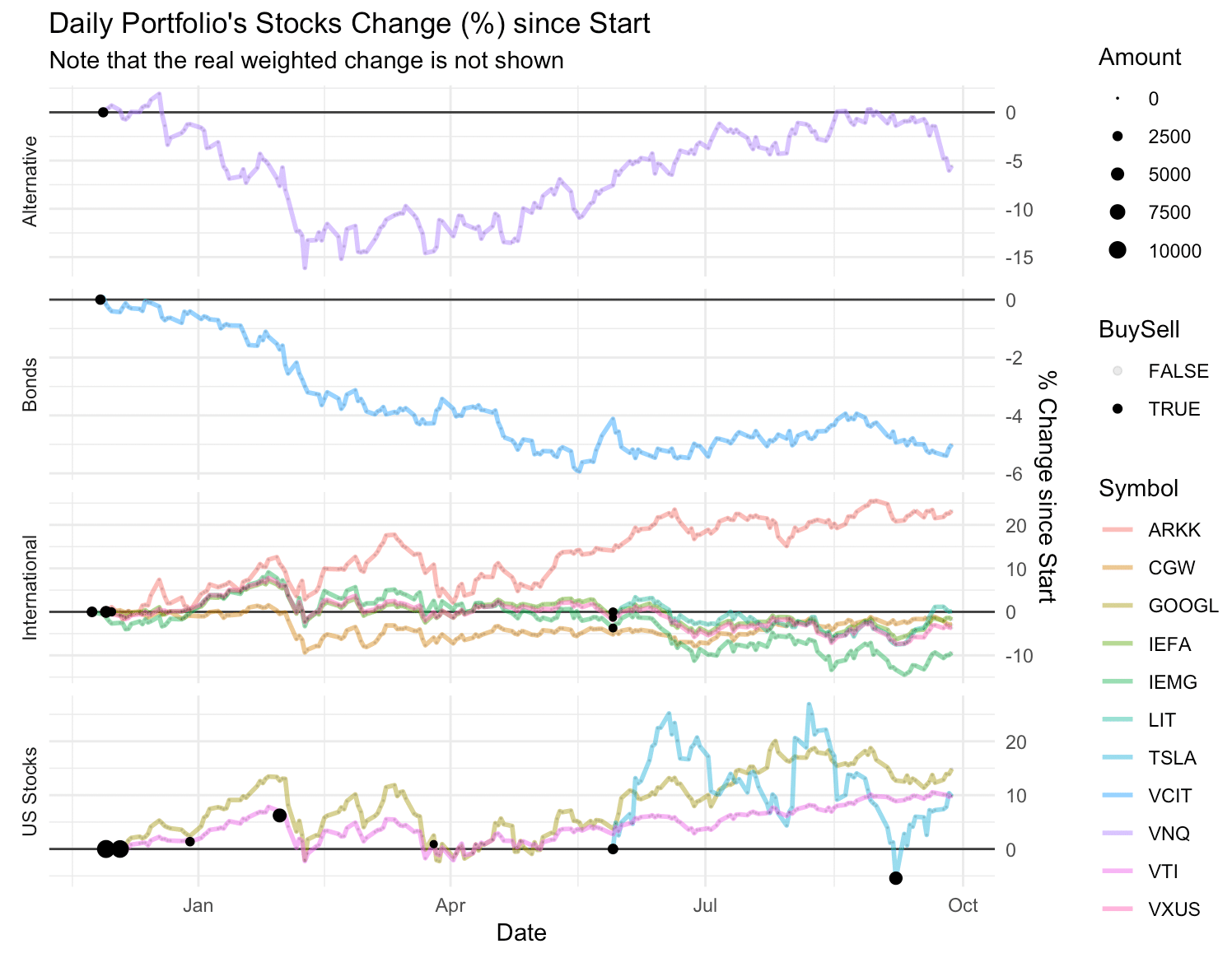
The next cool plot we get shows the daily percentage change since the first stock you purchased for each Ticker. The grids will group and plot each stock into the category you defined at your Excel’s Portfolio tab. There are also some points added at those days you did transactions; with those you can evaluate in the future if it was or not a good moment to buy/sell (don’t worry: no one can predict the future!)
dfp$plots$change1
Will generate this plot:
Generate Report
We can generate a nice HTML report with our portfolio’s performance using another quick command. It uses RMarkdown for rendering the plots and table into a single document. In addition to our prior plots, there is one more which shows the distribution of stocks into categories and a nice table with all the useful data summarizing everything up.
stocks_report(dfp)
Now you have a new nice HTML report created in your working directory. You can download this post’s report here.
Extra tip
RServer + cronR + mailR: RStudio in the cloud has indubitably been a great friend of mine for some time now. It automates daily tasks such as reporting, updating Google Sheets, sending mails, creating databases… and you only have to write the code once! It is a great way to get more independence from your company’s Tech Team. You could set a cronR job to send a daily or weekly report to your email automatically with this great tool.
Hope you guys enjoyed this post. If you have any doubts, comments, pull requests, issues, just let me know! Please, do LinkedIn me if you want to connect.
Thanks for your time 😉
Hi Bernardo!
Thanks for sharing this! Great tool!
How do you think I should go about the dividends and tax withholding on those dividends?
Thanks
Thanks Santiago. The dividends are automatically downloaded when you run the stocks_objects function. And, the tax withholding is set with the tax parameter inside that function i.e. if it’s 40%, then write tax = 40.
Thanks Bernardo. Is this same tax rate also applied to the dividends? How do you suggest imputing the stock splits or reverse splits?
also, to input the sales, are the quantities the ones that need to be registered as negative? when I make the plots, it is hard to distinguish one from the other, as the cycles are not coming out full or empty depending on sell/buy. Am I doing something wrong?
Thanks in advance
Actually, the tax rate is only applied to dividends. I should/could add tax rate to sales as well, your are right. If I’m not wrong, it should be applied to the difference between the bought value and sold value, yes? Could you please open a ticket? https://github.com/laresbernardo/lares/issues
Hi Bernardo. Yes, that is the capital gains tax and is the difference between the purchase and sale price. I am new in this platform, let’s see if I opened the ticket correctly.
You got it! Let’s work it then..
Nice work! So how often do u do this? Is there way way to automate the output from a vendor into this?
Glad you liked my post Amit. I currently send this report daily to my personal email just to check it out at night. I do not live out of this so no need to keep and update every hour… but you could!!! Check my lares::stocks_report() function 😉
Gracias por tu respuesta… es q mi pregunta iba mas a la automatizacion de la metida de la info. En mi ejemplo… busco meter informacion sobre mis mutual funds… entonces busco exportar directamente por ejemplo desde shwab a este paquete… pero me parece q tu solo trabajas con stocks?
Pues sí se puede.. lo que tienes que hacer es usar los tickers oficiales de cada uno de los mutual fonds, ETFs, o lo que sea que tengas y listo!
esq no se publican publicamente… 🙁 O al menos no los he encontrado yo… habra un lugar donde se publican?
Si no son públicos es más complicado porque tendrías que hacer un robot que haga scrap jaja Quedo a la orden cualquier cosa! Saludos amigo