A well-done correlation analysis will lead us to a greater understanding of our data and empower us with valuable insights. A correlation analysis is a statistical technique that can show whether and how strongly pairs of variables are related, but all features must be numerical. Usually, we have numerous categorical variables in our data, that contains valuable information which might be hard to catch without a correlation analysis. So, is there an alternative or mathematical trick for us to use our data as it is and discover high correlation variables/values?
Correlations
Correlation works for quantifiable data in which numbers are meaningful, thus it cannot be calculated with categorical data such as gender, cities, or brands. These correlation coefficients might take values in the range of -1 to 1 (or -100% to 100%). It represents how closely the two variables are related: if this value is close to 0, it means that there is no relationship between the variables. When the value is positive, it means that as one variable gets larger the other gets larger. And, if they are negative it means that as one gets larger, the other gets smaller (often called an “inverse” correlation).
For the following examples, we will be using the lares library and dplyr’s Star Wars dataset. To install the former, run the following in your R session.
install.packages("lares")
Ranked Cross-Correlations
I am sure there must be another academic name for this specific kind of analysis, but as I haven’t found it out there yet, that is how I’ve been addressing it. Basically, it is the result of a sorted long-format correlation matrix from a dataset which may contain dates and other categorical features, that has been transformed with one-hot encoding and some additional features creations.
There are other authors who have done similar functions such as Alastair Rushworth with his inspectdf::inspect_cor() and Matt Dancho with correlationfunnel:: plot_correlation_funnel(). Both are great but are not exactly what I imagined and needed. So that’s why corr_cross() exists!
Ranked Cross-Correlations not only explains relationships of a specific target feature with the rest but the relationship of all values in your data in an easy to use and understand tabular format. It automatically converts categorical columns into numerical with one hot encoding (1s and 0s) and other smart groupings such as “others” labels for not very frequent values and new features out of date features.
OHSE (One Hot Smart Encoding) under the hood
One way to go around this issue is to study the correlation of a specific value in a categorical feature with the rest of numerical columns, but that wouldn’t be enough; we are losing too much information from other variables. Another solution could be to apply dummy variables or one-hot-encoding to every categorical value, but we will probably get thousands of columns and it may be a problem. Maybe, we could get the n most frequent values for each categorical feature and group the rest in a single column. We could also create new features out of date values such as weekdays, time of the day, minute of the day, week of the year. It would be great if we could also include the festivals from the country we are studying as well. And the currency exchange rate for each day? That’s what ohse() does. Note: Even though this functionality is used in the corr_cross function automatically, for better custom results I’d recommend to manually add it before the pipeline and use its parameters to get the features you’d want to check.
When is Ranked Cross-Correlations useful?
The most trivial use for Ranked Cross-Correlations is to understand a dataset further. Normally, the first thing you do when you encounter a dataset would be an EDA (Exploratory Data Analysis). You will understand now how many rows and columns there are, how many missing values per variable, how many numerical vs categorical features, their distributions, etc (check lares::plot_df()). The next logical step would be to check the interactions between variables and their values (correlations would work just fine but only if you have 100% numerical values).
Another useful case use is understanding clusters and what does each individual has in common for a group of observations. K-nearest neighbors algorithms might be great for creating similar groups but usually are hard to interpret, especially because they are unsupervised algorithms. Let’s say we ran K-means to group students and defined 5 groups. Now we need to understand, for each cluster, what do individuals have in common among themselves. Instead of exploring row by row, column by column, getting frequencies and making dozens of plots, why not run a ranked cross-correlation function to do the work for us?
Cross-correlate Star Wars dataset we must!
Let’s load dplyr’s starwars dataset and check how corr_cross() works with it. I would like to mention that I like Star Wars but am not a fan, so the insights mentioned bellow are 100% taken from the data and not from past knowledge.
library(lares)
library(dplyr)
data("starwars")
# Let's get rid of the lists inside the dataframe
df <- select(starwars, -starships, -vehicles, -films)
If you are not familiar with this dataset, I’ll quickly show its first six rows so you have an idea.
head(df)
  name       height  mass hair_color  skin_color eye_color birth_year gender homeworld species

1 Luke Skyw…    172    77 blond       fair       blue            19   male   Tatooine  Human
2 C-3PO         167    75 NA          gold       yellow         112   NA     Tatooine  Droid
3 R2-D2          96    32 NA          white, bl… red             33   NA     Naboo     Droid
4 Darth Vad…    202   136 none        white      yellow          41.9 male   Tatooine  Human
5 Leia Orga…    150    49 brown       light      brown           19   female Alderaan  Human
6 Owen Lars     178   120 brown, grey light      blue            52   male   Tatooine  Human
Basically, we have all of the characters of the movies (87) with some specific characteristics such as height, mass, hair colour, etc. It’s a small (but fun) dataset! Let’s run what we came here to see:
corr_cross(df)
Which will plot you the following:
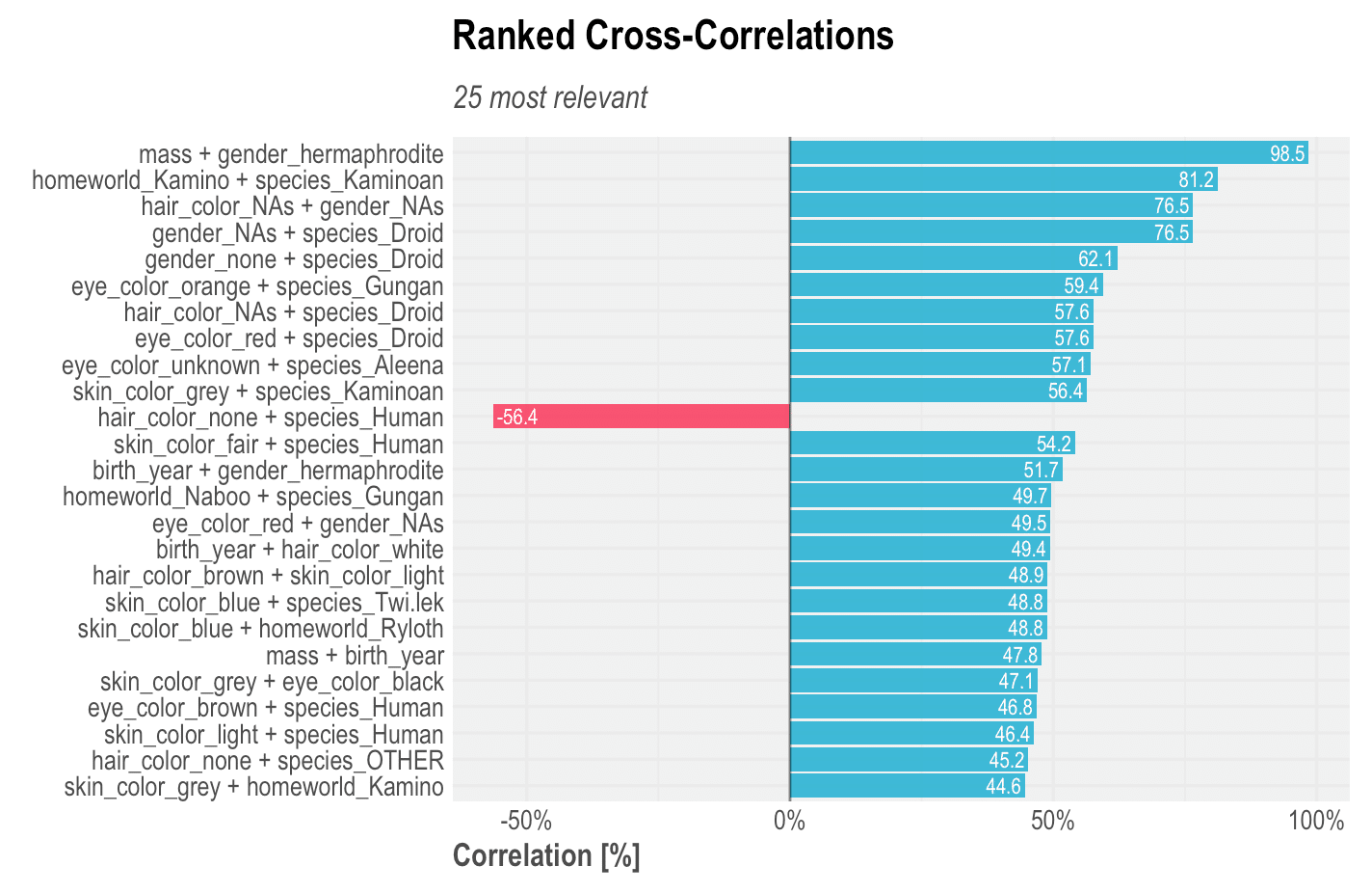
Yes, it is as easy as that. We can check the top correlations of variables and values ranked in descending order, excluding 100% correlations of course. From the plot above we can extract some interesting insights:
– Characters which are hermaphrodites are commonly fat as well! Jabba is the only hermaphrodite character and happens to be the fattest as well, followed by Grievous which mass consists only of 12% of Jabba’s. Also, it(?) is the second oldest character, leaving Yoda as the champion with 896 years old!
– Characters which are Kamionan (a species) usually come from Kamino, and have grey skin. The correlation might sound obvious because of both names, but if the planet was named Mars, then it would have been harder to detect. Interesting to notice that there is one human that also comes from Kamino (Boba Fett) and that is why the correlation is not 1 (100%).
– Droids commonly do not have gender (or not known), no hair colour, and red eyes.
– Gungans have orange eyes and their homeworld is Naboo.
– Most humans have hair colour defined (thus have hair) and fair skin colour. This is an inverse correlation example because when the character is human species the negative coefficient establishes that hair colour none is not common.

[The Illustrious Jabba The Hutt (…) | sideshow.com]
With these facts at hand, everyone would think I’m a Star Wars fan (rather than a data geek)! Leaving jokes aside, these insights are usually what we need to get from our datasets. With corr_cross() you find them as easily as that. Now, let’s check some other parameters to help us improve further our EDA.
Using the contains parameter you can check specific variables correlations. This option returns all Ranked Cross-Correlations that contains a certain string. Let’s say we want to check eye, hair, and skin colour in a single plot, then running corr_cross(df, contains = "color") will do. Give it a try!
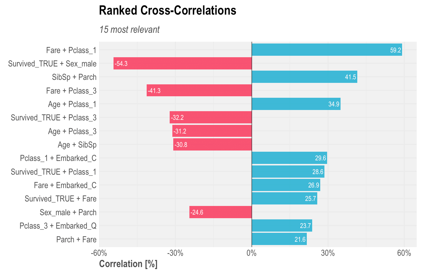
Also check the titanic data set’s Ranked Cross-Correlation; it doesn’t even need further explanations!
data(dft)
# Let's get rid of some noisy columns first
dft <- select(dft, -Cabin, -Ticket)
corr_cross(dft, top = 15)
Local Cross-Correlation
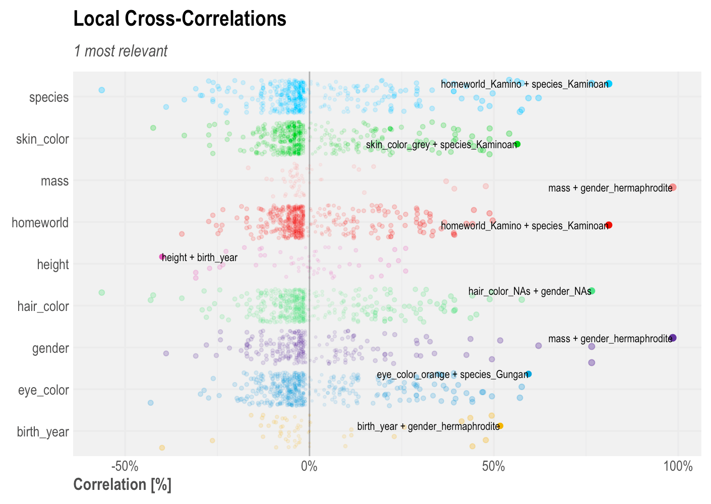
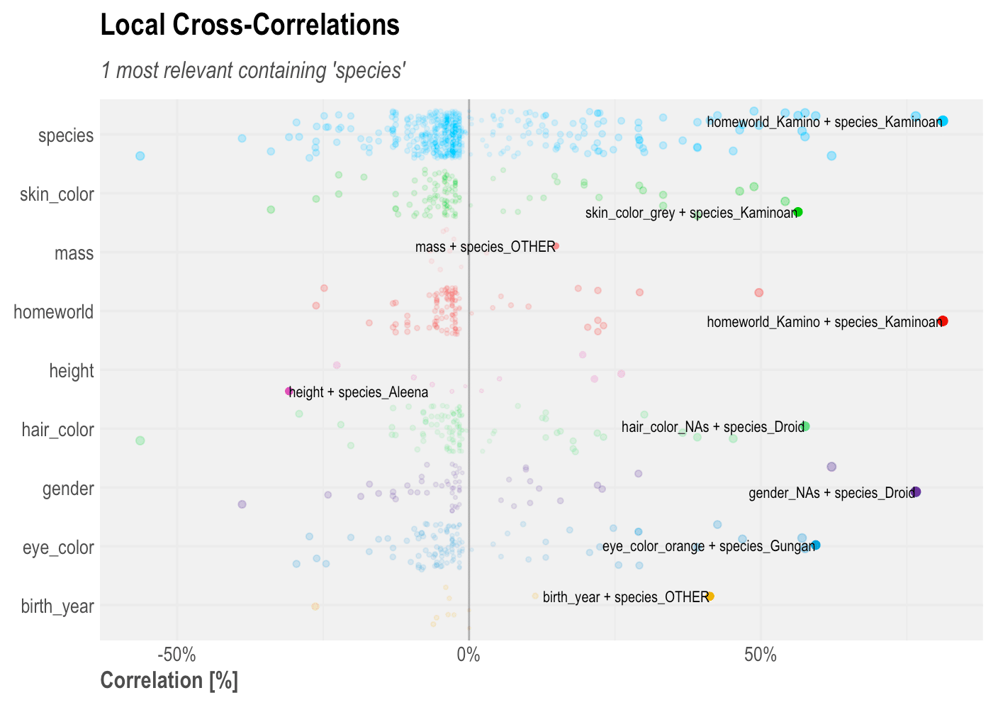
There is another kind of cross-correlation that returns all correlations in a single plot, not necessarily ranked. This will help us understand the skewness or randomness of some correlations found. It will also highlight the highest correlations for each of the variables used.
corr_cross(df, type = 2)
or something like
corr_cross(df, type = 2, contains = "species")
Other parameters
Additionally there are other parameters such as method for selecting which method you wish to use for calculating correlations (pearson, kendall, or spearman), plot for returning a data frame with the results instead of a plot, max for setting a ceiling different than 100%, top for showing more or less results for the Ranked Cross-Correlations, and some others which can be check in the documentation: ?cross_corr(). You might also fin useful its very close brothers: corr_var() and corr().
Feel free to share your results with other datasets and any interesting insights found with this method. I hope Ranked Cross-Correlations becomes an important tool for your future EDAs!


Hey Bernardo! This is a very useful package! I shared it with my co-workers as well. There’s just one question I have about corr_var().
I’m working with RNA-Seq data and wanted to check the correlation of other genes’ expression in my dataset to one gene of interest. The function works perfectly, however, when I set “top = 5”, it plots the correlation of 6 genes instead (and it plots 5 when I set ‘Top = 4’). At the top of the plot it still says “Top 5 out of 392 variables (original & dummy)“. Is there a way I can adjust the header or is this a different problem? Thanks in advance!
Hi Elena! That’s great, thanks for the referrals ?
Re the top argument, I can’t seem to replicate your issue. Is it possible to share your dataset or a reproducible example so I can dig into it? At least, with the Titanic dataset used in the post, when I set 5, I only get 5. Please, post it in here: https://github.com/laresbernardo/lares/issues
On the other hand, you actually can edit the subtitle with something like this: `corr_cross(df) + ggplot2::labs(subtitle = “New text”)` or `NULL` instead to suppress the subtitle.
Hey again! Unfortunately, I cannot share the data as it is not published yet. For now the header change works perfectly! Thanks!
Hi Elena! That’s great, thanks for the referrals ?
Re the top argument, I can’t seem to replicate your issue. Is it possible to share your dataset or a reproducible example so I can dig into it? At least, with the Titanic dataset used in the post, when I set 5, I only get 5. Please, post it in here: https://github. com/laresbernardo/lares/issues
On the other hand, you actually can edit the subtitle with something like this: `corr_cross(df) + ggplot2::labs(subtitle = “New text”)` or `NULL` instead to suppress the subtitle.
Hi! This package is great, thank you. I’m just trying to wrap my head around what the different plots and results mean… When the correlations are calculated for the data frame, the correlation matrix only includes some of the information, for instance in the Star Wars dataset above there are 38 different species, but in the correlation matrix there are only 10 included… does this mean there are simply no correlations between the other 28 species and the remaining features? Perhaps I’m interpreting this all wrong! Thanks for any info!
Thanks for your feedback! Indeed, the ohse() function, which runs a one hot smart encoding logic on the back to calculate correlations between categorical and numerical values, has a limit parameter which is automatically set to 10. This will set 1s an 0s for every discrete values of every categorical feature. If this variable, in this case species, has more than 10, the 10 most frequent will be shown and the rest will be grouped into a single “other” value. I am adding the possibility to use this limit argument inside the corr functions so you can calculate the correlation of all of categories, including the ones that appear once.
You can now update the library with `updateLares()` and you’ll get this new `limit` argument to control this limit when running one hot encoding internally. By default it still is 10 but if set to NA, this argument will not be used to limit the categories.
Found a pretty similar approach you should check. Is for Python and it’s based on a Predictive Power Score (PPS) for every feature combination.
Here you go: https://github.com/8080labs/ppscore
Bernardo, this is one of the most useful, and interesting projects I’ve seen on this site. However, I’m having difficulty with cross correlation type 2, when I type in the code on my end, the plot doesn’t display the species’ correlations and the subheading says “0 most relevant containing “species.”” Any chance you know what the problem might be?
Hi @coreif:disqus Thanks, really glad you are finding this post useful. Do you have any replicable example so I can try it? Might be a bug…
I was trying to replicate your example, ‘corr_cross(df, type = 2, contains = “species”),’ I assume it’s a bug on my end.
That’s strange. I’ve just run that same example in the post and worked for me. Be sure to have your libraries updated (R 4.0 is working too). If you think it’s a library bug, you can open an issue thread in the Github’ repo: laresbernardo/lares
This is great Bernardo! Is there a way to include the statistical significance of each correlation?
Hi there Charlie. That’s something I’d want to include since some time ago and you have just triggered it….
I’ve deployed an update with p-values data included as a new column! Now, the function has a parameter, pvalue, set to TRUE as default 😉
To get the data instead of a plot, just set plot = FALSE inside the corr_cross() function.
To update the library, you may run updateLares() in your R session.
Hi Bernardo. I had a go at using the update and it works! That’s really good. Would it be possible to include the statistical significance in the chart (as *,**,*** markers perhaps?) or to filter out non-significant correlations? Thanks so much for getting back to me btw, I really appreciate it.
Great! Glad it worked out for you. You could simply mutate a new column with your criteria like:
results_given %>% mutate(signif = case_when(pvalue < 0.0001 ~ "***", pvalue < 0.001 ~ "**", … and such! 😉
On the other hand, I just added an additional parameter, max_pvalue , so when you decrease its value, the plot will filter those less-significant values automatically and will let you know 😉
Mate, thanks so much for your help with this. I am fairly new to using R, so it’s really useful to get these sorts of tips.
Thanks again and keep up the good work! Charlie.
Hi Bernardo! Following your answer regarding max_value, is it possible to do this in the “corr_var” function? I want to remove the less significant correlations when ONLY showing correlations for one specific variable. As Im working with bacteria the dataset I have is too big to show. Thank you!
Sandra
Hi Sandra! I’ve included the “max_pvalue” argument into the `corr_var` function as well. Feel free to share your results on bacteria 😉
Is there a way to add and use an adjusted p-value?
Hi @disqus_HpbtL1crFU:disqus Yes! You can use the contains parameter. Something like: corr_cross(df, contains = “X”) or you could simply use the corr_var(df, X) function.
Hope that helps! 😉
Thanks Mr Lares for this great package, is there any way to specify the variables for which I want to see the cross correlations, say I have variables X, Y, Z, W. and I want to check pair cross correlations for only X~Y, X~Z, and X~W. Is this option available in this package?
Hi @disqus_HpbtL1crFU:disqus Yes! You can use the contains parameter. Something like: corr_cross(df, contains = “X”) or you could simply use the corr_var(df, X) function.
Hope that helps!
Correlation analysis is a very important issue.
You have to be very careful, especially with the problem generated by spurious correlations.
From the point of view of the validity of information and methods, the biggest problem is to clearly define which correlations are treated as spurious and which are not.
Many times we assume that it makes no sense to correlate two variables, however, the real problem is that we did not have all the information of the context in which the values of these variables were generated.
I have experienced this problem personally several times. I speak from experience.
I absolutely agree with you @hectoralvarorojas:disqus
Correlation may be attributed to causality or to consequence, and the coefficients won’t reflect any difference. That’s why data analysts will never cease to exist, because understanding any case is not only about the numbers shown and simple EDAs, but about the context. There is no algorithm smart enough to get relevant data from real life sources by its own as we (smart) humans do. And if it ever becomes a reality, I wish to be alive to see that!
Thanks for your valuable comment Hector. Keep in touch.