
Given the number of people interested in my first post for visualizing Classification Models Results, I’ve decided to create and share some new function to visualize and compare whole Linear Regression Models with one line of code. These plots will help us with our time invested in model selection and a general understanding of our results.
Where are we going with this post? Let’s take a quick look at the final output: a quick nice dashboard with everything you’d need to compare and evaluate if your regression model is looking good, compare with others, or get working on further improvements.
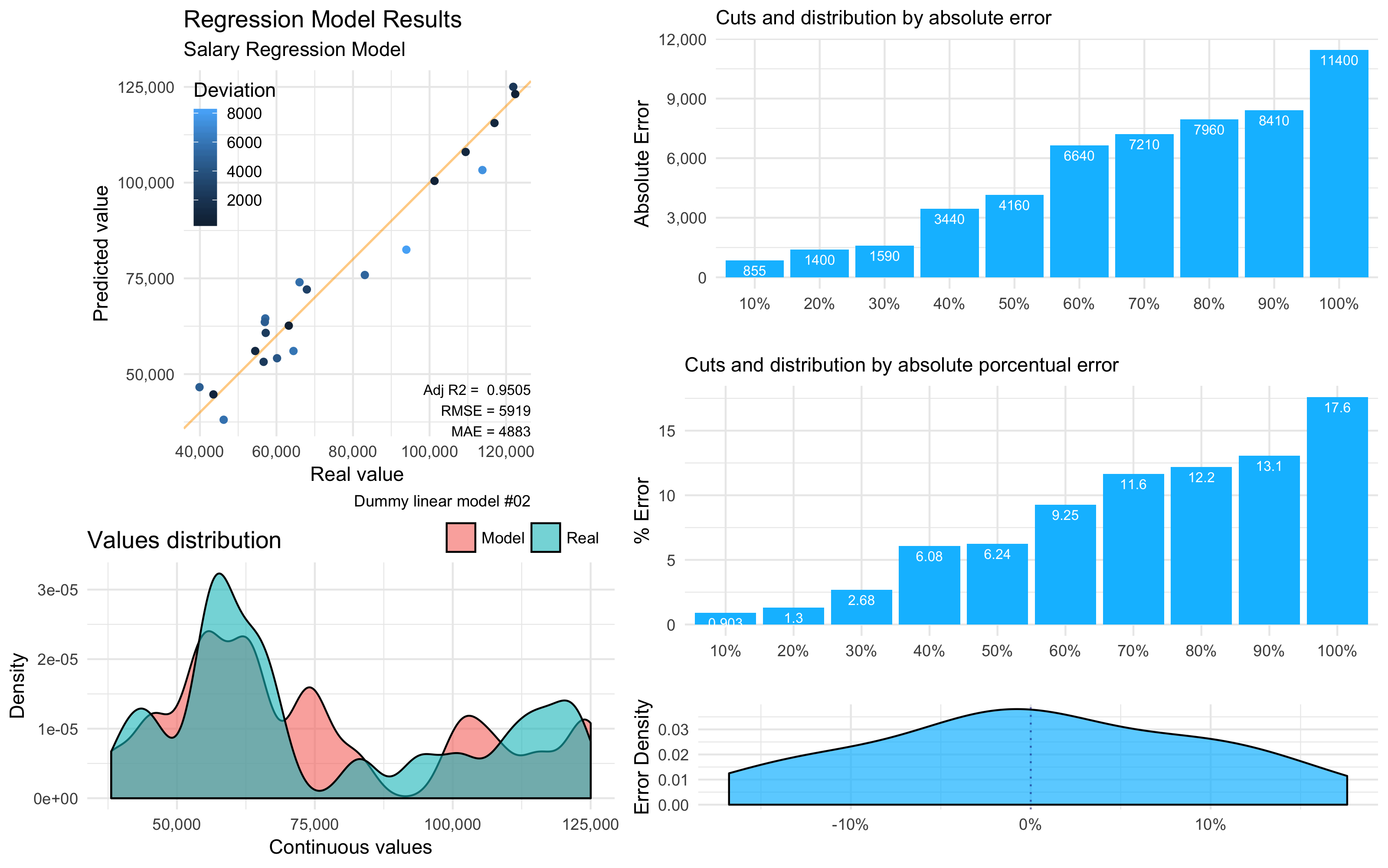
Interesting to say that, the exact same function mplot_full used before in the Part 1: Classification Models post, will work on for Regression Models too. There’s a simple validator which will automatically label the model as a “regression” if the ‘tag’ values is numeric and have more than 6 unique values; if not, will run as a “classifier”.
NOTE: If you wish to replicate the following plots, you can download the dummy data used for the examples here.
Install the ‘lares’ library
install.packages("lares")
Regression results plot
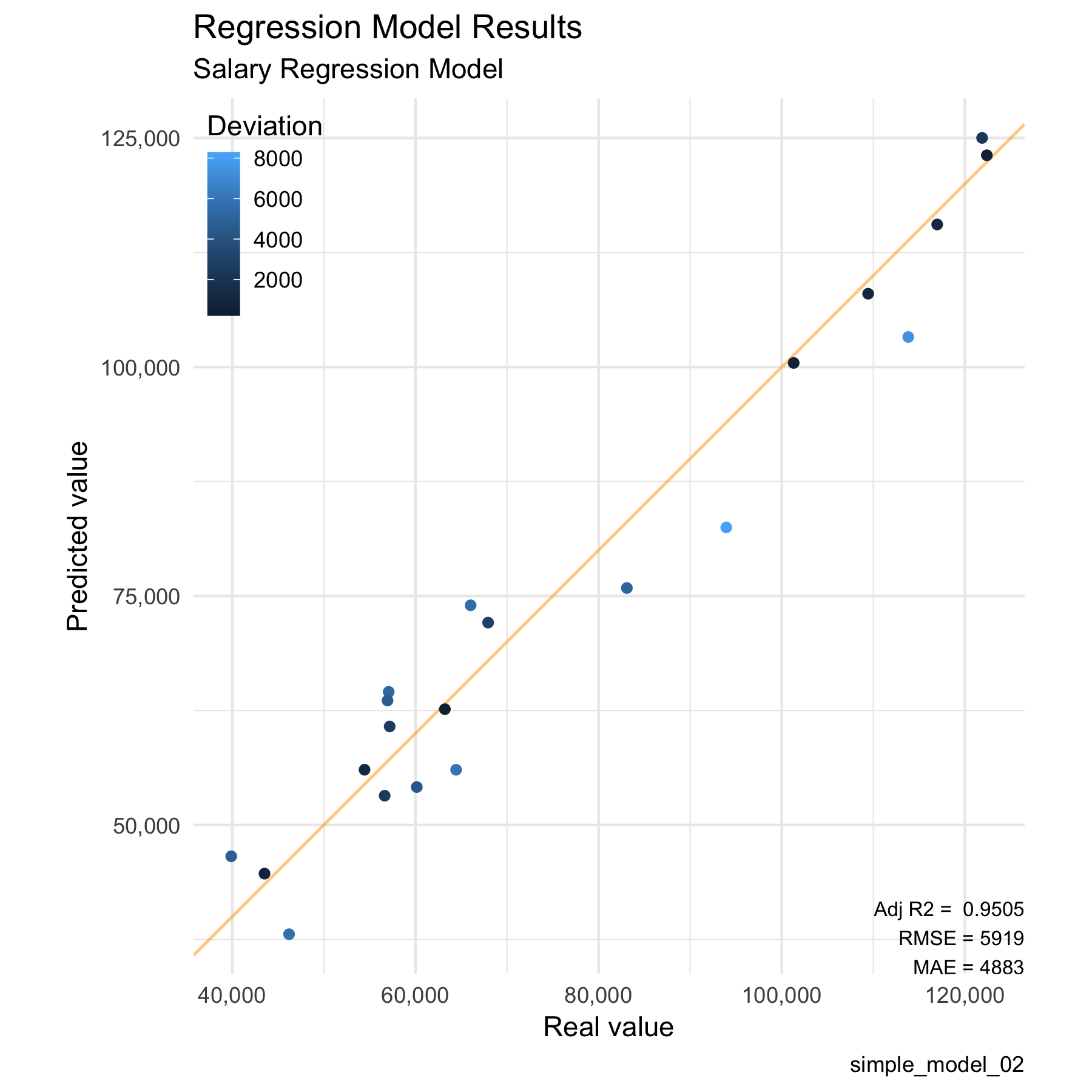
The most obvious plot to study for a linear regression model, you guessed it, is the regression itself. If we plot the predicted values vs the real values we can see how close they are to our reference line of 45° (intercept = 0, slope = 1). If we’d had a very sparse plot where we can see no clear tendency over that line, then we have a bad regression. On the other hand, if we have all our points over the line, I bet you gave the model your wished results!
Then, the Adjusted R2 on the plot gives us an easy parameter for us to compare models and how well did it fits our reference line. The nearer this value gets to 1, the better. Without getting too technical, if you add more and more useless variables to a model, this value will decrease; but, if you add useful variables, the Adjusted R-Squared will improve.
We also get the RMSE and MAE (Root-Mean Squared Error and Mean Absolute Error) for our regression’s results. MAE measures the average magnitude of the errors in a set of predictions, without considering their direction. On the other side we have RMSE, which is a quadratic scoring rule that also measures the average magnitude of the error. It’s the square root of the average of squared differences between prediction and actual observation. Both metrics can range from 0 to ∞ and are indifferent to the direction of errors. They are negatively-oriented scores, which means lower values are better.
Having a data.frame with the ‘label’ and ‘prediction’ values (real value and obtained from the model value) in our environment, we can start plotting:
lares::mplot_lineal(tag = results$label,
                    score = results$pred,
                    subtitle = "Salary Regression Model",
                    model_name = "simple_model_02")
Which will give us (and save into our working directory if set to save = TRUE) the following plot:
Errors plot
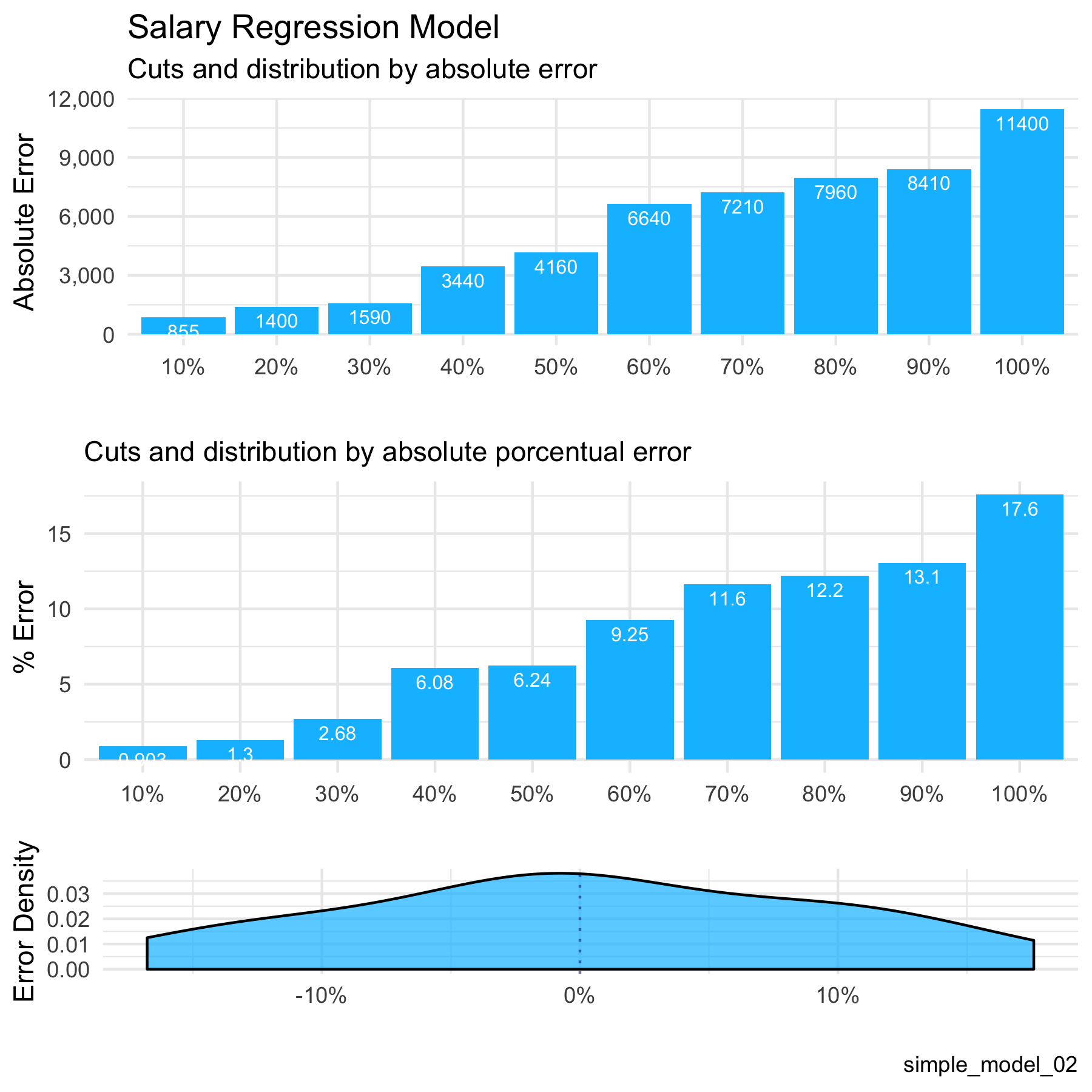
If we achieved a good model, now we have to learn to deal with its errors. As I said in the other post, this is the easiest plot to explain to the C-level guys to understand the consequences of getting your model to production. For example, if we tell them that our regression has an Adjusted R2 value of 0.97 and a great p-value of 1e-14, probably, they’ll blink twice and give you an awkward face. But, if you tell them that you trained your model and when tested in an untouched-by-your-algorithm dataset you get only a 5% of error in 90% of the cases, that is much more worthy to sell (depending on the final goal)!
On the background, I calculate the error of each calculation, absolute and porcentual, and sort them from the smallest errors to the worst. Finally, I split them into n different buckets with the same amount of observations. As you can see, we can conclude how much of our test set have an error below a value or percentage with the first two plots. The third one is a density plot for the real porcentual error, with a 0 reference line, where we can see in which ranges our errors are most common.
lares::mplot_cuts_error(tag = results$label,
                        score = results$pred,
                        title = "Salary Regression Model",
                        model_name = "simple_model_02")
Which gives us these three plots:
Distribution plot
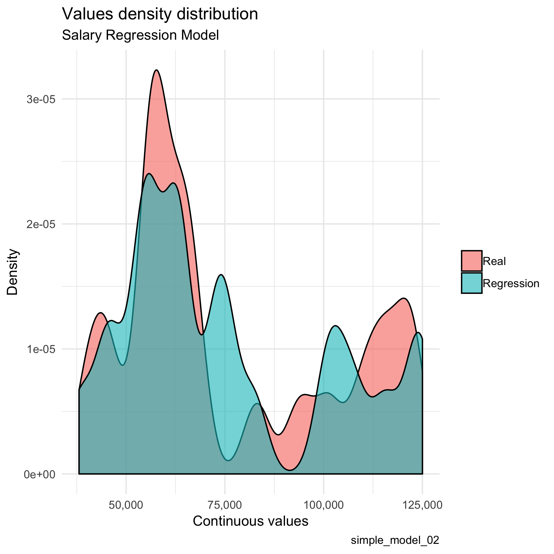
This is a simple comparison between the real values and the predicted values. The more similar this two curves are, the better. I give a smaller size to this plot because it gives us an idea of the whole picture more than a specific metric.
lares::mplot_density(tag = results$label,
                     score = results$pred,
                     subtitle = "Salary Regression Model",
                     model_name = "simple_model_02")
Plots:
Final All-In Plot
We do not have to plot non of the above functions to get this result (that’s the whole point of this post). We need to provide only two values: tag for real values and score for our model’s prediction or regression. The rest of the parameters may not be used.
lares::mplot_full(tag = results$label,
                  score = results$pred,
                  splits = 10,
                  subtitle = "Salary Regression Model",
                  model_name = "simple_model_02",
                  save = T)
These functions were adapted into my past mplot series functions from the lares library, merging some of them so they plot automatically, whether we have a categorical or a numerical input. Remember, if your tag values have more than 6 unique values, it’ll assume you are studying a regression.
BONUS: Splits by quantiles
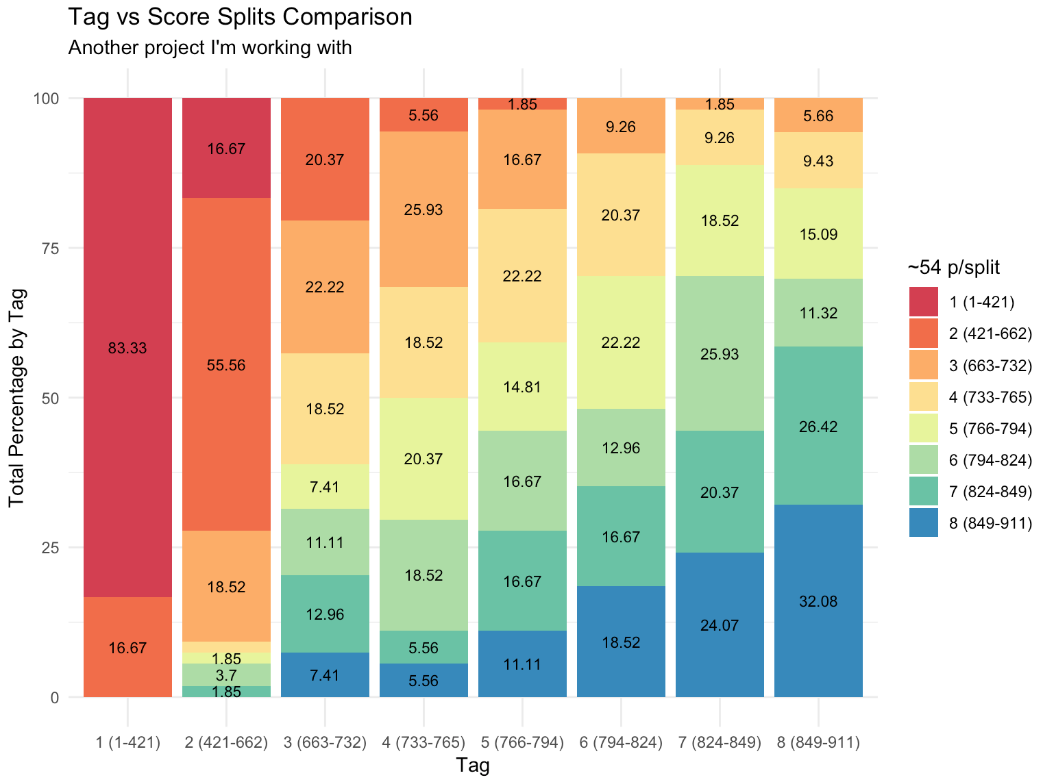
One of my favourite functions to study our model’s quality is the following. What it shows is the result of arranging all scores or predicted values in sorted quantiles, from worst to best, and see how the classification goes compared to our test set. Being a regression model, we won’t always need this plot but I though it might be useful for some cases. More detailed explanation in this other post.
lares::mplot_splits(tag = results$label,
                    score = results$pred,
                    split = 8)
Which will give us something like this:
Hope this post was as useful as the other one. If anyone wishes to contact me, don’t hesitate to add me on Linkedin, email me, and/or comment below.

Hi Bernardo,
Thank you. The lares package is really a great way to communicate my ML results. I am wondering. Is there a way to edit or costumize the title in the mplot_lineal() function. It now says “Regression Model Results”. Can I change this by adding an argument/setting somewhere int he function? Another question. In the regression plot there is no specification for having similar axis scales for predicted and modelled. Can I somehow specify that, as we know from the coord_obs_pred() function in ggplot?
Hi Kamau. Thanks for getting in contact and giving your feedback. You can actually change its title easily with ggplot2’s ggtitle or labs(title = “…”) by simply adding + to yoir results and modified the gg object. Makes sense?
Bernardo: this library is a piece of aRt ?
Thanks @pablo__c:disqus Glad you find it as nice as you say!! Cheers 😉
Hi,
When I click “here” in the sentence (If you wish to replicate the following plots, you can download the dummy data used for the examples here).
I get the following error message:
“Too many requests
Sorry, this link has been automatically turned off for now. Learn more about traffic limits.”
Is there a way I can access the dummy data?
Thanks.
Hello @perrytaneja:disqus sorry for the late reply!!
Now the link is working.. but I’ve got a better solution for you: when you load the lares library with library(lares), you can call data(dft) and will have the same dataframe. Hope it works for you
Hi Bernardo,
Great and easy to use functions.
Excellent!.
I have a basic question
about interpreting
in plain, simple language –
what the Error Plots actually show.
Q1) In the “Absolute” Error Plot (above)
for ex., – what does the value:
“11400”
inside the 100% blue bar actually mean?.
Q2) In the “Percentual” Error Plot (above)
for ex., – what does the value:
“13.1”
inside the 90% blue bar actually mean?.
So, how to answer these 2 questions
to an actual End User (not a statistician…)
in plain, simple English or Spanish?.
In a practical, easy to understand way…
Thanks Bernardo!!!
SFdisqus
San Francisco
Hello SFdisqus.
Thanks for your compliments.. glad you enjoyed this post! So, let me see if I can help with your doubts:
1. That number in the highest bar means that all absolute (real values) errors are less than 11.400. So you should not expect to get a worse error than that in your test set (reality?).
2. In that second plot, it means that 90% of your predicted values has an error of 13.1% or less. Makes sense?
3. I think I answered your points as a non-statistician already!
Feel free to add my in Linkedin and we can talk further (English or Spanish xD)
Cheers,
B
Thanks Bernardo!
Super-clear answers…understood.
Last Q – if you don’t mind 🙂
for the “Bonus – Splits by Quantiles” plot:
Could you also explain
(with your same easy, business End-User vocabulary),
what the 1st / left vertical bar
and the last / right vertical bar
represent / mean?.
Thanks again, Bernardo!!
SFdisqus
San Francisco
Yes, of course.
Imagine you have a continuous score (regression) and you want to compare with the real known values. Then, imagine you have 100 observations on your test set; you arrange them from the smaller to the bigger scores and then divide those in 8 parts (some will have 13, some 12). So: The first column contains the worst 13 scores If it was a perfect model, then it will have all red.. but in this case, we have 83% red and 17% in orange. That’s because some of the next bucket were “categorized” inside those 13% worst scores. The same happens with all columns. A perfect model would have Each column with a single color, but not possible right? Check how the top 13% (blue) grow more common as you move to the “top buckets”! That’s it 🙂 Hope you understood…
Cheers, B
Ok, Bernardo.
I think I understand. The plot shows a correspondence btw:
– “real values” (Tags or Labels)
and
– model “predicted” values (Scores or Pred).
In a perfect, ideal model,
all columns would have a single color,
since all Scores would have been predicted 100% vs their “real values”.
But in your example plot (above),
why would the leftmost column
have the “worst” scores.
It’s 83% red
…aren’t 83% of the Scores equal
to their Tags “real values”?.
Seems pretty good Score vs. Real Value correspondence in that 1st column…
What makes the leftmost column
be the “worst”?.
And the rightmost column be the “best”?.
Ok, Bernardo.
I think I understand. The plot shows a correspondence btw:
– “real values” (Tags or Labels)
and
– model “predicted” values (Scores or Pred).
In a perfect, ideal model,
all columns would have a single color,
since all Scores would have been predicted 100% vs their “real values”.
But in your example plot (above),
why would the leftmost column
have the “worst” scores.
It’s 83% red
…aren’t 83% of the Scores equal
to their Tags “real values”?.
Seems pretty good Score vs. Real Value correspondence in that 1st column…
What makes the leftmost column
be the “worst”?.
And the rightmost column be the “best”?.
Ok, Bernardo.
I think I understand. The plot shows a correspondence btw:
– “real values” (Tags or Labels)
and
– model “predicted” values (Scores or Pred).
In a perfect, ideal model,
all columns would have a single color,
since all Scores would have been predicted 100% vs their “real values”.
But in your example plot (above),
why would the leftmost column
have the “worst” scores.
It’s 83% red
…aren’t 83% of the Scores equal
to their Tags “real values”?.
Seems pretty good Score vs. Real Value correspondence in that 1st column…
What makes the leftmost column
be the “worst”?.
And the rightmost column be the “best”?.
Ok, Bernardo.
I think I understand. The plot shows a correspondence btw:
– “real values” (Tags or Labels)
and
– model “predicted” values (Scores or Pred).
In a perfect, ideal model,
all columns would have a single color,
since all Scores would have been predicted 100% vs their “real values”.
But in your example plot (above),
why would the leftmost column
have the “worst” scores.
It’s 83% red
…aren’t 83% of the Scores equal
to their Tags “real values”?.
Seems pretty good Score vs. Real Value correspondence in that 1st column…
What makes the leftmost column
be the “worst”?.
And the rightmost column be the “best”?.
Worst I meant by nearer to zero, less chances to score the top scores… Remember this is for regressions, not classifications. So from this 13% observations with lowest real values, 83% were actually part of this lowest scores cluster according to our model. Makes sense?
Ahh, yes!…
Finally understand it.
(after carefully reading your prev. answers
and your most recent answer, above).
The key was your definition of the word “score”…I was missing what you meant by this word.
Interesting how some plots
can visually communicate meaning directly, clearly and immediately to a Business End User,
But other plots (like the “Bonus – Splits by Quantiles” plot), are so useful yet much more difficult to interpret without adequate and clear explanations of meaning to a non-specialist, (like an End User…).
And you have provided the explanations in the above comments thread…
Hope it benefits other people…
Thanks for your patience, Bernardo!.
Great R pkg author and VERY good teacher. 🙂
SFdisqus
San Francisco