
Between November 2000 and July 2022, every three-year window of monthly returns had US stocks and 10-year Treasury bonds moving in opposite directions: when stocks fell, bonds tended to rise. That made bonds the cushion in a portfolio. I wanted to know whether that still holds after the bond losses of 2022, so I rebuilt 64 years of monthly returns and measured it. It does not. The 36-month correlation has been positive in every window since August 2022, averaging 0.50, and in December 2024 it reached 0.67, the highest reading since these windows begin in 1965. In a portfolio of 60% stocks and 40% bonds, the bonds carried none of the risk in 2000-2021 (their share was -1%) and 20% of it since 2022. And the single correlation for the whole period, 0.10, describes none of its three eras.
Monthly stock and bond returns since 1962
Stock returns come from the Fama/French factors in Kenneth French’s data library: the monthly return of the whole US stock market, dividends included (the market excess return plus the Treasury bill rate). Free monthly Treasury return series that go back that far are themselves built from yields, so I build one from the 10-year Treasury yield the Federal Reserve Board publishes in its H.15 release (DGS10 on FRED). At the end of each month I buy a new 10-year bond at par, so its coupon equals that day’s yield. A month later I price it at the new yield, with 9 years and 11 months left, and add one month of coupon. The block runs on its own with readr 2.2.0, dplyr 1.2.1 and httr2 1.3.0 on R 4.6.1:
library(tidyverse)
library(httr2)   # as of October 2026, FRED refuses R's default user agent

fred <- function(id) {
  request("https://fred.stlouisfed.org/graph/fredgraph.csv") |>
    req_url_query(id = id) |>
    req_perform() |>
    resp_body_string() |>
    I() |>
    read_csv(na = c("", ".")) |>
    set_names(c("date", "value"))
}

# Stocks: Fama/French market factor, monthly, in percent
zip <- tempfile(fileext = ".zip")
download.file("https://mba.tuck.dartmouth.edu/pages/faculty/ken.french/ftp/F-F_Research_Data_Factors_CSV.zip",
              zip, mode = "wb", quiet = TRUE)
stocks <- read_csv(unz(zip, "F-F_Research_Data_Factors.csv"), skip = 4,
                   col_types = cols(.default = "c")) |>
  rename(ym = 1) |>
  filter(str_detect(ym, "^\\d{6}$")) |>          # monthly rows only; annual ones follow
  transmute(month = ym(ym), stocks = (as.numeric(`Mkt-RF`) + as.numeric(RF)) / 100)

# Bonds: total return of a 10-year par bond, rebought every month
bond_return <- function(y_start, y_end) {
  n <- 2 * (10 - 1/12)                           # half-years left after one month
  price <- y_start / y_end * (1 - (1 + y_end / 2)^-n) + (1 + y_end / 2)^-n
  price - 1 + y_start / 12                       # price change plus one month of coupon
}

bonds <- fred("DGS10") |>
  drop_na(value) |>
  mutate(month = floor_date(date, "month")) |>
  slice_max(date, by = month) |>                 # last trading day of each month
  transmute(month, bonds = bond_return(lag(value) / 100, value / 100))

returns <- inner_join(stocks, bonds, by = "month") |> drop_na()
That gives 775 months, February 1962 to August 2026. Before trusting a rebuilt series I check it against two years whose bond markets everyone remembers. Compounded to calendar years, the rebuilt bond returned 20.4% in 2008, when stocks lost 36.7%, and -16.4% in 2022, when stocks lost 19.9%.
One correlation for 64 years describes none of them
Over all 775 months the correlation between stock and bond returns is 0.10, which reads as "roughly unrelated". A rolling correlation shows what that average is made of. slide2_dbl() from slider 0.3.3 runs cor() over the current month and the 35 before it:
library(slider)

rolling <- returns |>
  mutate(cor36 = slide2_dbl(stocks, bonds, cor, .before = 35, .complete = TRUE))
You can copy the gray theme below for your own plots.
dsp_colors <- c("#0066CC", "#E8862D", "#159A6C", "#7D5BD6",
                "#D64580", "#2AA9B8", "#C9A227")
dsp_theme <- theme_minimal(base_size = 13) +
  theme(plot.background    = element_rect(fill = "#ECECEF", color = NA),
        panel.background   = element_rect(fill = "#ECECEF", color = NA),
        panel.grid.minor   = element_blank(),
        panel.grid.major.x = element_blank(),
        panel.grid.major.y = element_line(color = "grey78"),
        axis.ticks         = element_blank(),
        plot.title         = element_text(face = "bold"),
        strip.text         = element_text(face = "bold"),
        legend.position    = "top")

full <- cor(returns$stocks, returns$bonds)

rolling |>
  drop_na(cor36) |>
  ggplot(aes(month, cor36, fill = cor36 > 0)) +
  geom_col(width = 31) +
  geom_hline(yintercept = full, linetype = "dashed") +
  annotate("text", x = as.Date("2002-01-01"), y = full + 0.05, hjust = 0, size = 3.8,
           label = sprintf("All %d months at once: %.2f", nrow(returns), full)) +
  scale_fill_manual(values = c(`TRUE` = dsp_colors[2], `FALSE` = dsp_colors[1]),
                    labels = c(`TRUE` = "Move together", `FALSE` = "Move opposite"), name = NULL) +
  scale_x_date(breaks = as.Date(paste0(seq(1970, 2020, 10), "-01-01")), date_labels = "%Y") +
  labs(x = NULL, y = "Stock-bond correlation, past 36 months") +
  dsp_theme
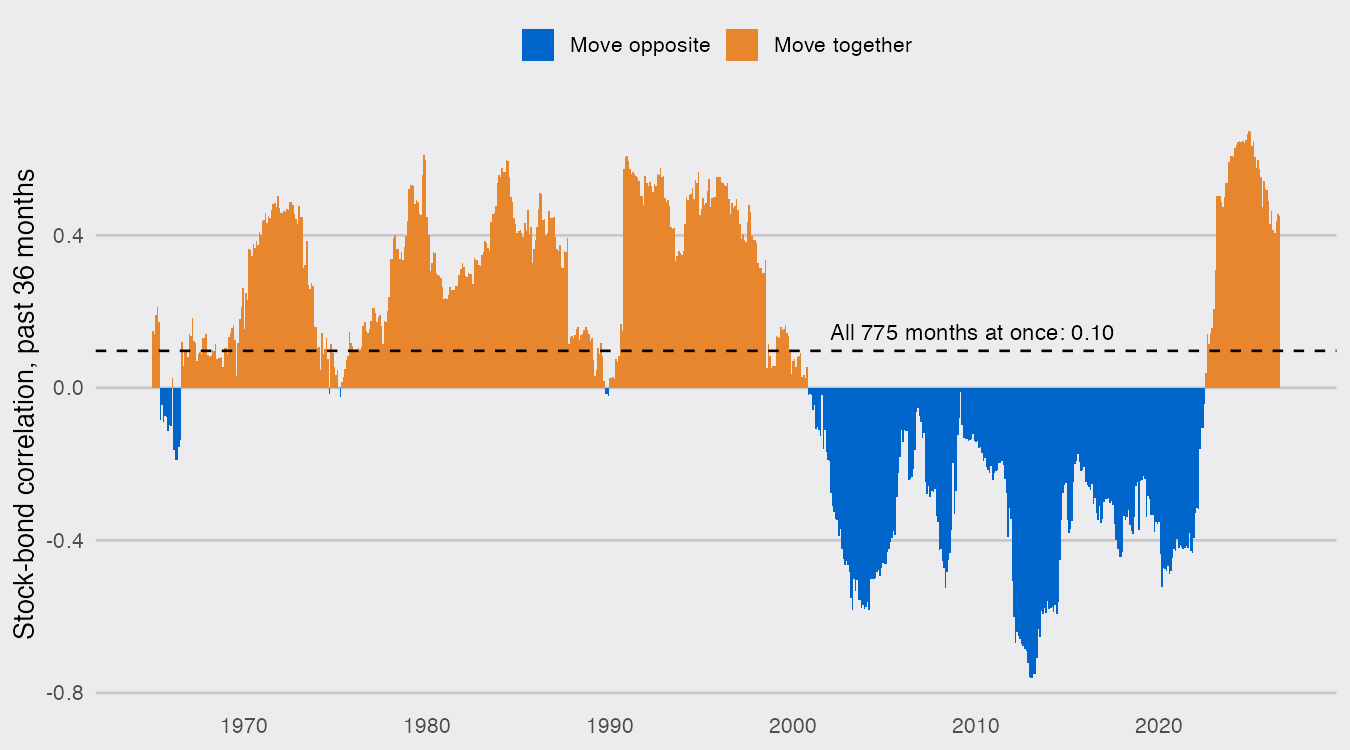
There are three eras, not one. From the mid-1960s through the 1990s stocks and bonds mostly rose and fell together. From November 2000 to July 2022, 261 windows in a row, they moved in opposite directions, averaging -0.35. Since August 2022 they have moved together again in all 49 windows, and the 0.67 of December 2024 is above the previous high (0.61, November 1979).
How do I calculate portfolio risk from a covariance matrix in R?
A portfolio’s variance is t(w) %*% S %*% w, where w holds the weights and S is the covariance matrix of the assets’ returns (cov() on a data frame with one column per asset); multiply S by 12 to annualize monthly returns and take the square root for volatility. Each asset’s share of that variance is w * (S %*% w) divided by the total, which is how a 40% holding can carry more or less than 40% of the risk. Below I split the months where the rolling correlation changed sign, rounded to calendar years, and compare each era’s 60/40 portfolio with the same portfolio under zero correlation:
era_of <- function(month) {
  case_when(month < as.Date("2000-01-01") ~ "1962-1999",
            month < as.Date("2022-01-01") ~ "2000-2021",
            .default = "2022-2026")
}

w <- c(stocks = 0.6, bonds = 0.4)

portfolio_risk <- function(d) {
  S  <- cov(d) * 12                              # annualized covariance matrix
  S0 <- S
  S0[1, 2] <- S0[2, 1] <- 0                      # same volatilities, zero correlation
  variance <- drop(t(w) %*% S %*% w)
  tibble(cor        = cov2cor(S)[1, 2],
         stocks_vol = sqrt(S[1, 1]),
         bonds_vol  = sqrt(S[2, 2]),
         vol_6040   = sqrt(variance),
         vol_if_0   = sqrt(drop(t(w) %*% S0 %*% w)),
         bond_share = (w * (S %*% w))[2] / variance)
}

risk <- returns |>
  mutate(era = era_of(month)) |>
  nest(.by = era, .key = "d") |>
  mutate(d = map(d, \(x) portfolio_risk(select(x, stocks, bonds)))) |>
  unnest(d)

risk |> mutate(across(-era, \(x) round(x, 3)))
## # A tibble: 3 × 7
##   era          cor stocks_vol bonds_vol vol_6040 vol_if_0 bond_share
##   <chr>      <dbl>      <dbl>     <dbl>    <dbl>    <dbl>      <dbl>
## 1 1962-1999  0.275      0.153     0.08     0.105    0.097      0.164
## 2 2000-2021 -0.343      0.155     0.073    0.088    0.098     -0.01
## 3 2022-2026  0.547      0.163     0.082    0.119    0.103      0.2
In 2000-2021 the negative correlation did real work. The 60/40 portfolio’s volatility was 8.8%, below the 9.8% it would have had with uncorrelated assets, and bonds, 40% of the money, carried -1% of the risk. A share below zero means their negative covariance with stocks took out slightly more variance than their own swings put in. Since 2022 the same portfolio has run at 11.9%, above the zero-correlation 10.3%, with bonds carrying 20% of the risk. Each asset was about as volatile on its own in both eras (stocks 15.5% and 16.3% a year, bonds 7.3% and 8.2%), so the difference is almost all in the off-diagonal of S.
The months that matter most tell the same story. In 2000-2021 the stock market fell more than 5% in 30 months, and bonds rose in 25 of them. Since 2022 it has happened 6 times, and bonds rose in 1. Before 2000 the cushion worked about half the time (18 of 36).
One caution: the 2022-2026 era is 56 months, so its correlation is estimated with less precision than the others. It is not one bad year, though: the latest 36-month window, September 2023 to August 2026, leaves 2022 out entirely and still comes to 0.45.
Inflation draws the line
Why would the sign flip? The usual explanation is that when inflation is the main worry, rising prices push interest rates up, which hurts bonds and stocks at once, and when growth is the worry, investors buy bonds as stocks fall. The data fit that story. I line each 36-month correlation up with the annual inflation rate over the same three years (the Bureau of Labor Statistics’ CPI, CPIAUCSL on FRED):
infl_windows <- fred("CPIAUCSL") |>
  transmute(month = date, inflation = (value / lag(value, 36))^(1/3) - 1) |>
  inner_join(drop_na(rolling, cor36), by = "month") |>
  drop_na(inflation)                             # October 2025 has no CPI (shutdown)

by_inflation <- infl_windows |>
  mutate(band = cut(inflation, c(-Inf, 0.02, 0.03, 0.05, Inf),
                    labels = c("2% or less", "2-3%", "3-5%", "above 5%"))) |>
  summarise(months = n(), positive = sum(cor36 > 0), mean_cor = mean(cor36), .by = band) |>
  arrange(band)
by_inflation
## # A tibble: 4 × 4
##   band       months positive mean_cor
##   <fct>       <int>    <int>    <dbl>
## 1 2% or less    115       10  -0.259
## 2 2-3%          245      115  -0.0490
## 3 3-5%          208      166   0.221
## 4 above 5%      171      169   0.324
When inflation over the previous three years ran above 5%, the correlation was positive in 169 of 171 months. At 2% or less it was positive in 10 of 115. Those 171 months come from three episodes (the 1970s and early 1980s, 1990-91 and 2022-24), and overlapping windows are not independent, so this is a pattern across a few episodes, not a test. It is a consistent one, though:
infl_windows |>
  mutate(era = era_of(month)) |>
  ggplot(aes(inflation, cor36, color = era)) +
  geom_hline(yintercept = 0, color = "grey50") +
  geom_point(alpha = 0.6, size = 1.6) +
  scale_color_manual(values = dsp_colors[c(2, 1, 5)], name = "Window ending in") +
  scale_x_continuous(breaks = seq(0, 0.14, 0.02), labels = scales::label_percent(accuracy = 1)) +
  labs(x = "Inflation, past 36 months (annual rate)",
       y = "Stock-bond correlation, past 36 months") +
  dsp_theme
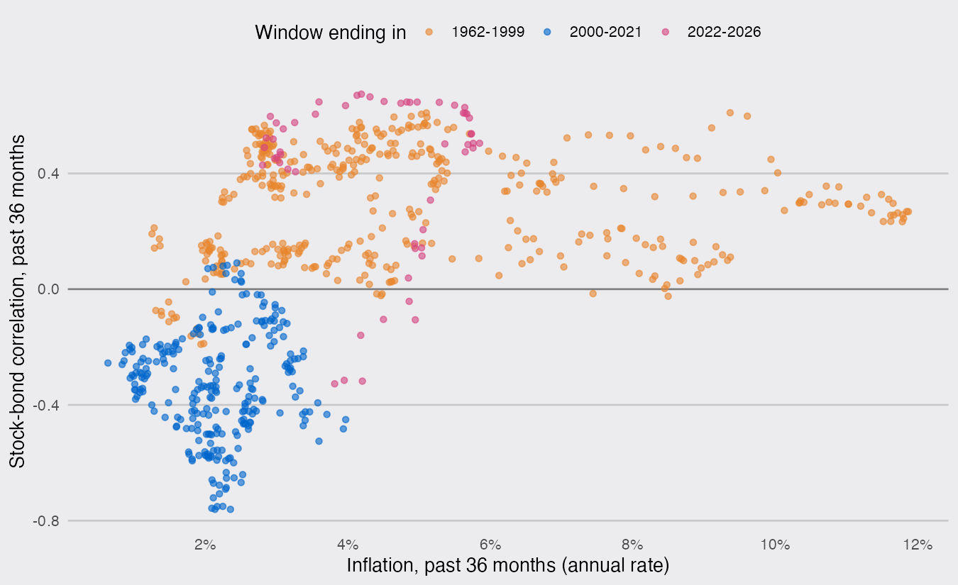
The 2000-2021 windows sit in the lower left: low inflation, negative correlation. The latest window, ending August 2026, has inflation at 2.97% and a correlation of 0.45. That is the 2-3% band, where both signs have occurred: 47% of its months were positive. Inflation has come down from its 2022 peak, and the correlation has not come down with it. A covariance matrix estimated over the whole history still describes bonds as nearly independent of stocks; for the last four years they have moved with them.
