
Zillow’s typical US home value reached another record in August 2026: $368,697, the highest since its series begins in 2000, and 17 of Zillow’s 50 largest metro areas set a record the same month. I wondered how many of those records survive once you take out inflation. None do. Consumer prices rose 13.2% between August 2022 and August 2026, and in August 2026 dollars the typical US home was worth $398,617 in August 2022, so today’s record is 7.5% below that peak. Since then 30 of the 50 metros have gained value in dollars but only 11 after inflation, and in Austin homes have lost 34% of their real value.
How do I adjust prices for inflation in R?
Divide each price by the consumer price index (CPI) for its month, then multiply by the CPI for the month you want to express it in: real = price / cpi * cpi_base. The block below runs on its own with readr 2.2.0, dplyr 1.2.1 and httr2 1.3.0 on R 4.6.1. It reads the Zillow Home Value Index (ZHVI, the typical value of homes in the middle third of the market, single-family and condo, smoothed and seasonally adjusted) for the US and its metro areas, and the seasonally adjusted CPI for all urban consumers (CPIAUCSL) from FRED, and expresses every value in dollars of the latest month:
library(tidyverse)
library(httr2)   # as of October 2026, FRED refuses R's default user agent

zhvi <- read_csv("https://files.zillowstatic.com/research/public_csvs/zhvi/Metro_zhvi_uc_sfrcondo_tier_0.33_0.67_sm_sa_month.csv")

cpi <- request("https://fred.stlouisfed.org/graph/fredgraph.csv") |>
  req_url_query(id = "CPIAUCSL") |>
  req_perform() |>
  resp_body_string() |>
  I() |>
  read_csv() |>
  set_names(c("month", "cpi"))

homes <- zhvi |>
  slice_min(SizeRank, n = 51) |>                     # the US (rank 0) and the 50 largest metros
  pivot_longer(matches("^\\d{4}-"), names_to = "date", values_to = "value",
               names_transform = as.Date) |>
  mutate(month = floor_date(date, "month")) |>       # Zillow dates are month ends, FRED's month starts
  left_join(cpi, by = "month") |>
  group_by(RegionName) |>
  mutate(real = value / cpi * cpi[month == max(month)]) |>   # in latest-month dollars
  ungroup()
Two things in that block are easy to get wrong. Zillow stamps each month with its last day (2026-08-31) and FRED with its first (2026-08-01), so joining on the date column as it comes matches 0 of 320 US rows, and left_join() fills every CPI with NA without a warning. floor_date(date, "month") puts both on the first of the month. And one month has no CPI at all: October 2025 is empty in FRED because the Bureau of Labor Statistics did not collect prices during that autumn’s federal government shutdown and never published the month. Its real values come out NA, so anything that looks for a maximum needs na.rm = TRUE.
The typical US home since 2000
You can copy the gray theme below for your own plots.
dsp_colors <- c("#0066CC", "#E8862D", "#159A6C", "#7D5BD6",
                "#D64580", "#2AA9B8", "#C9A227")
dsp_theme <- theme_minimal(base_size = 13) +
  theme(plot.background    = element_rect(fill = "#ECECEF", color = NA),
        panel.background   = element_rect(fill = "#ECECEF", color = NA),
        panel.grid.minor   = element_blank(),
        panel.grid.major.x = element_blank(),
        panel.grid.major.y = element_line(color = "grey78"),
        axis.ticks         = element_blank(),
        plot.title         = element_text(face = "bold"),
        strip.text         = element_text(face = "bold"),
        legend.position    = "top")

homes |>
  filter(RegionType == "country") |>
  select(month, `In dollars of the day` = value, `In August 2026 dollars` = real) |>
  pivot_longer(-month, names_to = "measure") |>
  drop_na(value) |>                                   # the October 2025 CPI gap
  ggplot(aes(month, value, color = measure)) +
  geom_line(linewidth = 1) +
  scale_color_manual(values = c("In dollars of the day" = dsp_colors[2],
                                "In August 2026 dollars" = dsp_colors[1]), name = NULL) +
  scale_y_continuous(labels = scales::label_dollar(scale = 1e-3, suffix = "K")) +
  labs(x = NULL, y = "Typical US home value (ZHVI)") +
  dsp_theme
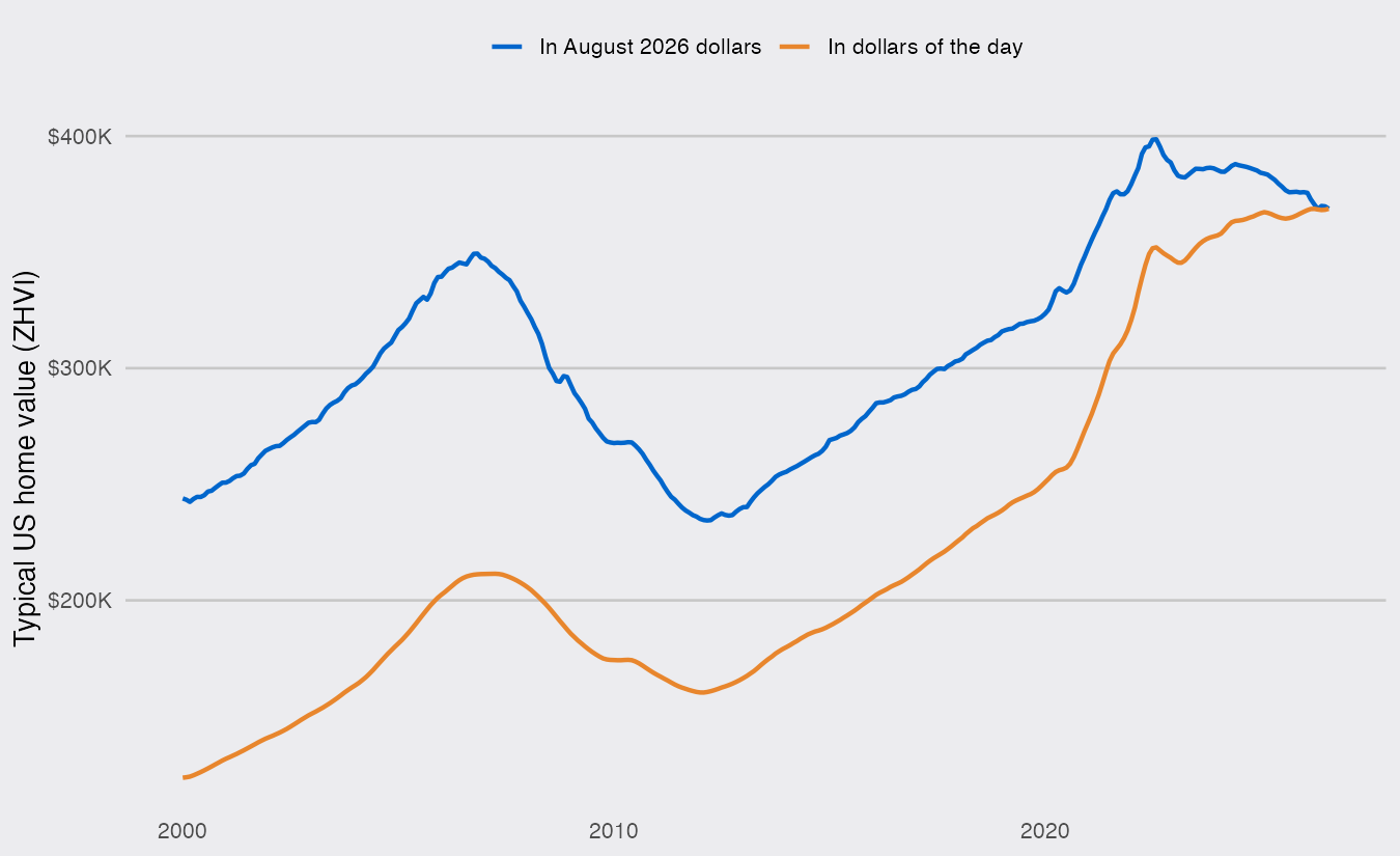
In dollars of the day the line only pauses after 2022. In real terms the typical home peaked in August 2022 at $398,617 and has lost 7.5% since. It is still 5.5% above the top of the 2000s boom ($349,368 in today’s dollars, November 2006).
Fifty metros, two answers
For each metro I compare the latest month with August 2022 and check whether the latest month is the highest in the series:
metros <- homes |>
  filter(RegionType == "msa") |>
  group_by(RegionName) |>
  summarise(nominal_change   = value[month == max(month)] / value[month == as.Date("2022-08-01")] - 1,
            real_change      = real[month == max(month)] / real[month == as.Date("2022-08-01")] - 1,
            nominal_record   = value[month == max(month)] == max(value, na.rm = TRUE),
            real_record      = real[month == max(month)] == max(real, na.rm = TRUE),
            real_near_record = real[month == max(month)] >= 0.995 * max(real, na.rm = TRUE),
            vs_boom          = real[month == max(month)] / max(real[year(month) < 2010], na.rm = TRUE) - 1)

metros |>
  summarise(up_in_dollars = sum(nominal_change > 0), up_in_real_terms = sum(real_change > 0),
            records_in_dollars = sum(nominal_record), records_in_real_terms = sum(real_record))
## # A tibble: 1 × 4
##   up_in_dollars up_in_real_terms records_in_dollars records_in_real_terms
##           <int>            <int>              <int>                 <int>
## 1            30               11                 17                     0
Since August 2022, 30 of the 50 metros have gained value in dollars and 11 in real terms. 22 have lost more than 10% of their real value. The split is regional. The deepest losses are in the Sun Belt and the West: all four Texas metros, Phoenix, Denver, Las Vegas, Tampa, Sacramento and San Francisco are down 15% or more in real terms. Nearly all of the gains are in older metros of the Northeast and Midwest (Hartford is up 14% after inflation). Only Buffalo, Cleveland, and Milwaukee are within half a percent of a real record.
metros |>
  mutate(RegionName = fct_reorder(RegionName, real_change)) |>
  ggplot(aes(y = RegionName)) +
  geom_vline(xintercept = 0, color = "grey50") +
  geom_segment(aes(x = nominal_change, xend = real_change), color = "grey65") +
  geom_point(aes(x = nominal_change, color = "In dollars"), size = 2.5) +
  geom_point(aes(x = real_change, color = "After inflation"), size = 2.5) +
  scale_color_manual(values = c("In dollars" = dsp_colors[2], "After inflation" = dsp_colors[1]),
                     breaks = c("In dollars", "After inflation"), name = NULL) +
  scale_x_continuous(labels = scales::percent) +
  labs(x = "Change in typical home value, August 2022 to August 2026", y = NULL) +
  dsp_theme +
  theme(panel.grid.major.x = element_line(color = "grey78"),
        panel.grid.major.y = element_blank())
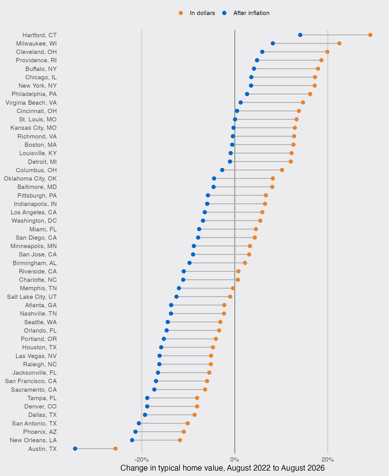
The longer view is less kind still. 21 of the 50 metros are below the real peak they reached in the 2000s boom, among them New Orleans, Las Vegas, Baltimore and Washington, and Chicago, at a record in dollars, is 16% below its 2006 value in real terms. Austin, the biggest loser since 2022, is still 19% above anything it reached before 2010, because its prices rose more slowly than inflation through the 2000s.
Which price index?
Headline CPI includes shelter (rents and the rent-equivalent of owned homes), about a third of the index, so dividing home values by it partly divides housing by housing.
cpi_ex_shelter <- request("https://fred.stlouisfed.org/graph/fredgraph.csv") |>
  req_url_query(id = "CUSR0000SA0L2") |>          # CPI, all items less shelter
  req_perform() |>
  resp_body_string() |>
  I() |>
  read_csv() |>
  set_names(c("month", "cpi_xs"))

ex_shelter <- homes |>
  left_join(cpi_ex_shelter, by = "month") |>
  group_by(RegionName, RegionType) |>
  summarise(change = value[month == max(month)] / value[month == as.Date("2022-08-01")] *
                     cpi_xs[month == as.Date("2022-08-01")] / cpi_xs[month == max(month)] - 1,
            .groups = "drop")
Deflating by CPI without shelter, the typical US home is 4.4% below its August 2022 value instead of 7.5%, and 17 metros are up in real terms instead of 11. The size of the decline depends on the index, the direction does not: measured against everything else people buy, the typical American home is worth less than it was four summers ago, even as its price sets records.
