In this article, we will go through the implementation and interpretation of Control Charts, popularly used during Six Sigma DMAIC projects. Six Sigma at many organizations means a measure of quality that strives for near perfection. Six Sigma is a data-driven approach and methodology for eliminating defects (driving toward six standard deviations between the mean and the nearest specification limit) in any process. Six Sigma DMAIC is the problem-solving methodology. It consists of five Phases: Define, Measure, Analyse, Improve and Control.
Control charts are used during the Control phase of DMAIC methodology. Control charts, also known as Shewhart charts or process-behavior charts, are a statistical process control tool used to determine if a manufacturing or business process is in a state of control. If analysis of the control chart indicates that the process is currently under control, then no corrections or changes to process control parameters are needed. Moreover, data from the method can be used to predict the future performance of the process. If the control chart indicates that the process is not in control, analysis of the chart can help determine the sources of variation, as this will result in degradation of process performance.
There are 8 Control chart rules that gives the indication that there are special causes of variation :-
Rule 1 :- One or more points beyond the control limits
Rule 2 :- 8/9 points on the same size of the center line.
Rule 3 :- 6 consecutive points are steadily increasing or decreasing.
Rule 4 :- 14 consecutive points are alternating up and down.
Rule 5 :- 2 out of 3 consecutive points are more than 2 sigmas from the center line in the same direction.
Rule 6 :- 4 out of 5 consecutive points are more than 1 sigma from the center line in the same direction.
Rule 7 :- 15 consecutive points are within 1 sigma of the center line
Rule 8 :- 8 consecutive points on either side of the center line with not within 1 sigma.
There are many packages in R, which can be used for analysis related to Six Sigma. Here, we will go through qcc package (R package for statistical quality control charts) and learn “How to create control chart (to know whether the process is in control)”.
Implementation and Interpretation of Control Charts in R
Step 1
The first step is loading the qcc package and sample data. It can be seen from the data that there are total 200 observations of diameter of Piston rings- 40 samples with 5 reading/observation each.
# loading package
library(qcc)
# Loading the piston rings data
data(pistonrings)
attach(pistonrings)
head(pistonrings)
##   diameter sample trial
## 1   74.030      1  TRUE
## 2   74.002      1  TRUE
## 3   74.019      1  TRUE
## 4   73.992      1  TRUE
## 5   74.008      1  TRUE
## 6   73.995      2  TRUE
Step 2
Before creating control charts, we need to create qcc object from the data, which can be done by calling qcc function. To do that we need to group the data such that each sample observation readings are in one column, so as to perform the further analysis.
diameter <- qcc.groups(diameter, sample)
head(diameter)
summary(diameter)
##     [,1]   [,2]   [,3]   [,4]   [,5]
## 1 74.030 74.002 74.019 73.992 74.008
## 2 73.995 73.992 74.001 74.011 74.004
## 3 73.988 74.024 74.021 74.005 74.002
## 4 74.002 73.996 73.993 74.015 74.009
## 5 73.992 74.007 74.015 73.989 74.014
## 6 74.009 73.994 73.997 73.985 73.993
Step 3
Now, we consider first 30 samples as training data. Standard Shewhart control charts can be obtained by calling qcc function. R chart (plotting range of all groups) and X-bar chart (plotting averages of all groups) can be created as follows:
obj <- qcc(diameter[1:30,], type="R")
Gives this plot:
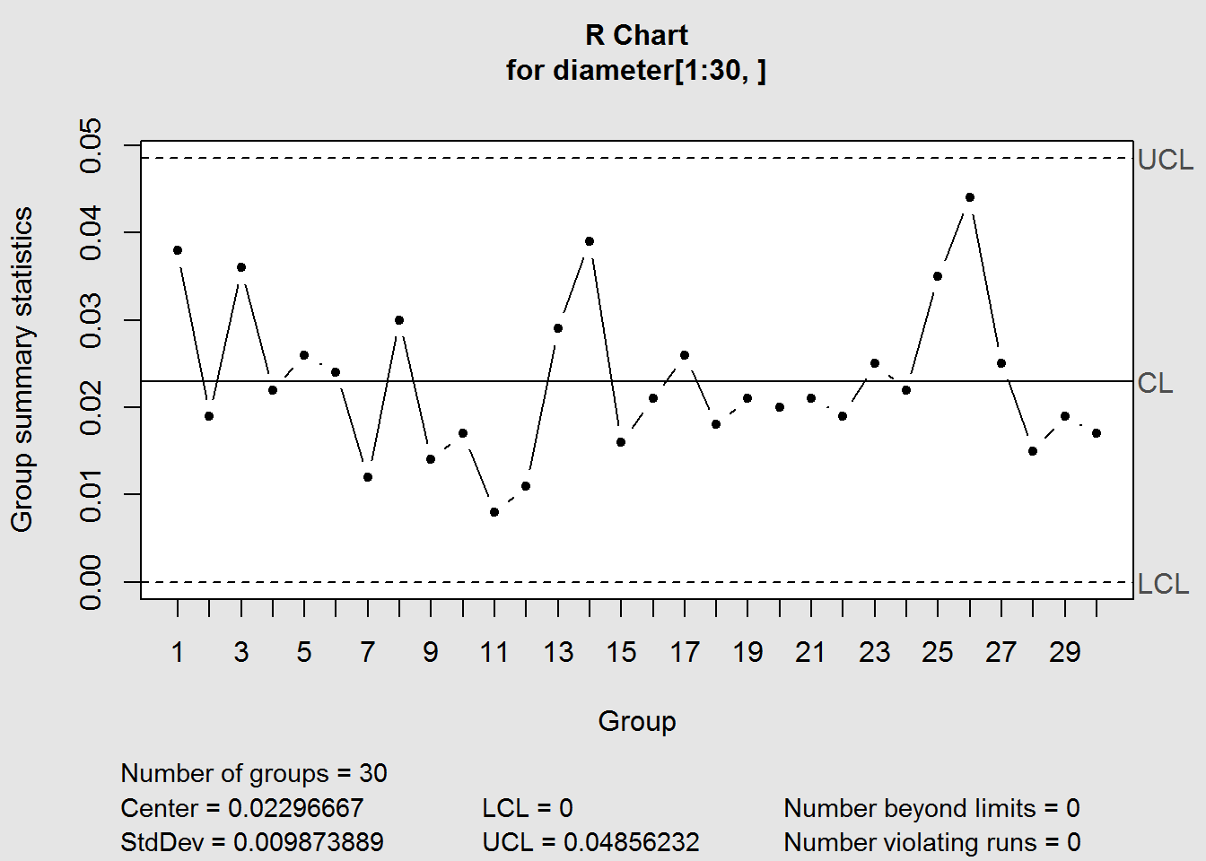
summary(obj)
##
## Call:
## qcc(data = diameter[1:30, ], type = "R")
##
## R chart for diameter[1:30, ]
##
## Summary of group statistics:
##       Min.    1st Qu.     Median       Mean    3rd Qu.       Max.
## 0.00800000 0.01725000 0.02100000 0.02296667 0.02600000 0.04400000
##
## Group sample size:  5
## Number of groups:  30
## Center of group statistics:  0.02296667
## Standard deviation:  0.009873889
##
## Control limits:
##  LCL        UCL
##    0 0.04856232
obj <- qcc(diameter[1:30,], type="xbar")
Gives this plot :
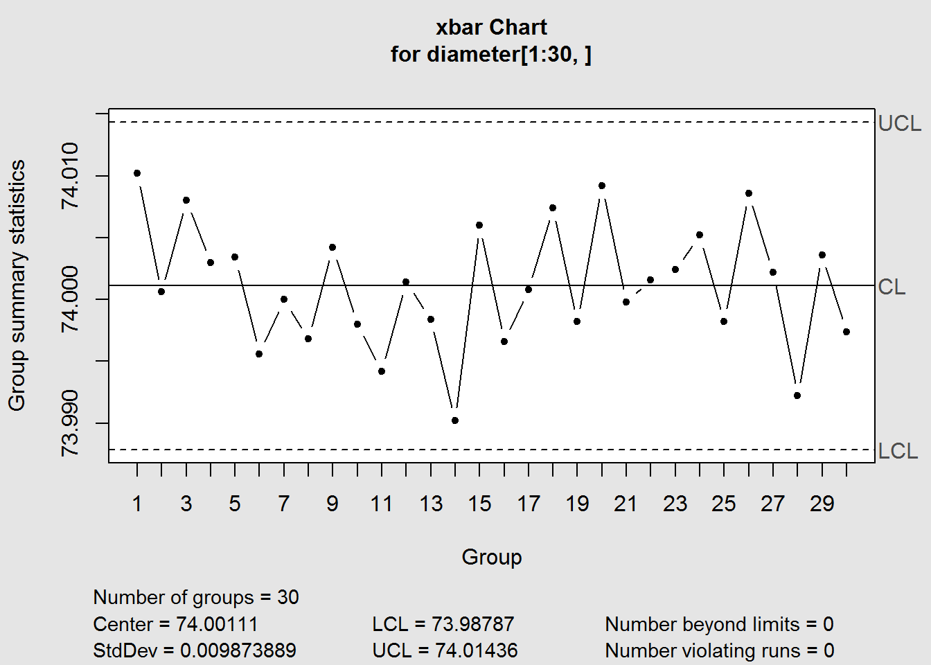
summary(obj)
##
## Call:
## qcc(data = diameter[1:30, ], type = "xbar")
##
## xbar chart for diameter[1:30, ]
##
## Summary of group statistics:
##     Min.  1st Qu.   Median     Mean  3rd Qu.     Max.
## 73.99020 73.99805 74.00110 74.00111 74.00405 74.01020
##
## Group sample size:  5
## Number of groups:  30
## Center of group statistics:  74.00111
## Standard deviation:  0.009873889
##
## Control limits:
##       LCL      UCL
##  73.98787 74.01436
The control chart has the center line (horizontal solid line), the upper and lower control limits (dashed lines). The summary gave the LCL (Lower Control limit) = 73.98805 and UCL (Upper control limit) =74.0143 for x-bar chart.
Summary statistics show that UCL (upper controlled limit) and LCL (lower control limit) is calculated as: Centre of group statistics ± nsigma.
By default, qcc function considers nsigma= 3 , means ±3 standard deviation of statistic. However, nsigma and confidence interval can be changed.
The main objective of control chart is to see whether a process is in “out of control”, so that appropriate action can be taken in that case. If all the points lie with in the control limits, process is said to be “in control”. It can be seen from the above plots that all the 30 group observations are ” in control”
Let’s see what happen if I change the nsigma to 2.
obj <- qcc(diameter[1:30,], type="xbar",nsigmas = 2)
Gives this plot:
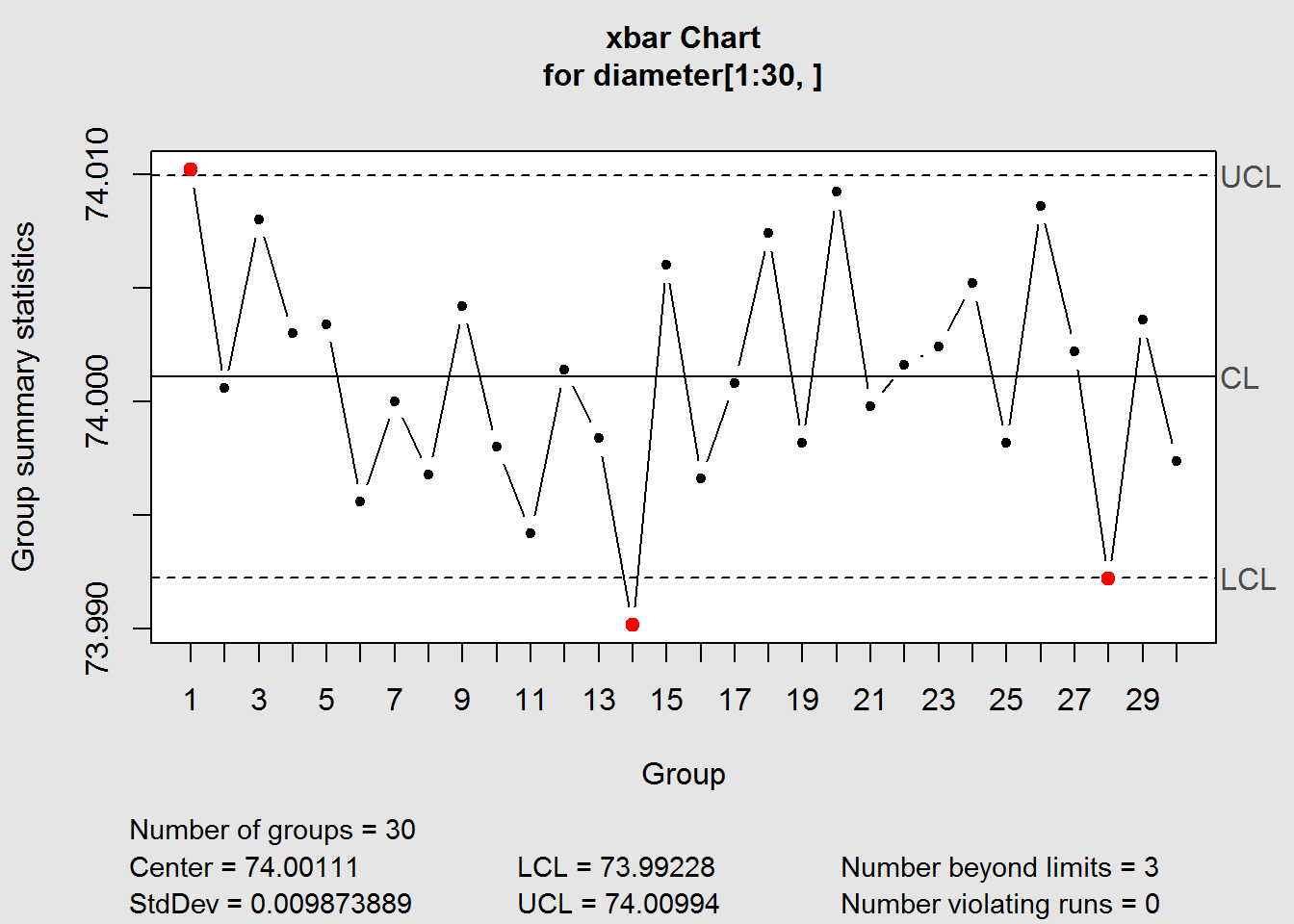
As it can be seen from the plot, 3 observation points goes out of control. This is because we make control limits tighter.
Let’s see for nsigma=1.
obj <- qcc(diameter[1:30,], type="xbar",nsigmas = 1)
Gives this plot:
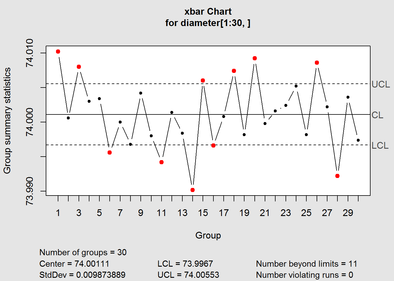
Now 11 points are out of control, as control limits are even more tighter. You can try the same with changing confidence levels. Higher confidence level means tighter control limits.
Step 4
The last step is to test for new data. Now, so far, we know that for nsigma=3, the process is in control. We can use the computed control limits for monitoring new sample data from the same process.
obj <- qcc(diameter[1:30,], type="xbar",newdata=diameter[31:40,])
Gives this plot:
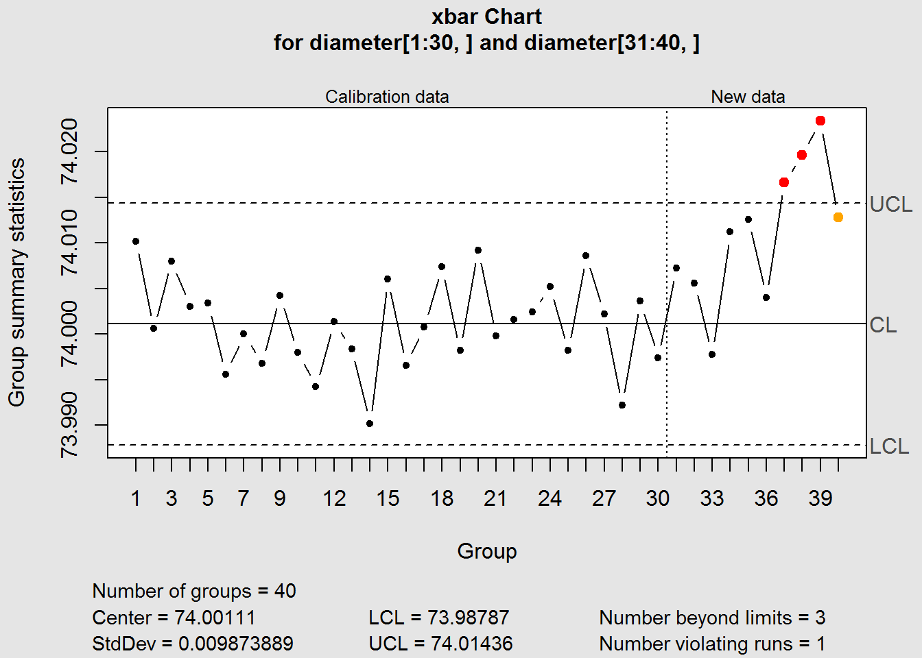
The above plot shows that new data has 3 points out of control.
I explained about x-bar and R chart, but with qcc you can plot various types of control chart such as p-chart (proportion of non-confirming units), np chart (number of nonconforming units), c chart (count, nonconformities per unit) and u chart (average nonconformities per unit). The idea remains the same i.e. to know whether process in in control.
Conclusion
I have explained the implementation & interpretation of control charts in R. It would be interesting for quality professionals to know that How R can be used to do six sigma analysis, as those people generally use MINITAB or other statistical software for this purpose. qcc package is also capable of calculating the process capability (Cp, Cpk, etc), creating time weighted control charts (CUSUM and EWMA), creating OC curves, and even making cause and effect diagrams.
Hope you all liked the article.
Make sure to like & share it. Cheers!