Hope you liked the Part 1 and Part 2 of this Series. In this Part 3, we will go through the tools used during the analyze phase of Six Sigma DMAIC cycle. In this phase, available data is used to identify the key process inputs and their relation to the output.
We will go through the following tools:
- Charts in R
- Hypothesis Testing in R
Charts in R
In Six Sigma projects, Charts plays a very important role. They are used to support the interpretation of data, as a graphical representation of data provides a better understanding of the process. So, Charts are used not only in analyze phase, but at every step of Six Sigma projects.
Bar Chart
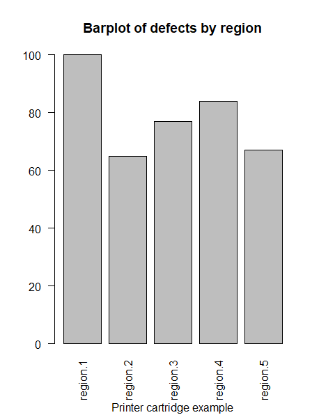
A bar chart is a very simple chart where some quantities are shown as the height of bars. Each bar represents a factor where the variable under study is being measured. A bar chart is usually the best graphical representation for counts. For example, the printer cartridge manufacturer distributes its product to five regions. An unexpected amount of defective cartridges has been returned in the last month. Bar plot of defects by region is as below:
library("SixSigma")
with(ss.data.pc.r,
     barplot(pc.def,
             names.arg = pc.regions,
             las = 2,
             main = "Barplot of defects by region",
             sub = "Printer cartridge example"))
Output as below:
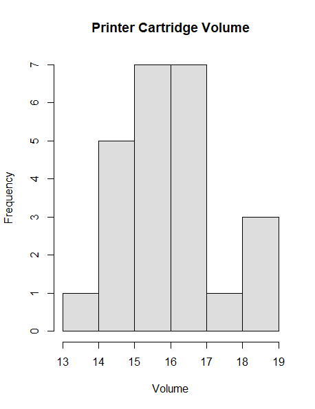
Histogram
A histogram is a bar chart for continuous variables. It shows the distribution of the measurements of variables. A histogram is used to find the distribution of a variable. That is, the variable is centered or biased. Are the observations close to the central values, or is it a spread distribution? Is it a normal distribution?
For example, histograms for the variables volume and density in the ss.data.pc data set.
hist(ss.data.pc$pc.volume,
     main="Printer Cartridge Volume",
     xlab="Volume",
     col="#DDDDDD")
Output as below:
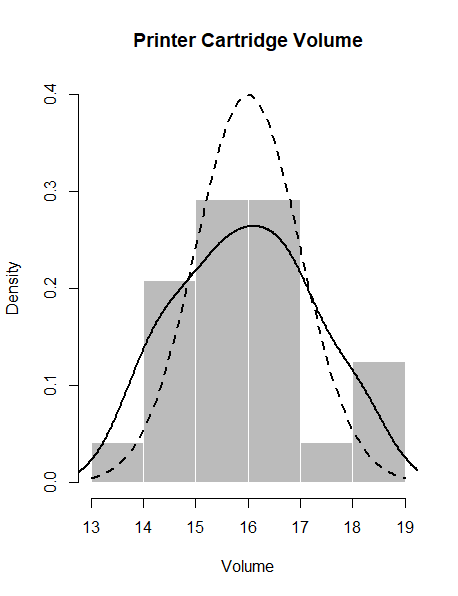
Superimpose a density line for a theoretical normal distribution whose mean is 16 and standard deviation is 1
hist(ss.data.pc$pc.volume,
       main = "Printer Cartridge Volume",
       xlab = "Volume",
       col = "#BBBBBB",
       border = "white",
       bg = "red",
       freq = FALSE,
       ylim = c(0,0.4))
curve(dnorm(x,16,1),
        add = TRUE,
        lty = 2,
        lwd = 2)
lines(density(ss.data.pc$pc.volume),
        lwd = 2)
Output as below:
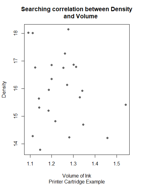
Scatterplot
A scatter plot is an important tool to reveal relationships between two variables. There are three types of correlation between two variables: Positive correlation (high values of one variable lead to high values of the other one ). A negative correlation (Inversely proportional, high values of one variable lead to low values of the other one). No correlation: the variables are independent.
In the ss.data.pc dataset, we have two continuous variables: pc.volume and pc.density, Scatterplot can be used to find patterns for this relation.
plot(pc.volume ~ pc.density,
     data = ss.data.pc,
     main = "Searching correlation between Density
     and Volume",
     col = "#666666",
     pch = 16,
     sub = "Printer Cartridge Example",
     xlab = "Volume of Ink",
     ylab = "Density")
Output as below:
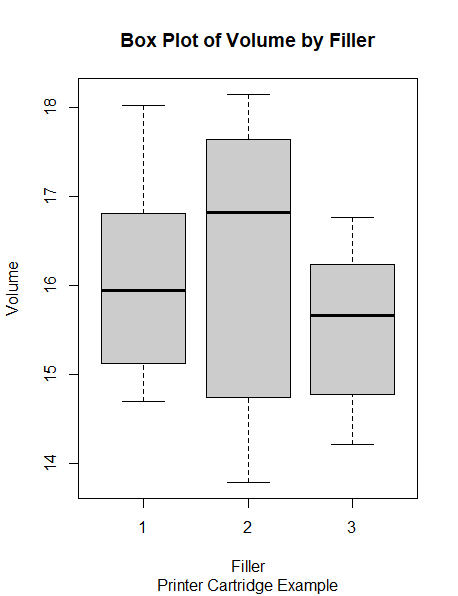
Boxplot
The box-whisker chart is also known as the box plot. It graphically summarizes the distribution of a continuous variable. The sides of the box are the first and third quartiles (25th and 75th percentile, respectively). Thus, inside the box, we have the middle 50% of the data. The median is plotted as a line that crosses the box The box plot tells us if the distribution is centered or biased (the position of the median with respect to the rest of the data), if there are outliers (points outside the whiskers), or if the data are close to the center values (small whiskers or boxes).
It is useful when we want to compare groups and check if there are differences among them. Example: In a production line, we have three fillers for the printer cartridges. We want to determine if there are any differences among the fillers and identify outliers.
boxplot(pc.volume ~ pc.filler,
        data = ss.data.pc,
        col = "#CCCCCC",
        main = "Box Plot of Volume by Filler",
        sub = "Printer Cartridge Example",
        xlab = "Filler",
        ylab = "Volume")
Output as below:
Hypothesis Testing
A statistical hypothesis is an assumption about a population parameter. This assumption may or may not be true. Hypothesis testing refers to the formal procedures used by statisticians to accept or reject statistical hypotheses. So it is intended to confirm or validate some conjectures about the process we are analyzing. For example, if we have data from a process that are normally distributed and we want to verify if the mean of the process has changed with respect to the historical mean, we should make the following hypothesis test:
H0: μ = μ0
H1: μ not equal μ0
where H0 denotes the null hypothesis and H1 denotes the alternative hypothesis. Thus we are testing H0 (“the mean has not changed”) vs. H1 (“the mean has changed”).
Hypothesis testing can be performed in two ways: one-sided tests and two-sided tests. An example of the latter is when we want to know if the mean of a process has increased:
H0: μ = μ0,
H1: μ >μ0.
Hypothesis testing tries to find evidence about the refutability of the null hypothesis using probability theory. We want to check if a situation of the alternative hypothesis is arising. Subsequently, we will reject the null hypothesis if the data do not support it with “enough evidence.” The threshold for enough evidence can be set by expressing a significance level α. A 5% significance level is a widely accepted value in most cases.
There are some functions in R to perform hypothesis tests, for example, t.test for means, prop.test for proportions, var.test and bartlett.test for variances, chisq.test for contingency table tests and goodness-of-fit tests, poisson.test for Poisson distributions, binom.test for binomial distributions, shapiro.test for normality tests. Usually, these functions also provide a confidence interval for the parameter tested.
Example: Hypothesis test to verify if the length of the strings is different from the target value of 950 mm:
H0 : μ = 950,
H1 : μ not equal to 950.
t.test(ss.data.strings$len,
       mu = 950,
       conf.level = 0.95)
One Sample t-test

data:  ss.data.strings$len
t = 0.6433, df = 119, p-value = 0.5213
alternative hypothesis: true mean is not equal to 950
95 percent confidence interval:
 949.9674 950.0640
sample estimates:
mean of x
 950.0157
As the p-value >0.05, we accept that the mean is not different from the target.
Two means can also be compared, for example, for two types of strings. To compare the length of the string types E6 and E1, we use the following code:
data.E1 <- ss.data.strings$len[ss.data.strings$type == "E1"]
data.E6 <- ss.data.strings$len[ss.data.strings$type == "E6"]
t.test(data.E1, data.E6)
Welch Two Sample t-test

data:  data.E1 and data.E6
t = -0.3091, df = 36.423, p-value = 0.759
alternative hypothesis: true difference in means is not equal to 0
95 percent confidence interval:
 -0.1822016  0.1339911
sample estimates:
mean of x mean of y
 949.9756  949.9997
Variances can be compared using the var.test function:
var.test(data.E1, data.E6)
F test to compare two variances

data:  data.E1 and data.E6
F = 1.5254, num df = 19, denom df = 19, p-value = 0.3655
alternative hypothesis: true ratio of variances is not equal to 1
95 percent confidence interval:
 0.6037828 3.8539181
sample estimates:
ratio of variances
          1.525428
In this case, the statistic used is the ratio between variances, and the null hypothesis is “the ratio of variances is equal to 1,” that is, the variances are equal.
Proportions can be compared using the prop.test function. Do we have the same defects for every string type? For example, compare types E1 and A5:
defects <- data.frame(type = ss.data.strings$type, res = ss.data.strings$res < 3)
defects <- aggregate(res ~ type, data = defects, sum)
prop.test(defects$res, rep(20,6))
6-sample test for equality of proportions without continuity correction

data:  defects$res out of rep(20, 6)
X-squared = 5.1724, df = 5, p-value = 0.3952
alternative hypothesis: two.sided
sample estimates:
prop 1 prop 2 prop 3 prop 4 prop 5 prop 6
  0.05   0.00   0.00   0.10   0.00   0.05
The p-value for the hypothesis test of equal proportions >0.05, so we cannot reject the null hypothesis, and therefore we do not reject that the proportions are equal.
A normality test to check if the data follow a normal distribution can be performed with the shapiro.test() function:
shapiro.test(ss.data.strings$len)
Shapiro-Wilk normality test

data:  ss.data.strings$len
W = 0.98463, p-value = 0.1903
The statistic used to perform this hypothesis test is the Shapiro–Wilk statistic. In
this test, the hypotheses are as follows:
H0 : The data are normally distributed.
H1 : The data are not normally distributed.
The p-value > 0.05, we cannot reject the hypothesis of normality for the data, so we do not have enough evidence to reject normality.
A type I error occurs when we reject the null hypothesis and it is true. We commit a type II error when we do not reject the null hypothesis and it is false. The probability of the former is represented as α, and it is the significance level of the hypothesis test (1 − α is the confidence level). The probability of the latter is represented as β, and the value 1−β is the statistical power of the test.
The R functions power.prop.test and power.t.test can be used to determine the power or the sample size.
Example: Black belt plan to perform a new analysis to find out the sample size needed to estimate the mean length of the strings with a maximum error of δ = 0.1 cm. He sets the significance level (α = 0.05) and the power (1−β = 0.90). The sample size can be determined using the following command:
power.t.test(delta = 0.1, power = 0.9, sig.level = 0.05,
             sd = sd (ss.data.strings$len))
Two-sample t test power calculation

              n = 151.2648
          delta = 0.1
             sd = 0.2674321
      sig.level = 0.05
          power = 0.9
    alternative = two.sided

NOTE: n is number in *each* group
So the sample size must be 152.
In next part, we will go through Improve Phase of Six Sigma DMAIC process. Please let me know your feedback in the comments section. Make sure to like & share it. Happy Learning!!