I am really enjoying Uefa Euro 2016 Footbal Competition, even because our national team has done pretty well so far. That’s why after browsing for a while statistics section of official EURO 2016 website I decided to do some analysis on the data they share
Just to be clear from the beginning: we are not talking of anything too rigourus, but just about some interesting questions with related answers gathered mainly through data visualisation.
We can divide following analyses into two main parts: a first part were we analyse distribution of fouls and their incidence on matches outcome ( data as at the 21th of June) and a second part where ball possession is analysed, once again looking at relationship between this stat and matches outcome (data as at 28th june). Let’s start with some specs on data import.
Data import and treatment
As usual we first need to load required packages and our data into the R environment. We perform the task running the following lines of code:
# Load required packages
library(rio)
library(plyr)
library(dplyr)
library(choroplethr)
library(choroplethrMaps)
library(ggplot2)
library(dummies)

#data from http://www.uefa.com/uefaeuro/season=2016/statistics/index.html
players_stat <- read.csv('players_stats.csv',sep = ";")
players_stat$Team <- tolower(players_stat$Team)
team_stat <- read.csv('team_stats.csv' ,sep = ";")
team_stat$Team <- tolower(team_stat$Team)
possession_stat <- read.csv('possession.csv', sep = ";")
possession_stat$team <- tolower(possession_stat$team)
I am not going to spend too much time on this chunk but I would like to highlight you the use of rio package by Thomas J. Leeper, since it is a really powerfull package that can make your life really easy when talking about data import in R.
You can find referred .csv file within the rstudio project Rstudio project I have uploaded on Github.
Which team committed the greatest number of fouls?
Here we are with the first question. And here it is the answer:

We obtained the plot aggregating fouls data by team and leveraging country_choropleth() function from choroplethr package
#sum up fouls data from player view to team view
by_team <- group_by(players_stat,Team)
team_sums <- summarise(by_team, sum(Yellow.Cards),
sum(Red.Cards),
sum(Fouls.Committed),
sum(Fouls.Suffered))

# subset columns to plot only the number of fouls committed
fouls_data <- data.frame("region" = team_sums$Team,"value" = team_sums$`sum(Fouls.Committed)`)
# plot
fouls_plot <- country_choropleth(fouls_data,
title = "number of Fouls Committed by region",
legend = "# fouls",
num_colors = 1) +
xlim(-31.266001, 39.869301) +
ylim(27.636311, 81.008797) +
coord_map("lambert", lat0 = 27.636311, lat1 = 81.008797)
fouls_plot
An important disclaimer is needed here: since country_choropleth() is not able to handle Northern Ireland, Wales and England as separate regions I decided not to populate them within map plot, given that joining related team data into one fictious United Kingdom team would have resulted in a misrepresentation of analyzed statistics.
Given that black countries are countries not playing the competition it seams Romania committed quite a great number of fouls. You may wonder: were them serious fouls? Let’s have a look to the number of yellow and red cards to answer that legitimate question. Let’s start from yellow cards, plotting sum(Yellow.Cards) against each team with standard barplot:
ggplot(team_sums,aes(x = Team,y = `sum(Yellow.Cards)`, fill = `sum(Yellow.Cards)` )) +
  geom_bar(stat = 'identity') +
  coord_flip()
Here it is the plot:
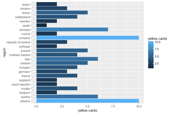
Well, Romania togheter with Albania is standing at the top of yellow cards ranking as well. Getting to red cards we have to underline that we dont’ have a lot of data about them, since just two of them were assigned. Guess to whom? Albania and Austria. All that summed up we can definitely say Albania am Romania played toughest matches overall. but was that worthing? Uhm I guess no, since both of them didn’t get trough staging phase. And this raise another interesting question:
Is there a correlation between number of fouls and number of wins?
To answer this technically silly question we can try to plot total number of fouls against number of wins by country team. Let’s have a look to the plot code:
# merge team data
total_stats <- merge(team_sums,team_stat)
#plot fouls committed against number of wins by country
ggplot(total_stats,aes(x = total_stats$`sum(Fouls.Committed)`,y = total_stats$Wins, label = Team)) +
  geom_point() +
  geom_text(nudge_y = 0.2) +
  geom_smooth(method = 'lm', formula = y~x)
Here it is the plot:
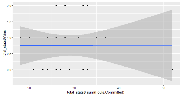
We added a linear regression model to the scatter plot to investigate the hypothesis of linear relationship but nothing happened, so no, committing more fouls is not a winning strategy. Let us ask one last reasonable question about fouls:
Is committing more fouls at least a good strategy in order to reduce goals against?
Once again let’s the data speak out, plotting number of goal against togheter with number of fouls committed:
ggplot(total_stats,aes(x = total_stats$`sum(Fouls.Committed)`,
                       y = total_stats$Total.goals.against, label = Team)) +
  geom_point() +
  geom_text(nudge_y = 0.2) +
  geom_smooth(method = 'lm', formula = y~x)
Here is the plot:
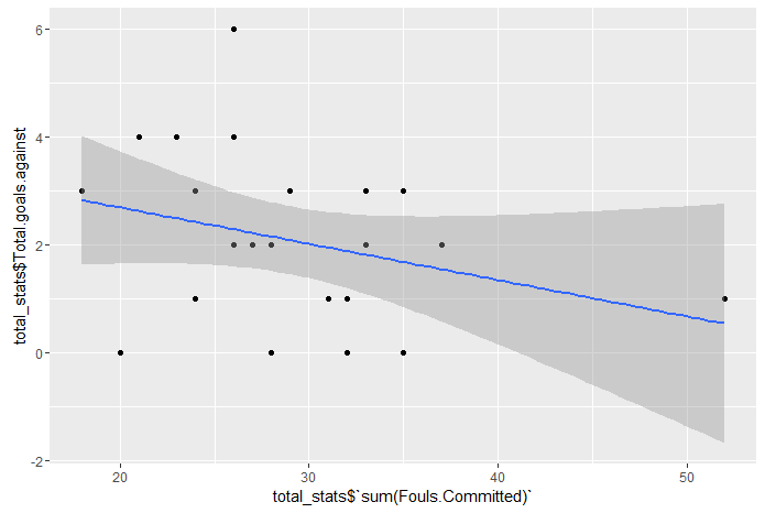
Ok, it could seems we can answer a sound yes, but I get a bit disturbed by that 52 romanian fouls so I am going to try to remove them and plot again:
total_stats_no_romania <- total_stats[-16,]
ggplot(total_stats_no_romania,aes(x = total_stats_no_romania$`sum(Fouls.Committed)`,
                                  y = total_stats_no_romania$Total.goals.against, label = Team)) +
  geom_point() +
  geom_text(nudge_y = 0.2) +
  geom_smooth(method = 'lm',formula = y~x)
Here is the plot:

Our first guess seems to be confirmed: number of fouls committed is negatively correlated to the number of goals against suffered, which appears to be reasonable since we may assume a great number of fouls are committed to stop rivals from dangerous game actions.
Who’s keeping the ball more? ball possession stats
Ball possession is a key start when analysing a football match, so let’s start answering this introductory question: who’s scoring the highest possession stat within this competition? Once again we can visualise it on a europe map:
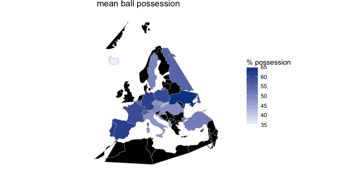
Before actually producing this plot we had to treat quite heavily raw data since they where produced in untidy format, meaning each row stored more than one observation of the attribute we are investigating: ball possession. For isntance first record was related to Northern Ireland vs Germany match played on 21/06/2016, showing a possession possession stat related to Northern Ireland on a column, and another possession stat related to Germany in a second column. We then needed to split our dataset into two separate data frames, each one storing one of two possession stat columns, and then binding those data frames togheter merging possession stats columns:
possession_a <- possession_stat[,-c(4,8)]
possession_a$win  possession_a$score_
possession_b <- possession_stat[,-c(3,7)]
possession_b$win <- possession_b$score < possession_b$score_
possession_a <- possession_a[,-5]
possession_b <- possession_b[,-4]
colnames(possession_b) <- colnames(possession_a)
possession_tidy <- rbind(possession_a,possession_b)
Once our data are ready, we can easily produce above showed mpa leveraging once again country_choropleth() function:
by_team_pos <- group_by(possession_tidy,team)
team_means <- summarise(by_team_pos, mean(possession))
colnames(team_means) <- c("region","value")

possession_plot <- country_choropleth(team_means,
                                 title = "mean ball possession",
                                 legend="% possession",
                                 num_colors=1)+
  xlim(-31.266001, 39.869301)+
  ylim(27.636311, 81.008797) +
  coord_map("lambert", lat0=27.636311, lat1=81.008797)
possession_plot
Table: Giving a closer look to first five teams by ball possession we find a prevalence of north western europe countries:
| Country | Mean Possession |
| Germany | 71% |
| ukraine | 65% |
| portugal | 62% |
| spain | 62% |
so here’s come the question that has always stimulated my curiosity: ball possession is always considered a relevant topic, but is it correlated with matches victory? in other words:
Increasing ball possession increases winning likelihood?
we are going to tackle this visually, plotting percentage of ball possession against a win_dummy variable, scoring 1 for win and 0 for defeat (ties were considered as defeats) , which can be easily done leveraging dummies and ggplot packages :
dummy_win <- as.data.frame(dummy(possession_tidy$win))
possession_tidy$win_dummy <- dummy_win[,2]
ggplot(data = possession_tidy,aes(x = possession)) +
  geom_point(aes(y = win_dummy)) +
  stat_smooth(aes(y = win_dummy),method = "glm")
Here is the plot:
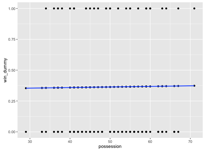
As you can see we have also added an estimated logistic regression which visually enforces the truth already visible from raw data: there is no positive correlation, or at least not a strong one, between ball possession and matches outcome. This seems to me a non obvious result, since a great number successful of football coaches have founded their success on possession ball. It is actually quite a debated topic as you can see simply googling “correlation between ball possession win”.
Conclusions
Within this post we tried to answer some questions about matches occured so far during UEFA EURO 2016 and we definitely found that being tough is not a good tactic to win your matches but at least can help you avoid suffering a great number of goals. Moreover we understood that ball possession is only weakly related to matches outcome. If you are interested in reperforming showed analyses or even further explore related raw data you can have a look to the Rstudio project I have uploaded on Github.
That said: may the best win!
Let me know if you have any comment or question.


What can we learn from the statistics of the EURO 2016?- Application of factor analysis http://goo.gl/P7Pflp
Very nice example and wonderful figures!
Just one little question, in your correlation code your use “total_stats” as your df. Do you mean “team_stat”? I don’t see a df named “total_stats” elsewhere in the text or in your files. Am I missing something?
Again thanks for the article!
Thank you for commenting knos!
you were right, total_stats was not mentioned before along the post, I have just added it.
If you would like to have a complete look at code I suggest you to give a look to the online github repository: https://github.com/AndreaCirilloAC/euro_2016_stat.
Thank you once again and let me know if anything else is not clear.
Thank you for commenting knos!
you were right, total_stats was not mentioned before along the post, I have just added it.
If you would like to have a complete look at code I suggest you to give a look to the online github repository: https://github.com/AndreaCirilloAC/euro_2016_stat.
Thank you once again and let me know if anything else is not clear.
Hi Andrea,
really nice work.
Just a question, how did you download data?
Hi Andrea, good idea with the football article! Your country maps are a bit odd, given that England, Wales, Northern Ireland and the Republic of Ireland are all blacked out. There must be something weird in the way that countries are looked up when being plotted!
Hi Howard, thank you.
you are perfectly right, and you are even more right now that a great Wales is approaching semifinals 🙂
Problem is that choroplethr package takes as variable for mapping (‘region’ variable), only ‘United Kingdom’ for the all area, so I should change ‘Wales’, ‘Northern Ireland’ and ‘England’ to ‘United Kingdom’ in order to properly populate that region, but it wouldn’t be a correct representation of data as well. That’s why I decided not to populate it at all.
As you can imagine the other analyses performed are not affected from this misclassification.
Anyway I am going to add a proper disclaimer on this to make that clear to future reader.
Thank you for pointing this out!
Hello. Just a small suggestion, I don’t think your first analysis is about “number of fouls”, but more like “number of times penalised”.
In this tournament, as seen in all major soccer tournaments as far back as I can remember, this is a significant difference and appears mainly due to referee bias in favouring the “big” teams and to the ongoing scourge of divers and their ability to deceive referees.
really thank you for commenting Marco!
To be honest I couldn’t found any further explanation about attribute: “fouls committed” within the stat page, so talking about data quality we could say here metadata are missing :).
About the bias you are mentioning we can’t exclude it a priori but looking at data we find within first 10 position of fouls committed even France and Germany, which should’t suffer supposed bias. Let me kindly know if I am correctly seeing your point.