Increasing amount of data is available on the web. Web scraping is a technique developed to extract data from web pages automatically and transforming it into a data format for further data analysis and insights. Applied clustering is an unsupervised learning technique that refers to a family of pattern discovery and data mining tools with applications in machine learning, bioinformatics, image analysis, and segmentation of consumer types, among others. R offers several packages and tools for web scraping, data manipulation, statistical analysis and machine learning. The motivation for this post is to illustrate the applications of web scraping, dimension reduction and applied clustering tools in R.
The original 2016 world happiness data set used for this post is no longer available at Wikipedia. Instead, code snippets in this post have been updated to scrape the 2019 World Happiness Report published at this link (https://en.wikipedia.org/wiki/World_Happiness_Report#2019_report). In this exercise, the data set was pre-processed prior to principal component analysis (PCA) and clustering. The goals of the clustering approach in this post were to segment rows of the over 156 countries in the data into separate groups (clusters), The expectation is that sets of countries within a cluster are as similar as possible to each other for happiness and social progress, and as dissimilar as possible to the other sets of countries assigned in different clusters.
Load Required Packages
require(rvest)
require(magrittr)
require(plyr)
require(dplyr)
require(reshape2)
require(ggplot2)
require(FactoMineR)
require(factoextra)
require(cluster)
require(useful)
Web Scraping and Data Pre-processing
# Import data set from the site
url1 <- "https://en.wikipedia.org/wiki/World_Happiness_Report"
happy <- read_html(url1) %>%
    html_nodes("table") %>%
    extract2(5) %>%
    html_table(fill=T)


# inspect imported data structure

str(happy)

'data.frame':	156 obs. of  9 variables:
 $ Overall rank                : int  1 2 3 4 5 6 7 8 9 10 ...
 $ Country or region           : chr  "Finland" "Denmark" "Norway" "Iceland" ...
 $ Score                       : num  7.77 7.6 7.55 7.49 7.49 ...
 $ GDP per capita              : num  1.34 1.38 1.49 1.38 1.4 ...
 $ Social support              : num  1.59 1.57 1.58 1.62 1.52 ...
 $ Healthy life expectancy     : num  0.986 0.996 1.028 1.026 0.999 ...
 $ Freedom to make life choices: num  0.596 0.592 0.603 0.591 0.557 0.572 0.574 0.585 0.584 0.532 ...
 $ Generosity                  : num  0.153 0.252 0.271 0.354 0.322 0.263 0.267 0.33 0.285 0.244 ...
 $ Perceptions of corruption   : num  0.393 0.41 0.341 0.118 0.298 0.343 0.373 0.38 0.308 0.226 ...
Pre-process the data set for analysis:
## Exclude columns with ranks and scores, retain the other columns
happy <- happy[c(2,4:9)]
### rename column headers
colnames(happy) <- gsub(" ", "_", colnames(happy), perl=TRUE)
names(happy)

[1] "Country_or_region"            "GDP_per_capita"               "Social_support"
[4] "Healthy_life_expectancy"      "Freedom_to_make_life_choices" "Generosity"
[7] "Perceptions_of_corruption"
Check for missing values in the data set
mean(is.na(happy[, 2:7]))
## [1] 0
There are no missing values. The code below will generate summary statistics of the raw data.
summary(happy[,2:7])

GDP per capita   Social support  Healthy life expectancy Freedom to make life choices   Generosity
 Min.   :0.0000   Min.   :0.000   Min.   :0.0000          Min.   :0.000                Min.   :0.0000
 1st Qu.:0.6028   1st Qu.:1.056   1st Qu.:0.5477          1st Qu.:0.308                1st Qu.:0.1087
 Median :0.9600   Median :1.272   Median :0.7890          Median :0.417                Median :0.1795
 Mean   :0.9023   Mean   :1.209   Mean   :0.7254          Mean   :0.393                Mean   :0.1862
 3rd Qu.:1.2235   3rd Qu.:1.452   3rd Qu.:0.8818          3rd Qu.:0.508                3rd Qu.:0.2520
 Max.   :1.6840   Max.   :1.624   Max.   :1.1410          Max.   :0.631                Max.   :0.5660
 Perceptions of corruption
 Min.   :0.0000
 1st Qu.:0.0465
 Median :0.0850
 Mean   :0.1102
 3rd Qu.:0.1412
 Max.   :0.4530
An important procedure for meaningful clustering and dimension reduction steps involves data transformation and scaling variables. The simple function below will transform all variables to values between 0 and 1.
## transform variables to a range of 0 to 1
range_transform <- function(x) {
     (x - min(x))/(max(x)-min(x))
 }
happy[,2:7] <- as.data.frame(apply(happy[,2:7], 2, range_transform))

### summary of transformed data shows success of transformation
summary(happy[,2:7])


GDP per capita   Social support   Healthy life expectancy Freedom to make life choices   Generosity
 Min.   :0.0000   Min.   :0.0000   Min.   :0.0000          Min.   :0.0000               Min.   :0.0000
 1st Qu.:0.3579   1st Qu.:0.6501   1st Qu.:0.4801          1st Qu.:0.4881               1st Qu.:0.1921
 Median :0.5701   Median :0.7829   Median :0.6915          Median :0.6609               Median :0.3171
 Mean   :0.5358   Mean   :0.7447   Mean   :0.6357          Mean   :0.6228               Mean   :0.3290
 3rd Qu.:0.7265   3rd Qu.:0.8944   3rd Qu.:0.7728          3rd Qu.:0.8051               3rd Qu.:0.4452
 Max.   :1.0000   Max.   :1.0000   Max.   :1.0000          Max.   :1.0000               Max.   :1.0000
 Perceptions of corruption
 Min.   :0.0000
 1st Qu.:0.1026
 Median :0.1876
 Mean   :0.2432
 3rd Qu.:0.3118
 Max.   :1.0000
Although the previous data transformation step could have been adequate for next steps of this analysis, the function shown below as an example of data transformation will re-scale all variables to a mean of 0 and standard deviation of 1.
## Scaling variables to a mean of 0 and standard deviation of 1.
sd_scale <- function(x) {
     (x - mean(x))/sd(x)
 }
happy[,2:7] <- as.data.frame(apply(happy[,2:7], 2, sd_scale))

### summary of the scaled data
summary(happy[,2:7])

GDP per capita    Social support    Healthy life expectancy Freedom to make life choices   Generosity
 Min.   :-2.2803   Min.   :-4.0381   Min.   :-2.9953         Min.   :-2.7353              Min.   :-1.93585
 1st Qu.:-0.7570   1st Qu.:-0.5130   1st Qu.:-0.7334         1st Qu.:-0.5915              1st Qu.:-0.80544
 Median : 0.1459   Median : 0.2074   Median : 0.2627         Median : 0.1672              Median :-0.07003
 Mean   : 0.0000   Mean   : 0.0000   Mean   : 0.0000         Mean   : 0.0000              Mean   : 0.00000
 3rd Qu.: 0.8119   3rd Qu.: 0.8117   3rd Qu.: 0.6457         3rd Qu.: 0.8006              3rd Qu.: 0.68357
 Max.   : 1.9757   Max.   : 1.3844   Max.   : 1.7162         Max.   : 1.6567              Max.   : 3.94746
 Perceptions of corruption
 Min.   :-1.1625
 1st Qu.:-0.6718
 Median :-0.2655
 Mean   : 0.0000
 3rd Qu.: 0.3281
 Max.   : 3.6179
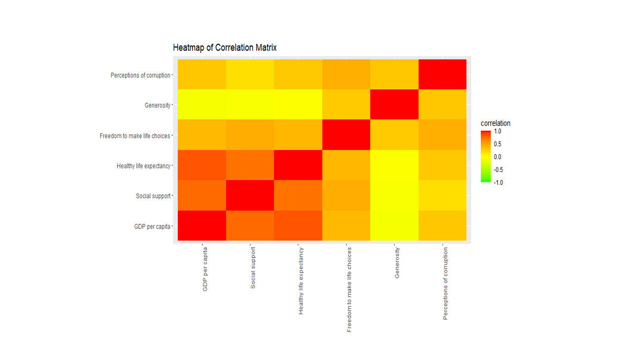
Simple Correlation Analysis
Now, the data is ready to explore variable relationships with each other.
corr <- cor(happy[, 2:7], method="pearson")
ggplot(melt(corr, varnames=c("x", "y"), value.name="correlation"),
       aes(x=x, y=y)) +
             geom_tile(aes(fill=correlation)) +
             scale_fill_gradient2(low="green", mid="yellow", high="red",
             guide=guide_colorbar(ticks=FALSE, barheight = 5),
             limits=c(-1,1)) +
             theme(axis.text.x = element_text(angle = 90, hjust = 1)) +
             labs(title="Heatmap of Correlation Matrix",
                  x=NULL, y=NULL)
Principal Component Analysis
Principal component analysis is a multivariate statistics widely used for examining relationships among several quantitative variables. PCA identifies patterns in the variables to reduce the dimensions of the data set in multiple regression and clustering, among others.
soc.pca <- PCA(happy[, 2:7], graph=FALSE)
fviz_screeplot(soc.pca, addlabels = TRUE, ylim = c(0, 65))
Here is a scree plot:
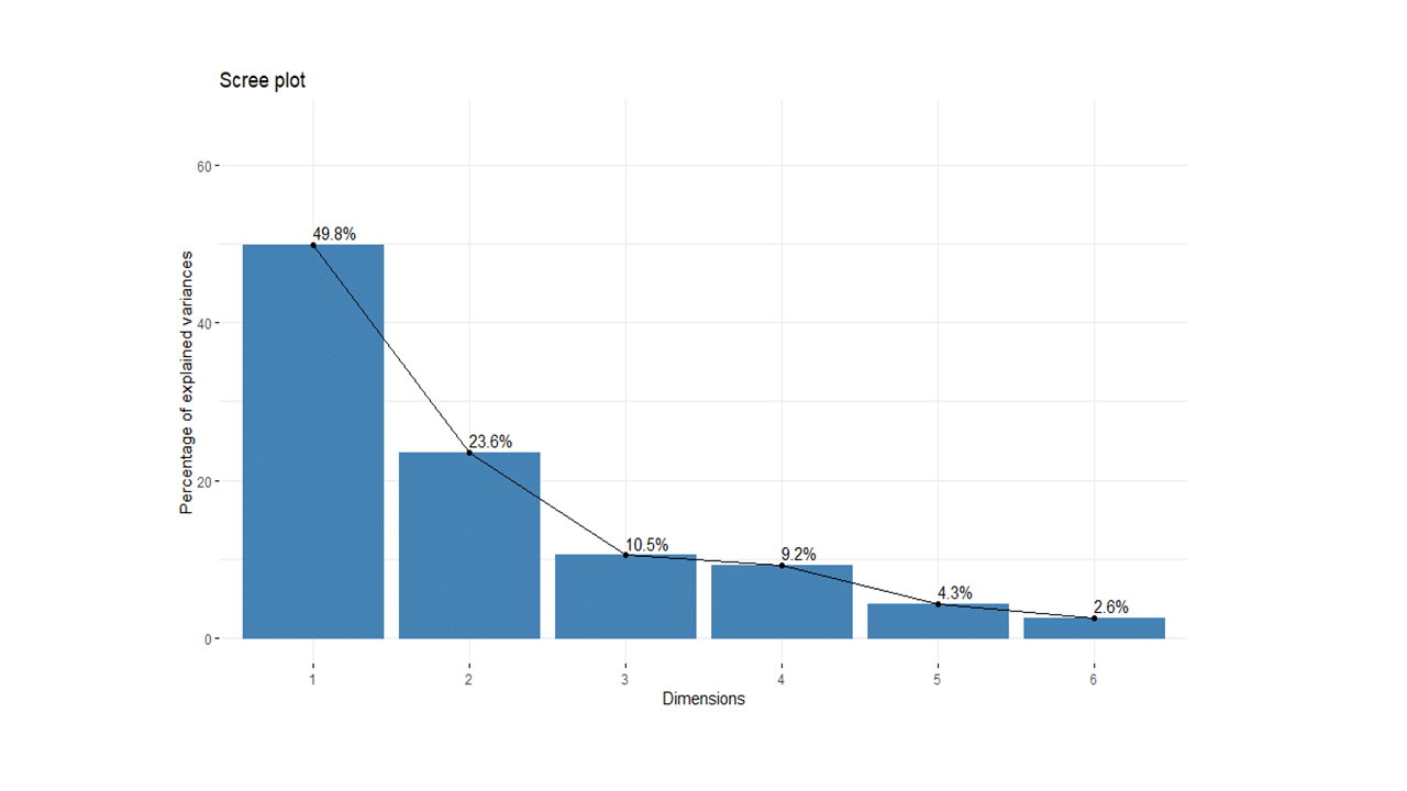
The percentages on each bar indicate the proportion of total variance explained by the respective principal component. As seen in the scree plot, the first three principal components accounted for ~84% of the total variance.
soc.pca$eig

eigenvalue percentage of variance cumulative percentage of variance
comp 1  2.9904701              49.841169                          49.84117
comp 2  1.4130577              23.550961                          73.39213
comp 3  0.6307329              10.512215                          83.90435
comp 4  0.5518763               9.197939                          93.10228
comp 5  0.2605080               4.341800                          97.44408
comp 6  0.1533550               2.555916                         100.00000
The output suggests that the first two principal components are worthy of consideration. A practical guide to determining the optimum number of principal component axes could be to consider only those components with eigen values greater than or equal to 1.
# Contributions of variables to principal components
soc.pca$var$contrib[,1:3]

                                 Dim.1     Dim.2       Dim.3
GDP per capita               26.5456729  5.280318  0.11986429
Social support               24.1053873  4.864469  7.67197216
Healthy life expectancy      26.1002417  3.822251  0.02279907
Freedom to make life choices 14.4674975 12.952726  2.52299300
Generosity                    0.4263867 48.134912 30.49214676
Perceptions of corruption     8.3548139 24.945324 59.17022472
The first principal component explained approximately 50% of the total variation and appears to represent opportunity, GDP per capita, healthy life expectancy, and social support.
The second principal component explained a further 24% of the total variation and represented generosity, perception of corruption.
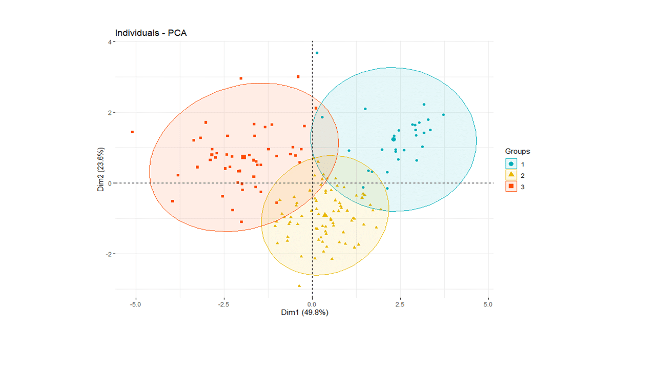
Applied Clustering
The syntax for clustering algorithms require specifying the number of desired clusters (k=) as an input. The practical issue is what value should k take? In the absence of a subject-matter knowledge, R offers various empirical approaches for selecting a value of k. One such R tool for suggested best number of clusters is the NbClust package.
require(NbClust)
nbc <- NbClust(happy[, 2:7], distance="manhattan",
               min.nc=2, max.nc=30, method="ward.D", index='all')

*** : The Hubert index is a graphical method of determining the number of clusters.
                In the plot of Hubert index, we seek a significant knee that corresponds to a
                significant increase of the value of the measure i.e the significant peak in Hubert
                index second differences plot.

*** : The D index is a graphical method of determining the number of clusters.
                In the plot of D index, we seek a significant knee (the significant peak in Dindex
                second differences plot) that corresponds to a significant increase of the value of
                the measure.

*******************************************************************
* Among all indices:
* 3 proposed 2 as the best number of clusters
* 11 proposed 3 as the best number of clusters
* 3 proposed 4 as the best number of clusters
* 1 proposed 8 as the best number of clusters
* 1 proposed 11 as the best number of clusters
* 1 proposed 23 as the best number of clusters
* 1 proposed 27 as the best number of clusters
* 2 proposed 30 as the best number of clusters

                   ***** Conclusion *****

* According to the majority rule, the best number of clusters is  3
The NbClust algorithm suggested a 3-cluster solution to the combined data set. So, we will apply K=3 in next steps.
set.seed(4653)
pamK3 <- pam(happy[, 2:7], diss=FALSE, 3, keep.data=TRUE)
# Number of countries assigned in the three clusters
fviz_silhouette(pamK3)

cluster size ave.sil.width
1       1   29          0.34
2       2   78          0.37
3       3   49          0.27
The number of countries assigned in each cluster is displayed in the table above. The second cluster contains half of the total number of countries.
Putting it together
We can now display individual countries and superimpose their cluster assignments on the plane defined by the first two principal components.
happy['cluster'] <- as.factor(pamK3$clustering)

fviz_pca_ind(soc.pca,
             label="none",
             habillage = happy$cluster, #color by cluster
             palette = c("#00AFBB", "#E7B800", "#FC4E07", "#7CAE00", "#C77CFF", "#00BFC4"),
             addEllipses=TRUE
)
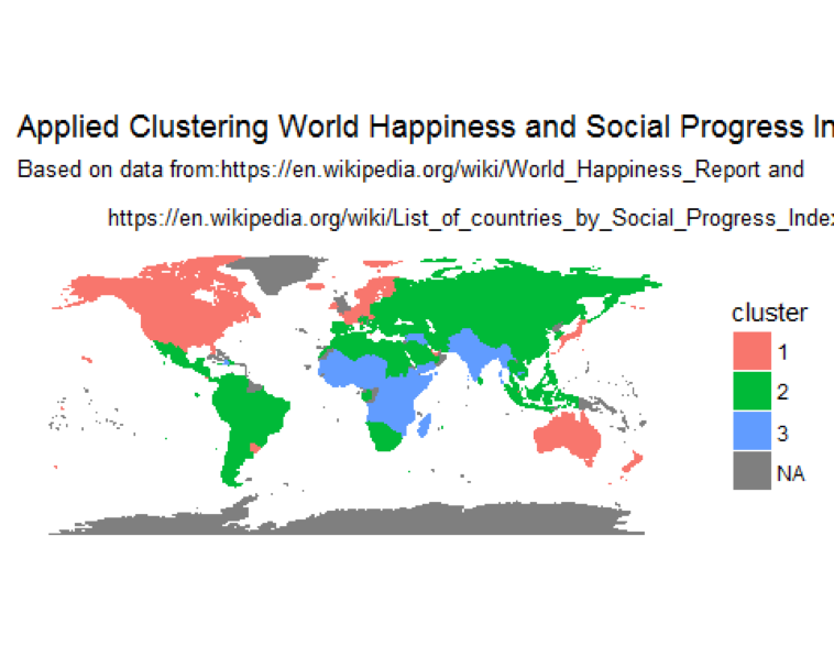
Finally, displaying clusters of countries on a world map
Standardize country names to confirm with country names in the map dataset
happy$Country <- as.character(mapvalues(happy$Country_or_region,
                                         from = c("United States of America",  'Congo (Kinshasa)', 'Trinidad & Tobago'),
                                         to=c("USA", "Democratic Republic of the Congo", 'Trinidad')))
load world map data in memory and left join with the world happiness data set.
map.world <- map_data("world")
# LEFT JOIN
map.world_joined <- left_join(map.world, happy, by = c('region' = 'Country'))
ggplot() +
        geom_polygon(data = map.world_joined, aes(x = long, y = lat, group = group, fill=cluster, color=cluster)) +
        labs(title = "Applied Clustering World Happiness and Social Progress Index",
             subtitle = "Based on data from:https://en.wikipedia.org/wiki/World_Happiness_Report and\n
             https://en.wikipedia.org/wiki/List_of_countries_by_Social_Progress_Index",
             x=NULL, y=NULL) +
        coord_equal() +
        theme(panel.grid.major=element_blank(),
              panel.grid.minor=element_blank(),
              axis.text.x=element_blank(),
              axis.text.y=element_blank(),
              axis.ticks=element_blank(),
              panel.background=element_blank()
        )
The map of clusters:
Concluding Remarks
Cluster analysis and dimension reduction algorithms such as PCA are widely used approaches to split data sets into distinct subsets of groups as well as to reduce the dimensionality of the variables, respectively. Together, these analytics approaches: 1) make the structure of the data easier to understand, and 2) also make subsequent data mining tasks easier to perform. Hopefully, this post has attempted to illustrate the applications of web scraping, pre-processing data for analysis, PCA, and cluster analysis using various tools available in R. Please let us know your comments and suggestions.