This is the final part of a three-part article recently published in DataScience+. Using the dataset prepared in part 1, this post is a continuation of the applications of unsupervised machine learning algorithms covered in part 2 and illustrates principal component analysis as a method of data reduction technique. Unsupervised machine learning refers to machine learning with no known response feature or no prior knowledge about the classification of sample data.
Motivation
Some analytical challenges in predictive modeling include identifying redundant and irrelevant features. In large datasets, identifying irrelevant features is more challenging than redundant features. There are practical reasons to check if data contains highly correlated features. Between-feature correlation (Collinearity) reduces the power of the test-statistic in regression. It is also challenging to tease out the individual effects of collinear features on a target variable. A recommended analytical approach is to first address the redundancy, which can be achieved by identifying groups of features that are as correlated as possible among themselves and as uncorrelated as possible with other variable groups in the same dataset. A simple way to detect collinearity is to visually display a correlation matrix of input features. When a variable reduction step is considered in multivariate dataset due to a large number of collinearities among input features, PCA is widely used for examining relationships among numerical features and is useful in reducing the number of features into a much smaller number of dimensions (principal components). The main idea behind PCA is that most of the variance in large datasets can be accounted for in a lower-dimensional subspace that is spanned by the first few principal components. It is therefore feasible to “reduce the dimension” by choosing a small number of principal components to retain. Python offers many algorithms for unsupervised machine learning. Unsupervised learning algorithms are often used in an exploratory setting when data scientists want to understand the data better, rather than as a part of a larger automated step.
Load Required libraries
import pandas as pd
import numpy as np
import matplotlib.pyplot as plt
%matplotlib inline
import seaborn as sns
from sklearn.preprocessing import scale
import prince
from sklearn.cluster import KMeans
from sklearn.decomposition import PCA
Load the dataset
The dataset for this article was scraped from a Wikipedia webpage using python code described in part 1. For convenience, a copy of the dataset has been uploaded here.
Load a copy of the dataset in memory and check for the structure of the dataset.
df = pd.read_csv('C://Users//xxxxx//world_happiness_data19.csv')
print(f"The table contains: {df.shape[0]} rows and {df.shape[1]} columns")

The table contains: 156 rows and 9 columns
Dataset Exploration
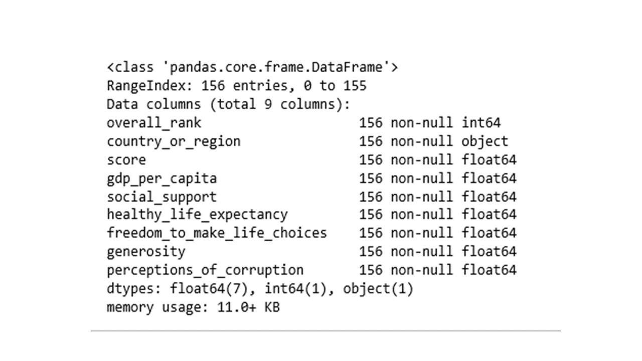
The data table contains 156 rows of countries of the world in 9 features. Feature names and associated data types can be revealed using info().
df.info()
Sometimes it may be necessary to exclude variables from a dataset. The following code will drop the overall_rank and score features from the dataset.
df = df.drop(['overall_rank','score'], axis=1)
Are there any missing data values?
# any missing values
df.isnull().sum()

country_or_region 0
gdp_per_capita 0
social_support 0
healthy_life_expectancy 0
freedom_to_make_life_choices 0
generosity 0
perceptions_of_corruption 0
dtype: int64
No, there are no missing data values.
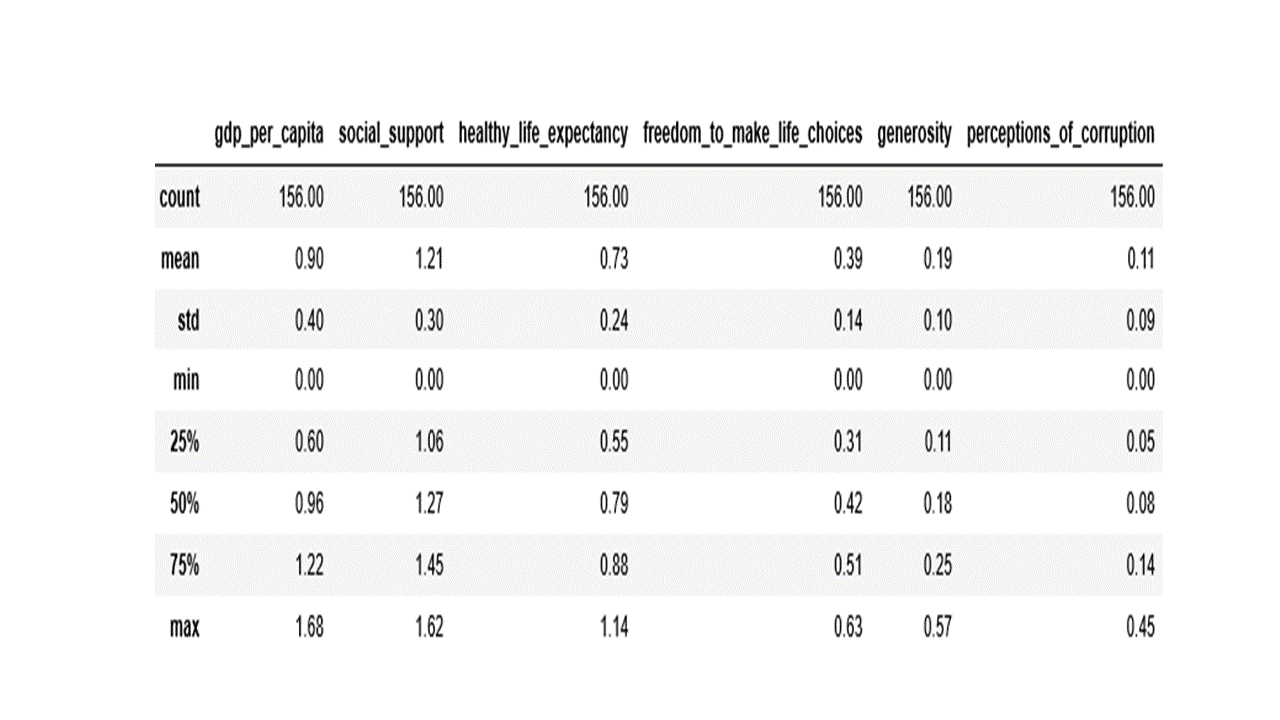
Data distribution and summary statistics of every numeric feature can be obtained with the describe() function which returns the count, mean, median, standard deviation, min, max and the first and third quartiles as shown below.
numerical_features = ['gdp_per_capita', 'social_support', 'healthy_life_expectancy',
                      'freedom_to_make_life_choices', 'generosity', 'perceptions_of_corruption']

df[numerical_features].describe().round(2)
Applying data transformation
The scale() function transforms variables to the same magnitude by scaling the data to a mean of 0 and standard deviation of 1. The code below transforms the data and produces a box plot of the transformed data.
df_scaled = scale(df[numerical_features])
df2 = pd.DataFrame(df_scaled, columns=numerical_features)
df2['country_or_region'] = pd.Series(df['country_or_region'], index=df.index)
df3 = pd.melt(df2, id_vars='country_or_region', value_vars=df2[numerical_features])
plt.figure(figsize=(8,6))
sns.set(style="whitegrid")
sns.boxplot(y='variable',x='value', data=df3, palette="Set2")
plt.show()
Produces this figure!
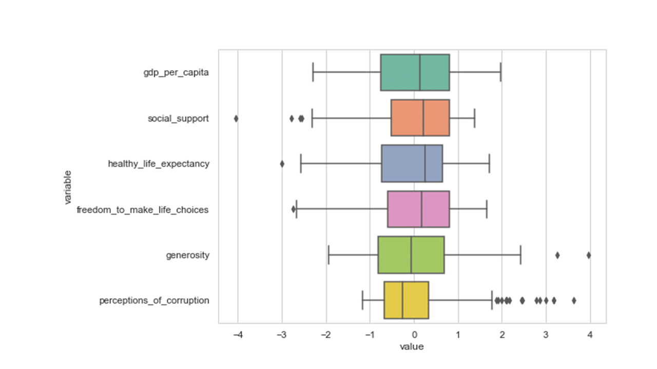
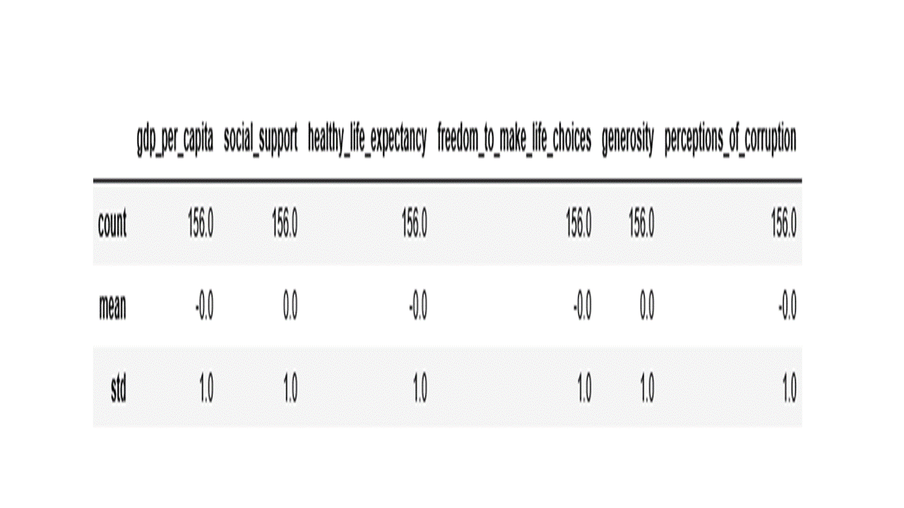
From the box plot above, we see that values of all variables have been scaled to the same magnitude as desired. The code below confirms if the features have been transformed to a mean of 0 and standard deviation of 1.
df2[numerical_features].describe().loc[['count', 'mean','std']].round()
Describing the relationship between variables is also an important first step in any statistical analysis. One way to visualize variable relationships is by using scatter plot matrix using the code below.
sns.set(style="whitegrid")
sns.pairplot(df2[numerical_features], kind='reg', diag_kind='kde')
plt.show()
Produces this scatter plot matrix!
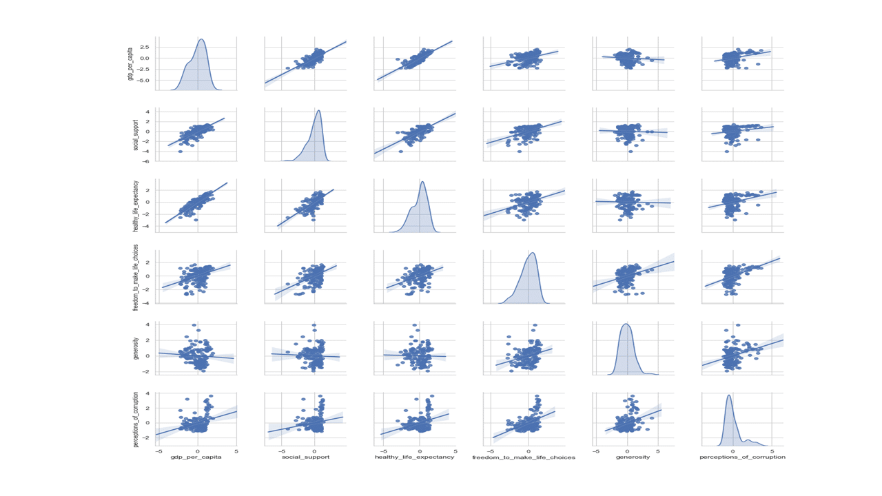
The above scatter plot shows relationship of every numerical feature with every other numerical feature, with the diagonal filled with density plot. Density plot shows data distribution and shape as is the case with histograms.
Some trends are emerging from visual inspection of the pairwise scatter plots above. For instance, GDP per capita shows positive linear relationship with healthy life expectancy and social support. On the other hand, GDP per capita shows weak to no linear relationship with generosity and perception of corruption.
The degree of linear association between two variables can be quantified with a correlation statistic. Using corr(), the Pearson correlation coefficient is the default measure of correlation for continuous features. The code below outputs a visual display of between-features correlation matrix.
plt.figure(figsize=(8,6))
sns.set(style="whitegrid")
sns.heatmap(df2[numerical_features].corr(method='pearson'), vmin=-.1, vmax=1,  annot=True, cmap='RdYlGn')
plt.show()
Produces this heat map!
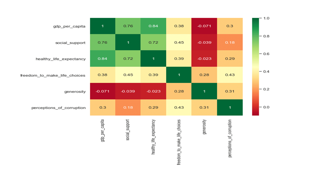
The colors of the heatmap in the above correlation matrix represent a strong positive linear relationship (green), a moderate positive linear relationship (yellow), and a no to negative linear relationship (red) between features. Such a heatmap of the correlation matrix provides a simple visual way to detect collinear groups of features. We see that the three features related to GDP per capita, healthy life expectancy and social support show multicollinearity. The second variable group comprised of freedom to make life choices and perception of corruption. The third variable group comprises of generosity.
A practical guide to minimizing redundancy in multivariate data analysis and predictive modeling is to select a variable that represents the multicollinear group. However, subject-matter implications should also be considered. Principal component analysis can also be used to reduce redundancy.
PCA with the Prince library
The prince library implements the scikit-learn’s fit/transform API with the following parameters:
n_components: the number of components that are computed.
n_iter: the number of iterations used for computing the SVD.
rescale_with_mean: whether to subtract each column’s mean.
rescale_with_std: whether to divide each column by it’s standard deviation.
copy: if False then the computations will be done in-place.
engine: what SVD engine to use (one of [‘auto’, ‘fbpca’, ‘sklearn’])
random_state: controls the randomness of the SVD results.
The code below initializes and fit PCA
pca = prince.PCA(
     n_components=6,
     n_iter=10,
     rescale_with_mean=False,
     rescale_with_std=False,
     copy=True,
     check_input=True,
     engine='sklearn',
     random_state=234
 )
pca = pca.fit(df2[numerical_features])
The code below prints eigenvalues.
print(pca.eigenvalues_)

[466.5133386545401, 220.43699902064674, 98.39433322145923,
86.09270919643257, 40.63924693532085, 23.923372971600692]
PCA does not exclude any features. Instead, it reduces the number of dimensions by constructing new variables called principal components. That means there are as many principal components as there are features. In high-dimensional dataset, one can “reduce the dimension” by choosing a small number of principal components to retain. The question is how many principal components should you retain? This can be answered by constructing a ‘scree plot’ as a diagnostic tool to determine the number of principal components to keep. A scree plot displays the eigenvalues printed above from largest to smallest in a downward curve as shown in the figure below.
dset = pd.DataFrame()
dset['pca'] = range(1,7)
dset['eigenvalue'] = pd.DataFrame(pca.eigenvalues_)
plt.figure(figsize=(8,6))
sns.lineplot(x='pca', y='eigenvalue', marker="o", data=dset)
plt.ylabel('Eigenvalue', fontsize=16)
plt.xlabel('Principal Component', fontsize=16)
plt.show()
Produces this figure!
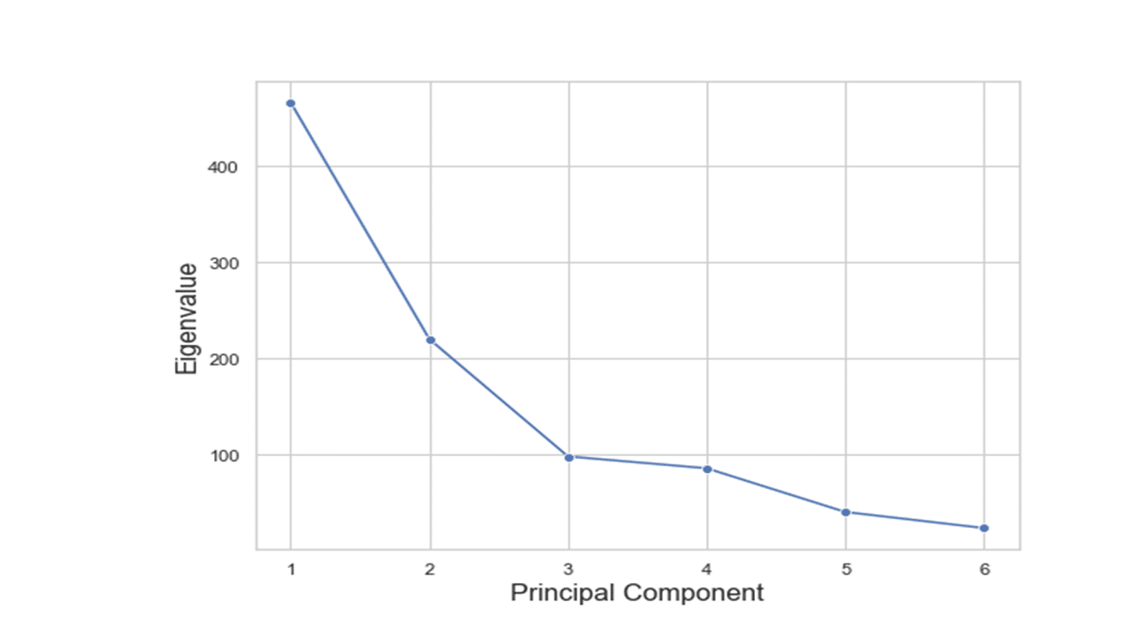
According to the scree plot above, the “elbow” of the graph where the eigenvalues seem to level off is found at 3(4) and the principal components to the left of this point could be retained as significant. As can be seen in the variance explained plot below, the first three principal components explained most (about 85%) of the variance in the dataset.
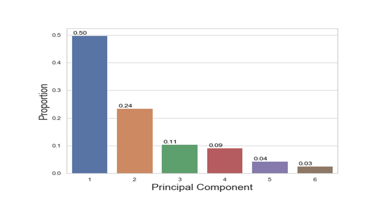
print(pca.explained_inertia_)

[0.4984116865967309, 0.23550961433829778, 0.10512215087762738,
0.0919793901671288, 0.043417998862522275, 0.025559159157693048]
The code below is to visually display the variance explained by principal components.
dset = pd.DataFrame()
dset['pca'] = range(1,7)
dset['vari'] = pd.DataFrame(pca.explained_inertia_)

plt.figure(figsize=(8,6))
graph = sns.barplot(x='pca', y='vari', data=dset)
for p in graph.patches:
    graph.annotate('{:.2f}'.format(p.get_height()), (p.get_x()+0.2, p.get_height()),
                   ha='center', va='bottom',
                   color= 'black')
plt.ylabel('Proportion', fontsize=18)
plt.xlabel('Principal Component', fontsize=18)
plt.show()
Produces this figure!
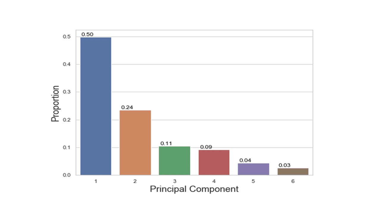
The percentages on each bar indicate the proportion of total variance explained by the respective principal component. The first principal component explained approximately 50% of the total variation. With 24%, the second principal component accounted for the second most variation and the third principal component accounted for 11% of the total variation.
The correlations between the original features and the principal components can be obtained using the code below.
pca.column_correlations(df2[numerical_features])
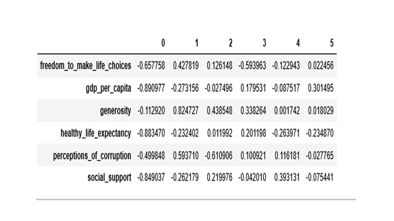
From the values in the table above, the first principal component has high negative loadings on GDP per capita, healthy life expectancy and social support and a moderate negative loading on freedom to make life choices. The second component has high positive loading on generosity and a moderate positive loading on perceptions of corruption. The third component has high negative loading on perception of corruption and moderate positive loading on generosity.
The code below is for a pairwise principal component pattern plot of principal component 1 (PC1) vs principal component 2 (PC2).
scatter = pd.DataFrame(pca.column_correlations(df2[numerical_features])).reset_index()
plt.figure(figsize=(10,6))
ax = sns.scatterplot(x=0, y=1, data=scatter)
ax.set(ylim=(-1, 1), xlim=(-1,0))
def label_point(x, y, val, ax):
    a = pd.concat({'x': x, 'y': y, 'val': val}, axis=1)
    for i, point in a.iterrows():
        ax.text(point['x']+.02, point['y'], str(point['val']))
label_point(scatter[0], scatter[1], scatter['index'], plt.gca())
plt.axvline(-0.5, ls='--')
plt.axhline(0, ls='--')
plt.title('Pattern Plot of Component 2 by Component 1', fontsize=18)
plt.xlabel('Component 1 (50%)', fontsize=18)
plt.ylabel('Component 2 (24%)', fontsize=18)
plt.show()
Produces this figure!
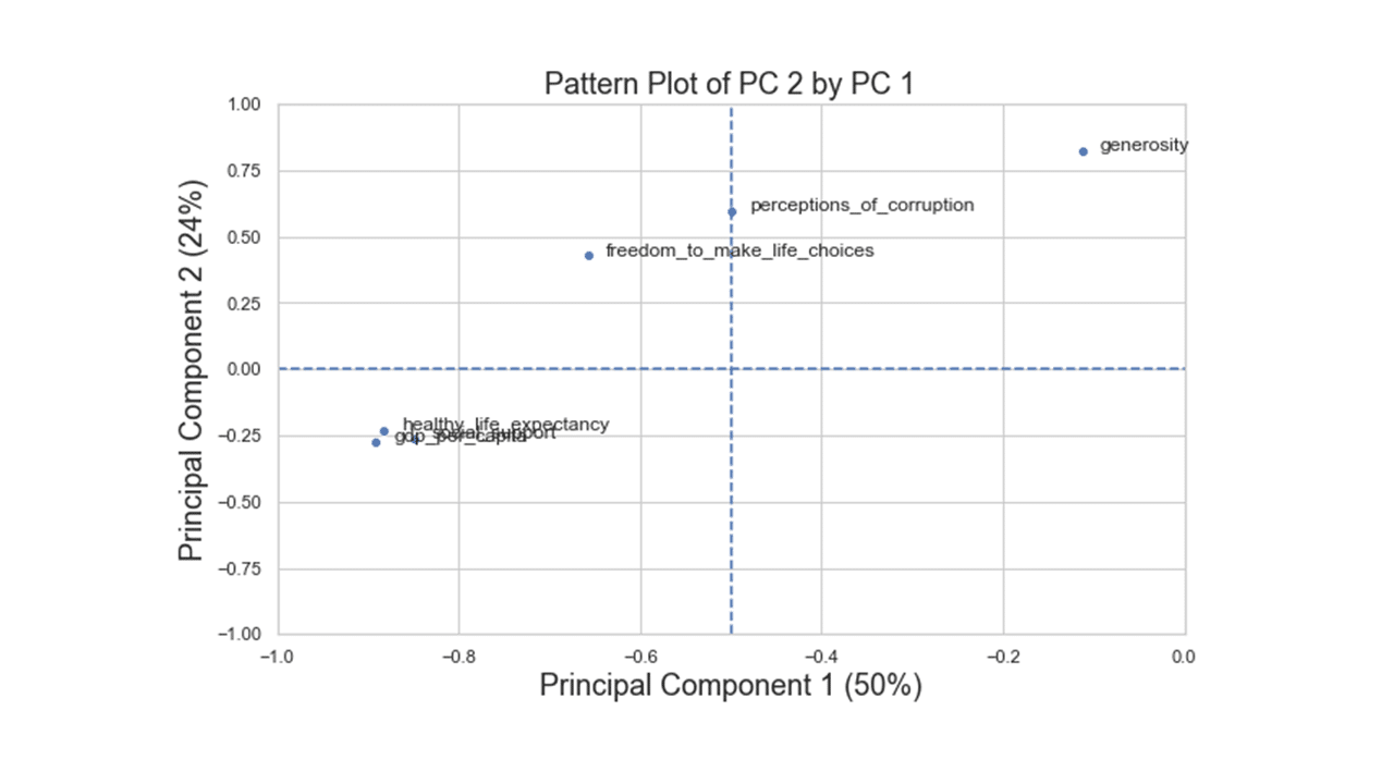
There are three variable groups based on the first two principal components: i) GDP, social support, and healthy life expectancy, ii) freedom to make life choices and perception of corruption, and iii) generosity.
Putting it together
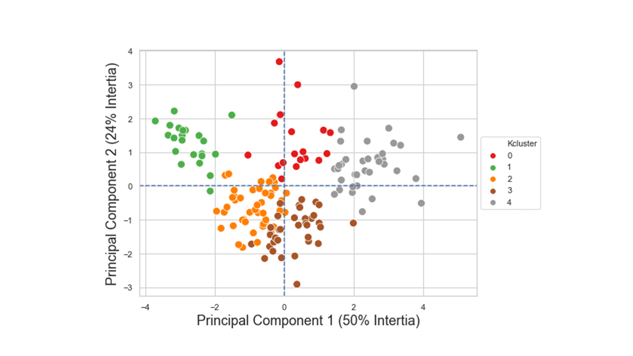
We can now display individual countries, superimposed with their K-Means cluster assignment determined in Part 2, on the plane defined by the first two principal components.
kmeans5 = KMeans(n_clusters=5, init='random', n_init=20, max_iter=600,  random_state=234)
kmeans5.fit_predict(df2[numerical_features])
df2['Kcluster'] =  pd.Series(kmeans5.labels_, index=df.index)
ax = pca.plot_row_coordinates(
     df2[numerical_features],
     ax=None,
     figsize=(10, 8),
     x_component=0,
     y_component=1,
     labels=None,
     color_labels=df2['Kcluster'],
     ellipse_outline=True,
     ellipse_fill=True,
     show_points=True
 ).legend(loc='center left', bbox_to_anchor=(1, 0.5))
plt.title('Row Principal Components with KMeans Cluster Groups', fontsize=18)
plt.xlabel('Component 1 (50% Intertia)',fontsize=18)
plt.ylabel('Component 2 (24% Intertia)', fontsize=18)
plt.show()
Produces this figure!
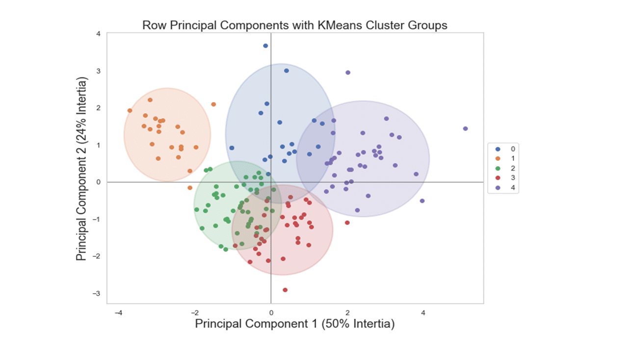
Looking at the figure above, we see a clear separation between countries assigned in cluster #1 at the left outer side and countries assigned in cluster #4 at the right outer side.
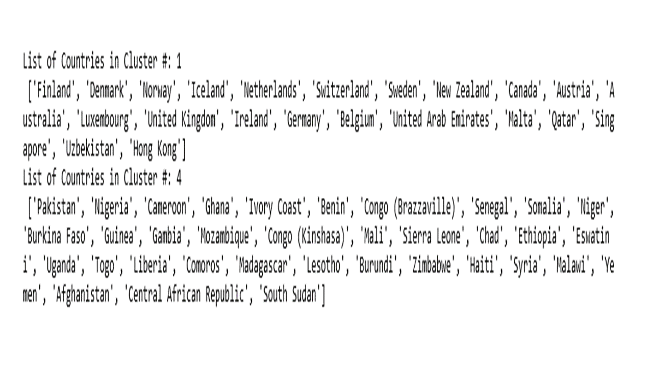
The code below will list the countries that were assigned in cluster #1 and cluster #4.
tt = df2[(df2.Kcluster == 1) | (df2.Kcluster == 4)]
for m in tt['Kcluster'].unique():
    tt1 = tt[['Kcluster','country_or_region']][tt['Kcluster']==m]
    print(f"List of Countries in Cluster #: {m} \n {list(tt1['country_or_region'])}")
As a bonus, the following sections will illustrate PCA with scikit-learn.
PCA with scikit-learn
sk_pca = PCA(n_components=6,random_state=234 )
sk_pca.fit(df_scaled)
dset2 = pd.DataFrame()
dset2['pca'] = range(1,7)
dset2['vari'] = pd.DataFrame(Sk_pca.explained_variance_ratio_)
plt.figure(figsize=(8,6))
graph = sns.barplot(x='pca', y='vari', data=dset2)
for p in graph.patches:
    graph.annotate('{:.2f}'.format(p.get_height()), (p.get_x()+0.2, p.get_height()),
                   ha='center', va='bottom',
                   color= 'black')
plt.ylabel('Proportion', fontsize=18)
plt.xlabel('Principal Component', fontsize=18)
plt.show()
Produces this figure!
x_pca = sk_pca.transform(df2[numerical_features])

plt.figure(figsize=(8,6))
sns.scatterplot(x_pca[:,0],x_pca[:,1],hue=df2['Kcluster'],
                palette="Set1", legend='full', s=100).legend(loc='center left', bbox_to_anchor=(1, 0.5))
plt.xlabel('Principal Component 1 (50% Intertia)',fontsize=18)
plt.ylabel('Principal Component 2 (24% Intertia)', fontsize=18)
plt.axvline(0, ls='--')
plt.axhline(0, ls='--')
plt.show()
Produces this figure!
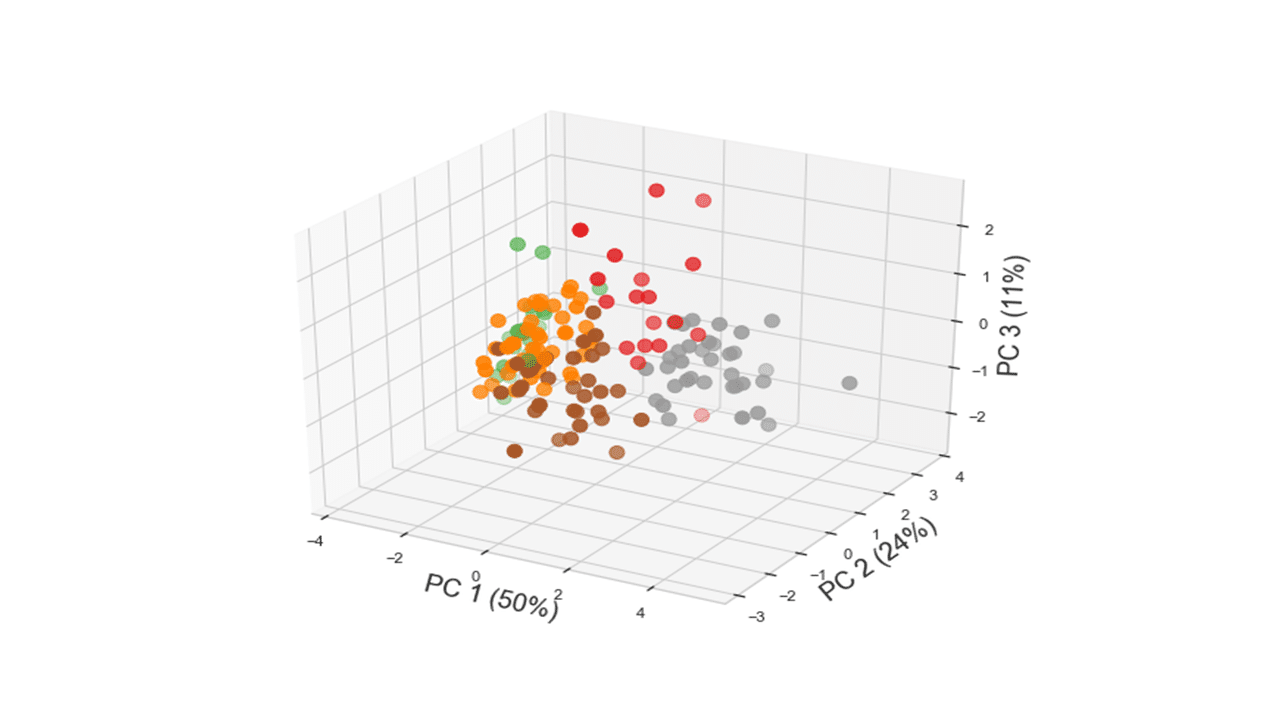
Code below produces a 3D plot of the 156 countries along the plane defined by the first three principal components.
from mpl_toolkits.mplot3d import Axes3D
fig = plt.figure(figsize=(8,6))
ax = Axes3D(fig)
ax.scatter(x_pca[:,0],x_pca[:,1],x_pca[:,2], c=df2['Kcluster'], s=100, cmap="Set1")
ax.set_xlabel('PC 1 (50%)',fontsize=18)
ax.set_ylabel('PC 2 (24%)',fontsize=18)
ax.set_zlabel('PC 3 (11%)',fontsize=18)
plt.show()
Produces this figure!
In Summary
To recap, techniques for unsupervised learning are of growing importance in predictive modeling and prescriptive analytics. Unsupervised learning algorithms are often used in an exploratory setting when data scientists want to understand the data better, rather than as a part of a larger automated step. Both types of unsupervised machine learning techniques, applied clustering and PCA, seek to reduce the dataset with a small number of cases and features. Applied clustering aims to find similar subgroups among the observations, whereas PCA attempts to find a low-dimension representation of the variables that explain a higher proportion of the total variance. The idea behind PCA is to choose the smallest number of principal components that could explain a large proportion of the variation in the dataset. Besides learning new representations of the data, using applied clustering and/or PCA can improve the accuracy of supervised models or can lead to reduced memory and time consumption, as the first few principal components might be used in place of the original variables in the data analysis.