MongoDB is a NoSQL database program which uses JSON-like documents with schemas. It is free and open-source cross-platform database. MongoDB, top NoSQL database engine in use today, could be a good data storage alternative when analyzing large volume data.
To use MongoDB with R, first, we have to download and install MongoDB
Next, start MongoDB. We can start MongoDB like so:
mongod
We can use the mongolite, package which is a fast and simple MongoDB client for R, to use MongoDB with R.
Inserting data
Let’s insert the crimes data from data.gov to MongoDB. The dataset reflects reported incidents of crime (with the exception of murders where data exists for each victim) that occurred in the City of Chicago since 2001.
library(ggplot2)
library(dplyr)
library(maps)
library(ggmap)
library(mongolite)
library(lubridate)
library(gridExtra)

crimes=data.table::fread("Crimes_2001_to_present.csv")
names(crimes)
'ID' 'Case Number' 'Date' 'Block' 'IUCR' 'Primary Type' 'Description' 'Location Description' 'Arrest'
'Domestic' 'Beat' 'District' 'Ward' 'Community Area' 'FBI Code' 'X Coordinate' 'Y Coordinate' 'Year' 'Updated On' 'Latitude' 'Longitude' 'Location'
Let’s remove spaces in the column names to avoid any problems when we query it from MongoDB.
names(crimes) = gsub(" ","",names(crimes))
names(crimes)
'ID' 'CaseNumber' 'Date' 'Block' 'IUCR' 'PrimaryType' 'Description' 'LocationDescription' 'Arrest' 'Domestic' 'Beat' 'District' 'Ward' 'CommunityArea' 'FBICode' 'XCoordinate' 'YCoordinate' 'Year' 'UpdatedOn' 'Latitude' 'Longitude' 'Location'
we can use the insert function from the mongolite package to insert rows to a collection in MongoDB.
Let’s create a database called Chicago and call the collection crimes.
my_collection = mongo(collection = "crimes", db = "Chicago") # create connection, database and collection
my_collection$insert(crimes)
Let’s check if we have inserted the “crimes” data.
my_collection$count()
6261148
We see that the collection has 6261148 records.
Performing a query and retrieving data
First, let’s look what the data looks like by displaying one record:
my_collection$iterate()$one()
$ID
1454164
$CaseNumber
'G185744'
$Date
'04/01/2001 06:00:00 PM'
$Block
'049XX N MENARD AV'
$IUCR
'0910'
$PrimaryType
'MOTOR VEHICLE THEFT'
$Description
'AUTOMOBILE'
$LocationDescription
'STREET'
$Arrest
'false'
$Domestic
'false'
$Beat
1622
$District
16
$FBICode
'07'
$XCoordinate
1136545
$YCoordinate
1932203
$Year
2001
$UpdatedOn
'08/17/2015 03:03:40 PM'
$Latitude
41.970129962
$Longitude
-87.773302309
$Location
'(41.970129962, -87.773302309)'
How many distinct “Primary Type” do we have?
length(my_collection$distinct("PrimaryType"))
35
As shown above, there are 35 different crime primary types in the database. We will see the patterns of the most common crime types below.
From the iterate()iterate() $one() command above, we have seen that one of the columns is Domestic, which shows whether the crime is domestic or not.
Now, let’s see how many domestic assualts there are in the collection.
my_collection$count('{"PrimaryType" : "ASSAULT", "Domestic" : "true" }')
82470
To get the filtered data and we can also retrieve only the columns of interest
query1= my_collection$find('{"PrimaryType" : "ASSAULT", "Domestic" : "true" }')
query2= my_collection$find('{"PrimaryType" : "ASSAULT", "Domestic" : "true" }',
                           fields = '{"_id":0, "PrimaryType":1, "Domestic":1}')
ncol(query1) # with all the columns
ncol(query2) # only the selected columns
22
2
Where do most crimes take pace?
my_collection$aggregate('[{"$group":{"_id":"$LocationDescription", "Count": {"$sum":1}}}]')%>%na.omit()%>%
arrange(desc(Count))%>%head(10)%>%
ggplot(aes(x=reorder(`_id`,Count),y=Count))+
geom_bar(stat="identity",color='skyblue',fill='#b35900')+geom_text(aes(label = Count), color = "blue") +coord_flip()+xlab("Location Description")

If loading the entire dataset we are working with does not slow down our analysis, we can use data.table or dplyr but when dealing with big data, using MongoDB can give us performance boost as the whole data will not be loaded into mememory. We can reproduce the above plot without using MongoDB, like so:
crimes%>%group_by(`LocationDescription`)%>%summarise(Total=n())%>% arrange(desc(Total))%>%head(10)%>%
ggplot(aes(x=reorder(`LocationDescription`,Total),y=Total))+
geom_bar(stat="identity",color='skyblue',fill='#b35900')+geom_text(aes(label = Total), color = "blue") +coord_flip()+xlab("Location Description")

What if we want to query all records for certain columns only? This helps us to load only the columns we want and to save memory for our analysis.
query3= my_collection$find('{}', fields = '{"_id":0, "Latitude":1, "Longitude":1,"Year":1}')
Let’s explore domestic crimes
We can explore any patterns of domestic crimes. For example, are they common in certain days/hours/months?
domestic=my_collection$find('{"Domestic":"true"}', fields = '{"_id":0, "Domestic":1,"Date":1}')
domestic$Date= mdy_hms(domestic$Date)
domestic$Weekday = weekdays(domestic$Date)
domestic$Hour = hour(domestic$Date)
domestic$month = month(domestic$Date,label=TRUE)

WeekdayCounts = as.data.frame(table(domestic$Weekday))
WeekdayCounts$Var1 = factor(WeekdayCounts$Var1, ordered=TRUE, levels=c("Sunday", "Monday", "Tuesday", "Wednesday", "Thursday", "Friday","Saturday"))
ggplot(WeekdayCounts, aes(x=Var1, y=Freq)) + geom_line(aes(group=1),size=2,color="red") + xlab("Day of the Week") + ylab("Total Domestic Crimes")+
ggtitle("Domestic Crimes in the City of Chicago Since 2001")+
theme(axis.title.x=element_blank(),axis.text.y = element_text(color="blue",size=11,angle=0,hjust=1,vjust=0),
      axis.text.x = element_text(color="blue",size=11,angle=0,hjust=.5,vjust=.5),
     axis.title.y = element_text(size=14),
     plot.title=element_text(size=16,color="purple",hjust=0.5))
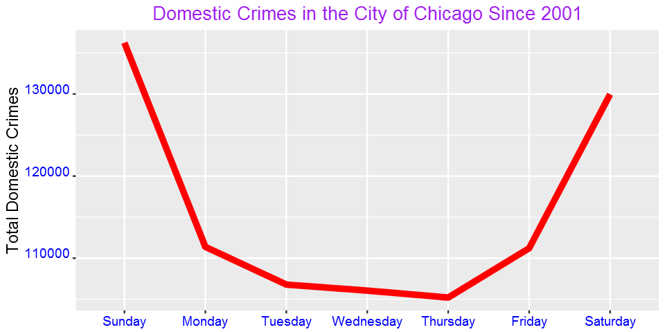
Domestic crimes are common over the weekend than in weekdays? What could be the reason?
We can also see the pattern for each day by hour:
DayHourCounts = as.data.frame(table(domestic$Weekday, domestic$Hour))
DayHourCounts$Hour = as.numeric(as.character(DayHourCounts$Var2))
ggplot(DayHourCounts, aes(x=Hour, y=Freq)) + geom_line(aes(group=Var1, color=Var1), size=1.4)+ylab("Count")+
ylab("Total Domestic Crimes")+ggtitle("Domestic Crimes in the City of Chicago Since 2001")+
theme(axis.title.x=element_text(size=14),axis.text.y = element_text(color="blue",size=11,angle=0,hjust=1,vjust=0),
      axis.text.x = element_text(color="blue",size=11,angle=0,hjust=.5,vjust=.5),
     axis.title.y = element_text(size=14),
     legend.title=element_blank(),
     plot.title=element_text(size=16,color="purple",hjust=0.5))
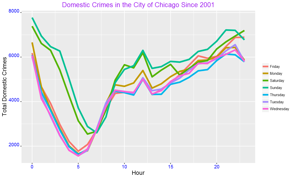
The crimes peak mainly around mid-night. We can also use one color for weekdays and another color for weekend as shown below.
DayHourCounts$Type = ifelse((DayHourCounts$Var1 == "Sunday") | (DayHourCounts$Var1 == "Saturday"), "Weekend", "Weekday")

ggplot(DayHourCounts, aes(x=Hour, y=Freq)) + geom_line(aes(group=Var1, color=Type), size=2, alpha=0.5) +
ylab("Total Domestic Crimes")+ggtitle("Domestic Crimes in the City of Chicago Since 2001")+
theme(axis.title.x=element_text(size=14),axis.text.y = element_text(color="blue",size=11,angle=0,hjust=1,vjust=0),
      axis.text.x = element_text(color="blue",size=11,angle=0,hjust=.5,vjust=.5),
     axis.title.y = element_text(size=14),
     legend.title=element_blank(),
     plot.title=element_text(size=16,color="purple",hjust=0.5))
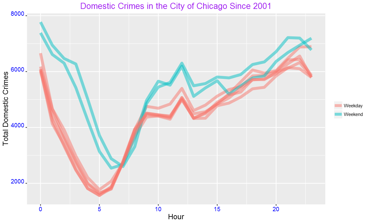
The difference between weekend and weekdays are more clear from this figure than from the previous plot. We can also see the above pattern from a heatmap.
DayHourCounts$Var1 = factor(DayHourCounts$Var1, ordered=TRUE, levels=c("Monday", "Tuesday", "Wednesday", "Thursday", "Friday", "Saturday", "Sunday"))
ggplot(DayHourCounts, aes(x = Hour, y = Var1)) + geom_tile(aes(fill = Freq)) + scale_fill_gradient(name="Total MV Thefts", low="white", high="red") +
ggtitle("Domestic Crimes in the City of Chicago Since 2001")+theme(axis.title.y = element_blank())+ylab("")+
theme(axis.title.x=element_text(size=14),axis.text.y = element_text(size=13),
      axis.text.x = element_text(size=13),
     axis.title.y = element_text(size=14),
     legend.title=element_blank(),
     plot.title=element_text(size=16,color="purple",hjust=0.5))
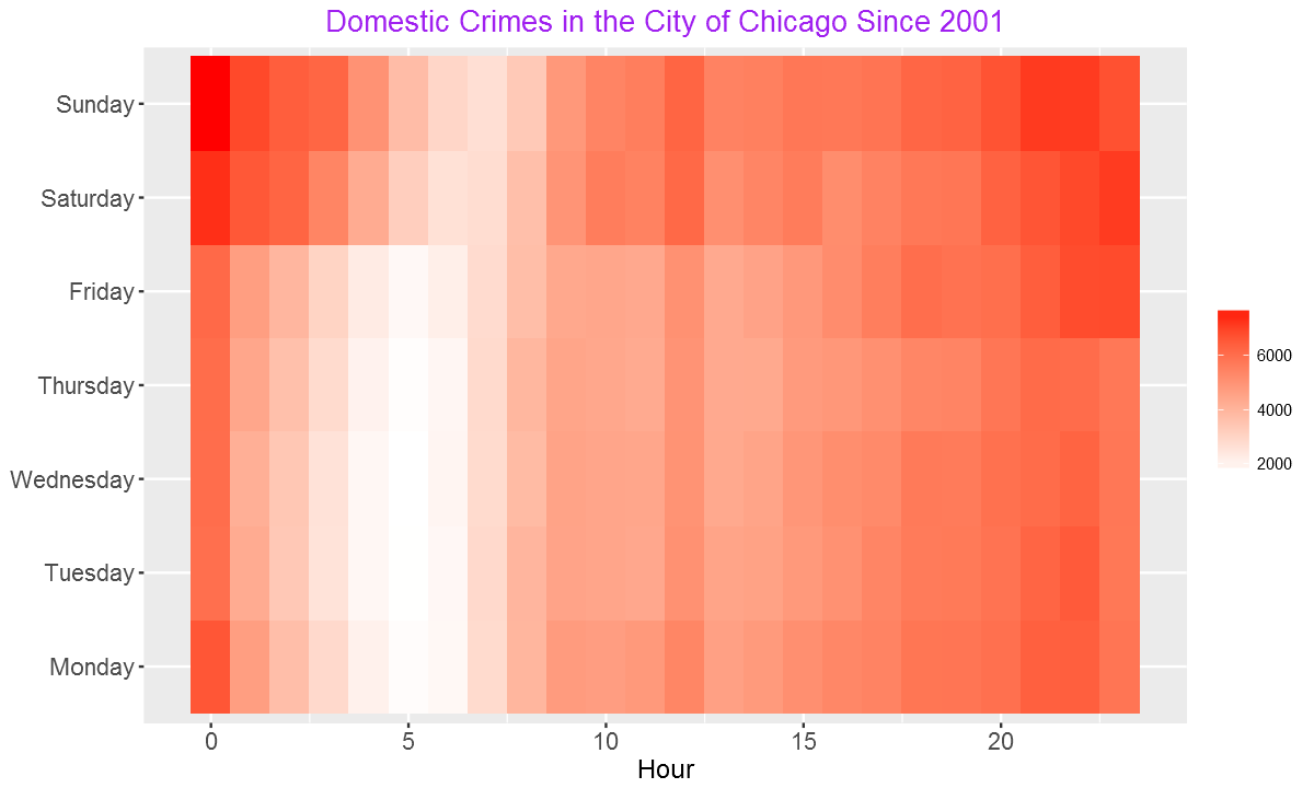
From the heatmap, we can see more crimes over weekends and at night.
monthCounts = as.data.frame(table(domestic$month))
ggplot(monthCounts, aes(x=Var1, y=Freq)) + geom_line(aes(group=1),size=2,color="red") + xlab("Day of the Week") + ylab("Total Domestic Crimes")+
ggtitle("Domestic Crimes in the City of Chicago Since 2001")+
theme(axis.title.x=element_blank(),axis.text.y = element_text(color="blue",size=11,angle=0,hjust=1,vjust=0),
      axis.text.x = element_text(color="blue",size=11,angle=0,hjust=.5,vjust=.5),
     axis.title.y = element_text(size=14),
     plot.title=element_text(size=16,color="purple",hjust=0.5))
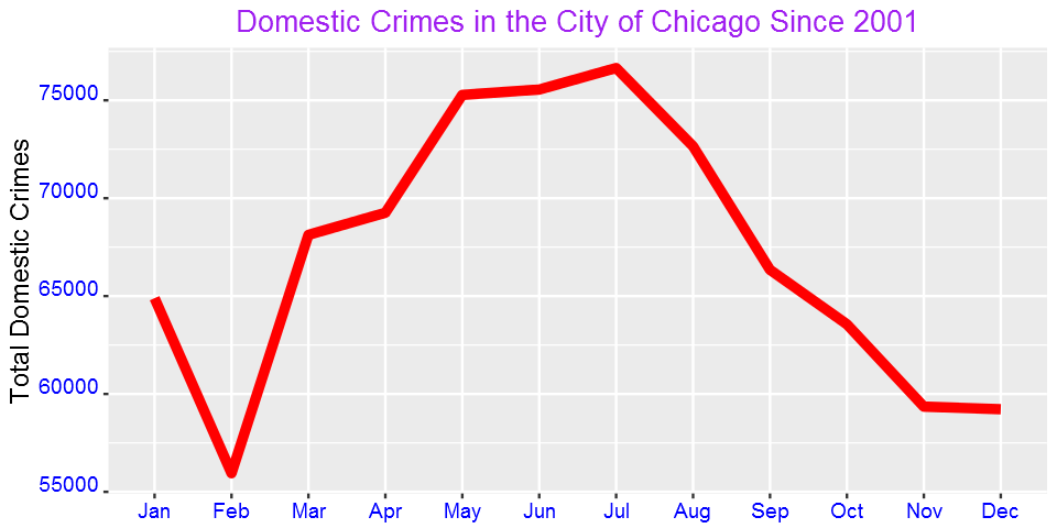
Is domestic crime associated with temperature? Domestic crimes tremendously increases during the warm months.
Now, let’s see the pattern of other crime types. Since there are 35 primary types, we cannot see all of them in this post. Let’s focus on four of the most common ones.
crimes=my_collection$find('{}', fields = '{"_id":0, "PrimaryType":1,"Year":1}')
crimes%>%group_by(PrimaryType)%>%summarize(Count=n())%>%arrange(desc(Count))%>%head(4)
Imported 6261148 records. Simplifying into dataframe...
PrimaryType	Count
THEFT	        1301434
BATTERY	        1142377
CRIMINAL DAMAGE	720143
NARCOTICS	687790
As shown in the table above, the most common crime type is theft followed by battery. Narcotics is fourth most common while criminal damage is the third most common crime type in the city of Chicago.
Now, let’s generate plots by day and hour.
four_most_common=crimes%>%group_by(PrimaryType)%>%summarize(Count=n())%>%arrange(desc(Count))%>%head(4)
four_most_common=four_most_common$PrimaryType

crimes=my_collection$find('{}', fields = '{"_id":0, "PrimaryType":1,"Date":1}')
crimes=filter(crimes,PrimaryType %in%four_most_common)
crimes$Date= mdy_hms(crimes$Date)
crimes$Weekday = weekdays(crimes$Date)
crimes$Hour = hour(crimes$Date)
crimes$month=month(crimes$Date,label = TRUE)

g = function(data){
    WeekdayCounts = as.data.frame(table(data$Weekday))
    WeekdayCounts$Var1 = factor(WeekdayCounts$Var1, ordered=TRUE, levels=c("Sunday", "Monday", "Tuesday", "Wednesday", "Thursday", "Friday","Saturday"))
    ggplot(WeekdayCounts, aes(x=Var1, y=Freq)) + geom_line(aes(group=1),size=2,color="red") + xlab("Day of the Week") +
    theme(axis.title.x=element_blank(),axis.text.y = element_text(color="blue",size=10,angle=0,hjust=1,vjust=0),
          axis.text.x = element_text(color="blue",size=10,angle=0,hjust=.5,vjust=.5),
         axis.title.y = element_text(size=11),
         plot.title=element_text(size=12,color="purple",hjust=0.5))
    }

g1=g(filter(crimes,PrimaryType=="THEFT"))+ggtitle("Theft")+ylab("Total Count")
g2=g(filter(crimes,PrimaryType=="BATTERY"))+ggtitle("BATTERY")+ylab("Total Count")
g3=g(filter(crimes,PrimaryType=="CRIMINAL DAMAGE"))+ggtitle("CRIMINAL DAMAGE")+ylab("Total Count")
g4=g(filter(crimes,PrimaryType=="NARCOTICS"))+ggtitle("NARCOTICS")+ylab("Total Count")
grid.arrange(g1,g2,g3,g4,ncol=2)
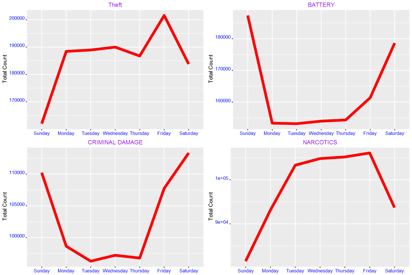
From the plots above, we see that theft is most common on Friday. Battery and criminal damage, on the other hand, are highest at weekend. We also observe that narcotics decreases over weekend.
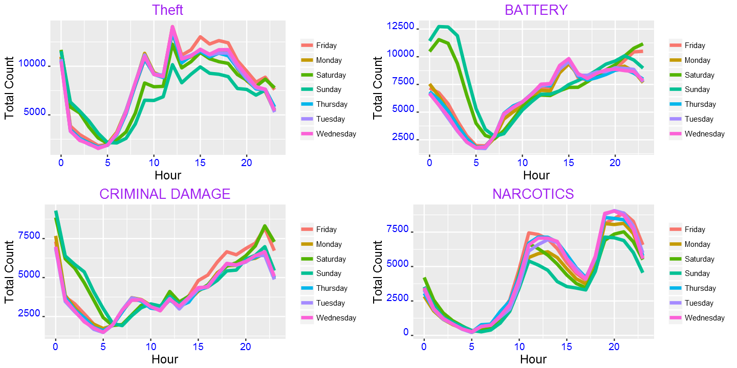
We can also see the pattern of the above four crime types by hour:
g=function(data){
    DayHourCounts = as.data.frame(table(data$Weekday, data$Hour))
    DayHourCounts$Hour = as.numeric(as.character(DayHourCounts$Var2))
    ggplot(DayHourCounts, aes(x=Hour, y=Freq)) + geom_line(aes(group=Var1, color=Var1), size=1.4)+ylab("Count")+
    theme(axis.title.x=element_text(size=14),axis.text.y = element_text(color="blue",size=11,angle=0,hjust=1,vjust=0),
      axis.text.x = element_text(color="blue",size=11,angle=0,hjust=.5,vjust=.5),
     axis.title.y = element_text(size=14),
     legend.title=element_blank(),
     plot.title=element_text(size=16,color="purple",hjust=0.5))
    }

g1=g(filter(crimes,PrimaryType=="THEFT"))+ggtitle("Theft")+ylab("Total Count")
g2=g(filter(crimes,PrimaryType=="BATTERY"))+ggtitle("BATTERY")+ylab("Total Count")
g3=g(filter(crimes,PrimaryType=="CRIMINAL DAMAGE"))+ggtitle("CRIMINAL DAMAGE")+ylab("Total Count")
g4=g(filter(crimes,PrimaryType=="NARCOTICS"))+ggtitle("NARCOTICS")+ylab("Total Count")
grid.arrange(g1,g2,g3,g4,ncol=2)
g=function(data){
    monthCounts = as.data.frame(table(data$month))
    ggplot(monthCounts, aes(x=Var1, y=Freq)) + geom_line(aes(group=1),size=2,color="red") + xlab("Day of the Week") +
    theme(axis.title.x=element_blank(),axis.text.y = element_text(color="blue",size=11,angle=0,hjust=1,vjust=0),
          axis.text.x = element_text(color="blue",size=11,angle=0,hjust=.5,vjust=.5),
         axis.title.y = element_text(size=14),
         plot.title=element_text(size=16,color="purple",hjust=0.5))
    }

g1=g(filter(crimes,PrimaryType=="THEFT"))+ggtitle("Theft")+ylab("Total Count")
g2=g(filter(crimes,PrimaryType=="BATTERY"))+ggtitle("BATTERY")+ylab("Total Count")
g3=g(filter(crimes,PrimaryType=="CRIMINAL DAMAGE"))+ggtitle("CRIMINAL DAMAGE")+ylab("Total Count")
g4=g(filter(crimes,PrimaryType=="NARCOTICS"))+ggtitle("NARCOTICS")+ylab("Total Count")
grid.arrange(g1,g2,g3,g4,ncol=2)
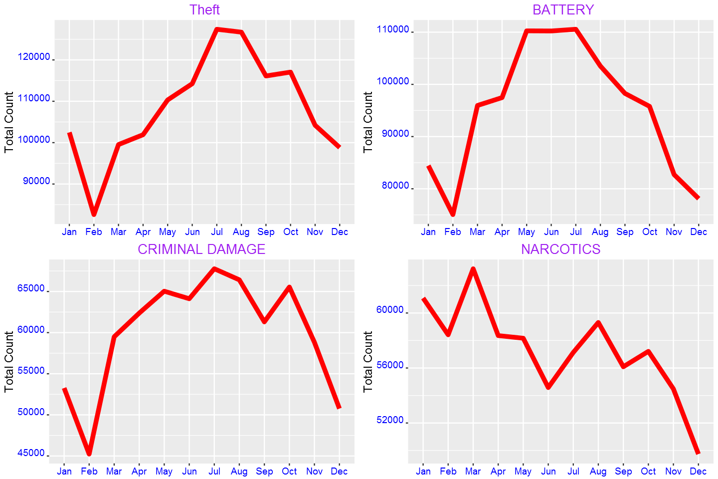
Except, narcotics, all increase in the warmer months. Does this have any association with temperature?
We can also produce maps.
chicago = get_map(location = "chicago", zoom = 11) # Load a map of Chicago into R:
Round our latitude and longitude to 2 digits of accuracy, and create a crime counts data frame for each area:
query3= my_collection$find('{}', fields = '{"_id":0, "Latitude":1, "Longitude":1,"Year":1}')
LatLonCounts=as.data.frame(table(round(query3$Longitude,2),round(query3$Latitude,2)))
Convert our Longitude and Latitude variable to numbers:
LatLonCounts$Long = as.numeric(as.character(LatLonCounts$Var1))
LatLonCounts$Lat = as.numeric(as.character(LatLonCounts$Var2))
ggmap(chicago) + geom_tile(data = LatLonCounts, aes(x = Long, y = Lat, alpha = Freq), fill="red")+
ggtitle("Crime Distribution")+labs(alpha="Count")+theme(plot.title = element_text(hjust=0.5))

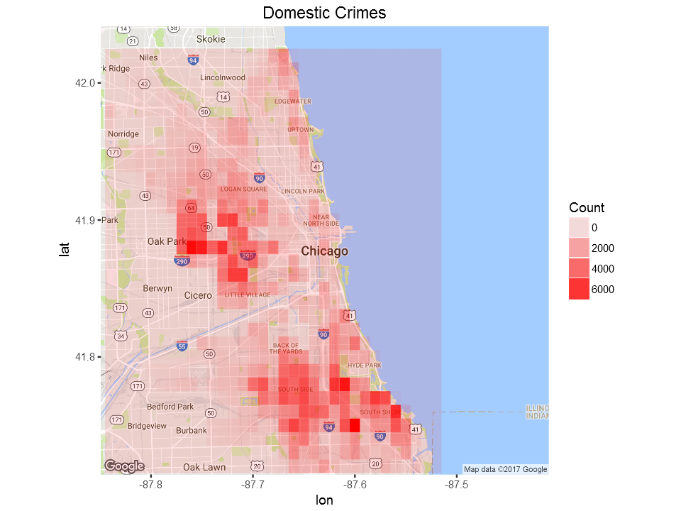
We can also see a map for domestic crimes only:
domestic=my_collection$find('{"Domestic":"true"}', fields = '{"_id":0, "Latitude":1, "Longitude":1,"Year":1}')
LatLonCounts=as.data.frame(table(round(domestic$Longitude,2),round(domestic$Latitude,2)))
LatLonCounts$Long = as.numeric(as.character(LatLonCounts$Var1))
LatLonCounts$Lat = as.numeric(as.character(LatLonCounts$Var2))
ggmap(chicago) + geom_tile(data = LatLonCounts, aes(x = Long, y = Lat, alpha = Freq), fill="red")+
ggtitle("Domestic Crimes")+labs(alpha="Count")+theme(plot.title = element_text(hjust=0.5))
Let’s see where motor vehicle theft is common:
mtheft=my_collection$find('{"PrimaryType":"MOTOR VEHICLE THEFT"}', fields = '{"_id":0, "Latitude":1, "Longitude":1,"Year":1}')
LatLonCounts=as.data.frame(table(round(mtheft$Longitude,2),round(mtheft$Latitude,2)))
LatLonCounts$Long = as.numeric(as.character(LatLonCounts$Var1))
LatLonCounts$Lat = as.numeric(as.character(LatLonCounts$Var2))
ggmap(chicago) + geom_tile(data = LatLonCounts, aes(x = Long, y = Lat, alpha = Freq), fill="red")+
ggtitle("Motor Vehicle Theft ")+labs(alpha="Count")+theme(plot.title = element_text(hjust=0.5))
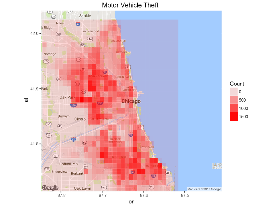
Domestic crimes show concentration over two areas whereas motor vehicle theft is wide spread over large part of the city of Chicago.
Summary
In this post, we saw how to use R to analyse data stored in MongoDB, top NoSQL database engine in use today. When dealing with large volume data, using MongoDB can give us performance boost and make our life happier 🙂


Unfortunately mongolite has no support for transactions, which is a dealbreaker for a lot of applications. Worse yet, the documentation doesn’t tell you this, you have to just infer it from the lack of any mention of transactions.
Unfortunately mongolite has no support for transactions, which is a dealbreaker for a lot of applications. Worse yet, the documentation doesn’t tell you this, you have to just infer it from the lack of any mention of transactions.
very nice
Great article! one question though, is it possible to convert data types in mongodb using mongolite. I.e if there is a date field in the database that is of type ‘string’ is it possible to convert this to date/POSIXct by some kind of update using mongolite without having to load the data into R?
This dataset seems to be way too large. The CSV is 1.5GB. Every command I enter takes 15 or more mins to return. Am I doing something wrong? I’m new to R as of yesterday. Thanks for any help.
Try to read only 10000 rows. Then you can improve further.
Thank you. I will try that.
R has a bunch of tools to time operations. Start with system.time(). Install them in this code to figure out whether the mongo calls are taking all the time or the other R code. You might want to unpack the whole mongo collection, then subset it and process it on your machine. This code is very dense. Not the best for a first-timer.
Yes, I do think my eyes were too big for my stomach on this one. I’ve
since been dealing with smaller sets. Your advice will help though.
Thank you!
The easiest way to get this into MongoDB would be to download the JSON version by right clicking on the URL https://data.cityofchicago.org/api/views/ijzp-q8t2/rows.json?accessType=DOWNLOAD and saving as JSON. I think its like 3 GB. when you are done just issue a mongoimport command. Something like mongoimport -c crime -d chicago –file crimeinchicago.json
Excellent article. Thank you.
Thank you for you providing us your knowledge and these examples. I have taken a couple of cursory stabs at working with MongoDB; but this is the first tutorial example that engaged my interest (with real data and illustrative material).
I am confused by the line:
“crimes=filter(crimes,PrimaryType %in%four_most_common)”
which throws an error in my installation.
I cannot track any info on this in mongolite documentation.
Thank you for pointing that out. Added two lines of code to fix that.
I continuously get this error when trying to run the graphs :
Error: Aesthetics must be either length 1 or the same as the data (1): x and y.