Previously, I have written a blog post on machine learning with R by Caret package. In this post, I will use the scikit-learn library in Python. As we did in the R post, we will predict power output given a set of environmental readings from various sensors in a natural gas-fired power generation plant.
The real-world data we are using in this post consists of 9,568 data points, each with 4 environmental attributes collected from a Combined Cycle Power Plant over 6 years (2006-2011), and is provided by the University of California, Irvine at UCI Machine Learning Repository Combined Cycle Power Plant Data Set. You can find more details about the dataset on the UCI page.
Import libraries to perform Extract-Transform-Load (ETL) and Exploratory Data Analysis (EDA)
import pandas as pd
import seaborn as sns
import statsmodels.api as sm
import matplotlib.pyplot as plt
Load Data
power_plant = pd.read_excel("Folds5x2_pp.xlsx")
Exploratory Data Analysis (EDA)
This is a step that we should always perform before trying to fit a model to the data, as this step will often lead to important insights about our data.
type(power_plant)
pandas.core.frame.DataFrame
See first few rows
power_plant.head()
AT	V	AP	RH	PE
0	14.96	41.76	1024.07	73.17	463.26
1	25.18	62.96	1020.04	59.08	444.37
2	5.11	39.40	1012.16	92.14	488.56
3	20.86	57.32	1010.24	76.64	446.48
4	10.82	37.50	1009.23	96.62	473.90
The columns in the DataFrame are:
- AT = Atmospheric Temperature in C
V = Exhaust Vacuum Speed
AP = Atmospheric Pressure
RH = Relative Humidity
PE = Power Output
Power Output is the value we are trying to predict given the measurements above.
Size of DataFrame
  power_plant.shape
(9568, 5)
Class of each column in the DataFrame
power_plant.dtypes    # all columns are numeric
AT    float64
V     float64
AP    float64
RH    float64
PE    float64
dtype: object
Are there any missing values in any of the columns?
power_plant.info()  # There is no missing data in all of the columns
RangeIndex: 9568 entries, 0 to 9567
Data columns (total 5 columns):
AT    9568 non-null float64
V     9568 non-null float64
AP    9568 non-null float64
RH    9568 non-null float64
PE    9568 non-null float64
dtypes: float64(5)
memory usage: 373.8 KB
Visualize relationship between variables
Before we perform any modeling, it is a good idea to explore correlations between the predictors and the predictand. This step can be important as it helps us to select appropriate models. If our features and the outcome are linearly related, we may start with linear regression models. However, if the relationships between the label and the features are non-linear, non-linear ensemble models such as random forest can be better.
Correlation between power output and temperature
power_plant.plot(x ='AT', y = 'PE', kind ="scatter",
                 figsize = [10,10],
                 color ="b", alpha = 0.3,
                fontsize = 14)
plt.title("Temperature vs Power Output",
          fontsize = 24, color="darkred")
plt.xlabel("Atmospheric Temperature", fontsize = 18)
plt.ylabel("Power Output", fontsize = 18)
plt.show()
Gives this plot:
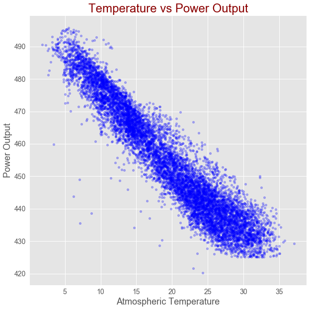
As shown in the above figure, there is strong linear correlation between Atmospheric Temperature and Power Output.
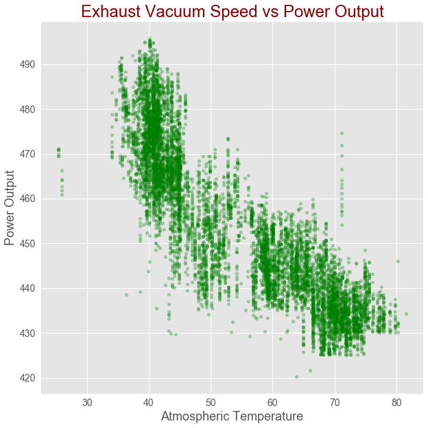
Correlation between Exhaust Vacuum Speed and power output
power_plant.plot(x ='V', y = 'PE',kind ="scatter",
                 figsize = [10,10],
                 color ="g", alpha = 0.3,
                fontsize = 14)
plt.title("Exhaust Vacuum Speed vs Power Output", fontsize = 24, color="darkred")
plt.xlabel("Atmospheric Temperature", fontsize = 18)
plt.ylabel("Power Output", fontsize = 18)
plt.show()
Gives this plot:
Correlation between Exhaust Vacuum Speed and power output
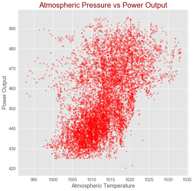
power_plant.plot(x ='AP', y = 'PE',kind ="scatter",
                 figsize = [10,10],
                 color ="r", alpha = 0.3,
                fontsize = 14)
plt.title("Atmospheric Pressure vs Power Output", fontsize = 24, color="darkred")
plt.xlabel("Atmospheric Temperature", fontsize = 18)
plt.ylabel("Power Output", fontsize = 18)
plt.show()
Gives this plot:
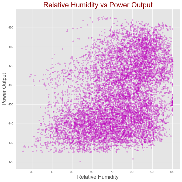
Correlation between relative humidity and power output
power_plant.plot(x ='RH', y = 'PE',kind ="scatter",
                 figsize = [10,10],
                 color ="m", alpha = 0.3)
plt.title("Relative Humidity vs Power Output", fontsize = 24, color="darkred")
plt.xlabel("Relative Humidity", fontsize = 18)
plt.ylabel("Power Output", fontsize = 18)
plt.show()
Gives this plot:
Correlation heatmap
corr = power_plant.corr()
plt.figure(figsize = (9, 7))
sns.heatmap(corr, cmap="RdBu",
            xticklabels=corr.columns.values,
            yticklabels=corr.columns.values)
plt.show()
Gives this plot:
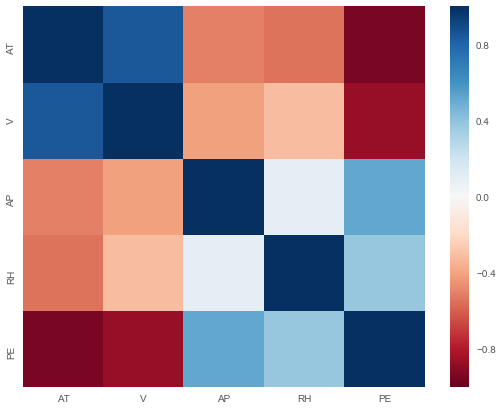
As shown in the correlation heatmap above, the target is correlated with the features. However, we also observe correlation among the features, hence we have multi-collinearity problem. He will use regularization to check if the collinearity we observe has a significant impact on the performance of linear regression model.
Data Modeling
All the columns are numeric and there are no missing values, which makes our modeling task strightforward.
Now, let’s model our data to predict what the power output will be given a set of sensor readings. Our first model will be based on simple linear regression since we saw some linear patterns in our data based on the scatter plots and correlation heatmap during the exploration stage.
We need a way of evaluating how well our linear regression model predicts power output as a function of input parameters. We can do this by splitting up our initial data set into a Training Set, used to train our model and a Test Set, used to evaluate the model’s performance in giving predictions.
from sklearn.model_selection import train_test_split
from sklearn.model_selection import cross_val_score
from sklearn.model_selection import GridSearchCV
from sklearn.preprocessing import StandardScaler
from sklearn.pipeline import Pipeline
from sklearn.linear_model import LinearRegression
from sklearn.linear_model import Ridge
from sklearn.linear_model import Lasso
from sklearn.linear_model import ElasticNet
from sklearn.tree import DecisionTreeRegressor
from sklearn.ensemble import RandomForestRegressor
from sklearn.ensemble import GradientBoostingRegressor
from sklearn.svm import SVR
from sklearn.metrics import mean_squared_error
import numpy as np
Split data into training and test datasets
Let’s split the original dataset into training and test datasets. The training dataset is 80% of the whole dataset, the test set is the remaining 20% of the original dataset. In Python, we use the train_test_split function to acheieve that.
X = power_plant.drop("PE", axis = 1).values
y = power_plant['PE'].values
y = y.reshape(-1, 1)

# Split into training and test set
# 80% of the input for training and 20% for testing

X_train, X_test, y_train, y_test = train_test_split(X, y,
                                               test_size = 0.2,
                                               random_state=42)

Training_to_original_ratio = round(X_train.shape[0]/(power_plant.shape[0]), 2) * 100

Testing_to_original_ratio = round(X_test.shape[0]/(power_plant.shape[0]), 2) * 100

print ('As shown below {}% of the data is for training and the rest {}% is for testing.'.format(Training_to_original_ratio,
                                                                                               Testing_to_original_ratio))
list(zip(["Training set", "Testing set"],
   [Training_to_original_ratio, Testing_to_original_ratio]))
As shown below 80.0% of the data is for training and the rest 20.0% is for testing.
Linear Regression
# Instantiate linear regression: reg
# Standardize features by removing the mean
# and scaling to unit variance using the
# StandardScaler() function

# Apply Scaling to X_train and X_test
std_scale = StandardScaler().fit(X_train)
X_train_scaled = std_scale.transform(X_train)
X_test_scaled = std_scale.transform(X_test)
linear_reg = LinearRegression()
reg_scaled = linear_reg.fit(X_train_scaled, y_train)
y_train_scaled_fit = reg_scaled.predict(X_train_scaled)
print("R-squared for training dataset:{}".
      format(np.round(reg_scaled.score(X_train_scaled, y_train),
                      2)))
print("Root mean square error: {}".
      format(np.round(np.sqrt(mean_squared_error(y_train,
                                        y_train_scaled_fit)), 2)))
coefficients = reg_scaled.coef_
features = list(power_plant.drop("PE", axis = 1).columns)
print(" ")
print('The coefficients of the features from the linear model:')
print(dict(zip(features, coefficients[0])))
print("")
print("The intercept is {}".format(np.round(reg_scaled.intercept_[0],3)))
R-squared for training dataset:0.93
Root mean square error: 4.57

The coefficients of the features from the linear model:
{'AT': -14.763927385645419, 'V': -2.9496320985616462, 'AP': 0.36978031656087407, 'RH': -2.3121956560685817}

The intercept is 454.431
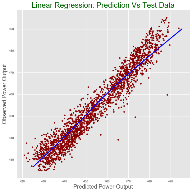
pred = reg_scaled.predict(X_test_scaled)
print("R-squared for test dataset:{}".
      format(np.round(reg_scaled.score(X_test_scaled,
                                       y_test),  2)))
print("Root mean square error for test dataset: {}".
      format(np.round(np.sqrt(mean_squared_error(y_test,
                                        pred)), 2)))
data =  {"prediction": pred, "observed": y_test}
test = pd.DataFrame(pred, columns = ["Prediction"])
test["Observed"] = y_test
lowess = sm.nonparametric.lowess
z = lowess(pred.flatten(), y_test.flatten())
test.plot(figsize = [10,10],
          x ="Prediction", y = "Observed", kind = "scatter", color = 'darkred')
plt.title("Linear Regression: Prediction Vs Test Data", fontsize = 24, color = "darkgreen")
plt.xlabel("Predicted Power Output", fontsize = 18)
plt.ylabel("Observed Power Output", fontsize = 18)
plt.plot(z[:,0], z[:,1], color = "blue", lw= 3)
plt.show()
R-squared for test dataset:0.93
Root mean square error for test dataset: 4.5
The plot:
In this blog we saw non-regularized multivariate linear regression. You may also read the R version of this post. In the second part of the post, we will work with regularized linear regression models. Next, we will see the other non-linear regression models. See you in the next post.