This is the fourth part of our post series about the exploratory analysis of a publicly available dataset reporting earthquakes and similar events within a specific 30 days time span. In this post, we are going to show a cluster analysis of earthquakes located into the California state mainland. In the specific
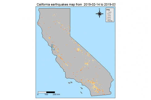
- we will show a California map where earthquakes are highlighted by different color based on their magnitude
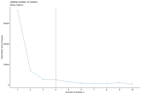
- we will determine the optimal number of clusters by means of the elbow method
- we will take advantage of the kmeans clustering;k-means clustering aims to partition n observations into k clusters in which each observation belongs to the cluster with the nearest mean, serving as a prototype of the cluster (ref. [6])
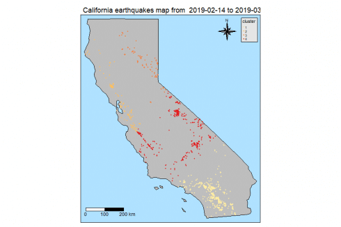
- we then plot again our California map with earthquakes location, however, this time highlighted by a different color as based on the cluster identifier
Packages
I am going to take advantage of the following packages.
suppressPackageStartupMessages(library(dplyr))
suppressPackageStartupMessages(library(lubridate))
suppressPackageStartupMessages(library(sf))
suppressPackageStartupMessages(library(spData))
suppressPackageStartupMessages(library(ggmap))
suppressPackageStartupMessages(library(tmap))
suppressPackageStartupMessages(library(factoextra))
Packages versions are herein listed.
packages <- c("dplyr", "lubridate", "sf", "spData", "ggmap", "tmap", "factoextra")
version <- lapply(packages, packageVersion)
version_c <- do.call(c, version)
data.frame(packages=packages, version = as.character(version_c))
##     packages version
## 1      dplyr 0.8.0.1
## 2  lubridate   1.7.4
## 3         sf   0.7.3
## 4     spData   0.3.0
## 5      ggmap   3.0.0
## 6       tmap     2.2
## 7 factoextra   1.0.5
Running on Windows-10 the following R language version.
R.version
##                _
## platform       x86_64-w64-mingw32
## arch           x86_64
## os             mingw32
## system         x86_64, mingw32
## status
## major          3
## minor          5.2
## year           2018
## month          12
## day            20
## svn rev        75870
## language       R
## version.string R version 3.5.2 (2018-12-20)
## nickname       Eggshell Igloo
Getting Data
As shown in the previous posts, we download the earthquake dataset from earthquake.usgs.gov, specifically the last 30 days dataset. Please note that such earthquake dataset is day by day updated to cover the last 30 days of data collection. Further, it is in CSV format. If not already present into our workspace, we download and save it and then we load it into quakes local variable. Moreover, it is not the most recent dataset available as I collected it some weeks ago.
if ("all_week.csv" %in% dir(".") == FALSE) {
  url <- "https://earthquake.usgs.gov/earthquakes/feed/v1.0/summary/all_week.csv"
  download.file(url = url, destfile = "all_week.csv")
}
quakes <- read.csv("all_month.csv", header=TRUE, sep=',', stringsAsFactors = FALSE)

quakes$time <- ymd_hms(quakes$time)
quakes$updated <- ymd_hms(quakes$updated)

quakes$magType <- as.factor(quakes$magType)
quakes$net <- as.factor(quakes$net)
quakes$type <- as.factor(quakes$type)
quakes$status <- as.factor(quakes$status)
quakes$locationSource <- as.factor(quakes$locationSource)
quakes$magSource <- as.factor(quakes$magSource)
quakes <- arrange(quakes, -row_number())

# earthquakes dataset
earthquakes <- quakes %>% filter(type == "earthquake")
Analysis
First, we have to show the location of the earthquakes occurred inside California mainland. At the purpose, here are the steps to do it whose numbering corresponds to the comments within the shown source code below.
- we filter out the California map from the US one, as made available by the spData package
- we convert our earthquakes dataset to a sf (simple features) object by st_as_sf() function within the sf package
- we inner join (left = FALSE) our simple features object with the california map; that gives a new simple features object providing with earthquakes occured exactly within California geographical boundaries
- we create a tmap-element as based on California map; such tmap-element instance specifies a spatial data object using the world Simple Features object as available within the spData package.
- we choose the natural style for out map and gray color fill color with borders for regions
- we set the title onto the map
- we add the compass chossing the 8star type in the right+top position
- we add a scale bar 0-100-200 km in the left+bottom position
- we add the previously build Simple Features object resulting from the inner join at step #2; we define a new variable p1 since in the prosecution of the analysis the variable p will be used as starting base for a new further plot
- we use the dot symbol to indicate earthquake events on the map with a color scale associated with the magnitude of the event
#1
map_california <- us_states %>% filter(NAME == "California")
#2
df <- st_as_sf(x = earthquakes, coords = c("longitude", "latitude"), crs = st_crs(map_california))
#3
df_map_inner_join <- st_join(df, map_california, left=FALSE)
## although coordinates are longitude/latitude, st_intersects assumes that they are planar
#4
p <- tm_shape(map_california)
#5
p <- p + tm_style("natural") + tm_fill(col = "gray") + tm_borders()
#6
p <- p + tm_layout(main.title = paste("California earthquakes map from ", paste(as.Date(df_map_inner_join$time[1]), as.Date(df_map_inner_join$time[nrow(df_map_inner_join)]), sep = " to ")))
#7
p <- p + tm_compass(type = "8star", position = c("right", "top"))
#8
p <- p + tm_scale_bar(breaks = c(0, 100, 200), size = 1, position = c("left", "bottom"))
#9
p1 <- p + tm_shape(df_map_inner_join)
#10
p1 <- p1 + tm_dots(size = 0.1, col = "mag", palette = "YlOrRd")
p1
We apply hierarchical clustering on California earthquakes dataset. Steps are:
- We extract the coordinates from the simple feature data frame to determine a new dataframe
- we give proper names to the columns of our coordinates dataframe
- we determines and visualize the optimal number of clusters using the wss (Weighted Squared Sum) method by means of fviz_nbclust() function as available within the factoextra package
#1
cal_quakes_coordinates <- as.data.frame(st_coordinates((df_map_inner_join)))
#2
colnames(cal_quakes_coordinates) <- c("longitude", "latitude")
#3
fviz_nbclust(cal_quakes_coordinates, kmeans, method = "wss") + geom_vline(xintercept = 4, linetype = 2) + labs(subtitle = "Elbow method")
The optimal number of clusters for our dataset is indicated as equal to 4 by the above plot.
Let us give a brief overview of how this works, as outlined by ref. [4].
The elbow method looks at the total WSS as a function of the number of clusters. It chooses a number of clusters so that adding another cluster doesn't improve much better the total WSS.
The optimal number of clusters can be defined as follow:
- compute clustering algorithm for different values of k
- for each k, calculate the total within-cluster sum of square (wss)
- plot the curve of wss according to the number of clusters k
- the location of a bend (knee) in the plot is generally considered as an indicator of the appropriate number of clusters
Other methods available are silhouette and gap_statistics, see ref. [4] and [5] for more details.
In the prosecution of the analysis,
- we use computed optimal number of clusters (4) to run a kmeans based clustering
- we create a new column cluster in our simple feature data frame
- we update our plot object p (as introduced in our first plot) in order to show clusters; that is achieved by passing as argument the updated simple features data frame instance
- we color the dots indicating where earthquakes occurred with the cluster identifier
- we show the resulting plot
#1
kmeans_res <- kmeans(cal_quakes_coordinates, centers = 4)
#2
df_map_inner_join$cluster <- as.factor(kmeans_res$cluster)
#3
p1 <- p + tm_shape(df_map_inner_join)
#4
p1 <- p1 + tm_dots(size = 0.1, col = "cluster", palette = "YlOrRd")
#5
p1
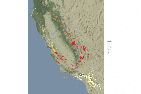
The same shown on a stamen sourced map. Here are the steps.
- we add the longitude and latitude columns to our simple features dataframe
- we take advantage of the qmplot() function within the tmap package passing our simple features dataframe without the geometry associated to; a darken factor is suggested for better highlight the dots
#1
df_map_inner_join$longitude <- cal_quakes_coordinates$longitude
df_map_inner_join$latitude <- cal_quakes_coordinates$latitude
#2
suppressMessages(qmplot(x = longitude, y = latitude, data = st_drop_geometry(df_map_inner_join), geom = "point", color = cluster, source = "stamen", zoom = 9, darken = 0.2) + scale_color_brewer(palette="YlOrRd"))
If you have any questions, please feel free to comment below.


