
After you have checked the distribution of your data by plotting a histogram, the second thing to do is to look for outliers. Identifying outliers is important because an association you find in your analysis might be explained by their presence.
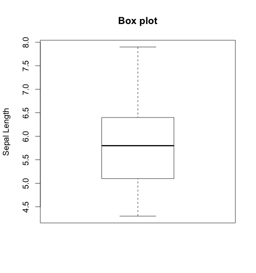
The best tool for identifying outliers is the box plot. Through a box plot we find the minimum, the lower quartile (25th percentile), the median (50th percentile), the upper quartile (75th percentile), and the maximum of a continuous variable. The function to build a box plot is boxplot().
Let’s build the following box plot with the iris dataset, which comes preloaded with R:
boxplot(iris$Sepal.Length, main="Box plot", ylab="Sepal Length")
This will generate the following box plot. Each horizontal line, starting from the bottom, shows the minimum, lower quartile, median, upper quartile, and maximum value of Sepal.Length.
We can also use box plots to explore the distribution of a continuous variable across strata. I say strata because the grouping variable should be categorical. For example, you may want to see the distribution of age among individuals with and without high blood pressure. In the example below, I show the sepal length for the different species:
# build the box plot
boxplot(Sepal.Length ~ Species, data=iris,
     main="Box Plot",
     xlab="Species",
     ylab="Sepal Length")
This will generate the following box plots:
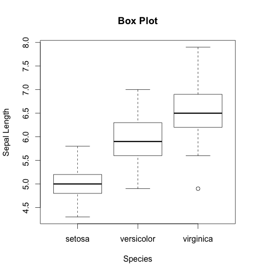
If you look at the bottom of the third box plot, you will find an outlier — a point plotted below the lower whisker. If you find an outlier in your dataset, I suggest examining it and, if appropriate, removing it. How to remove outliers deserves a post of its own; for now, you can inspect your dataset and remove the observation manually. There are also functions that remove outliers automatically.
Feel free to post a comment below if you have any questions.

Hi,
I came across this post on R-bloggers. thanks for the detailed explanation. Can you please go one step further and help us know how can we have combination of all plots in one single window. That is 4 different box plots for all the four input attributes(Sepal.length, Sepal.width, petal.length, petal.width) vs class values(species) . How to modify the existing code to produce this?