Recently, I came across this great visualization of MLS Player salaries. I tried to do something similar with ggplot2, and while I was unable to replicate the interactivity or the tree-map nature of the graph, the graph still looks pretty cool.
Data
The data is contained in this pdf file. I obtained a CSV file extracted from the PDF file by using PDFtables.com. The data can be downloaded here.
Exploratory Analysis
We will need the plyr and ggplot2 libraries for this. Let’s load them up and read in the data. To learn more about ggplot2 read my previous tutorial.
library(plyr)
library(ggplot2)

salary <- read.csv('September 15 2015 Salary Information - Alphabetical.csv', na.strings = '')
head(salary)

  Club    Last.Name First.Name Pos X Base.Salary X.1 Compensation
1   NY        Abang    Anatole   F $   50,000.00   $    50,000.00
2   KC Abdul-Salaam       Saad   D $   60,000.00   $    73,750.00
3  CHI        Accam      David   F $  650,000.00   $   720,937.50
4  DAL       Acosta     Kellyn   M $   60,000.00   $    84,000.00
5  VAN     Adekugbe     Samuel   D $   60,000.00   $    65,000.00
6  POR          Adi    Fanendo   F $  651,500.00   $   664,000.00
The X and X.1 columns have nothing but the $ sign, so we can remove them. Also, the base salary is stored as factor. To convert to numeric, first we have to remove the commas in the data. We can use the gsub function for this. Next, we need to convert it to numeric. However, we cannot directly convert from factor to numeric, because R assigns a factor level to each data variable and if you convert it directly, it will just return that number. The way to convert it without losing information is to first convert it to character and then to numeric.
salary$X <- NULL
salary$X.1 <- NULL

salary$Base.Salary <- gsub(',', '', salary$Base.Salary)
salary$Base.Salary <- as.numeric(as.character(salary$Base.Salary))
salary$Base.Salary <- salary$Base.Salary / 1000000
I decided to divide the salary by a million so that everyone’s salary is displayed in units of millions of dollars.
Plotting the data
Now, for plotting the data, we will use ggplot2. We want the names of players to be displayed in the bars that correspond to their salaries. Normally, text is displayed at the top of each section of the bar. This can cause problems and mess up the way the graph looks. To avoid this, we need to calculate the mid point of each section of the bars and displaying the name at the midpoint. This can be done as follows (as explained in this StackOverflow thread:
salary <- ddply(salary, .(Club), transform, pos = cumsum(Base.Salary) - (0.5 * Base.Salary))
Basically, this splits the data frame by the Club variable, and then calculates the cumulative sum of salaries for that bar minus half the base salary of that specific section of the bar to find its midpoint.
Okay, now, let’s plot the data.
ggplot(salary, aes(x = Club, y = Base.Salary, fill = Base.Salary)) +
  geom_bar(stat = 'identity') +
  labs(y = 'Base Salary in millions of dollars', x = '') +
  coord_flip() +
  geom_text(data = subset(salary, Base.Salary > 2), aes(label = Last.Name, y = pos)) +
  scale_fill_gradient(low = 'springgreen4', high = 'springgreen')
which gives us the following plot:
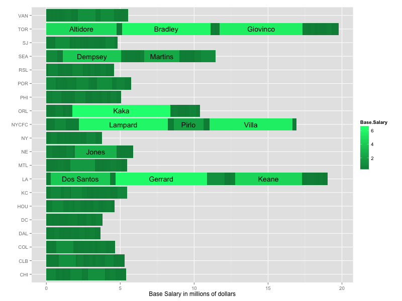
labsis used to specify the labels for the axes.coord_flipis used to flip the axes so that we get a horizontal bar chart instead of a vertical one.geom_textis used to specify the text to include in the chart. Since some of the sections of the chart are very small and cannot fit a players name inside them, I decided to only display the name of all players whose salary is more than 2 million dollars. The position of the players’ name is determined by pos as calculated earlier.scale_fill_gradientis used to specify the color gradient of the chart. The default color gradient is dark blue to blue. The full list of color names in R can be found here.
That brings us to the end of this article. I hope you found it useful! As always, if you have any questions or feedback, leave a comment or reach out to me on Twitter.
Edit: Updated dataset as pointed out by James Marquardt in the comments. If you would want to order the bar chart based on total salaries paid by the clubs, you can use this (as explained by Jeff Hamilton in the comments):
salary <- ddply(salary, .(Club), transform, Clubcost = sum(Base.Salary))
salary$Club <- factor(salary$Club, levels = unique(salary$Club[order(salary$Clubcost)]))


Hi Teja,
I had this post bookmarked for months and finally decided to replicate your #datavis approach with other soccer leagues in America.
Thanks for the idea…
http://arturocm.github.io/blog/r/web%20scraping/plotly/rtodolist/liga-mx/
Nice visualization, but I think this is a good example of why data cleaning and a limited amount of domain knowledge is important.
A casual glance shows that there are 22 teams listed. One of them is obviously problematic; the “NA” team. Additionally, there is a team labeled “POOL.” I’m fairly certain neither of these are actual teams in the MLS.
While neither “team” appears to have a significant enough number of entries to change the overall effect, it does take away from the credibility of the visual.
Hello James, thank you for pointing it out to me. I have cleaned up the data, and updated the plot.
Can you replicate this project to do MLB like the Chicago White Sox?
Awful, awful plot. Horrible aesthetics and almost meaningless
Hello jrogowksi, how would you improve it? The main reason for writing this post was to show how powerful ggplot2 is, but I am always looking to improve, and your feedback would be very helpful.
Thanks for the article. One of my constant frustrations with R is ordering bar charts. Here is some code to order your beautiful bar chart by total salaries paid per club:
# create a total salary by club variable to sort the plot by total club salary
# same ddply technique used to group variables by club and create Clubcost = sum of club salaries
salary <- ddply(salary, .(Club), transform, Clubcost = sum(Base.Salary))
# use the order and unique operators to change the factor level order
salary$Club <- factor(salary$Club, levels = unique(salary$Club[order(salary$Clubcost)]))
# my chart was in dollars (not $M)
Also interesting that only teams without the highest-paid Designated Players made it to E and W conference championships. Also, 2 new teams in MLS had some of the highest-paid DPs (NYCFC and ORL) but didn’t make it to the playoffs at all.
Thanks for pointing it out Jeff, I have added your code to the article!