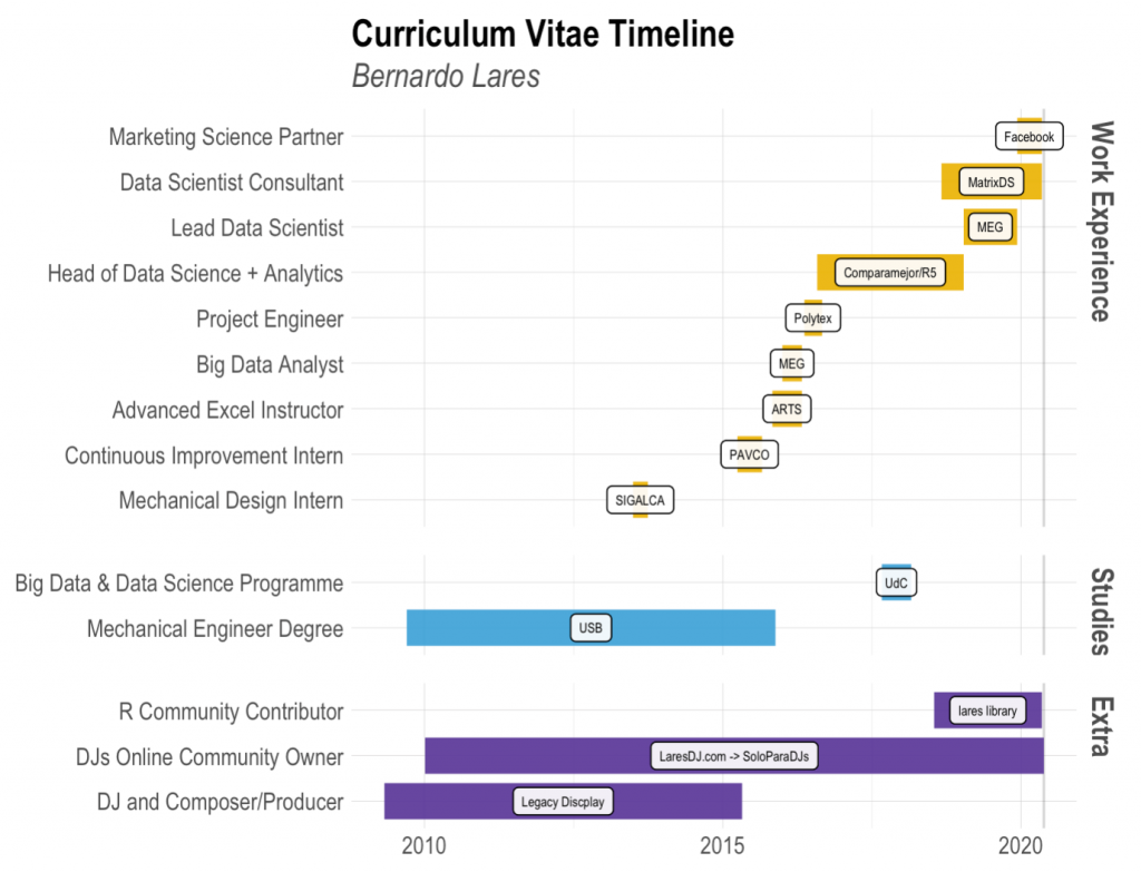
I have been improving my curriculum vitae (CV) these last days and what a nice idea came up: we can use R to generate a neat organised plot showing our different roles and jobs throughout the years. Not only it will draw our recruiters’ attention but you will also show some of your proficiency with visualizations. In my case, as a data scientist, that is one of the most important skills to have when showing your results to C-level guys or explaining a model’s performance to non-technical people.
Install lares library
As I usually do, I have already implemented the plot_timeline function in the lares library. Feel free to install it and use it with a simple line of code:
install.packages("lares")
Copy
The plot
So, let’s start with the final outcome: the plot.
I know it is quite similar to a Gantt chart. That is why it is designed so you can actually use this same function to generate one. Instead of role you could write projects, for the labels you could show the product owners, for the colours the departments, etc.
To run the plot_timeline function you should, at least, have the role (or event for more generic use), the start date and the end date. You can also add a group and label for each of your events. Then, you can customize little details such as title, subtitle, bars size, colour (for when no group is being used) and save to export as a file. Pretty straightforward!
Let’s run the example showed above (easier if you load a CSV or XLSX file with the data):
cols <- c("Role", "Place", "Type", "Start", "End")
today <- as.character(Sys.Date())
cv <- data.frame(rbind(
  c("Marketing Science Partner", "Facebook", "Work Experience", "2019-12-09", today),
  c("Data Scientist Consultant", "MatrixDS", "Work Experience", "2018-09-01", today),
  c("R Community Contributor", "lares library", "Extra", "2018-07-18", today),
  c("Lead Data Scientist", "MEG", "Work Experience", "2019-01-15", "2019-12-09"),
  c("Head of Data Science + Analytics", "Comparamejor/R5", "Work Experience", "2016-08-01", "2019-01-15"),
  c("Big Data & Data Science Programme", "UdC", "Studies", "2017-09-01", "2018-02-28"),
  c("Project Engineer", "Polytex", "Work Experience", "2016-05-15", "2016-09-01"),
  c("Big Data Analyst", "MEG", "Work Experience", "2016-01-01", "2016-04-30"),
  c("Advanced Excel Instructor", "ARTS", "Work Experience", "2015-11-01", "2016-04-30"),
  c("Continuous Improvement Intern", "PAVCO", "Work Experience", "2015-04-01", "2015-08-30"),
  c("Mechanical Design Intern", "SIGALCA", "Work Experience", "2013-07-01", "2013-09-30"),
  c("DJs Online Community Owner", "LaresDJ.com / SoloParaDJs", "Extra", "2010-01-05", "2020-05-20"),
  c("Mechanical Engineer Degree", "USB", "Studies", "2009-09-15", "2015-11-20"),
  c("DJ and Composer/Producer", "Legacy Discplay", "Extra", "2009-05-01", "2015-04-30")
))
colnames(cv) <- cols
plot_timeline(event = cv$Role,
              start = cv$Start,
              end = cv$End,
              label = cv$Place,
              # Simple trick to re-arrange the grids
              group = factor(cv$Type, levels = c("Work Experience", "Studies", "Extra")))
Copy
NOTE: Keep in mind that the plot will show your roles and jobs in the same order as you introduce them into the function. If you use the group parameter, it will also keep the arrangement but split the rows within the facets.
I know there are loads of ways to do a CV, from a simple Word document to a Shiny dashboard or Latex. But that is the interesting thing about it: you can use your favorite tool to share your personal experience! In my case, I do love R, ggplot2, and nicely done visualizations (who doesn’t?).
Further improvements
We can also generate a plotly object, with the same template but adding more information when you hover over each role. For example, when you hover your mouse over a specific role in the plot, a popup little window will show the details you wish to display: job place, your specific responsibilities, successes, references. We could also create a scrapper with rvest and bring our Linkedin’s data to plot. These would be quite cool!
If you want to improve this function or the plot’s aesthetics, please do so and share it with us. Always open to share and learn. All the code is hosted in the library’s site in Github. Hope you enjoyed this post!
