Principal Component Analysis(PCA) is an unsupervised statistical technique used to examine the interrelation among a set of variables in order to identify the underlying structure of those variables. In simple words, suppose you have 30 features column in a data frame so it will help to reduce the number of features making a new feature which is the combined effect of all the feature of the data frame. It is also known as factor analysis.
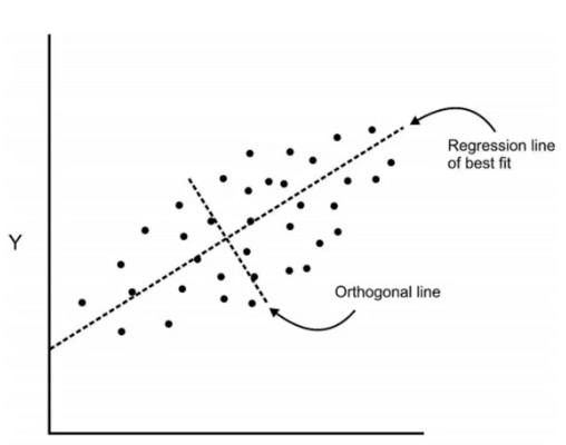
So, in regression, we usually determine the line of best fit to the dataset but here in the PCA, we determine several orthogonal lines of best fit to the dataset. Orthogonal means these lines are at a right angle to each other. Actually, the lines are perpendicular to each other in the n-dimensional space.
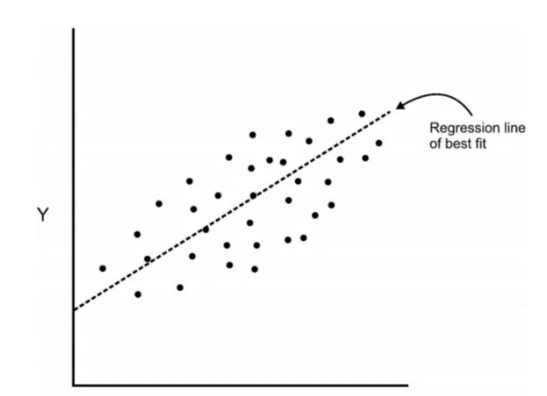
Here, n-dimensional space is a variable sample space. The number of dimensions will be the same as there are a number of variables. Eg-A dataset with 3 features or variable will have 3-dimensional space. So let us visualize what does it mean with an example. Here we have some data plotted with two features x and y and we had a regression line of best fit.
Now we are going to add an orthogonal line to the first line.
Components are a linear transformation that chooses a variable system for the dataset such that the greatest variance of the dataset comes to lie on the first axis. Likewise, the second greatest variance on the second axis and so on… Hence, this process will allow us to reduce the number of variables in the dataset.
We will understand this better when we implement and visualize using the python code.
Import libraries
We will import the important python libraries required for this algorithm
import matplotlib.pyplot as plt
import pandas as pd
import numpy as np
import seaborn as sns
%matplotlib inline
Data
Import the dataset from the python library sci-kit-learn.
from sklearn.datasets import load_breast_cancer
cancer = load_breast_cancer()
The datset is in a form of a dictionary.So we will check what all key values are there in dataset.
cancer.keys()
dict_keys(['data', 'target', 'target_names', 'DESCR', 'feature_names', 'filename'])
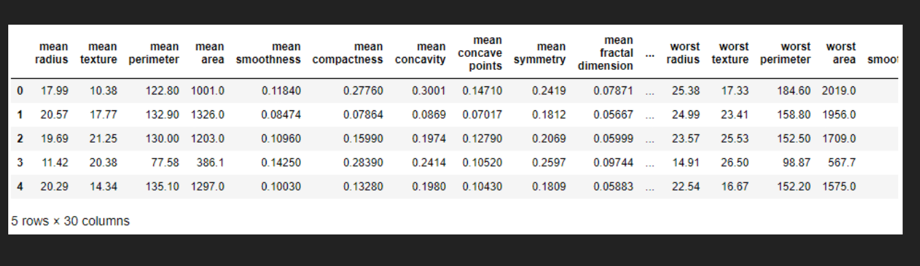
Now lets make the Dataframe for the given data and check its head value.
df = pd.DataFrame(cancer['data'],columns=cancer['feature_names'])
df.head()
PCA visualization
As we know it is difficult to visualize the data with so many features i.e high dimensional data so we can use PCA to find the two principal components hence visualize the data in two-dimensional space with a single scatter plot. But, before that, we need to pre-process the data i.e we need to scale the data such that each feature has unit variance and has not a greater impact than the other one.
from sklearn.preprocessing import StandardScaler
scaler = StandardScaler()
scaler.fit(df)
StandardScaler(copy=True, with_mean=True, with_std=True)
scaled_data = scaler.transform(df)
PCA with Scikit Learn uses a very similar process to other preprocessing functions that come with SciKit Learn. We instantiate a PCA object, find the principal components using the fit method, then apply the rotation and dimensionality reduction by calling transform().
We can also specify how many components we want to keep when creating the PCA object.
Here,we will specify number of components as 2
from sklearn.decomposition import PCA
pca = PCA(n_components=2)
pca.fit(scaled_data)
PCA(copy=True, n_components=2, whiten=False)
Now we can transform this data to its first 2 principal components.
x_pca = pca.transform(scaled_data)
Now let us check the shape of data before and after PCA
scaled_data.shape
(569, 30)
x_pca.shape
(569, 2)
Great! We’ve reduced 30 dimensions to just 2! Let’s plot these two dimensions out!
plt.figure(figsize=(8,6))
plt.scatter(x_pca[:,0],x_pca[:,1],c=cancer['target'],cmap='rainbow')
plt.xlabel('First principal component')
plt.ylabel('Second Principal Component')
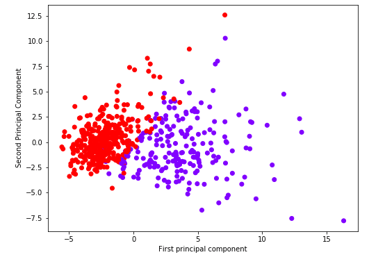
Clearly by using these two components we can easily separate these two classes.
Interpreting the components
Its not easy to understand these component reduction.The components correspond to combinations of the original features, the components themselves are stored as an attribute of the fitted PCA object:
pca.components_
array([[-0.21890244, -0.10372458, -0.22753729, -0.22099499, -0.14258969,
        -0.23928535, -0.25840048, -0.26085376, -0.13816696, -0.06436335,
        -0.20597878, -0.01742803, -0.21132592, -0.20286964, -0.01453145,
        -0.17039345, -0.15358979, -0.1834174 , -0.04249842, -0.10256832,
        -0.22799663, -0.10446933, -0.23663968, -0.22487053, -0.12795256,
        -0.21009588, -0.22876753, -0.25088597, -0.12290456, -0.13178394],
       [ 0.23385713,  0.05970609,  0.21518136,  0.23107671, -0.18611302,
        -0.15189161, -0.06016536,  0.0347675 , -0.19034877, -0.36657547,
         0.10555215, -0.08997968,  0.08945723,  0.15229263, -0.20443045,
        -0.2327159 , -0.19720728, -0.13032156, -0.183848  , -0.28009203,
         0.21986638,  0.0454673 ,  0.19987843,  0.21935186, -0.17230435,
        -0.14359317, -0.09796411,  0.00825724, -0.14188335, -0.27533947]])
We can visualize this using heatmap-
map= pd.DataFrame(pca.components_,columns=cancer['feature_names'])
plt.figure(figsize=(12,6))
sns.heatmap(map,cmap='twilight')
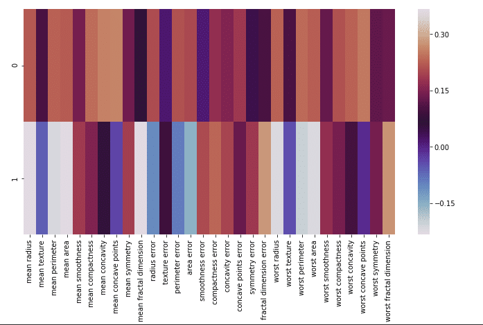
This heatmap and the color bar basically represent the correlation between the various feature and the principal component itself.
Conclusions
This is useful when you are dealing with the high dimensional dataset.
Stay tuned for more fun!
Thank you.