A K-Means Clustering algorithm allows us to group observations in close proximity to the mean. This allows us to create greater efficiency in categorising the data into specific segments.
In this instance, K-Means is used to analyse traffic clusters across the City of London.
Specifically, we wish to analyse the frequency of traffic across different routes in London, specifically for bicycles and cars and taxis.
In this example, we are using traffic data from the UK Department of Transport.
We have several routes, along with the distance traveled on each over a particular period:
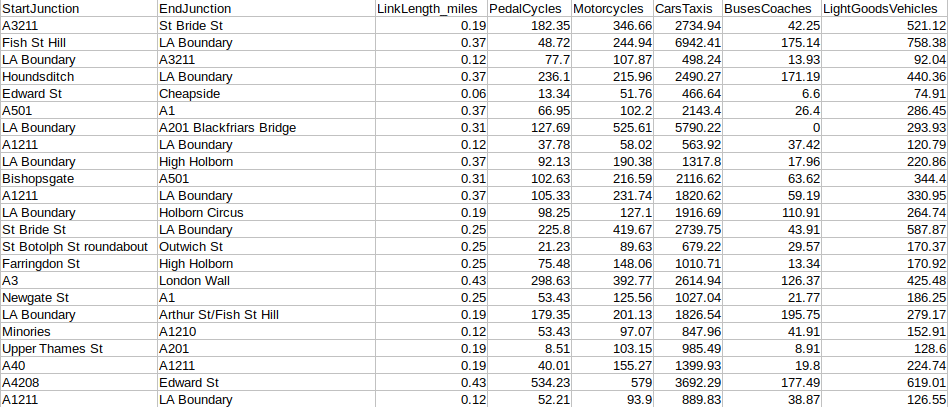
Source: UK Department of Transport
So, let’s go ahead and implement the Python code.
K-Means Clustering: Traffic Analysis
import pandas as pd
import pylab as pl
from sklearn.cluster import KMeans
from sklearn.decomposition import PCA
variables = pd.read_csv('cityoflondon.csv')
Y = variables[['CarsTaxis']]
X = variables[['PedalCycles']]
StartJunction = variables[['StartJunction']]
EndJunction = variables[['EndJunction']]
X_norm = (X - X.mean()) / (X.max() - X.min())
Y_norm = (Y - Y.mean()) / (Y.max() - Y.min())
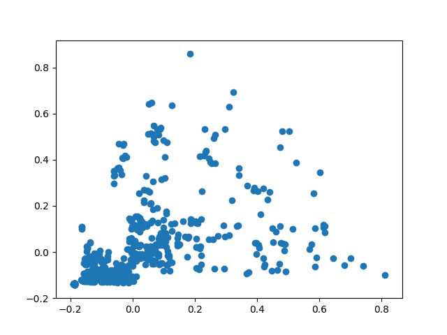
pl.scatter(Y_norm,X_norm)
pl.show()
Firstly, we are importing the data and then normalizing in order to allow the K-Means algorithm to interpret it properly.
Here is a raw scatter plot of our data:
The main objective of using K-Means is to separate these observations into different clusters. We do this in order to categorize routes that have different traffic patterns into separate groups.
For instance, the correlation coefficient between the frequency of traffic for bicycles vs. cars and taxis on a particular route is 0.48.
This implies that there are certain routes which would have high frequency of cyclists vs. drivers, whereas some other routes may have lots of cars but few cyclists, few cars but lots of cyclists, etc.
K-Means is what will allow us to accurately classify a route based on differences on vehicle type and traffic frequency.
Before actually running the K-Means, we firstly need to generate an elbow curve in order to determine the number of clusters that we actually need for our k-means analysis.
Elbow curve
Nc = range(1, 20)
kmeans = [KMeans(n_clusters=i) for i in Nc]
kmeans
score = [kmeans[i].fit(Y_norm).score(Y_norm) for i in range(len(kmeans))]
score
pl.plot(Nc,score)
pl.xlabel('Number of Clusters')
pl.ylabel('Score')
pl.title('Elbow Curve')
pl.show()
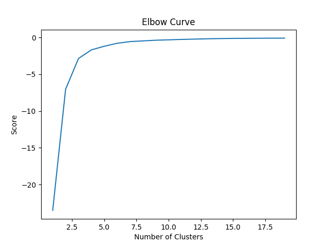
Here, we see that our score (or the percentage of variance explained by our clusters) levels off at 6 clusters. In this regard, this is what we will choose to include in the K-Means Analysis.
Principal Component Analysis and K-Means
The purpose behind these two algorithms are two-fold. Firstly, the pca algorithm is being used to convert data that might be overly dispersed into a set of linear combinations that can more easily be interpreted.
pca = PCA(n_components=1).fit(Y_norm)
pca_d = pca.transform(Y_norm)
pca_c = pca.transform(X_norm)
We already know that the optimal number of clusters according to the elbow curve has been identified as 6. Therefore, we set n_clusters equal to 6, and upon generating the k-means output use the data originally transformed using pca in order to plot the clusters:
kmeans=KMeans(n_clusters=6)
kmeansoutput=kmeans.fit(Y_norm)
kmeansoutput
pl.figure('6 Cluster K-Means')
pl.scatter(pca_d[:, 0], pca_c[:, 0], c=kmeansoutput.labels_)
Now, we can generate the labels belonging to each route, i.e. determine which route belongs to which cluster.
labels=kmeansoutput.labels_
labels
Here is some sample output.
>>> labels
array([4, 3, 0, 4, 0, 2......0, 0, 4, 0, 0, 5], dtype=int32)
Now, when we plot the k-means clusters, we see six distinct groups.
pl.xlabel('Cycles')
pl.ylabel('Cars and Taxis')
pl.title('6 Cluster K-Means')
pl.show()
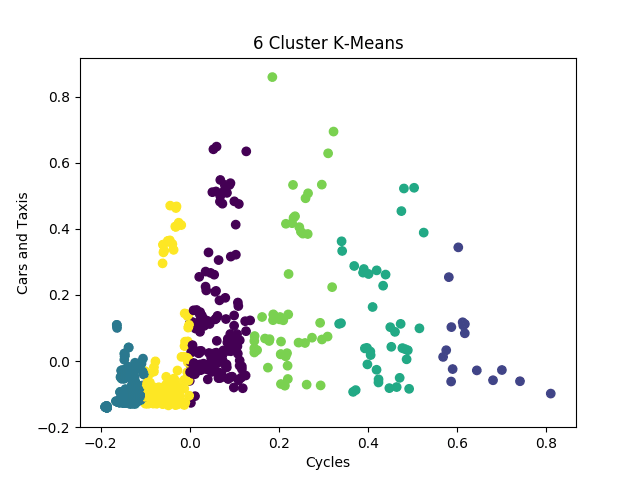
Specifically, segmentation into different groups allows us to distinguish routes that have busy traffic generally, compared to routes that have predominantly bicycle traffic as opposed to car traffic.
Moreover, we can now view the routes in conjunction with the generated clusters to determine how to segment each route. Here is an example of the first 10 routes:
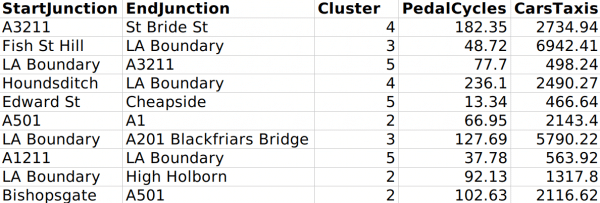
Based on the findings, the data is organized into six separate clusters (or clusters 0-5 according to the notation).
- Cluster 0: Light bicycle/light car traffic
- Cluster 1: Heavy bicycle/heavy car traffic
- Cluster 2: Moderate bicycle/moderate car traffic
- Cluster 3: Light bicycle/heavy car traffic
- Cluster 4: Moderate bicycle/light car traffic
- Cluster 5: Heavy bicycle/moderate car traffic
In this regard, segmenting the data into clusters allows for efficient classification of routes by traffic density and traffic type.
Conclusion
In this example, we have seen:
- How to use Python to conduct k-means clustering
- Use of k-means clustering in analysing traffic patterns
- Configuration of data to use the k-means model effectively
Thank you for your time, and feel free to leave any questions in the comments below.