Before you judge me, let me confirm it that ggplot2 is amazing. But there are a couple of plots that I admire in Python’s modern Data Visualisation library Seaborn. It’s not just it produces high-quality visualization but also how easy and simple it is building that one. Those two plots are heatmap and pairplot. I’ve always missed them but I guess not anymore.
What If I tell you that you can now build that Seaborn heatmap and pairplot in R using your RStudio? In this post, We will see how to make such Seaborn visualizations like Pairplot and Heatmap and for that matter, any Python code in R.
Reticulate
The Holy Grail here is the recently made available R package reticulate, developed by RStudio.
About the package:
The reticulate package provides a comprehensive set of tools for interoperability between Python and R. The package includes facilities for:
- Calling Python from R in a variety of ways including R Markdown, sourcing Python scripts, importing Python modules, and using Python interactively within an R session.
- Translation between R and Python objects (for example, between R and Pandas data frames, or between R matrices and NumPy arrays).
- Flexible binding to different versions of Python including virtual environments and Conda environments.
Reticulate embeds a Python session within your R session, enabling seamless, high-performance interoperability.
Installation and Loading the R package
reticulate is available on CRAN and can be installed with the below code:
install.packages('reticulate')
Let us load the R package (just like we load other R packages) into our current R session:
#loading required R libraries
library(reticulate) #the superpower bridges python and R
Initial Setup
Remember, You need to have Python in your machine for this package to access. So make sure you have got you Python installed along with the required packages and are available on the PATH and by default, reticulate uses the Python version that’s on the PATH. If you have got multiple Python versions on your machine, you can instruct which version of Python for reticulate to use with the following code:
#specifying which version of python to use
use_python('C:\\PROGRA~1\\Python35\\python.exe')
Loading Python libraries
import() function helps in importing the specified Python library into the current R session. Remember, the specified Python library must have been already installed on the machine.
#importing required Python libraries/modules
sns <- import('seaborn')
plt <- import('matplotlib.pyplot')
pd <- import('pandas')
Code Structure
This code does two things:
-
1. Visualise R’s inbuilt
AirPassengers dataset in the form of a Seaborn heatmap2. Plot a Seaborn Pairplot using R’s inbuilt
iris datasetSeaborn Heatmap in R
#using R's inbuilt AirPassengers dataset
df <- datasets::AirPassengers
#converting Time-Series object into an R Dataframe
#Thx: https://stackoverflow.com/questions/5331901/transforming-a-time-series-into-a-data-frame-and-back
df1 <- data.frame(tapply(df, list(year = floor(time(df)), month = month.abb[cycle(df)]), c))
df1 <- df1[month.abb]
#building a heatmap using seaborn
#please note the function r_to_py() that converts R object into a python
sns$heatmap(r_to_py(df1), fmt="g", cmap ='viridis')
#display the plot
plt$show()
Gives this plot:
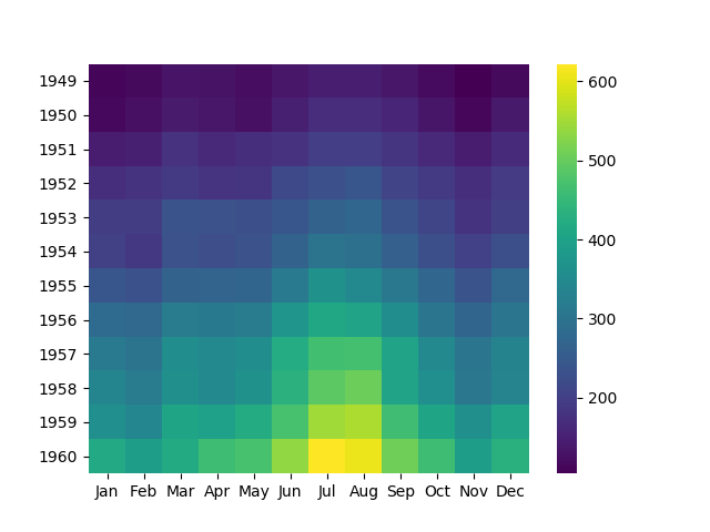
That’s really a beautiful heatmap. To understand what’s going on there, We have taken AirPassengers dataset which is an R Object in Time Series format. That is converted to a dataframe which is then inputted to seaborn’s heatmap function to plot the heatmap. A few things to note down here:
- The function of a python package is accessed using
$symbol after the object into which the Python library is loaded. This is very similar to how a column of a dataframe is accessed usin$. r_to_py()is a function used to convert R objects into Python objects. In this case, an R dataframe is converted into a Python Pandas Dataframe which is ideally the object type that the heatmap function would take in to plot the heatmap.
Seaborn Pairplot in R
#building a seaborn pairplot using pairplot()
sns$pairplot(r_to_py(iris), hue = 'Species')
#display the plot
plt$show()
Gives this plot:
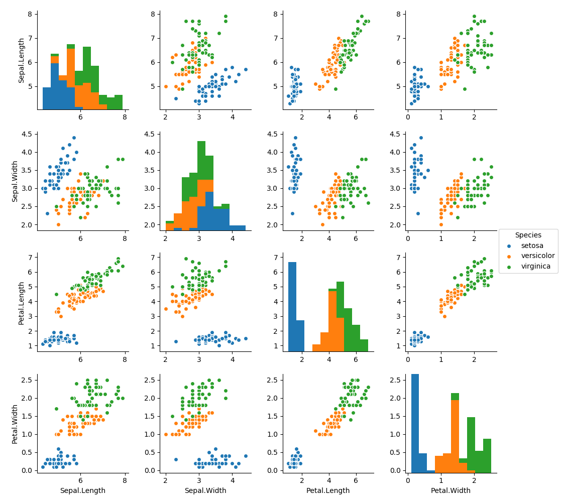
And this is a good plot to understand pairwise relationships in the given dataset.
Conclusion
Thus with very little coding and configurations, we managed to beautifully visualize the given dataset using Python Seaborn in R and plotted Heatmap and Pairplot. While this post might have been very specific about making those two plots, the larger idea to be inferred from this post is to understand how simpler and easier it is to integrate Python codes into your R codes with reticulate package. The complete code used here is available on my github.
ggpairs makes excellent pairplots!