This is an attempt to see how the data that are collected from us, can also be used for the betterment of us – one’s self. When companies are so interested in collecting our personal data to show a push in Quarterly revenues, Why not use our own Data Science skills and get some useful insight that can help our life.
Embarking on that journey, I decided to start with my Android Mobile App usage using the data that Google lets us download. The reason I’m posting this article is for everyone else to introspect their usage and learn about it. So, for someone to replicate my results, I’ll explain in the below steps starting from how to download the data.
How to download your Android Mobile usage data:
- Go to your Google Account (using the gmail id that you have used in your Android Phone) – Skip this if you are already logged in.
- Go to Google Takeout
- Click SELECT NONE button and scroll down to see My Activity
- Select My Activity (enabling the grey/blue button) and click the down arrow to select JSON format and click Next (bottom-most button)
- In the next screen, you can select your preferred method and file format of download and click Create Archive.
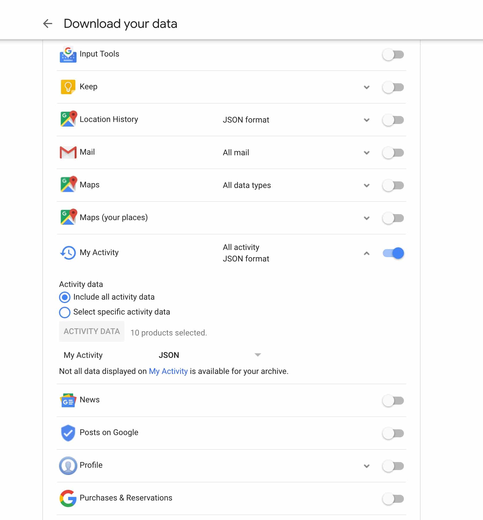
Once your data is ready to be downloaded, You’d be notified to download it. The downloaded file would be a compressed-file (most like Zip – based on what you selected in the last screen). So unzip it and keep the JSON file ready for us to proceed further.
Getting started with Analysis
Packages used
We are going to use the following packages for our Analysis.
library(jsonlite)
library(tidyverse)
library(lubridate)
library(ggrepel)
library(viridis)
library(gganimate)
library(cowplot)
library(ggthemes)
If you have not got any of the above mentioned packages, All of them are available on CRAN. So, use install.packages() to install missing packages.
Loading Data
We’ve got a JSON input file and It’d better for us to do analysis with Dataframe (since it fits well with tidyverse). But this data processing is as easy as Pie with the help of jsonlite‘s `fromJSON()` function that takes a JSON file and outputs a flattened Dataframe.
me <- jsonlite::fromJSON("MyActivity.json")
With the above code, we are good to start with our Data Preprocessing.
Data Preprocessing
One of the columns that we would use in our Analysis, `time` comes as a string with Data and Time in it. But for us to process time as time – it has to be in date-time format, so we’ll use the function `parse_date_time()` for converting string to date-time and `with_tz()` to change the time zone. As I live in India, I’ve converted it to Indian Standard Time. Please use your appropriate time zone for conversion.
# converting date-time in string to date-time format along with time-zone conversion
me$time_ist <- with_tz(parse_date_time(me$time),"Asia/Calcutta")
# remove incomplete years and irrelevant years too - Kept 2019 to see just January if required
me <- filter(me, year(time_ist) %in% c(2017,2018,2019))
As you can see in the above code, We’ve also filtered our data to only include the years 2017, 2018 and 2019. This is simply to avoid partial data. Even though 2019 is also partial data, I’ve decided to include it in the main data to compare my apps across these three years. With that we’re good with the data preprocessing and let’s head to Analysis.
Data Note
A caveat that has to be called out here is that this Activity data includes everything from the app that you open and the apps that are shown up in the notification – so we’re proceeding further with an assumption that every notification is also part of our interaction (or at least in my case, Every time a notification popus up, I tend to check it).
Sample/Head Data
# Sample
tibble::tibble(head(me))
# A tibble: 6 x 1
  `head(me)`$header  $title   $titleUrl     $time  $products $details $time_ist

1 OnePlus Launcher   Used On… https://play… 2019-…     2019-02-12 12:34:01
2 صلاتك Salatuk (Pr… Used صل… https://play… 2019-…     2019-02-12 12:34:01
3 Google Chrome: Fa… Used Go… https://play… 2019-…     2019-02-12 12:19:23
4 Firefox Browser f… Used Fi… https://play… 2019-…     2019-02-12 12:18:38
5 Hangouts           Used Ha… https://play… 2019-…     2019-02-12 12:18:15
6 Gmail              Used Gm… https://play… 2019-…     2019-02-12 12:17:50
Top apps – each year
The code in this section will make three different plots of top app usage for three different years and finally stitch all of them together.
# Top apps
me_count <- me %>%
  group_by(year = year(time_ist),header) %>%
  count() %>%
  arrange(desc(n)) %>%
  ungroup() %>%
  group_by(year) %>%
  top_n(20,n) #%>% #View()
#mutate(header = fct_reorder(header,n)) %>%

me_count %>%
  filter(year %in% "2017") %>%
  ggplot(aes(fct_reorder(header,n),n, label = n)) +
  geom_bar(aes(fill = n),stat = "identity") +
  #scale_y_log10() +
  coord_flip() +
  theme(axis.text.y = element_text(angle = 0, hjust = 1,size = 8))  +
  scale_fill_viridis() +
  theme_minimal() +
  theme(legend.position="none") +
  labs(
    title = "Most used 20 Apps",
    subtitle = "2017",
    x = "App name"
  ) -> y1

me_count %>%
  filter(year %in% "2018") %>%
  ggplot(aes(fct_reorder(header,n),n, label = n)) +
  geom_bar(aes(fill = n),stat = "identity") +
  #scale_y_log10() +
  coord_flip() +
  theme(axis.text.y = element_text(angle = 0, hjust = 1,size = 8))  +
  scale_fill_viridis() +
    theme_minimal() +
  theme(legend.position="none") +
  labs(
    subtitle = "2018",
    x = "App name"
  ) -> y2

me_count %>%
  filter(year %in% "2019") %>%
  ggplot(aes(fct_reorder(header,n),n, label = n)) +
  geom_bar(aes(fill = n),stat = "identity") +
  #scale_y_log10() +
  coord_flip() +
  theme(axis.text.y = element_text(angle = 0, hjust = 1,size = 8))  +
  scale_fill_viridis() +
  theme_minimal() +
  theme(legend.position="none") +
  labs(
    subtitle = "2019",
    x = "App name"
  ) -> y3
cowplot::plot_grid(y1,y2,y3, ncol = 3, scale = 0.7, vjust = 0, label_size = 8)
Gives this plot:
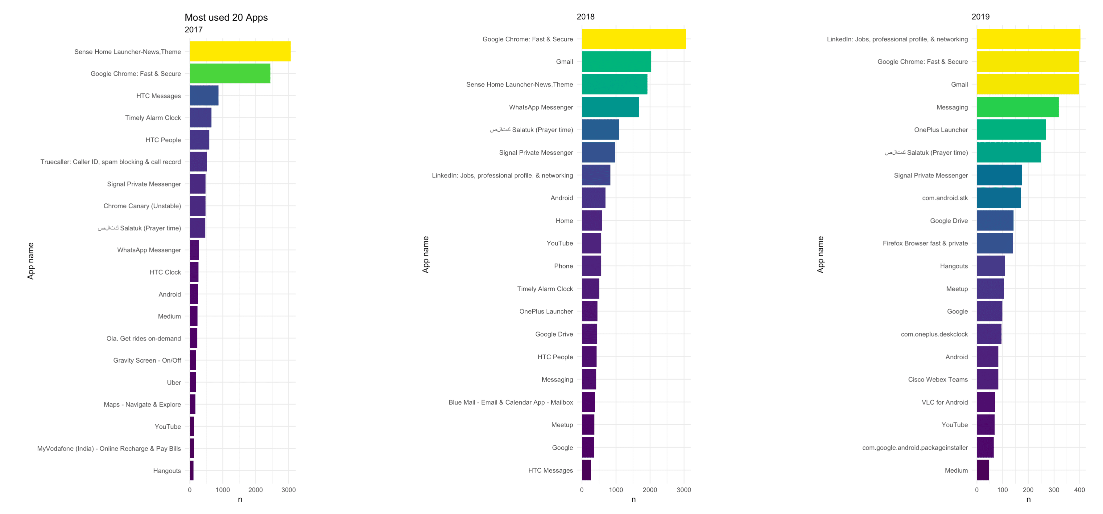
This plot clearly tells me how my app usage pattern has changed or evolved over time. It also denotes my change of handset from HTC One (that comes with Sense Launcher) to my recent Oneplus (that comes with Oneplus Launcher). You can also notice that I’ve moved on from Whatsapp to Signal messenger.
Overall Daily usage Trend
# Overall Daily usage trend

me %>%
filter(!str_detect(header,"com.")) %>%
filter(as.Date(time_ist) >= as.Date("2017-01-01")) %>%
group_by(Date = as.Date(time_ist)) %>%
count(n = n()) %>%
ggplot(aes(Date,n, group = 1, color = "red")) +
geom_line(aes(alpha = 0.8),show.legend = FALSE) +
stat_smooth() +
# Courtesy: https://stackoverflow.com/a/42929948
scale_x_date(date_breaks = "1 month", date_labels =  "%b %Y") +
labs(
    title = "Daily-wise usage",
    subtitle = "2+ years (including some 2019)",
    x = "Months",
    y = "# of Interactions"
  ) +

  theme(axis.text.x=element_text(angle=60, hjust=1))+
  theme(legend.position="none") +
  ggthemes::theme_hc(style  = "darkunica")
Gives this plot:
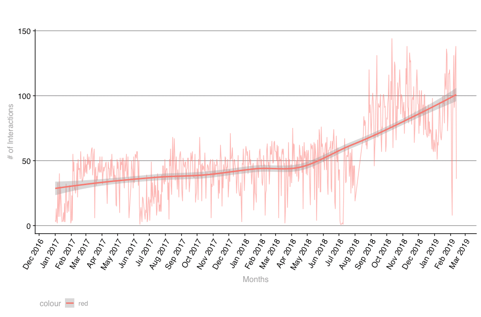
This plot scared me the most. My phone usage has really spiked since I bought a new phone which doesn’t seem to be a good sign for my productivity.
Weekday vs Weeknd
This plot is to see if I’m really a phone addict even while at home with my family.
me %>%
  filter(!str_detect(header,"com.")) %>%
  group_by(Date = as.Date(time_ist)) %>%
  count(n = n()) %>%
  mutate(year = as.factor(year(Date)),
         weekday = weekdays(Date, abbr = TRUE)) %>%
  mutate(what_day = ifelse(weekday %in% c("Sat","Sun"),"Weekend","Weekday")) %>%
  filter(year %in% c(2017,2018)) %>%
  group_by(year,what_day) %>%
  summarize(n = mean(n)) %>%
  ggplot(aes(fct_relevel(what_day, c("Weekday","Weekend")),
             n, group = year, color = year)) +
  geom_line() +
  labs(
    title = "Weekday vs Weekend usage",
    subtitle = "For two years",
    x = "Weekday / Weekend",
    y = "# of Interactions"
  ) +
  ggthemes::theme_excel_new()
Gives this plot:
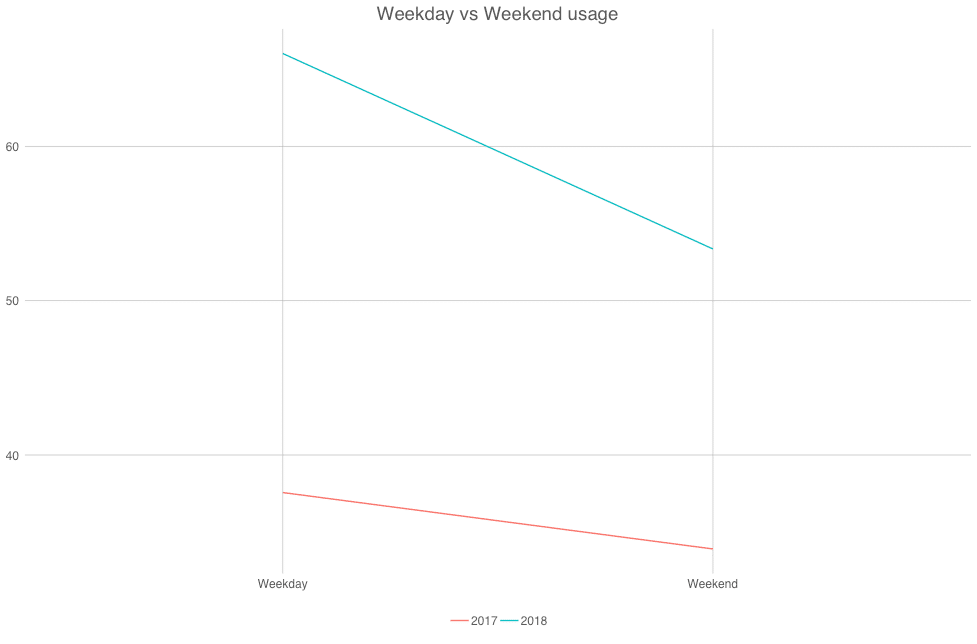
Luckily, it turns out I’m not that level of an Addict I worried I would be.
Messaging usage
Over the years, I’ve used a variety of messaging apps from normal SMS to IMs.
# Messaging Usage
p <- me %>%
  filter(str_detect(tolower(header), regex("signal|message|whatsapp"))) %>%
  mutate(ym = as.Date(paste0(format(as.Date(time_ist),"%Y-%m"),"-01"))) %>%
  group_by(ym) %>%
  count() %>%
  #https://community.rstudio.com/t/tweenr-gganimate-with-line-plot/4027/10
  ggplot(aes(ym,n, group = 1)) + geom_line(color = "green") +
  geom_point() +
  ggthemes::theme_hc(style = "darkunica") +
  theme(axis.text.x = element_text(colour = "white",
                                   angle = 60),
        axis.text.y = element_text(colour = "white")) +
  scale_x_date(date_breaks = "1 month", date_labels =  "%b %Y") +
  labs(
    title = "Messaging usage",
    x = "Year-Month"
  ) +
  transition_reveal(ym) +
  ease_aes('cubic-in-out')
animate(p, nframes = 20, renderer = gifski_renderer("msging.gif"), width = 800, height = 800)
Gives this animation:
This graph shows how this is one of the drivers of my overall phone usage. Similar spikes around similar period.
Youtube usage
# YouTube Usage
yt <- me %>%
  filter(header %in% "YouTube") %>%
  mutate(ym = as.Date(paste0(format(as.Date(time_ist),"%Y-%m"),"-01"))) %>%
  group_by(ym) %>%
  count() %>%
  #https://community.rstudio.com/t/tweenr-gganimate-with-line-plot/4027/10
  ggplot(aes(ym,n, group = 1)) + geom_line(color = "red") +
  geom_point() +
  ggthemes::theme_hc(style = "darkunica") +
  theme(axis.text.x = element_text(colour = "white",
                                   angle = 60),
        axis.text.y = element_text(colour = "white")) +
  scale_x_date(date_breaks = "1 month", date_labels =  "%b %Y") +
  labs(
    title = "YouTube usage",
    x = "Year-Month"
  ) +
  transition_reveal(ym) +
  ease_aes('quintic-in-out')
#anim_save("yt.gif", yt , width = 600, height = 600)
animate(yt, nframes = 10, renderer = gifski_renderer("yt2.gif"), width = 800, height = 800)
Gives this animation:
This is my Youtube usage where I primarily consume media content and this is also very much inline with my overall Phone usage which means it could be another potential driver. Possibly that my phone screen size increased, so I enjoy watching more videos ? which again isn’t something that I wanted it to be this way.
Conclusion
While I was under this constant belief that I’m one of those few Digital Minimalists, This analysis proves that I’m not so much of it and Yet I’ve got areas to work out in terms of reducing my phone usage and improve my lifestyle. Please note that this post is written in a cookbook-style than tutorial-style, this way you can be up and running with your Android activity analysis. If you have a doubt regarding the code (logic) please feel free to drop it in comments, I’d be happy to clarify them. Hope this post helps you in your Data-driven self-introspection – at least, the Android phone usage.
References
- If you are interested in learning about handling web data, Check out this Datacamp Tutorial on Working with Web Data
- The entire code-base (along with a few more sections and plots) is available on my github
Feel free to star/fork and use it!
o/ If you really are trying to reduce on phone activity in order to increase productivity, try out having your phone in monochrome setting except when watching videos/gaming. Might be hard at start but it helps a lot.
I do it every now and then, but more for a different perspective and to stay away from colors than for reducing phone usage.
Hey
I’m trying to go through your steps as a practical introduction to R.
“ggpthemes” doesn’t seem to be a valid package name. I found “ggthemes”, instead.
I’m also stuck at the first command as I get a syntax error right off the bat:
> me <- jsonlite::fromJSON("MyActivity.json") Error: lexical error: invalid char in json text. MyActivity.json (right here) ------^ Any clue what that is caused by?
Fixed the problem myself.
I realized i did not set a working directory for my R session.
After i did that, R effectively imported one of the .JSON file I pasted in that same directory.
Thanks for your PR. I’ve fixed the typos in the code.