During my masters’ project, I have designed a web app including few statistical and visualization tools. The aim was to facilitate bio researcher with a tool to find biochemical differences across the healthy and diseased samples.
It was important to use a library which can provide easy and high-class interactivity. Before embedding the plots into my website code, I tested a few different libraries like Matplotlib and Seaborn in order to visualize the results and to see how different they can look. After few trials, I came across Plotly library and found it valuable for my project because of its inbuilt functionality which gives user a high class interactivity.
In this post, I am going to compare Seaborn and Plotly using – Bar Chart and Heatmap diagram. I will be using Breast cancer dataset to visualize these plots. But before jumping into the comparison, the dataset I used needed preprocessing like data cleaning so, I followed steps.
#create dataframe from csv
breast_cancer_dataframe = pd.read_csv('data.csv')

#data cleaning step - remove the columns or rows with missing values and
#the ID as it doesn't have any relevance in anaysis
breast_cancer_df = breast_cancer_dataframe.drop(['id','Unnamed: 32'], axis = 1)

#dropping the column called diagnosis and having a columns of 0 and 1
#instead --> 1 for M(Malignant) and 0 for B(Benign)
breast_cancer_df= pd.get_dummies(breast_cancer_df,'diagnosis',drop_first=True)
In my point of view Bar Chart is the easiest plot to start with. Using Bar Chart we will get familiar with the libraries and code used to visualize the results.
Seaborn Bar Chart
import matplotlib.pyplot as plt
import seaborn as sns
%matplotlib inline

sns.countplot(x='diagnosis',data = breast_cancer_dataframe,palette='BrBG')
Gives this plot:
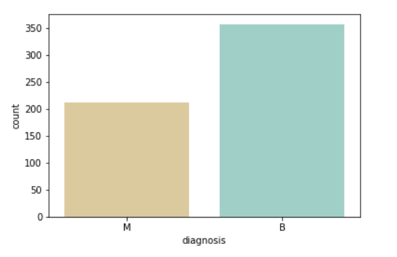
The code looks pretty tidy (isn’t it?) but what about the visuals of the data? They look okay too. Let’s try the same plot with plotly.
Plotly Bar Chart
#First Plotly chart - Bar chart to see the count of Malignant and Benign in our data
#create data to feed into the plot - x-axis will hold the name of the diagnosis
#and y-axis will have the counts according to the number of matches found in diagnosis column in our data frame
color = ['red','green']
data = [go.Bar(x=['Malignant','Benign'],
y=[breast_cancer_dataframe.loc[breast_cancer_dataframe['diagnosis']=='M'].shape[0],
   breast_cancer_dataframe.loc[breast_cancer_dataframe['diagnosis']=='B'].shape[0]],
   marker=dict(color=color)
)]
#create the layout of the chart by defining titles for chart, x-axis and y-axis
layout = go.Layout(title='Breast Cancer - Diagnosis',
xaxis=dict(title='Diagnosis'),
yaxis=dict(title='Number of people')
)
#Imbed data and layout into charts figure using Figure function
fig = go.Figure(data=data, layout=layout)
#Use plot function of plotly to visualize the data
py.offline.plot(fig)
Woooh!! a lot of code, but let’s see the visuals on plotly chart.
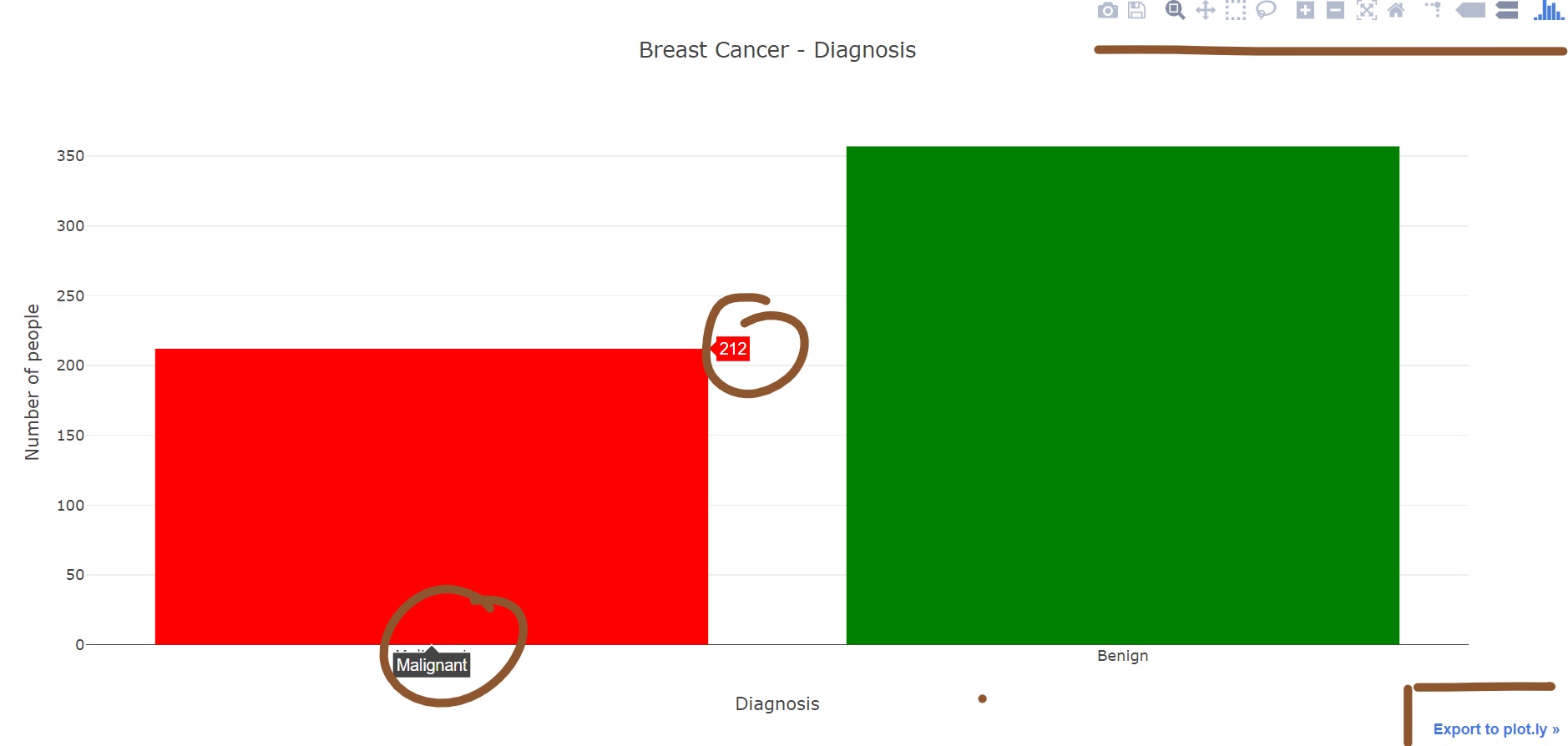
Look at the plot, at first it might seems this plot is similar to the last one, except few color changes. But you can see I have highlighted few things.
Let me explain that to you:
- When you mouse over to the bars, it displays the details about the bar. In this particular example, it is showing diagnosis details and how many people are affected by it.
- On the top right, you can see multiple small icons. These are the options/functionalities which make
plotlyplots more interactive, you save/download the plot as image, can use zoom in and out function not just these but you can play with the axis values too and get a new plot. - On the bottom rightan you can see option to export the plot to
plotly. If you click on that option the plot will open on plotly’s official website. The idea behind this option is to let user see the values of their chart axes and how it was plotted(e.g. code behind the plotting).
Do you see why I chose Plotly over seaborn? Did you like it? may be not yet?? But you will… Let’s draw a heatmap to visualize the correlation between different coefficients.
Seaborn Heatmap
plt.figure(figsize= (10,10), dpi=100)
sns.heatmap(breast_cancer_df.corr())
Again!! only few lines of code. The heatmap produced with Seaborn will look something like this –
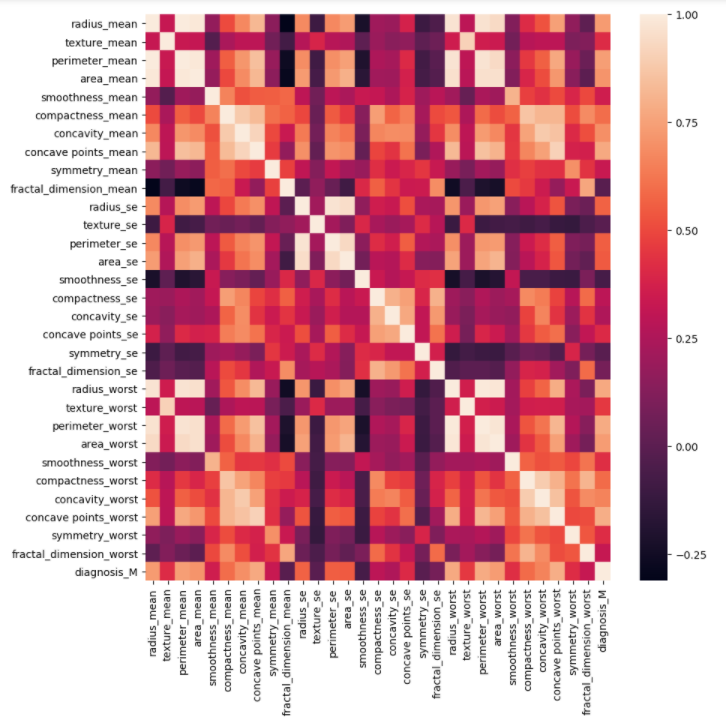
Look at the image – Can you tell me what is the correlation value between – concave point_means and fractal_dimension_se?? May be you are an expert and can tell the value easily but what will happen if we have 100+ or more features plotted on heatmap? Do you think then you’ll be able to tell the values? May be still you can.. Think you need to build a website for a researcher who doesn’t like to waste her/his time and want to see the values instantly. You might need to build another function which can show those values to end-user, but isn’t it extra work?
Plotly is the savior here. We have mouse hover function just like we had in Bar chart and we can get any correlation value easily.
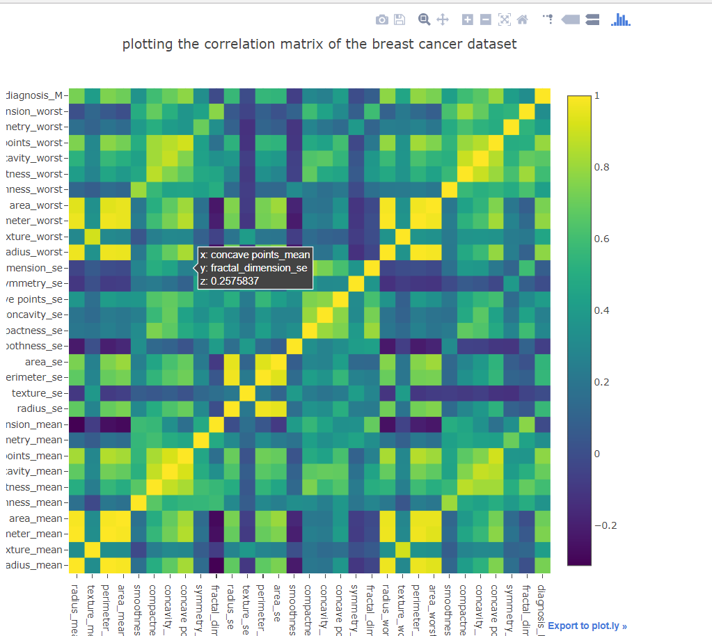
Here you can see the correlation value between concave point_means and fractal_dimension_se is around .25, easy, aye??
Summary
Plotly provides interactive plots and are easily readable to audience who doesn’t have much knowledge on reading plots. There are ways to use seaborn type plots in plotly with a touch of plotly.
You can find the code of this exercise here.