Kaggle recently released the dataset of an industry-wide survey that it conducted with 16K respondents.
This article aims to understand how the argument of Gender Diversity plays out in Data Science Practice.
Disclaimer: Yes, I understand this dataset is not the output of a Randomized Experiment hence cannot be a representative of the entire Data Science Practitioners and also contains Selection bias, which I’m well aware. Let us proceed further with this disclaimer in mind.
Loading required R packages:
#Loading Required Libraries
library(dplyr)
library(stringr)
library(ggplot2)
library(ggthemes)
library(tidyr)
library(scales)
We are going to deal with only multipleChoiceResponses.csv dataset from the downloaded files and let us load it into our R environment.
#Load Input Data
complete_data <- read.csv(".../multipleChoiceResponses.csv",header =T, stringsAsFactors = F)
The very first thing we would check is how is the Gender distribution of the respondents.
#Gender Distribution
complete_data %>%
  filter(GenderSelect!='') %>%
  group_by(GenderSelect) %>%
  count() %>%
  ggplot(aes(x = GenderSelect,y = (n / sum(n))*100))+
  geom_bar(stat = 'identity') + ylab('Percent') + theme_solarized() +
  theme(axis.text = element_text(size = 6)) + ggtitle('Gender Distribution of Kaggle Survey Respondents')
Gives this plot:

With no surprise like many other Technical domain, Data Science is also dominated by Male Gender with more than 80% respondents being Male and less than 20% being Female. How about the split of Male and Female across countries of the participants.
complete_data %>% filter(GenderSelect %in% c('Male','Female')) %>%
  group_by(Country,GenderSelect) %>%
  summarise(count = n()) %>%
  arrange(desc(count)) %>% ggplot() +
  geom_bar(aes(Country,count, fill = GenderSelect), stat = 'identity') +
  #facet_grid(.~GenderSelect)  +
  theme_solarized() +
  theme(axis.text = element_text(size = 9),
        axis.text.x = element_text(angle = 40, vjust = 0.5, hjust = 0.5)) +
  ggtitle('Country wise Survey Respondends - M/F')
Gives this plot:

With the US being the top country of Respondents followed by India, We can see how Male-Female split across Countries look like. While this chart very well represents the distribution of countries, it doesn’t reflect which country is doing good in terms of Female Gender in Data Science. To understand that, Let us create a new KPI – F2M Ratio (Female to Male Ratio % – which could be interpreted as the number of Female to 100 Male).
complete_data %>% filter(GenderSelect %in% c('Male','Female') & Country!="") %>%
  group_by(Country,GenderSelect) %>%
  summarise(count = n()) %>%
  spread(GenderSelect,count) %>%
  mutate(F2M = (Female/Male)*100) %>%
  arrange(desc(F2M)) %>%
  #mutate(F2M = percent(F2M)) %>%
  ggplot() +
  geom_bar(aes(Country,F2M, fill = F2M), stat = 'identity') +
theme_solarized() +
  theme(axis.text = element_text(size = 9),
        axis.text.x = element_text(angle = 90, vjust = 0.5, hjust = 0.5)) +
  ggtitle('Female to Male Ratio - Country Wise') + scale_fill_continuous_tableau()
Gives this plot:
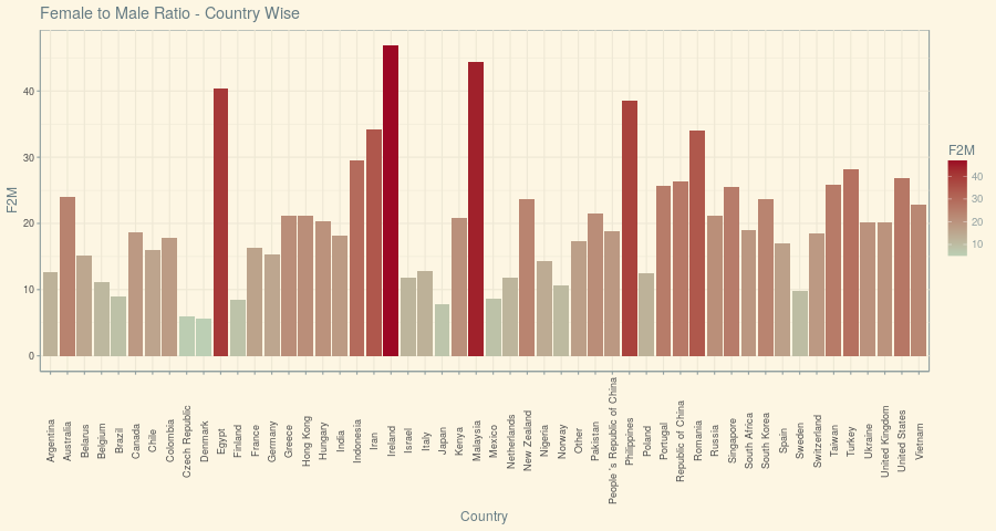
It turns out that no Country has got this Female-to-Male ratio more than 50% which is not a very healthy insight, but there are three countries that fared above 40% – Ireland, Malaysia and Egypt are those. Ironically, The US and India that were on the top overall have got lesser than 30% and 20% respectively.
Let us see how the Age distribution looks between Male and Female:
complete_data %>% filter(GenderSelect %in% c('Male','Female')) %>%
  ggplot() + geom_histogram(aes(Age),binwidth = 1) +
  theme_solarized() + facet_grid(.~GenderSelect) +
  ggtitle('Age Distribution - Male vs Female')
Gives this plot:
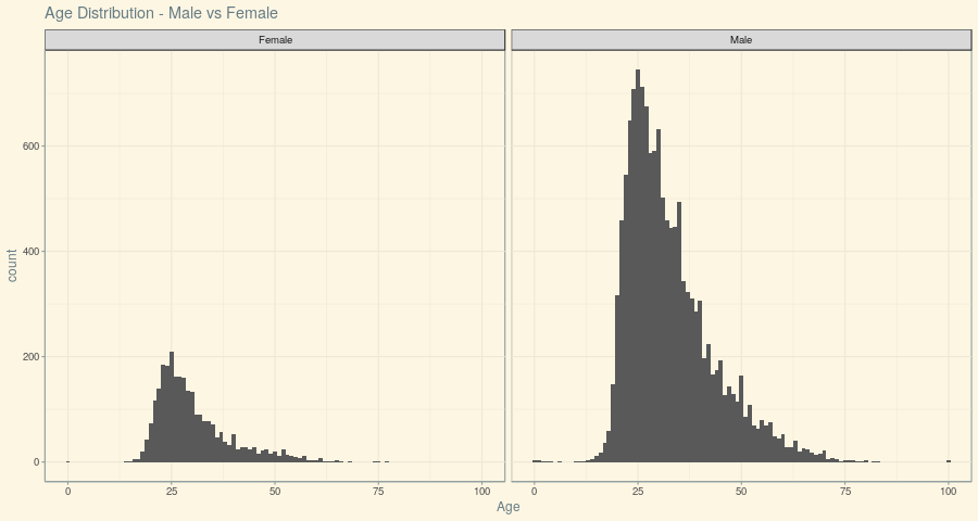
It could be inferred from the above Plot that the central tendency between Male and Female is similar, but it is very clear that Men seemed to start earlier than their Female counterparts – which could be a big factor to establish themselves in this industry with confidence.
And finally, What is the language that’s been familiar among Data Enthusiasts.
complete_data %>% group_by(LanguageRecommendationSelect) %>% summarize(count = n())
# A tibble: 14 x 2
   LanguageRecommendationSelect count
 1                               5718
 2                     C/C++/C#   307
 3                           F#     4
 4                      Haskell    17
 5                         Java   138
 6                        Julia    30
 7                       Matlab   238
 8                        Other    85
 9                       Python  6941
10                            R  2643
11                          SAS    88
12                        Scala    94
13                          SQL   385
14                        Stata    28
The answer becomes the obvious one – Python followed by R (Remember the Selection bias disclaimer). So, what’s the language that does well with our Female Data Enthusiasts:
complete_data %>% filter(GenderSelect %in% c('Male','Female')) %>% group_by(LanguageRecommendationSelect,GenderSelect) %>%
  summarize(count = n()) %>%
  spread(GenderSelect,count) %>%
  mutate(F2M = Female/Male) %>%
  arrange(desc(F2M)) %>%
  mutate(F2M = F2M * 100) %>%  ggplot() +
  geom_bar(aes(LanguageRecommendationSelect,F2M, fill = F2M), stat = 'identity') +
  theme_solarized() +
  theme(axis.text = element_text(size = 9),
        axis.text.x = element_text(angle = 90, vjust = 0.5, hjust = 0.5)) +
  scale_fill_continuous_tableau() + ggtitle('F2M Ratio of Languages used by Kagglers')
Gives this plot:
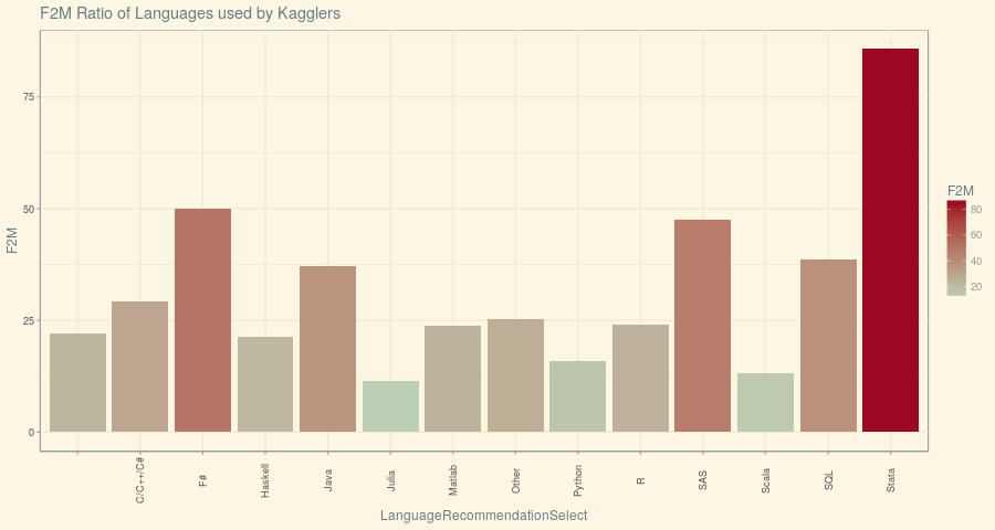
Stata has very well outperformed R and Python with Female Data Enthusiasts and the possible explanation for this could be the increased penetration of Stata as a language in Academia and Research.
Well, that’s a simple Gender Diversity Analysis of Data Science Industry with Kaggle Dataset. The entire code used here is available on my Github.
References:


Nice post!
I just do not understand the statement “It could be inferred from the above Plot that the central tendency
between Male and Female is similar, but it is very clear that Men seemed
to start earlier than their Female counterparts – which could be a big
factor to establish themselves in this industry with confidence.”, I cannot see in the picture that there are less young female than male. The shape looks similar, there are just less woman in every age group…
Thanks @phil_karl:disqus for your comment. That statement was made with the observation from the histogram that there are more Male respondents in age less 25 bin than Female (which almost seems to be nothing).
Very nice! I wonder about the Female to Male ratio, i.e., Egypt shows 40%, relatively higher than other countries, however, Egypt_n=66. I wonder how representative is that, and if there is some kind of survey bias causing this result (e.g., males in Egypt with higher refusals to cooperate compared to females(?)), rather than a real 40% ratio. I’m having a hard time to accept this result of 40% ratio, compared to other western countries…
Thanks @adisarid:disqus for your comment. Indeed that was one of the insights that raised my eyebrows. Perhaps, It could be because of more amount of females taking relevant courses in their university?
Can’t see the charts clearly. Labels are too small, I am afraid. Good work, overall.
Sorry about that. You could find the same plots with better resolution on the github link mentioned. Thanks for your comment.