Flexdashboard enables R-only Data Scientists deploy interactive visualizations, just like a Javascript-wizard would do.
The biggest problem with I-am-an-R-coder Data Scientists is the big wall they hit when it comes to Web-friendly Interactive Visualization. Because in most of the organizations, Data Scientists’ role not just involve building sophisticated statistical models but more to do with extracting valuable insights out of the data chunk — whose end result is a (nice) visualization.
The world hasn’t completely ruled out Powerpoint presentations, yet the need of the hour is Interactive Dashboards, because less is more — showing an information only on mouse hover is a lot better than having those values carved on the chart and interactive visualization also enables the analyst stuff-in more information (that reveals itself when required) than a static image.
The Rescue-Plan
But being an R-dominant Data Scientist, especially js-challenged ones, the world of mobile-friendly interactive visualizations suddenly become blank and that’s when you’ve to know, there’s something called ‘Flexdashboard for R’ and it’s going to save you!
While flexdashboard has a lot of good properties, 2 things I’d like to call out:
- 1. It’s support to include htmlwidgets
- 2. Flexible layouts (similar to bootstrap)
While the former brings the world of javascript-visualization libraries to the hands of R-programmer, the latter helps in laying them out in a responsive (mobile-friendly) grid layout. The documentation makes it extremely easier to start with the desired layout.
Installation and Loading
flexdashboard can be directly installed from on CRAN .
#install
install.packages('flexdashboard')

#load
library('flexdashboard')
Creating an Interactive Heatmap using d3heatmap
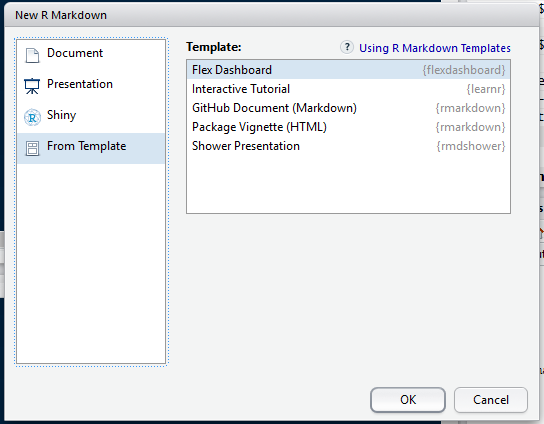
To create a new flexdashboard project, Open your RStudio, Create a new RMarkdown, select From Template and select Flex Dashboard.
This will create a basic layout with required grids in our flexdashboard. Now, let us edit the markdown code loading required libraries that include knitr and d3heatmap. Remember the entire code below is part of one single markdown file and hence displayed as a single code.
## Interactive heatmap
```
library(knitr)
library(d3heatmap)
library(flexdashboard)
url <- "http://datasets.flowingdata.com/ppg2008.csv"
nba_players <- read.csv(url, row.names = 1)
```
### Stats by Player {data-width=650}
```{r}
d3heatmap(nba_players, scale = "column")
```
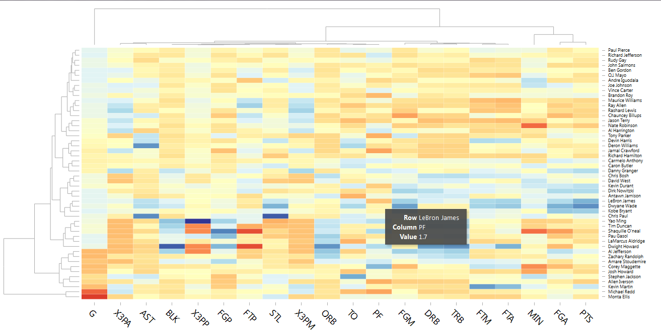
As mentioned in the above code, we are trying to visualise NBA Players using the dataset from Flowing Data.
With the above flexdashboard code, we get the following interactive dashboard (just a screenshot).
And once the visualisation is built, there are two easy options for deploying it:
With a very little learning curve (skimming through the documentation and the ability to understand the functions & paramters of required htmlwidgets) and zero knowledge about javascript, flexdashboard provides an elegant solution to produce quick interactive visualisation in R – that also can be deployed in RShiny or shared with RMarkdown documentation.