Congested streets and slow-crawling traffic are a fact of life in many metropolitan areas, such as New York City, Los Angeles, and Chicago. Bike sharing is an innovative solution for such problems, and it works by dispersing a large fleet of publicly-available bikes throughout crowded cities for personal transport.
Implemented in 2013, Ford GoBike is the first bike-sharing system introduced in the US West Coast. Its 540 stations and 7,000 bikes sprawl across five cities in San Francisco Bay Area. A docked bike can be checked out at any station and must be returned to a station when the trip is complete. As an avid GoBike user and a data fanatic, I am excited to explore, using R, the trip data that has been collected in 2018.
Highlights
- The number of rides per month more than doubled from January to June of 2018.
- Monthly and yearly subscribers have completed more than five times the number of rides compared to customers who hold single-use or day-ride passes.
- The ratio of male to female users is 3:1.
- The median age of users is 35 with a standard deviation of 10.5.
- More than 90% of the rides are under 30 minutes.
- The peak hours across all rides in 2018 are 8 AM and 5 PM, which align with normal working hours.
- The bike share system in San Francisco is popular among those who commute from outside of the city for work.
Data Acquisition
First, I downloaded the system data from the Ford GoBike website and saved them in my working directory. Currently, eight data files are available online, a collective file for 2017 and one for each month of 2018 up to August. In this analysis, I will solely focus on data that has been generated so far in 2018.
# List of data file names
file_names = list.files(pattern = ".csv")
file_names
## [1] "201801-fordgobike-tripdata.csv" "201802-fordgobike-tripdata.csv"
## [3] "201803-fordgobike-tripdata.csv" "201804-fordgobike-tripdata.csv"
## [5] "201805-fordgobike-tripdata.csv" "201806-fordgobike-tripdata.csv"
## [7] "201807-fordgobike-tripdata.csv" "201808-fordgobike-tripdata.csv"
To read the files into R, I iterate through file_names using the lapply function:
# Read data (this will take a second)
df_list = lapply(file_names,
                 function(x) read.csv(x, stringsAsFactors = FALSE))

# Assign names to data frames in the list
names(df_list) = file_names
Data Organization and Cleaning
Aggregate Data into a Single Data Frame
Let's look at the headers of a data frame in df_list:
# Extract column names from the first data frame
names(df_list[[1]])
##  [1] "duration_sec"            "start_time"
##  [3] "end_time"                "start_station_id"
##  [5] "start_station_name"      "start_station_latitude"
##  [7] "start_station_longitude" "end_station_id"
##  [9] "end_station_name"        "end_station_latitude"
## [11] "end_station_longitude"   "bike_id"
## [13] "user_type"               "member_birth_year"
## [15] "member_gender"           "bike_share_for_all_trip"
Information on ride duration, starting and ending time/location, and user descriptions are provided. Notice that the data contains a column called "bike_share_for_all_trip", which tracks members who are enrolled in the Bike Share for All program for low-income residents.
We will collapse the data frames into one and examine the data structure:
# Cast certain columns as numeric to enable row binding
df_list[[6]]$start_station_id = as.numeric(df_list[[6]]$start_station_id)
df_list[[6]]$end_station_id = as.numeric(df_list[[6]]$end_station_id)
df_list[[7]]$start_station_id = as.numeric(df_list[[7]]$start_station_id)
df_list[[7]]$end_station_id = as.numeric(df_list[[7]]$end_station_id)
df_list[[8]]$start_station_id = as.numeric(df_list[[8]]$start_station_id)
df_list[[8]]$end_station_id = as.numeric(df_list[[8]]$end_station_id)

# Bind data frames by rows
library(dplyr)   # for data manipulation
df = bind_rows(df_list)

# Glimpse at df
glimpse(df)
## Observations: 1,210,548
## Variables: 16
## $ duration_sec            <int> 75284, 85422, 71576, 61076, 39966, 647...
## $ start_time              <chr> "2018-01-31 22:52:35.2390", "2018-01-3...
## $ end_time                <chr> "2018-02-01 19:47:19.8240", "2018-02-0...
## $ start_station_id        <dbl> 120, 15, 304, 75, 74, 236, 110, 81, 13...
## $ start_station_name      <chr> "Mission Dolores Park", "San Francisco...
## $ start_station_latitude  <dbl> 37.76142, 37.79539, 37.34876, 37.77379...
## $ start_station_longitude <dbl> -122.4264, -122.3942, -121.8948, -122....
## $ end_station_id          <dbl> 285, 15, 296, 47, 19, 160, 134, 93, 4,...
## $ end_station_name        <chr> "Webster St at O'Farrell St", "San Fra...
## $ end_station_latitude    <dbl> 37.78352, 37.79539, 37.32600, 37.78095...
## $ end_station_longitude   <dbl> -122.4312, -122.3942, -121.8771, -122....
## $ bike_id                 <int> 2765, 2815, 3039, 321, 617, 1306, 3571...
## $ user_type               <chr> "Subscriber", "Customer", "Customer", ...
## $ member_birth_year       <int> 1986, NA, 1996, NA, 1991, NA, 1988, 19...
## $ member_gender           <chr> "Male", "", "Male", "", "Male", "", "M...
## $ bike_share_for_all_trip <chr> "No", "No", "No", "No", "No", "No", "N...
Format Data Structure
Data cleaning is essential for downstream analysis. This entails formatting the columns into appropriate data types and extracting essential data. First, I will isolate the hour, day of the week, and month from start_time for visualizing bike usage over time. In addition, I will convert member_birth_year into member_age. Moreover, I will convert duration_sec into duration_min. Finally, columns of type character should take on type factor.
# Format data structure
library(stringr)   # for regular expression

df = df %>%
  # Extract day and month from start_time
  mutate(start_month = sub(" .*", "", start_time)) %>%
  mutate(start_month = as.POSIXct(start_month)) %>%
  mutate(start_day = weekdays(start_month)) %>%
  mutate(start_month = format(start_month, "%B")) %>%

  # Extract hour from start_time
  mutate(start_hour = sub("^.{11}", "", start_time)) %>%
  mutate(start_hour = str_extract(start_hour, "^[0-9]{2}")) %>%

  # Convert birth year to age
  mutate(member_age = 2018 - member_birth_year) %>%

  # Convert duration_sec to duration_min
  mutate(duration_min = duration_sec / 60) %>%

  # Convert characters to factors
  mutate_if(is.character, as.factor) %>%

  # Remove columns not used in the analysis
  select(-c(start_time, end_time, start_station_id, end_station_id, bike_id, member_birth_year, duration_sec))

# Glimpse at cleaned df
glimpse(df)
## Observations: 1,210,548
## Variables: 14
## $ start_station_name      <fct> Mission Dolores Park, San Francisco Fe...
## $ start_station_latitude  <dbl> 37.76142, 37.79539, 37.34876, 37.77379...
## $ start_station_longitude <dbl> -122.4264, -122.3942, -121.8948, -122....
## $ end_station_name        <fct> Webster St at O'Farrell St, San Franci...
## $ end_station_latitude    <dbl> 37.78352, 37.79539, 37.32600, 37.78095...
## $ end_station_longitude   <dbl> -122.4312, -122.3942, -121.8771, -122....
## $ user_type               <fct> Subscriber, Customer, Customer, Custom...
## $ member_gender           <fct> Male, , Male, , Male, , Male, Male, Ma...
## $ bike_share_for_all_trip <fct> No, No, No, No, No, No, No, No, Yes, Y...
## $ start_month             <fct> January, January, January, January, Ja...
## $ start_day               <fct> Wednesday, Wednesday, Wednesday, Wedne...
## $ start_hour              <fct> 22, 16, 14, 14, 19, 22, 23, 23, 23, 23...
## $ member_age              <dbl> 32, NA, 22, NA, 27, NA, 30, 38, 31, 24...
## $ duration_min            <dbl> 1254.733333, 1423.700000, 1192.933333,...
The cleaned data frame contains 14 descriptors for over a million rides.
Data Analysis
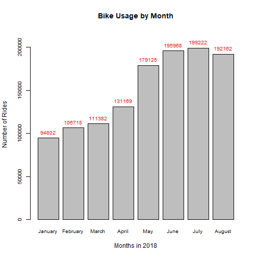
Bike Usage by Month and by Day in 2018
To start, we will examine the bike usage over time in 2018:
# Organize month
df$start_month = factor(df$start_month,
                        levels = c("January", "February", "March", "April", "May", "June", "July", "August"))

# Count usage by month
month_counts = table(df$start_month)

# Plot bar graph
bar = barplot(month_counts,
              ylim = c(0, 220000),
              xlab = "Months in 2018",
              ylab = "Number of Rides",
              main = "Bike Usage by Month",
              cex.names = 0.8,
              cex.axis = 0.8)
text(x = bar, y = month_counts,   # Add labels
     label = month_counts, pos = 3, cex = 0.8, col = "red")
# Organize day of the week
df$start_day = factor(df$start_day,
                      levels = c("Monday", "Tuesday", "Wednesday", "Thursday", "Friday", "Saturday", "Sunday"))

# Count usage by day
day_counts = table(df$start_day)

# Plot bar graph
bar = barplot(day_counts,
              ylim = c(0, 230000),
              xlab = "Day of the Week",
              ylab = "Number of Rides",
              main = "Bike Usage by Day of the Week",
              cex.axis = 0.8,
              xaxt = "n")
text(x = bar, y = day_counts,   # Add labels
     label = day_counts, pos = 3, cex = 0.8, col = "red")
text(x = bar, y = -6000, cex = 0.8,   # Rotate x-axis labels
     labels = names(day_counts), srt = 45, adj = 1, xpd = TRUE)
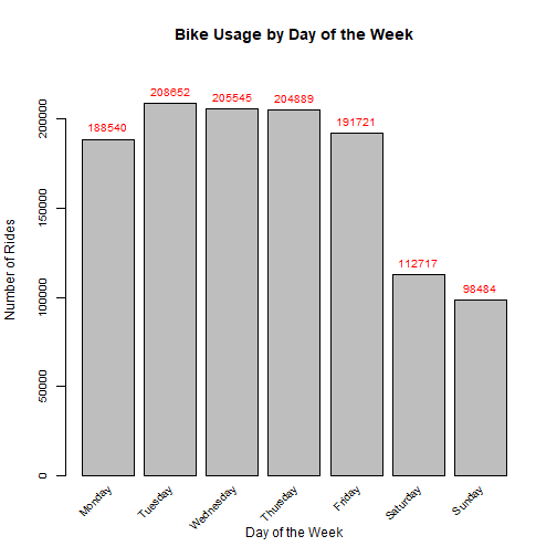
The first figure shows a consistent growth in the number of rides over the months with the exception of August. Six months into 2018, the bike usage more than doubled. In addition, there's a large increase in the number of rides from April to May, which may be associated with warmer weather in the summer months along with growing adoption of the bike-sharing service. The second figure shows that the usage over weekdays is greater than over weekends.
Bike Usage by Customers and Subscribers
Next, I will stratify the bar chart by user_type to reveal information on GoBike users. A customer is someone who holds a single-ride or day pass while a subscriber carries a monthly or annual pass.
# Plot bar graph
library(ggplot2)   # for plotting functions
ggplot(df, aes(start_month)) +
  geom_bar() +
  facet_grid(. ~ user_type) +
  xlab("Months in 2018") +
  ylab("Number of Rides") +
  ggtitle("Comparison of Usage Between Customers and Subscribers") +
  theme_minimal() +
  theme(axis.text.x = element_text(angle = 45, hjust = 1))   # Rotate x-axis labels
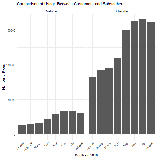
It is evident that the majority of the rides are made by subscribers while only a fraction (~16%) come from single-use customers. The usage trends over time are very similar between customers and subscribers. The number of users in both categories spiked from April to May and dipped in August.
Bike Usage by Gender
In my experience, the bikes are predominately operated by males. Let's test this intuition and see whether the gender composition of users have evolved over time:
# Organize data by gender
df_gender = df %>%
  filter(member_gender %in% c("Male", "Female")) %>%   # Isolate "Male" and "Female" genders
  mutate(member_gender = droplevels(member_gender))   # Drop unused levels

# Plot barplot
ggplot(df_gender, aes(start_month, fill = member_gender)) +
  geom_bar(position = "fill") +
  xlab("Months in 2018") +
  ylab("Proportion of Rides") +
  ggtitle("Bike Usage by Gender over Time") +
  scale_fill_discrete("Gender") +
  theme_minimal()
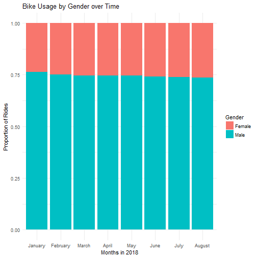
There are roughly three times as many male as female users, and the proportions have remained steady over time.
Distribution of the Age of Users
We have found that male users outnumber the female users. Now, we will examine the distribution of the age of our cohort. It is important to be aware that our metric is “number of rides” not “number of users.” That is to say the height of the bins is a function of both the number of users and frequency of use by individuals in a given age group. For privacy reasons, user IDs are not available to the public.
# Plot histogram
ggplot(df, aes(member_age)) +
  geom_histogram(binwidth = 2, alpha = 0.5) +
  scale_x_continuous(limits = c(10, 100),
                     breaks = seq(10, 100, by = 4)) +
  xlab("Age in Years") +
  ylab("Number of Rides") +
  ggtitle("Total Rides by Age") +
  theme_minimal()
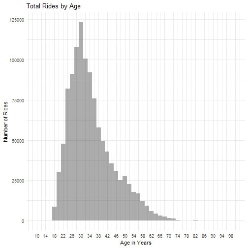
Take note that 82041 data points are omitted from the plot because age was not provided and that the service is restricted to those 18 years or older. Furthermore, there is reason to question the validity of the self-reported age since the oldest user is recorded as being 137. Nonetheless, the distribution indicates that the ages of the majority of users range from mid-twenties to mid-thirties, with a median of 33 and mean of 35.3.
Distribution of Ride Duration
The bike share system offers a short-term mode of transport, and this is reflected in its pricing structure. 30-minute and 45-minute time limits are imposed on the customers and subscribers, respectively, with a $3 fee for every additional 15 minutes. To avoid surcharges, I hypothesize that most rentals are below the prescribed limit.
# Plot histogram
ggplot(df, aes(duration_min)) +
  geom_histogram(binwidth = 2, alpha = 0.5) +
  scale_x_continuous(limits = c(0, 100),
                     breaks = seq(0, 100, by = 2)) +
  xlab("Ride Duration in Minutes") +
  ylab("Number of Rides") +
  ggtitle("Duration of Rides") +
  theme_minimal() +
  theme(axis.text.x = element_text(angle = 90))   # Rotate x-axis labels
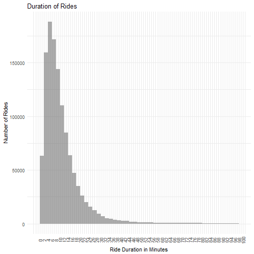
Indeed, 90% of the rides are below 22.65 minutes and 97% are below 41.3666667, well within the 30- and 45-minute period. The distribution is heavily skewed to the right, reinforcing the idea that the bikes are generally used for short trips.
Bike Usage by Hour
The GoBike is an integral part of my daily commute to work. I suspect that many others use it for the same purpose. Let's explore this by tracking bike usage by the hour:
# Organize usage by hour
hour = df %>%
  group_by(start_hour) %>%
  summarise(total = n())

# Plot line graph
ggplot(hour, aes(x = start_hour, y = total, group = 1)) +
  geom_line() +
  geom_point(color = "red") +
  xlab("Time in Hours") +
  ylab("Number of Rides") +
  ggtitle("Total Rides by Hour") +
  theme_minimal()
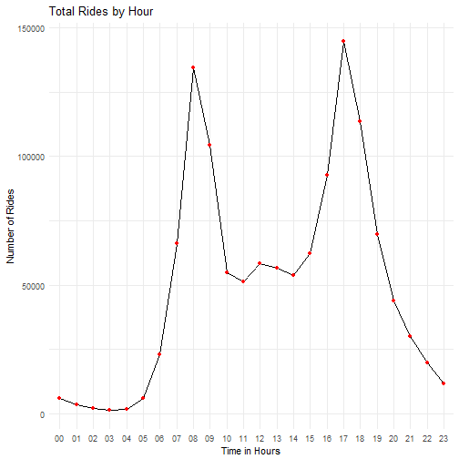
A bimodal curve with peaks at 8 AM and 5 PM confirms my gut instinct that the bike share system is busiest during commute hours. Along the same lines, it should not come as a surprise that the quietest times are in the wee hours of the night.
Station Usage at Peak Hours
Given the increased usage during commute hours, one may wonder if any ride pattern exists and can be detected at those times. We will focus our investigation on rides in San Francisco. I predict that many people are commuting to the city for work and, therefore, bike rentals will concentrate near major transit stations during the hours of 8 AM and 5 PM.
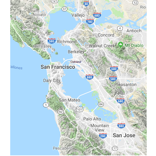
For those residing in the East Bay, a rail system called Bay Area Rapid Transit (BART) offers an efficient way into the city. Alternatively, a trans-bay bus service picks up from the East Bay and drops off at the Transbay Bus Terminal in San Francisco. Yet another option is the ferry that connects Oakland, Alameda, and Vallejo to the city. For those living in the South Bay (San Jose, for example), a rail system called Caltrain is a popular choice. See the map of the Bay Area below for reference.
library(ggmap)   # for retreiving and plotting Google Maps

# Obtain map of San Francisco Bay Area
BayMap = get_map("San Francisco Bay Area",
                 maptype = "terrain",
                 source = "google",
                 zoom = 9)

# Plot map and label stations
ggmap(BayMap) +
  geom_text(x = -122.270833, y = 37.804444, label = c("Oakland"), size = 3.1, color = "gray40") +
  scale_x_continuous(limits = c(-122.75, -121.75)) +   # trim x-axis range
  scale_y_continuous(limits = c(37.25, 38.15)) +   # trim y-axis range
  theme_void()   # suppress axes
Before delving into the analysis, here are all the active stations in San Francisco:
# Obtain map of San Francisco
SFmap = get_map("San Francisco",
                maptype = "terrain",
                source = "google",
                zoom = 13)

# Identify all unique stations
df_stations = df %>%
  group_by(start_station_longitude, start_station_latitude) %>%
  slice(1)

# Plot map and label stations
ggmap(SFmap) +
  geom_point(data = df_stations,
             mapping = aes(x = start_station_longitude,
                           y = start_station_latitude),
             color = "red") +
  scale_x_continuous(limits = c(-122.45, -122.375)) +   # trim x-axis range
  scale_y_continuous(limits = c(37.74, 37.81)) +   # trim y-axis range
  theme_void()   # suppress axes
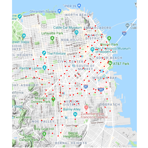
Docks are peppered throughout the city with a fairly even distance between stations. At the heart of the coverage area is South of Market, home to Uber and Twitter Headquarters. The downtown area is well-served by GoBikes, and they reach as far south as Bernal Heights.
Now that we have a sense of the bike station locations, it is time to test my hypothesis that stations near transport corridors are more widely used than other stations during working hours. First, I search on Wikipedia for the coordinates of major transit stations in San Francisco. I store this data in df_transit. Next, I write a function to extract the total number of rides taken, in 2018, to and from each stations at a given hour. The function map_trips will generate a figure displaying station usage as output. Check out the code below:
# Coordinates for stations of major transit systems
df_transit = data.frame(name = c("Embarcadeo BART Station",   # station names
                                 "Montgomery BART Station",
                                 "Powell BART Station",
                                 "Civic Center BART Station",
                                 "16th St Mission BART Station",
                                 "24th St Mission BART Station",
                                 "King St CalTrain Station",
                                 "22nd St CalTrain Station",
                                 "Ferry Building",
                                 "Transbay Transit Center"),
                        system = c(rep("BART", 6), rep("Caltrain", 2), "Ferry", "Transbay Bus Terminal"),   # transit system
                        longitude = c(-122.3972, -122.4019, -122.4080,   # coordinates
                                      -122.4135, -122.4200, -122.4187,
                                      -122.3944, -122.3925, -122.3937,
                                      -122.3966),
                        latitude = c(37.79306, 37.78936, 37.78400,
                                     37.77986, 37.76485, 37.75200,
                                     37.77639, 37.75722, 37.79550,
                                     37.7897))

# Function for visualizing trips at a designated time
map_trips = function(hour, plot_title) {
  # hour = a character of lenth one indicating the hour of interest (e.g. "07" for 7 AM and "15" for 3 PM)
  # plot_title = a character of length one indicating title of plot

  peak_start = df %>%
    group_by(start_hour, start_station_longitude, start_station_latitude) %>%
    rename(station_longitude = start_station_longitude,
           station_latitude = start_station_latitude) %>%
    summarise(rides = dplyr::n()) %>%   # ride count for each station
    filter(start_hour == hour) %>%
    mutate(type = "Start Stations")

  # Filter for rides taken at 8 AM and grouped by start time and end station
  peak_end = df %>%
    group_by(start_hour, end_station_longitude, end_station_latitude) %>%
    rename(station_longitude = end_station_longitude,
           station_latitude = end_station_latitude) %>%
    summarise(rides = dplyr::n()) %>%   # ride count for each station
    filter(start_hour == hour) %>%
    mutate(type = "End Stations")

  # Combine starting and ending stations into one data frame
  df_peak = bind_rows(peak_start, peak_end)

  # Convert "type" to factor
  df_peak$type = factor(df_peak$type,
                        levels = c("Start Stations", "End Stations"))

  # Plot trips
  ggmap(SFmap) +
    geom_point(data = df_peak,   # plot stations
               mapping = aes(x = station_longitude,
                             y = station_latitude,
                             size = rides,   # scale point size by number of rides
                             alpha = rides),   # scale point transparency size by number of rides
               color = "red") +
    geom_point(data = df_transit,   # plot transit systems
               mapping = aes(x = longitude,
                             y = latitude,
                             shape = system),
               size = 2.5) +
    facet_grid(. ~ type) +
    scale_x_continuous(limits = c(-122.45, -122.375)) +   # trim x-axis range
    scale_y_continuous(limits = c(37.74, 37.81)) +   # trim y-axis range
    scale_size_continuous("Number of Rides",
                          range = c(1, 8),
                          breaks = seq(0, 10000, by = 1000)) +   # control point size
    scale_alpha_continuous("Number of Rides",
                           range = c(0.1, 0.8),
                           breaks = seq(0, 10000, by = 1000)) +   # control transparency
    scale_shape_discrete("Transit Systems") +
      ggtitle(plot_title) +
    theme_void()   # suppress axes
}
Finally, let's compare the bike trips at 8 AM and 5 PM. The size and shading of a red circle corresponds to the number of rides at a station. Bigger and darker equates to more rides. In addition, the bus, train, and ferry stations are marked with symbols.
# Plot trips at 8 AM
map_trips("08", "Bike Trips at 8 AM")
# Plot trips at 5 PM
map_trips("17", "Bike Trips at 5 PM")
At 8 AM, a high volume of rides start near key transit stations as well as the outskirts of the city and finish in downtown San Francisco and the Financial District. Notably, a large number of rides begin at the northernmost Caltrain and BART station and the ferry stop. This is consistent with my prediction that many bike share users commute from outside of the city and rely on bikes to bridge the gap between transit terminals and their workplaces. At 5 PM, we observe a complete reversal of the trend. The bikes move out of the business centers to transit stations and the suburban parts of town.
One important caveat is that the current analysis includes all trips, even those on weekends. Therefore, one may argue that the morning and afternoon ride patterns are influenced by weekend getaways to San Francisco. While a valid point, our previous analyses reduce the weight of this concern. The bar chart for Bike Usage by Day of the Week shows that more rides are made on the weekdays than weekends. In addition, the line plot for Total Rides by Hour shows peak usage at 8 AM and 5 PM. Both suggest that shared bikes are employed as a mean of commuting to work. Even though the weekend data certainly confound our results, it is unlikely that they dictate the emerged trends.
Closing Remarks
Huge respect for those who have made it to the end of this long tutorial. I had an absolute blast probing the data on the bike share system in San Francisco Bay Area.
I encourage those galvanized by this work to explore further on their own. Ford GoBike has a cousin called Citi Bike that operates in New York City, of which the system is more established and mature with data records going back to 2013. Happy data mining!