Exploratory Data Analysis plays a very important role in the entire Data Science Workflow. In fact, this takes most of the time of the entire Data science Workflow.
There’s a nice quote (not sure who said it): “In Data Science, 80% of time spent prepare data, 20% of time spent complain about the need to prepare data.”
With R being the go-to language for a lot of Data Analysts, EDA requires an R Programmer to get a couple of packages from the infamous tidyverse world into their R code – even for the most basic EDA with some Bar plots and Histograms.
Recently, I came across this package DataExplorer that seems to be doing the entire EDA (at least, the typical basic EDA) with just one function create_report() that generates a nice presentable rendered Rmarkdown html document. That’s just a report automatically generated and what if you want the control of what you would like to perform EDA on, for which DataExplorer has got a couple of plotting functions for the same purpose.
The purpose of this article is to explain how blazing fast you could EDA in R using DataExplorer Package.
Installation and Loading
Let us begin our EDA by loading the library:
#Install if the package doesn't exist
#install.packages('DataExplorer)
library(DataExplorer)
Dataset
The dataset that we will be using for this analysis is Chocolate Bar Ratings posted on Kaggle. The dataset can be downloaded here. Loading input dataset into our R session for EDA:
choco = read.csv('../flavors_of_cacao.csv', header = T, stringsAsFactors = F)
Data Cleaning
Some reformatting of data types are required before proceeding. For example, Cocoa.Percent is supposed to be a numeric value but read as a character due to the presence of % symbol, so needs to be fixed.
choco$Cocoa.Percent = as.numeric(gsub('%','',choco$Cocoa.Percent))
choco$Review.Date = as.character(choco$Review.Date)
Variables
The very first thing that you’d want to do in your EDA is checking the dimension of the input dataset and the time of variables.
plot_str(choco)
Gives this plot:
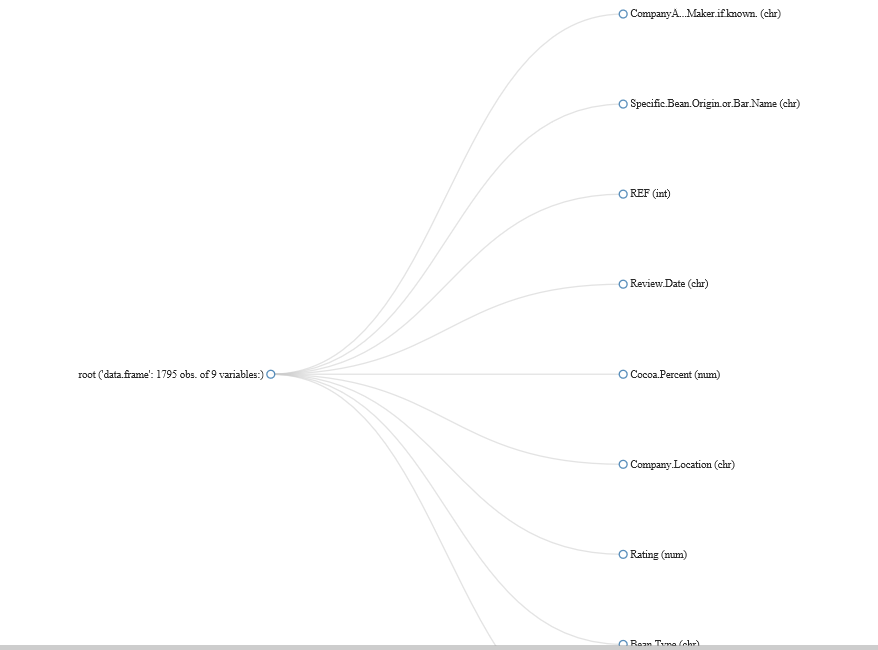
With that, we can see we’ve got some Continuous variables and some Categorical variables.
Man’s search for Missing Values
It’s very important to see if the input data given for Analysis has got Missing values before diving deep into the analysis.
plot_missing(choco)
Gives:
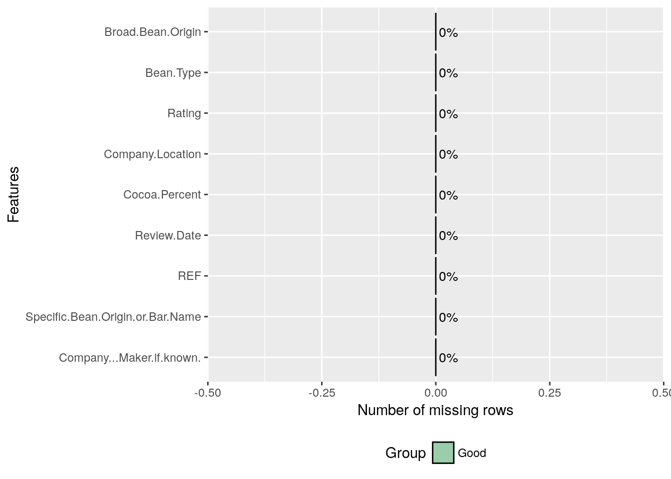
And we are fortunate that there’s no missing value in this dataset.
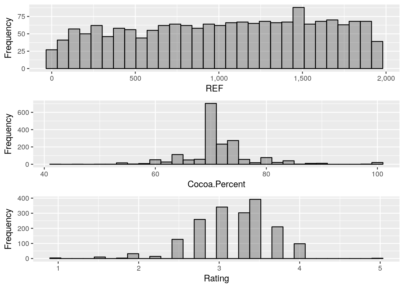
Continuous Variables
Histogram is analyst’s best friend to analyse/represent Continuous Variables.
plot_histogram(choco)
Gives this plot:
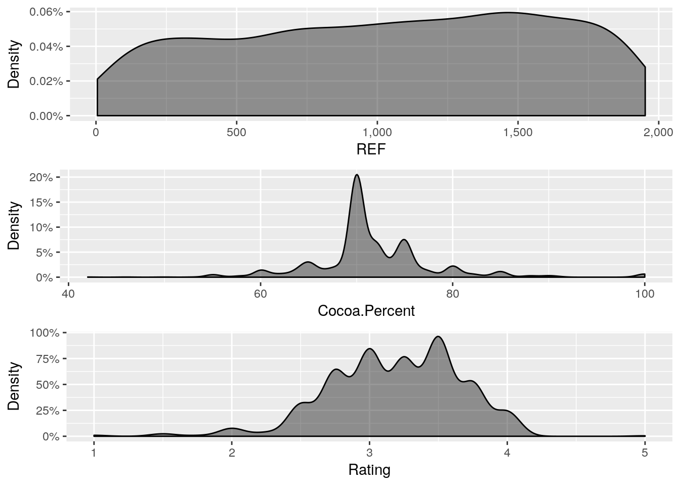
Perhaps, you are a fan of Density plot, DataExplorer has got a function for that.
plot_density(choco)
Gives this plot:
Multivariate Analysis
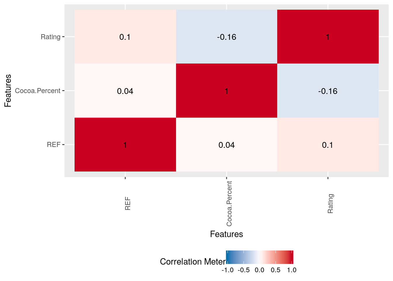
That marks the end of univariate analysis and the beginning of bivariate/multivariate analysis, starting with Correlation analysis.
plot_correlation(choco, type = 'continuous','Review.Date')
Gives this plot:
Similar to the correlation plot, DataExplorer has got functions to plot boxplot and scatterplot with similar syntax as above.
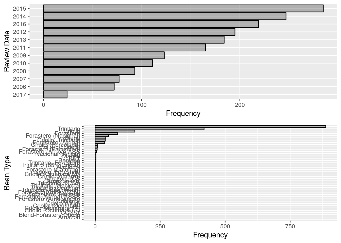
Categorical Variables – Barplots
So far we’ve seen the kind of EDA plots that DataExplorer lets us plot for Continuous variables and now let us see how we can do similar exercise for categorical variables. Unexpectedly, this becomes one very simple function plot_bar().
plot_bar(choco)
Gives this plot:
And finally, if you have got only a couple of minutes (just like in the maggi noodles ad, 2 mins!) just keep it simple to use create_report() that gives a very nice presentable/shareable rendered markdown in html.
create_report(choco)
Hope this article helps you perform simple and fast EDA and generate shareable report with typical EDA elements. To learn more about Exploratory Data Analysis in R, check out this DataCamp Course
References
- Dataset
Kaggle Kernel
Source Code – Github
DataExplorer – CRAN