This post is a continuation of my previous tutorial regarding the visualization of National Health and Nutrition Examination Survey (NHANES). Both posts aim to show how we can use the functions of ggplot to visualize the data. Also, I show the steps I follow to make data ready for visualization..
NHANES is a survey which combines interviews, physical examinations, and laboratory testing of Americans. You can find information about NHANES at the program’s website.
As I mentioned in the other post, no conclusion should be made from the plots or results, as this post is only for illustration of ggplot functions.
In this post, I will plot the levels of plasma lipids across age and gender. Most known blood lipids include LDL cholesterol, HDL cholesterol, and triglycerides. Those lipids are measured in NHANES survey and I will explore their relationship with age and gender. Higher blood lipids (LDL cholesterol and triglycerides) is associated with increased risk of cardiovascular disease. In contrary, higher levels of HDL cholesterol is related to lower risk of cardiovascular disease.
Ok, now lets dive into NHANES data.
Libraries and data
First I will load the neccessary libraries
library(tidyverse)
library(RNHANES)
library(ggsci)
library(ggthemes)
Load and merge the data in one dataset.
data1 %>%
  left_join(nhanes_load_data("TRIGLY_H", "2013-2014"), by="SEQN") %>%
  left_join(nhanes_load_data("DEMO_H", "2013-2014"), by="SEQN")
Checking the data
Creating the dataset with variables of interest
data2 = data1 %>%
  select(SEQN, RIAGENDR, RIDAGEYR, LBDHDD, LBDLDL, LBXTR)
-
SEQN: id
RIAGENDR: gender
RIDAGEYR: age in years
LBDHDD: HDL-cholesterol
LBDLDL: LDL-cholesterol
LBXTR: triglyceride
Summary of the data:
summary(data2)
      SEQN          RIAGENDR        RIDAGEYR         LBDHDD           LBDLDL          LBXTR
 Min.   :73557   Min.   :1.000   Min.   : 6.00   Min.   : 10.00   Min.   : 14.0   Min.   :  13.0
 1st Qu.:76132   1st Qu.:1.000   1st Qu.:16.00   1st Qu.: 42.00   1st Qu.: 81.0   1st Qu.:  60.0
 Median :78695   Median :2.000   Median :35.00   Median : 51.00   Median :103.0   Median :  88.0
 Mean   :78676   Mean   :1.513   Mean   :37.04   Mean   : 53.11   Mean   :106.2   Mean   : 112.3
 3rd Qu.:81218   3rd Qu.:2.000   3rd Qu.:56.00   3rd Qu.: 61.00   3rd Qu.:127.0   3rd Qu.: 133.0
 Max.   :83731   Max.   :2.000   Max.   :80.00   Max.   :173.00   Max.   :375.0   Max.   :4233.0
                                                 NA's   :667      NA's   :5186    NA's   :5145
I will remove missing values and exclude participants younger than 40 years. I will also create a new variable such as age-groups and recode gender variable as “Men” and “Women.” I use the function case_when to create the age-group variable. You can do the same with the function ifelse(), but I prefer case_when. To remove missings and those younger than 40 years old I use the function filter.
data3 = data2 %>%
  mutate(
    gender = recode_factor(RIAGENDR, `1` = "Men", `2` = "Women"),
    age_group = case_when(
      RIDAGEYR = 40 & RIDAGEYR = 45 & RIDAGEYR = 50 & RIDAGEYR = 55 & RIDAGEYR = 60 & RIDAGEYR = 65 & RIDAGEYR = 70 & RIDAGEYR = 75 & RIDAGEYR %
  filter(!is.na(LBDLDL), !is.na(LBXTR), !is.na(LBDHDD), age_group != "NA")
Visualization
Lets take a look at the data:
ggplot(data3, aes(RIDAGEYR, LBDHDD)) +
  geom_point(alpha = 0.7, size = 2, color = "#3C4D54") +
  geom_smooth(size = 1, color = "#E08F44") +
  theme_hc() +
  theme(text = element_text(family = "serif", size = 11)) +
  labs(
    title = "Age and HDL cholesterol",
    x = "Age (years)",
    y = "HDL cholesterol (mg/dl)",
    caption = "Source: NHANES survey 2013-2014"
    )
This gives this plot:
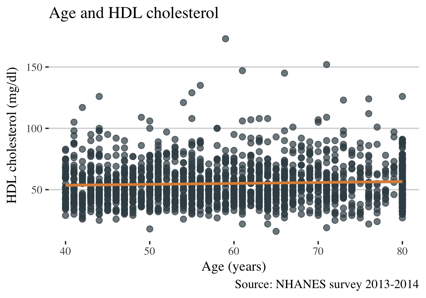
This plot shows that levels of HDL cholesterol are similar across the age in NHANES data. Now let see other lipids concerning age.
First I will transform the dataset and after I will create the plot.
long = data3 %>%
  select(SEQN, gender, RIDAGEYR, LBXTR, LBDLDL, LBDHDD, age_group) %>%
  gather(lipid, value, LBXTR:LBDLDL:LBDHDD) %>%
  mutate(lipid = recode(lipid, `LBXTR` = "Triglyceride", `LBDLDL` = "LDL-cholesterol", `LBDHDD` = "HDL-cholesterol" ))
head(long)
   SEQN gender RIDAGEYR age_group        lipid value
1 73559    Men       72     70-74 Triglyceride    51
2 73561  Women       73     70-74 Triglyceride    75
3 73564  Women       61     60-64 Triglyceride    64
4 73581    Men       50     50-54 Triglyceride    93
5 73596  Women       57     55-59 Triglyceride    87
6 73607    Men       75     75-80 Triglyceride   139
Plot the lipids across age:
ggplot(long, aes( RIDAGEYR, value, color = lipid)) +
  geom_point(alpha = 0.7, size = 2) +
  scale_color_jama() +
  theme_hc() +
  theme(text = element_text(family = "serif", size = 11), legend.position="top") +
  xlab("Age (years)") +
  ylab("Lipids (mg/ml)") +
  ggtitle("Lipids vs. Age") +
  labs(
    caption = "Source: NHANES survey 2013-2014",
    col="Lipids")
It gives this plot:
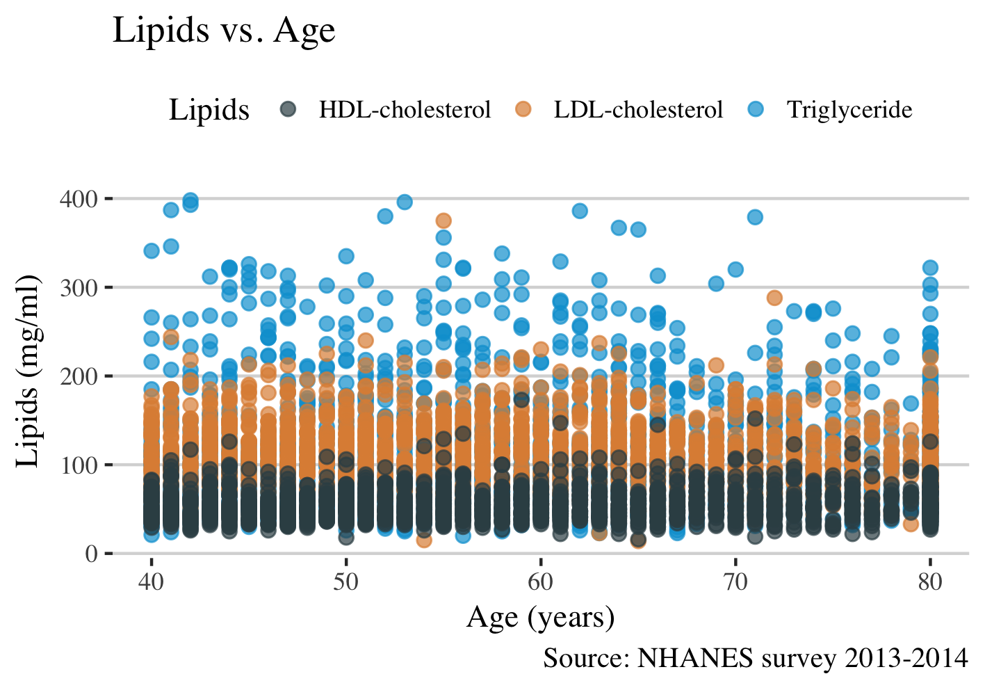
Given that the data points are overlapping each other is difficult to make any conclusion. The use of facet_grid function will solve this issue.
ggplot(long, aes(RIDAGEYR, value, color = lipid)) +
  geom_point(alpha = 0.7, size = 2) +
  geom_smooth(size = 1, color = "green") +
  scale_color_jama() +
  facet_grid(~lipid) +
  theme_hc() +
  theme(text = element_text(family = "serif", size = 11), legend.position="none") +
  xlab("Age (years)") +
  ylab("Lipids (mg/ml)") +
  ggtitle("Lipids vs. Age") +
  labs(
    caption = "Source: NHANES survey 2013-2014",
    col="Lipids")
The plot:
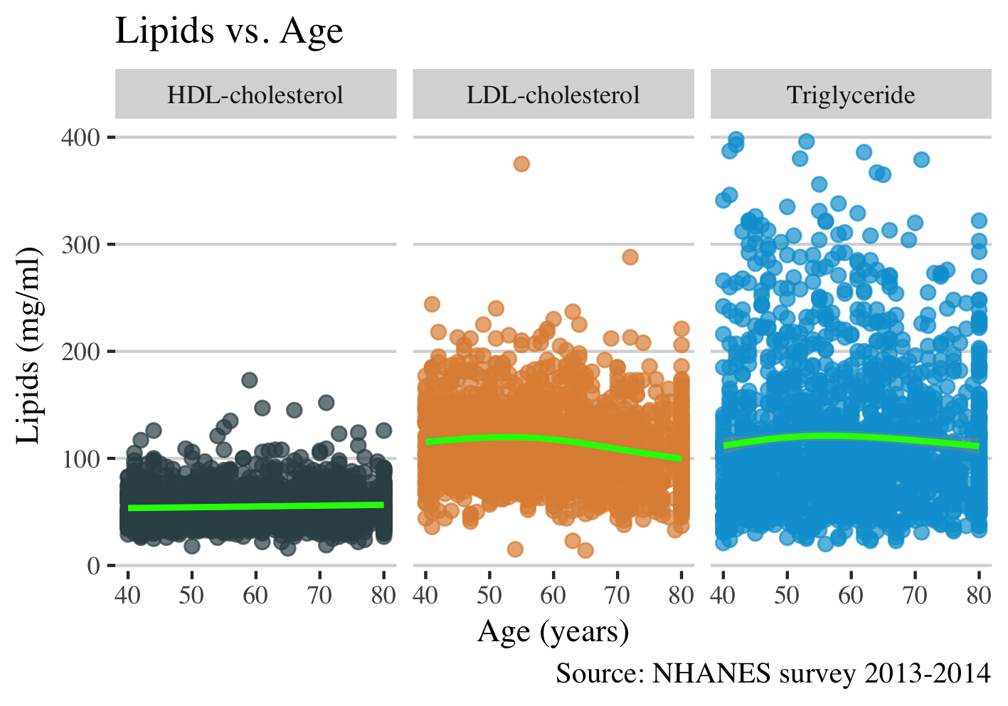
This plot shows that the levels of LDL cholesterol increases slightly between ages 50-60 and then after decreases. To have a comprehensive view of the relationship between age and lipids levels, I think I need to calculate the mean of lipids per age group and to plot it.
Calculate the mean of lipids by age group.
long_mean = long %>%
  group_by(age_group, lipid) %>%
  summarise(mean = mean(value))
head(long_mean)
# A tibble: 6 x 3
# Groups:   age_group [2]
  age_group           lipid      mean

1     40-44 HDL-cholesterol  54.05242
2     40-44 LDL-cholesterol 114.65726
3     40-44    Triglyceride 110.68145
4     45-49 HDL-cholesterol  51.99517
5     45-49 LDL-cholesterol 120.09662
6     45-49    Triglyceride 121.45894
Dataset looks good and now lets build the plot. I will use geom_point to plot the mean and geom_line to connect the points with line.
ggplot(long_mean, aes(age_group, mean, color = lipid, group = lipid)) +
  geom_point(alpha = 1, size = 2) +
  geom_line() +
  facet_grid(~lipid) +
  scale_color_jama() +
  theme_hc() +
  theme(
    text = element_text(family = "serif", size = 11),
    legend.position="none",
    axis.text.x = element_text(angle = 45, hjust = 1)
    ) +
  labs(
    title = "Lipids levels across age-groups",
    x = "Age (years)",
    y = "Lipids (mg/dl)",
    caption = "Source: NHANES survey 2013-2014",
    col="")
The plot is:
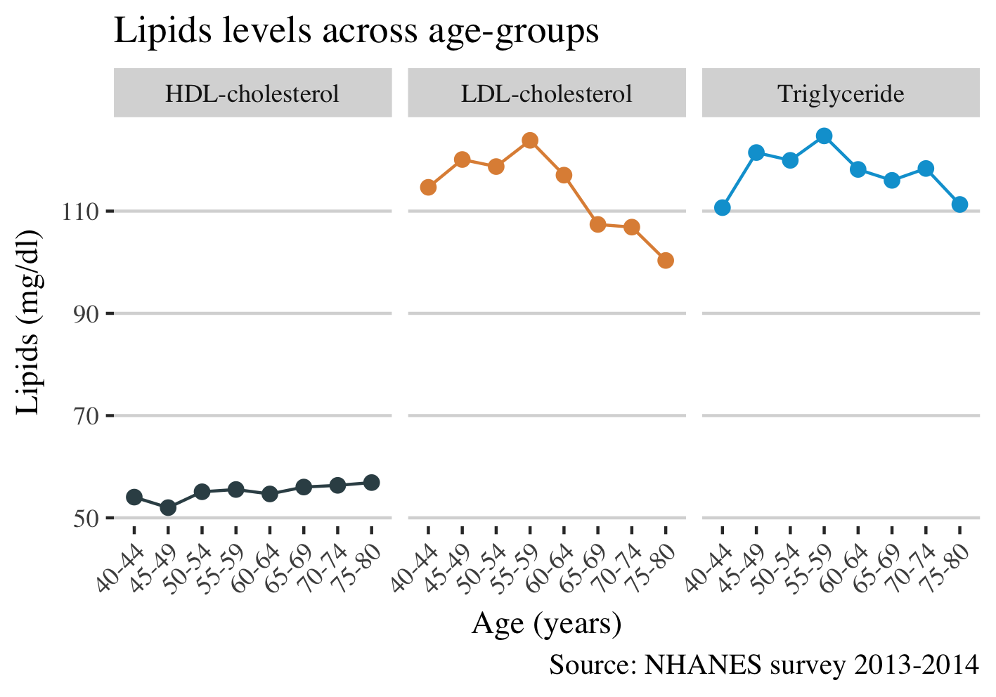
It is visiable that the levels of LDL cholesterol are decreasing with advancing age. We suspected a decrease from the plot above, but here is more noticeable. The reason for this decline may be attributed to medication of dyslipidemia.
And finally, I am interested to see whether there are gender differences in lipids levels across age.
long %>%
  group_by(age_group, lipid, gender) %>%
  summarise(mean = mean(value)) %>%
  ggplot(aes(age_group, mean, color = lipid, group = lipid)) +
  geom_point(alpha = 1, size = 2) +
  geom_line() +
  facet_grid(lipid~gender) +
  scale_color_jama() +
  theme_hc() +
  theme(
    text = element_text(family = "serif", size = 11),
    legend.position="none",
    axis.text.x = element_text(angle = 45, hjust = 1)
    ) +
  labs(
    title = "Lipids levels across age-groups",
    x = "Age (years)",
    y = "Lipids (mg/dl)",
    caption = "Source: NHANES survey 2013-2014",
    col="")
This gives the plot:
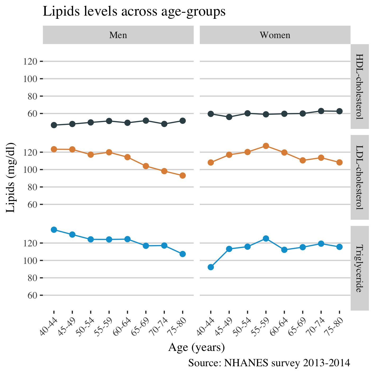
Conclusion
I found that the levels of LDL cholesterol and triglycerides decrease after the age of 55 years, probably due to medication. Men experience a larger decrease in LDL cholesterol than women. Compared to men, women had higher (better) levels of HDL cholesterol. Calculating the overall mean of lipids by age group was a better approach for visualizing the differences of lipid levels in Americans.
Feel free to comment if you have any question regarding the code or plots.