The National Health and Nutrition Examination Survey (NHANES) is a survey conducted by the National Center for Health Statistics to evaluate the health and nutritional status of people in the United States and to track changes over time. These data are a combination of interviews, physical examinations, and laboratory tests.
The visualization of the data gives more information than any other form of data expression. Therefore, I am going to explore the NHANES data by building plots using the ggplot2 which comes with tidyverse package. In this post, I will select few variables such as systolic blood pressure, diastolic blood pressure and cholesterol levels in men and women. The aim is to find most appropriate function of ggplot for better visualizing the data.
Please feel free to suggest and comment below if you find a better code or solution from ggplot than the ones I will use in this post. Also, please note, this post is only for illustration of ggplot functions, and no conclusions should be made.
Libraries and data
First I will load the neccessary libraries
library(tidyverse)
library(RNHANES)
library(ggsci)
library(ggthemes)
The data is from NHANES, and there is an R package for it. Below, I load and merge the datasets by ID.
data = nhanes_load_data("TRIGLY_G", "2011-2012")
dts = data %>%
  left_join(nhanes_load_data("DEMO_G", "2011-2012"), by="SEQN") %>%
  left_join(nhanes_load_data("ALQ_G", "2011-2012"), by="SEQN")
Checking the data
Creating the dataset with variables of interest
dt = dts %>%
  select(SEQN, RIAGENDR, BPXSY1, BPXDI1, LBDLDL)
-
SEQN: id
RIAGENDR: gender
BPXSY1: systolic blood pressure
BPXDI1: diastolic blood pressure
LBDLDL: LDL-cholesterol
Summary of the data:
summary(dt)
     SEQN          RIAGENDR         BPXSY1          BPXDI1          LBDLDL
 Min.   :62161   Min.   :1.000   Min.   : 74.0   Min.   :  0.0   Min.   :  9.0
 1st Qu.:64605   1st Qu.:1.000   1st Qu.:106.0   1st Qu.: 60.0   1st Qu.: 84.0
 Median :67048   Median :2.000   Median :116.0   Median : 68.0   Median :106.0
 Mean   :67043   Mean   :1.502   Mean   :119.2   Mean   : 66.9   Mean   :109.5
 3rd Qu.:69479   3rd Qu.:2.000   3rd Qu.:128.0   3rd Qu.: 76.0   3rd Qu.:131.0
 Max.   :71916   Max.   :2.000   Max.   :238.0   Max.   :120.0   Max.   :331.0
                                 NA's   :2582    NA's   :2582    NA's   :6396
Removing missing and create variables for hypertension and dyslipidemia. The cutoffs are based from guidelines for hypertension and dyslipidemia.
dat = dt %>%
  filter(!is.na(BPXSY1), !is.na(BPXDI1), !is.na(LBDLDL)) %>%
  mutate(
    hta = ifelse(BPXSY1 > 130 | BPXDI1 > 90, "Yes", "No"),
    dylip = ifelse(LBDLDL >= 100, "Yes", "No"),
    RIAGENDR = as.factor(RIAGENDR)
  )
Visualization
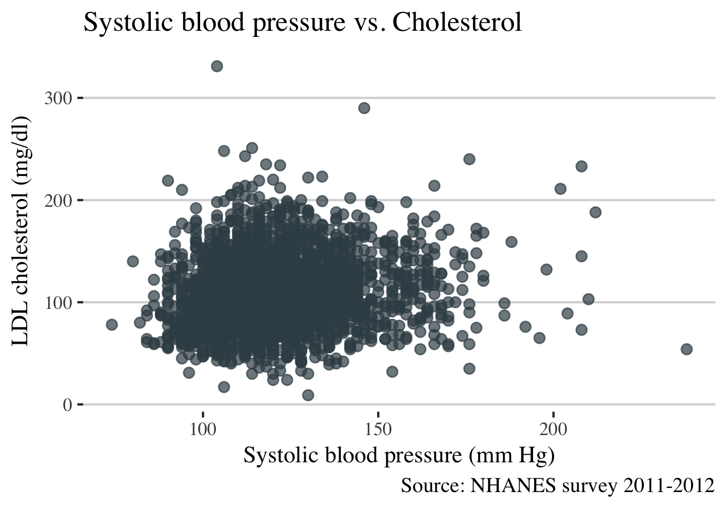
I will build a correlation plot between systolic and diastolic blood pressure with cholesterol levels by using the geom_point function from ggplot. The labels of variables are described above.
Systolic blood pressure and LDL cholesterol
ggplot(dat, aes(BPXSY1, LBDLDL)) +
  geom_point(alpha = 0.7, size = 2, color = "#3C4D54") +
  theme_hc() +
  theme(text = element_text(family = "serif", size = 11)) +
  xlab("Systolic blood pressure (mm Hg)") +
  ylab("LDL cholesterol (mg/dl)") +
  ggtitle("Systolic blood pressure vs. Cholesterol") +
  labs(caption = "Source: NHANES survey 2011-2012")
Gives this plot:
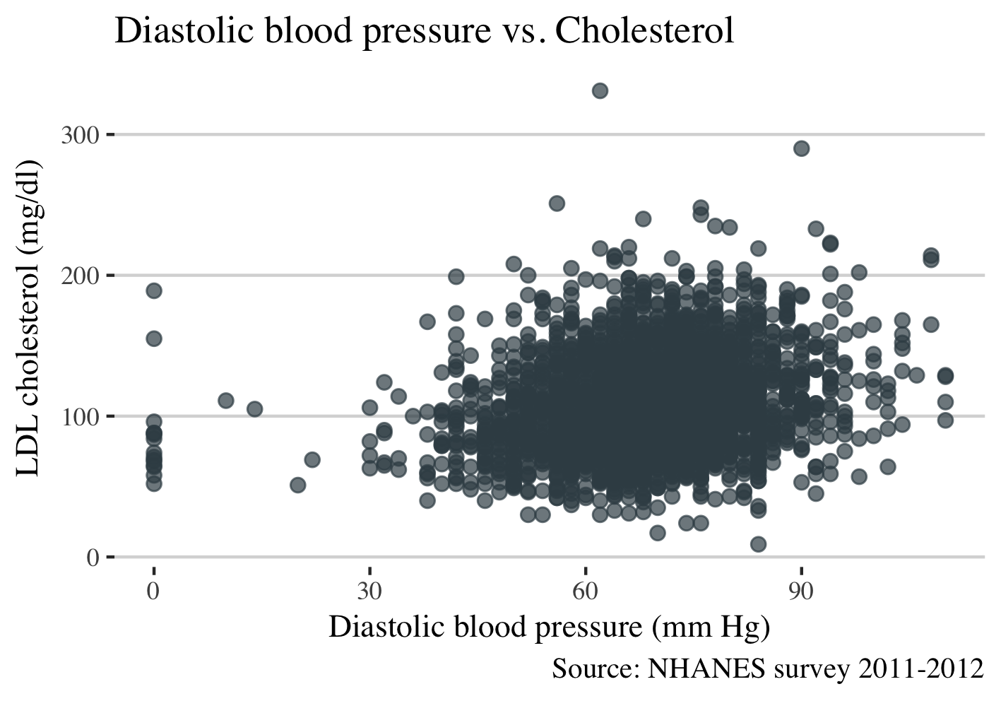
Diastolic blood pressure and LDL cholesterol
ggplot(dat, aes(BPXDI1, LBDLDL)) +
  geom_point(alpha = 0.7, size = 2, color = "#3C4D54") +
  theme_hc() +
  theme(text = element_text(family = "serif", size = 11), legend.position="top") +
  xlab("Diastolic blood pressure (mm Hg)") +
  ylab("LDL cholesterol (mg/dl)") +
  ggtitle("Dyastolic blood pressure vs. Cholesterol") +
  labs(caption = "Source: NHANES survey 2011-2012")
Gives this plot:
Now, I would like to combine these plots in one graph and compare the systolic with diastolic blood pressure about LDL cholesterol levels. In ggplot, I can differentiate between two groups by using the function color, but currently it is tricky as the dataset is not ready. We have three variables which we would like to plot, (1) systolic (2) diastolic blood pressure, and (3) LDL cholesterol. We will need one variable from blood pressure; the second variable should be an indicator for systolic and diastolic and the third variable the LDL cholesterol levels. I will transform the dataset from wide to long format.
Transforming the data wide to long
Follow the code below to transfrom from wide to long:
long = dat %>%
  select(SEQN, RIAGENDR, BPXSY1, BPXDI1, LBDLDL) %>%
  gather(bp, value, BPXSY1:BPXDI1) %>%
  mutate(bp = recode(bp, `BPXDI1` = "Diastolic", `BPXSY1` = "Systolic"),
         gender = recode(RIAGENDR, `1` = "Male", `2` = "Female"))
Create a plot with long data.
ggplot(long, aes(value, LBDLDL, color = bp)) +
  geom_point(alpha = 0.7, size = 2) +
  scale_color_jama() +
  theme_hc() +
  theme(text = element_text(family = "serif", size = 11), legend.position="top") +
  xlab("Blood pressure (mm Hg)") +
  ylab("LDL cholesterol (mg/dl)") +
  ggtitle("Blood pressure vs. Cholesterol") +
  labs(
    caption = "Source: NHANES survey 2011-2012",
    col="Blood pressure")
Gives this plot:
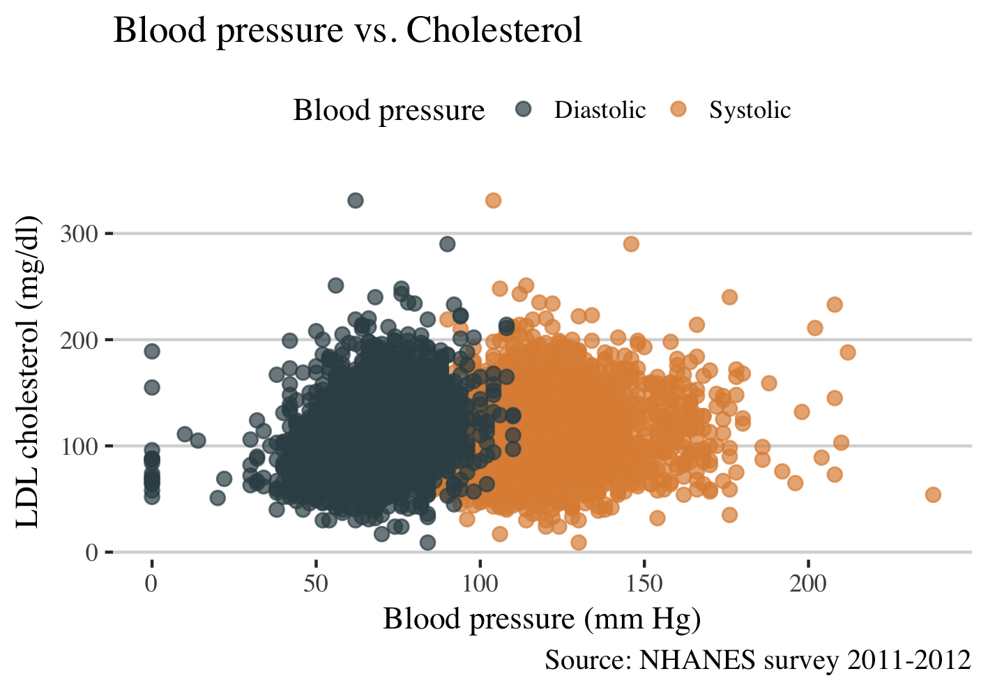
From the figure above I see that there is an overlap between systolic and diastolic blood pressure. The function faced_grid of ggplot will be used to separate systolic and diastolic blood pressure.
ggplot(long, aes(value, LBDLDL, color = bp)) +
  geom_point(alpha = 0.7, size = 2) +
  geom_smooth(colour="#479FD0") +
  facet_grid(~bp) +
  scale_color_jama() +
  theme_hc() +
    theme(text = element_text(family = "serif", size = 11), legend.position="none") +
  xlab("Blood pressure (mm Hg)") +
  ylab("LDL cholesterol (mg/dl)") +
  ggtitle("Blood pressure vs. Cholesterol") +
  labs(
    caption = "Source: NHANES survey 2011-2012")
Gives this plot:
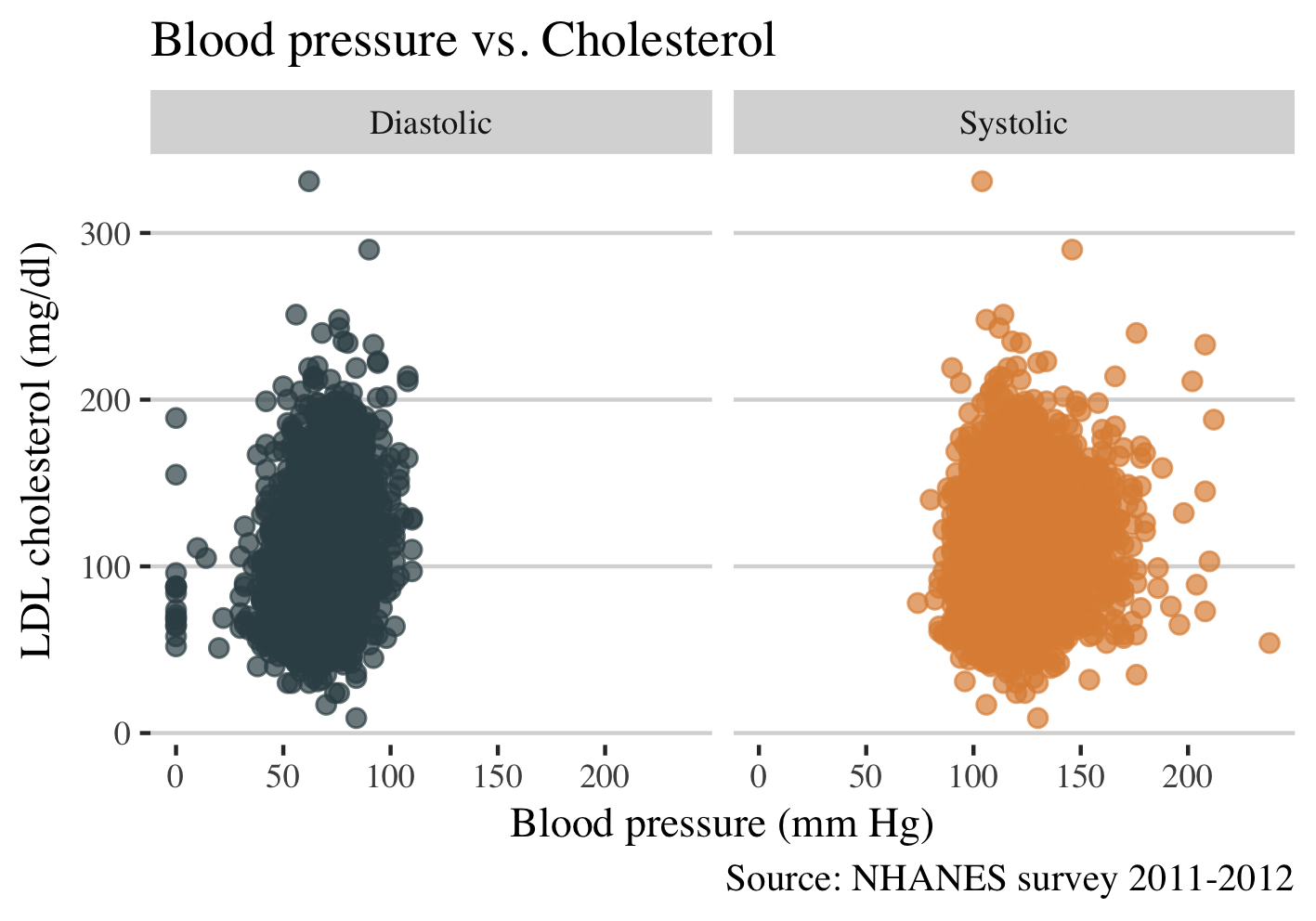
From the plots above I find that regardless the different levels of diastolic and systolic blood pressure there is no substantial correlation between cholesterol and blood pressure. However, it is better to build the correlation line with geom_smooth or to calculate the Spearman correlation, although in this post we focus only on the visualization.
Lets build the correlation line.
ggplot(long, aes(value, LBDLDL, color = bp)) +
  geom_point(alpha = 0.7, size = 2) +
  geom_smooth(colour="#479FD0") +
  facet_grid(~bp) +
  scale_color_jama() +
  theme_hc() +
    theme(text = element_text(family = "serif", size = 11), legend.position="top") +
  xlab("Systolic blood pressure (mm Hg)") +
  ylab("LDL cholesterol (mg/dl)") +
  ggtitle("Blood pressure vs. Cholesterol") +
  labs(
    caption = "Source: NHANES survey 2011-2012",
    col="Blood pressure")
Gives this plot:
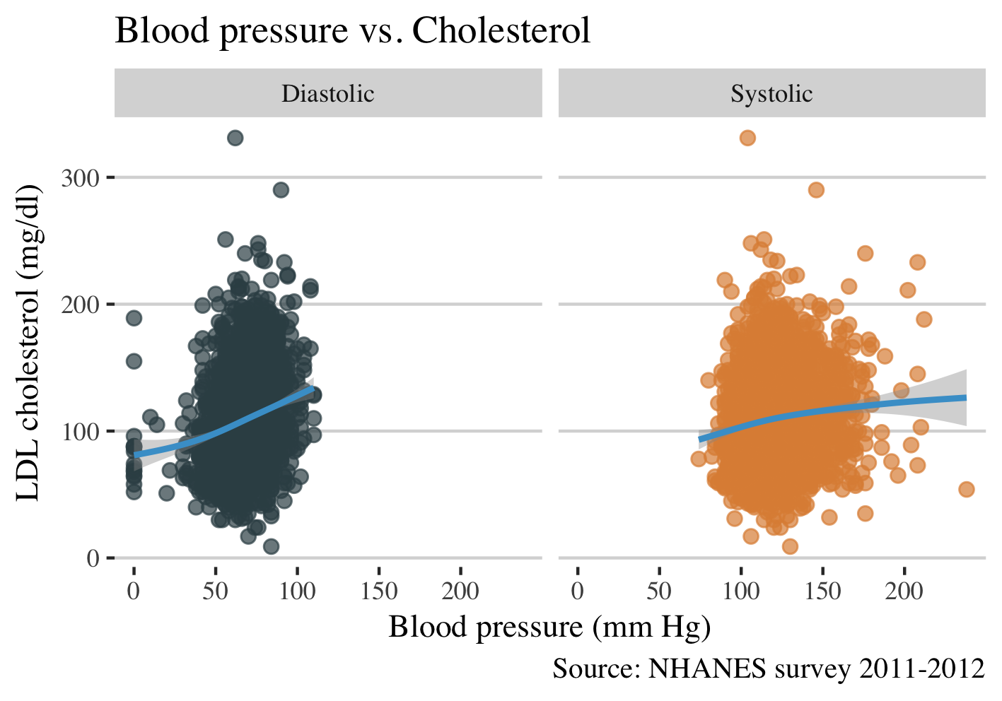
It is interesting that the levels of cholesterol are increasing more with an increase of diastolic blood pressure than with an increase in systolic blood pressure. However, from the plot, we do not know how the levels of cholesterol change by the presence of hypertension.
Cholesterol levels among participants with and without hypertension
ggplot(dat, aes(hta, LBDLDL, color=hta)) +
  geom_boxplot(fill='#eeeeee') +
  scale_color_jama() +
  theme_hc() +
  theme(text = element_text(family = "serif", size = 11), legend.position="none") +
  xlab("Presence of hypertension") +
  ylab("LDL cholesterol (mg/dl)") +
  ggtitle("Hypertension vs. Cholesterol") +
  labs(
    caption = "Source: NHANES survey 2011-2012")
Gives this plot:
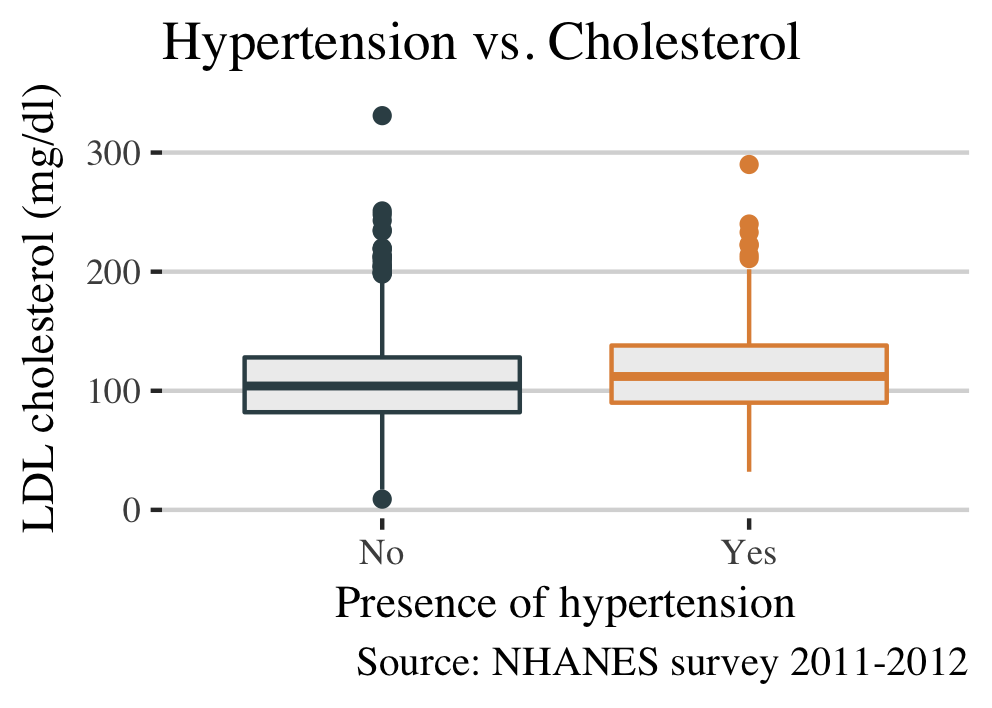
I find that NHANES participants with hypertension have slightly higher levels of cholesterol. Now I will see the levels of diastolic blood pressure by dyslipidemia.
Diastolic blood pressure among participants with and without dyslipidemia. I focus in diastolic blood pressure as I found earlier a correlation between diastolic blood pressure and LDL cholesterol.
long %>%
  mutate(dylip = ifelse(LBDLDL >= 100, "Yes", "No")) %>%
  ggplot(aes(dylip, value, color=dylip)) +
  geom_boxplot(fill='#eeeeee') +
  facet_grid(~bp) +
  scale_color_jama() +
  theme_hc() +
    theme(text = element_text(family = "serif", size = 11), legend.position="none") +
  xlab("Presence of dyslipidemia") +
  ylab("Blood pressure (mm Hg)") +
  ggtitle("Dyslipidemia vs. Blood pressure") +
  labs(
    caption = "Source: NHANES survey 2011-2012")
Gives this plot:
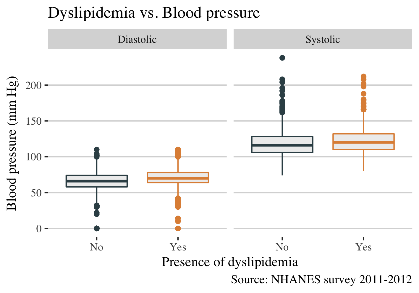
This plot shows no “significant” differences between dyslipidemia with systolic or diastolic blood pressure.
Finally, I will compare the differences between men and women in this survey of NHANES.
ggplot(long, aes(value, LBDLDL, color = gender)) +
  geom_point(alpha = 0.7, size = 2) +
  geom_smooth(colour="#479FD0") +
  facet_grid(bp ~ gender) +
  scale_color_jama() +
  theme_hc() +
    theme(text = element_text(family = "serif", size = 11), legend.position="none") +
  xlab("Blood pressure (mm Hg)") +
  ylab("LDL cholesterol (mg/dl)") +
  ggtitle("Blood pressure vs. Cholesterol vs. Gender") +
  labs(
    caption = "Source: NHANES survey 2011-2012")
Gives this plot:
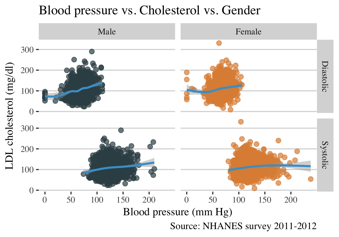
This plot shows that in males the increase of LDL cholesterol is associated with a rise in diastolic blood pressure.
That’s all for today! If you have questions, please leave a comment below.